
 [Image: Prison Visiting Room Backdrop, Woodbourne Correctional Facility, New York; photograph by Alyse Emdur].
Earlier this year, Venue published an interview with Los Angeles-based photographer Alyse Emdur discussing her project Prison Landscapes. I thought Emdur’s work—a look at the unexpected landscape paintings used as photographic backdrops in prison waiting rooms throughout the United States—deserved a second look, so I am re-posting the interview here.
Venue, of course, is a joint project between BLDGBLOG and Nicola Twilley of Edible Geography, and it is supported by the Nevada Museum of Art‘s Center for Art + Environment.
The full interview, along with its original introduction, appears below.
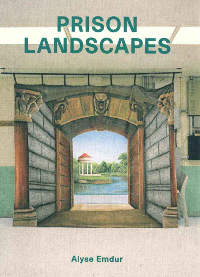 [Image: Prison Landscapes, published January 2013 by Four Corners Books].
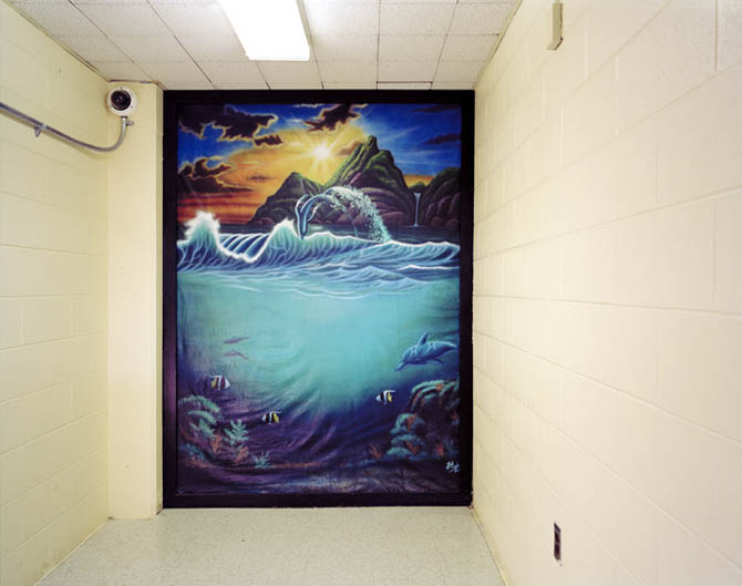
Some of the most unsettling examples of contemporary landscape painting in the United States are to be found in its prison visiting rooms, where they function as visual backdrops for family photographs.
 [Image: James Bowlin, United States Penitentiary, Marion, Illinois; photograph courtesy Alyse Emdur. Note the fake trout].
Ranging in subject matter from picturesque waterfalls to urban streetscapes, and from ski resorts to medieval castles, these large-format paintings serve a dual purpose: for the authorities, they help to restrict photography of sensitive prison facilities; for the prisoners and their families, they are an escapist fiction, constructing an alternate reality for later display on fridge doors and mantlepieces.
With nearly 2.3 million Americans in prison today—an astonishing one out of every hundred adults in the United States, according to a 2008 Pew study (PDF)—this school of landscape art is critically overlooked but has a mass-market penetration comparable to the work of Thomas Kinkade. And, like Kinkade’s work, these backdrops—which are usually painted by talented, self-taught inmates—are simultaneously photo-realistic and highly idealized. Cumulatively, they represent a catalog of imagined utopias: scenes from an abstracted and perfect elsewhere, painted from behind bars.
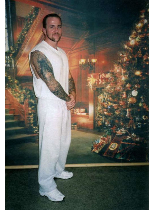
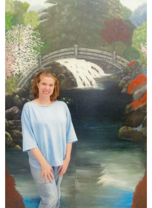
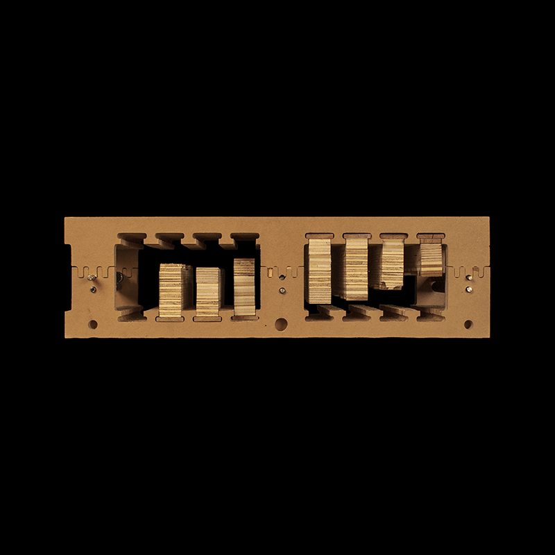
 [Image: Prison Visiting Room Backdrop, Shawangunk Correctional Facility, New York; photograph by Alyse Emdur. Unlike the family portraits, Emdur’s own large-format photographs deliberately show the prison context that surrounds the backdrop landscape, for an unsettling contrast].
Several years ago, artist Alyse Emdur was looking through a family album when she came across a photo of herself as a little girl, posing in front of a tropical beach scene while visiting her elder brother in prison. She spent the next few years exploring this surprising body of vernacular landscape imagery, tracking down examples across the United States.
 [Image: Emdur family photo in front of prison visiting room backdrop; photograph courtesy Alyse Emdur].
At first, she wrote to prison administrators to ask permission to photograph the backdrops herself—a request that was inevitably firmly denied. Instead, she joined prisoner pen-pal sites, asking inmates to send her pictures of themselves posed in front of their prison’s backdrops; through this method, Emdur eventually assembling several hundred photos and more than sixteen binders full of correspondence. Finally, in summer 2011, she gained permission to visit and photograph several prison visiting room backdrops herself.
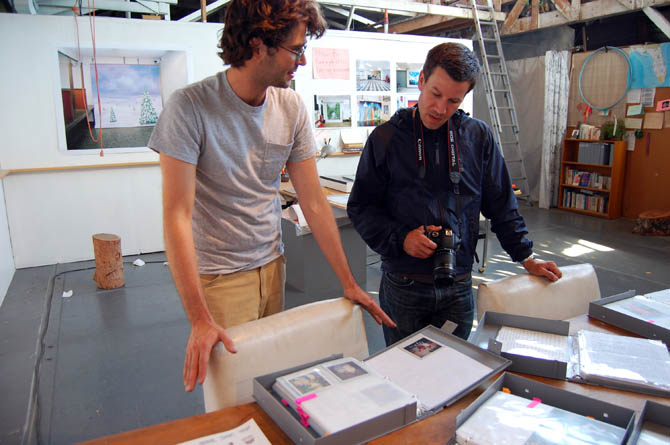 [Image: Michael Parker and Geoff Manaugh looking at Alyse Emdur‘s correspondence and work in Emdur’s studio space; photograph by Venue].
Venue visited Emdur’s studio in downtown Los Angeles in the summer of 2012, as she was collecting all this material for a book, Prison Landscapes, published in January 2013 by Four Corners Books. After a studio tour conducted by her partner, artist Michael Parker, we followed up with Emdur by phone: the edited transcript of our conversation follows.
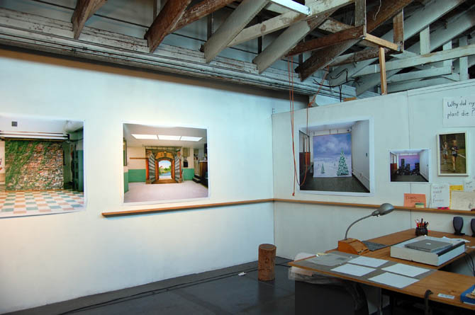 [Image: Alyse Emdur‘s large-format photographs of prison visiting room backdrops on her studio walls; photograph by Venue].
Nicola Twilley: From the hundreds of photographs that prisoners sent you, as well as the ten or so backdrops that you were able to photograph yourself, it seems as though there is almost a set list of subject matter: glittering cityscapes, scenes of natural landscapes, like beaches and sunsets, and then historical or fantasy architecture, such as medieval castles. Did you notice any patterns or geographic specificity to these variations in subject matter?
Alyse Emdur: You do see some regional realism—so, prisons in Washington State will have evergreen trees in their backdrops, prisons in Florida will have white sand beaches, and prisons in Louisiana will have New Orleans French Quarter-style features. There’s also the question of where the prisoners are from: one thing that I’ve observed is that in upstate New York, for example, many of the prisoners are actually from New York City, so many of the backdrops in upstate New York prisons show New York City skylines.
Fantastical scenes are actually much less common—from what I gather from my correspondence, realism is like gold in prison. That’s the form of artistic expression that’s most appreciated and most respected, so that’s often the goal for the backdrop painter.
 [Image: Brandon Jones, United States Penitentiary, Marion, Illinois; photograph courtesy Alyse Emdur].
Twilley: Do you have a sense of how you get to be a backdrop painter—do inmates chose amongst themselves or do the prison authorities just make a selection? And, on a similar note, how much artistic freedom does the backdrop painter actually have, in terms of needing approval of his or her subject matter from fellow inmates or the authorities?
Emdur: That’s one of the questions that I’ve asked of all the backdrop painters who I’ve been in touch with over the years. The answer is always that if you are a “good artist” in prison, then you’re very well-respected within the prison—people in the prison all know you. You’ll be making greeting cards for people or you’ll be doing hand calligraphy for love letters for friends in prison—you’ll be known for your skills. The prison administration is already aware of the respected artists, because they shine within the culture, and so they are usually the ones that are chosen. And when you’re chosen, it’s a huge honor.
 [Image: Genesis Asiatic, Powhatan Correctional Center, Statefarm, Virginia; photograph courtesy Alyse Emdur].
Something to keep in mind, though, is that backdrops do get painted over. In some prisons, the backdrop can change a few times a year.
One of the artists I’ve kept in touch with is Darrell Van Mastrigt—I interviewed him for the book, and he painted a backdrop for me that was in my thesis show. In the prison that he’s in, the portrait studios are organized by the NAACP. He said that the NAACP had seen his paintings in the past, and when they selected him, they gave him creative control over what sort of landscape he chose to paint.
Obviously, there are some rules. The main restriction is that you can’t use certain colors that are affiliated with gangs. So, for instance, Darrell painted a mural with two cars and they had to be green and purple—they couldn’t be red or blue. But, from what Darrell has told me and from what I understand from other painters, they don’t get much input from other prisoners. At the same time, they’re very conscious of wanting to please people and maintain their status within the prison, of course, and they get a lot of pleasure out of doing something positive for families in the visiting room.
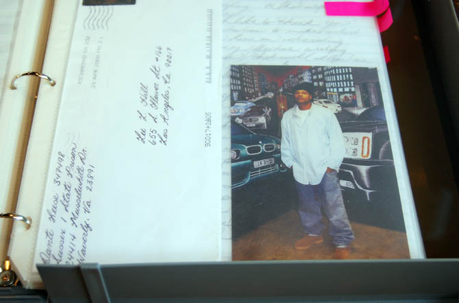 One of sixteen binders full of letters and prisoner portraits mailed to Emdur; photograph by Venue].
Another interesting thing a painter told me was that she was very conscious of not wanting to do a specific, recognizable cityscape, because she knew that not everyone in the prison was from the city. So she deliberately tried to paint a more abstract landscape that she thought anyone could relate to. And a lot of imagery they work from is from books in the prison library, rather than just their memories.
Twilley: In some of the photographs you were sent, the prisoners are in front of off-the-shelf printed backdrops—some offering multiple pull-down choices—rather than hand-painted ones. Are these standardized commercial backdrops gradually replacing the inmate-produced landscapes?
Emdur: The backdrop-painting tradition is definitely still vibrant and strong, but my sense is that these store-bought backdrops are becoming more and more common.
For one thing, the hand-painted backdrops are not always as realistic as a photograph, and, often, the prisoners and their families are looking to create the illusion that they really are somewhere else. So, the more realistic, the better. When I went to photograph a backdrop in one New York State prison, I found an amazing hand-painted mural of a New York City skyscraper with a cartoon-like Statue of Liberty in front—she almost looked alive. But it had been completely covered up by a pull-down, store-bought, photographic backdrop of the New York City skyline. I tried to photograph the backdrop in Fort Dix Federal Prison in New Jersey and they told me that they had just painted over the hand-painted backdrop and replaced it with a commercial photography backdrop.
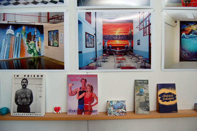 [Image: Small prints of Emdur‘s backdrop photographs on her studio wall, alongside a few examples of her extensive collection of self-help books; photograph by Venue. Note the hand-painted cityscape featuring the Statue of Liberty on the left].
Of course, another thing is that it’s easier to buy a backdrop than it is to engage with a prisoner, you know? And attitudes vary from prison to prison. In some prisons, you’ll find murals throughout the facility, not just in the visiting rooms. I went on a tour of a privately-operated women’s prison in Florida, for instance, that lasted four hours because there were paintings everywhere—in all the hallways, dorm rooms, and offices. The PR person who assisted me on that tour explained that having prisoners paint murals is really a way to keep them busy and out of trouble, so they saw it as a really positive activity.
Of course, I see these paintings as a way for people in prison to temporarily escape the architecture and culture of confinement, and that’s what makes them so important for me.
 [Image: Antoine Ealy, Federal Correctional Complex, Coleman, Florida; photograph courtesy Alyse Emdur].
Twilley: There’s an uncomfortable overlap between the escapism of the landscapes and then the other purpose of the backdrops, which is to not allow photographs of the prison interior to get out.
Emdur: Yes—I found that really concerning. The prison administration either thinks that photographs of the interior of the prison could help inmates escape or, at the very least, the administrators are trying to control the imagery of the prison that reaches the outside world.
During my research, I’ve been trying to figure out how long these kinds of backdrops have been used. From prison administrators to PR people to wardens and prisoners, everyone told me they don’t even remember—these kinds of painted backdrops have been used in visiting rooms for as long as they can remember. I’ve spoken to a sixty-five-year-old warden who just said, “You know, they’ve been here longer than I have.”
 [Image: Robert RuffBey, United States Penitentiary, Atlanta, Georgia; photograph courtesy Alyse Emdur].
I do know that at some point in the last twenty years, companies came along that would charge inmates to substitute in a different backdrop. If you’re a prisoner and you have a photograph of yourself or yourself and your kids in front of the painted backdrop in the visiting room, then you could send your photograph to one of these companies and they would take out the painting and then put in a Photoshop background. That’s not very common at all, but it’s pretty bizarre—one fake landscape being replaced by another.
Going along with that is the replacement of Polaroid with digital photography. All these portraits were Polaroid up until the last five to ten years, I would say. Some prisons still use Polaroids, but from what I gather, it’s basically all digital now.
 [Image: One of sixteen binders full of letters and prisoner portraits mailed to Emdur; photograph by Venue].
One thing to remember is that all the prisons have slightly different rules and they all organize their prison portrait programs differently. In most state and federal prisons in America, the only place where a prisoner can be photographed is in front of these backdrops, and the only time they can be photographed in front of the backdrops is when they have a visitor—but, then, there are all these exceptions.
At some prisons, for instance, you can get your picture taken at special events, like graduations or holiday parties. Then, some prisons have murals elsewhere in the prison, not in the visiting room, that you can sign up once a month or something to have your picture taken in front of.
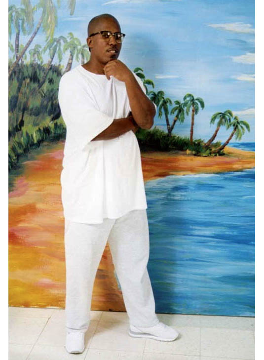
 [Image: Kimberly Buntyn, Valley State Prison for Women, Chowchilla, California; photograph courtesy Alyse Emdur].
This question of the kinds of images of prisons that are allowed out is quite interesting. In fact, I’m working with a photographer who’s been in prison for almost 30 years in Michigan, on what I think will be my next book. In the 1970s and 80s, he ran the photo lab in Jackson Prison, and he was in charge of developing and printing all the inmates’ photographs. At that time, the rules of photography were very different in prison—there just weren’t as many rules, basically. This guy has hundreds of photographs from all over Jackson State Prison.
It’s just fascinating to see the differences between these very staged and framed visiting room portraits and the reality of the prison as seen through this guy’s eyes—through an insider’s eyes. I think his situation was extremely rare when it happened, but today it’s totally unheard of. The majority of photographs that come out of prisons today are these visiting room portraits. I suppose some prisoners are smuggling cell phones with cameras into prison, but those images aren’t easy to find!

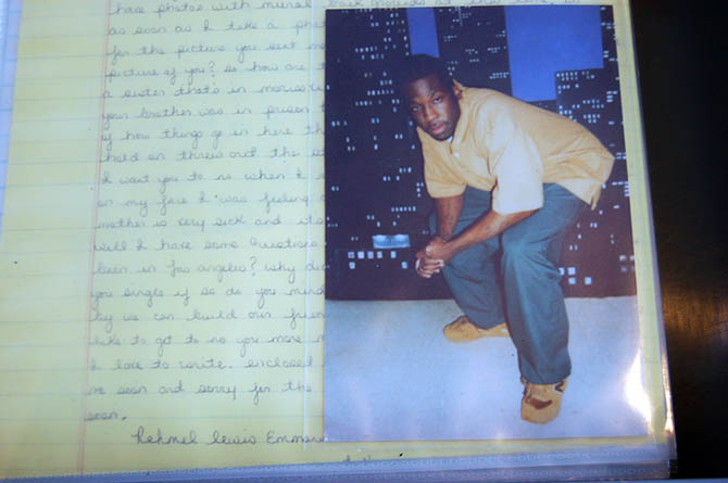 [Images: Sixteen binders’ worth of letters and prisoner portraits have been mailed to Emdur over the course of her project; photographs by Venue. Several of Emdur‘s pen-pals adopted the so-called “prison pose“—a low crouch—while others incorporated props or flexed their muscles].
Geoff Manaugh: Both Nicky and I were amazed by the amount of correspondence you’ve gathered in the process of researching these backdrops—binder after binder organized and shelved in your studio—but I can’t imagine that it’s been easy to edit it all down into a book, or to get releases from all the prisoners, for example. How has that process worked?
Emdur: It’s been really tough. With 2.3 million Americans in prison today, just think how many of these portrait studio photographs there are circulating in family albums and frames all across the country. A big part of me wants to document more and more and more. But, for a book, I figured it was really important to step back a little bit and not go crazy, and instead try to focus and pull out the different genres of backdrops and the different poses and the stories.
In terms of the process of getting releases, that was a huge effort. As you know, I collected the images through contacting prisoners on pen-pal websites. I sent out something like 300 letters and about 150 inmates responded really quickly with photographs of themselves in front of these backdrops.
A lot of prisoners are looking for engagement with the outside world, so it was very easy to collect the images. The challenging thing was getting releases for publication. Tracking down people who’d been released was one thing. For minors, we wanted to get our release approvals from both the incarcerated parents and also from the non-incarcerated parents, and that really was challenging.
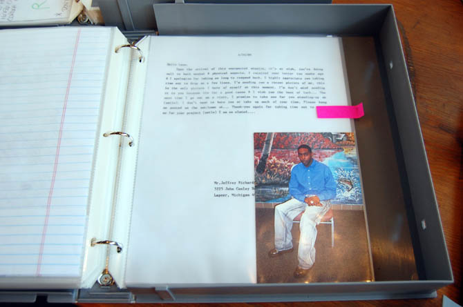 [Image: A binder of letters and prisoner portraits mailed to Emdur; photograph by Venue].
But, really, the most difficult thing for me about this project is just how emotionally challenging it is—how draining it is—to correspond with hundreds of people who have a very different reality than I have and live a very different life than I do and who don’t have the privileges that I would normally take for granted.
The relationship between the incarcerated and the free is a very complex relationship, and that’s something that I’m interested in showing in the book, and that I hope comes out in the correspondence.
For more Venue interviews, focusing on human interactions with the built, natural, and virtual environments, check out the Venue website in full.
Meanwhile, Michael Parker—the artist who showed us around the studio space he shares with Alyse Emdur—has some projects of his own worth checking out, in particular, his work Lineman, which documents, in film, photographs, and interviews, “an electrical lineman class at Los Angeles Trade-Technical College” where adult students learn “how to become power-pole technicians.”

 [Image: A “ghost” tank; image via
  [Image: Signal Corps officers look at militarized turntables in Paris; via the
 [Image: From a map of the San Andreas Fault, cutting through the
 [Images: From a map of the San Andreas Fault, cutting through the

 [Images: An

 [Images: From a map of the San Andreas Fault, cutting through the
 [Image: “
 [Image: “
 [Image: “
 [Image: Like the rings of Saturn, from “
 [Image: Photo courtesy of
  [Image: Photo courtesy of
 [Images: Photos courtesy of
  [Image: Photo courtesy of
  [Image: Photo courtesy of
  [Image: Photo courtesy of
  [Image: Photo courtesy of
  [Image: Photo courtesy of
  [Image: Photo courtesy of
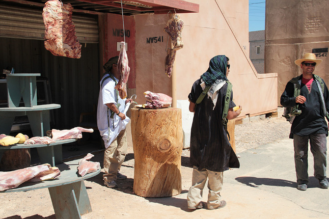
 [Images: Photos courtesy of
 [Images: Photos courtesy of
  [Image: Photo courtesy of
  [Image: Photo courtesy of
 [Images: Photos courtesy of
  [Image: Photo courtesy of
  [Image: Photo courtesy of
 [Images: Photos courtesy of
  [Image: Photo courtesy of
 [Images: Photos courtesy of
 [Images: Photos courtesy of
 [Images: Photos courtesy of
  [Image: Photo courtesy of
 [Images: Photos courtesy of
  [Image: Photo courtesy of
 [Images: Photos courtesy of
 [Images: Photos courtesy of
  [Image: Photo courtesy of
 [Image: Via
  [Image: Via
  [Image: Via
 [Image: The throwable
  [Image: Part of the
 [Images: From
  [Images: From
  [Image: From
  [Image: From
 [Image: “The ice is up taller than the cottages and homes,” we read. “It kind of dwarfs them.” Photo and quotation via the
  [Image: “This is nothing you can predict,” one homeowner said. “There’s nothing you can do to prevent this.” Photo and quotation via the
  [Image:
 [Image: Screenshot of our own SimCity—called, for reasons that made sense at the time, We Are The Champignons—after three hours of game play].
 [Image: A


 [Image: Using the zoning tool for the city designed by We Are the Champignons].
 [Images: Stone Librande’s storyboards for “Green City” and “Mining City” at the start of play].
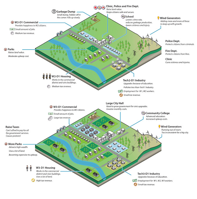 [Image: Stone Librande’s storyboard for “Green City” at mid-game].
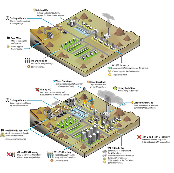 [Image: Stone Librande’s storyboard for “Mining City” at mid-game].
 [Image: Stone Librande’s storyboard for the “Green City” and “Mining City” end-game symbiosis].
 [Image: Data layer showing ore deposits].
 [Image: Data layer showing happiness levels. In SimCity, happiness is increased by wealth, good road connections, and public safety, and decreased by traffic jams and pollution].
 [Image: A regional view of a SimCity game, showing different cities and their painfully small footprints].
 [Image: Screenshot from SimCity 4].
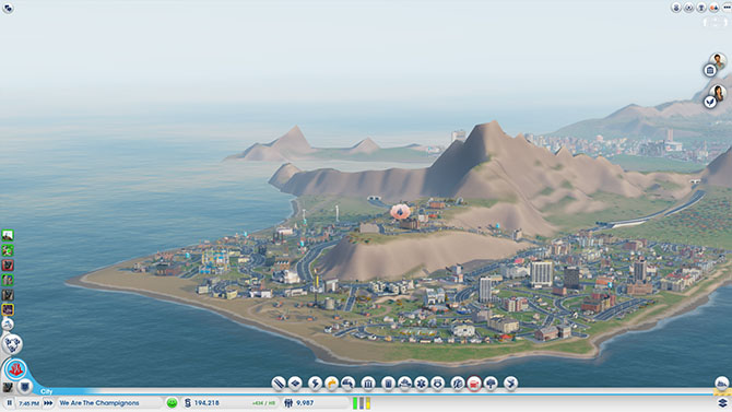 [Image: A fire breaks out in the city designed by We Are The Champignons].
 [Image: Sims queue for the bus at dawn].
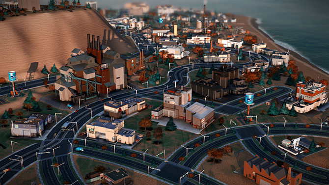 [Image: We Are The Champignons’ industrial zone, carefully positioned downwind of the residential areas].


 [Image: This surreal,