Tales of the Crash: An Interview with Nick Arvin

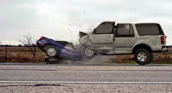
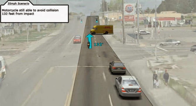
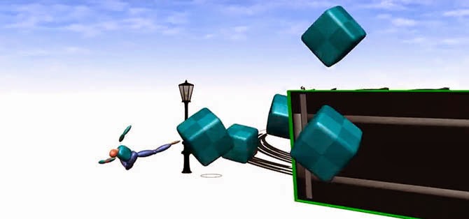
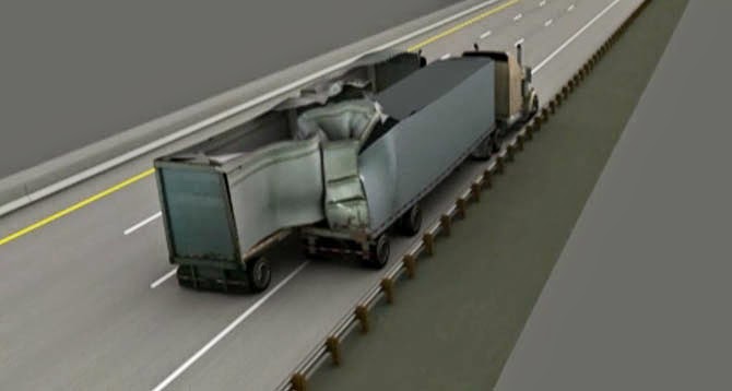
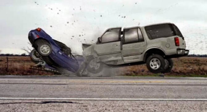
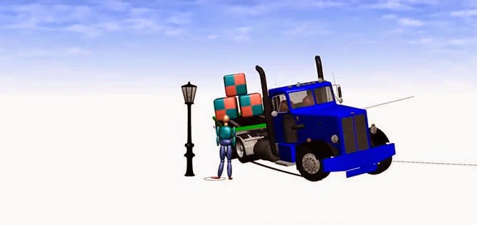
Screenshot from a sample 3D car crash animation created by Kineticorp; visit their website for the video.

(Note: An earlier version of this interview previously appeared on Venue).

Ellis Barstow, the protagonist in Nick Arvin‘s most recent novel, is a reconstructionist: an engineer who uses forensic analysis and simulation to piece together, in minute detail, what happened at a car crash site and why.

The novel is based on Arvin’s own experiences in the field of crash reconstruction; Arvin thus leads an unusual double-life as a working mechanical engineer and a successful author of literary fiction.

As part of our Venue project, Nicola Twilley and I sat down with Arvin at the Lighthouse Writers Workshop in Denver for an afternoon of conversation and car crash animations.

Flipping open his laptop, Arvin kicked things off by showing us a kind of greatest hits reel drawn from his own crash reconstruction experience. Watching the short, blocky animations—a semi jack-knifing across the center line, an SUV rear-ending a silver compact car, before ricocheting backward into a telephone pole—was surprisingly uncomfortable.

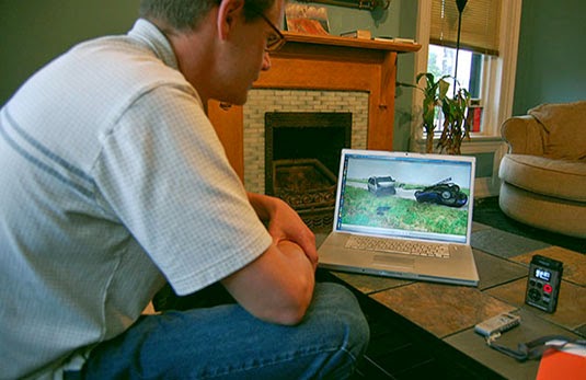
[Images: Nick Arvin demonstrates simulated car crashes; photos by Nicola Twilley].

As he hit play, each scene was both unspectacular and familiar—a rural two-lane highway in the rain, a suburban four-way stop surrounded by gas stations and fast-food franchises—yet, because we knew an impact was inevitable, these everyday landscapes seemed freighted with both anticipation and tragedy.

The animations incorporated multiple viewpoints, slowing and replaying the moments of impact, and occasionally overlaying an arrow, scale, or trajectory trace. This layer of scientific explanation provided a jarring contrast to the violence of the collision itself and the resulting wreckage—not only of the scattered vehicles, but of entire lives.

As we went on to discuss, it is precisely this disjuncture—between the neat explanations provided by laws of physics and the random chaos of human motivation and behavior—that The Reconstructionist takes as its narrative territory.

Our conversation ranged from the art of car crash forensics to the limits of causality and chance, via feral pigs, Walden Pond, and the Higgs boson. An edited transcript appears below.

• • •

Nicola Twilley: Walk us though how you would build and animate these car crash reconstructions.

Nick Arvin: In the company where I worked, we had an engineering group and an animation group. In the engineering group, we created what we called motion data, which was a description of how the vehicle moved. The motion data was extremely detailed, describing a vehicle’s movement a tenth of a second by a tenth of a second. At each of those points in time we had roll, pitch, yaw, and locations of vehicles.

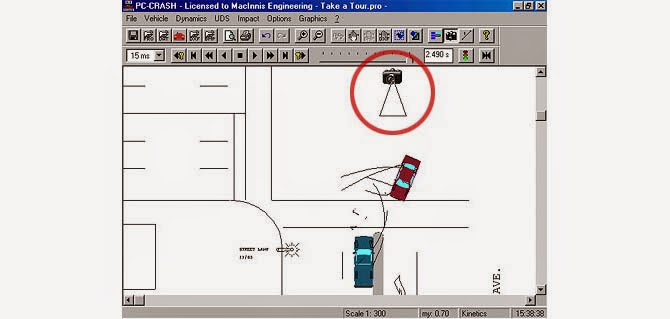
To generate such detailed data, we sometimes used a specialized software program⎯the one we used is called PC-Crash⎯or sometimes we just used some equations in Excel.
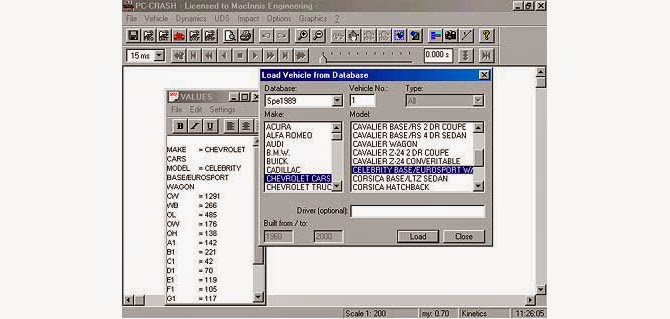
A screenshot from the PC-Crash demo, which boasts that the “Specs database contains vehicles sold in North America from 1972 to the present,” and that “up to 32 vehicles (including cars, trucks, trailers, pedestrians, and fixed objects such as trees or barriers) can be loaded into a simulation project.”

When you’re using PC-Crash, you start by entering a bunch of numbers to tell the program what a vehicle looks like: how long it is, where the wheels are relative to the length, how wide it is, where the center of gravity is, how high it is, and a bunch of other data I’m forgetting right now.

Once you’ve put in the parameters that define the vehicle, it’s almost like a video game: you can put the car on the roadway and start it going, and you put a little yaw motion in to start it spinning. You can put two vehicles in and run them into each other, and PC-Crash will simulate the collision, including the motion afterward, as they come apart and roll off to wherever they roll off to.

We then fed that motion data to the animators, and they created the imagery.
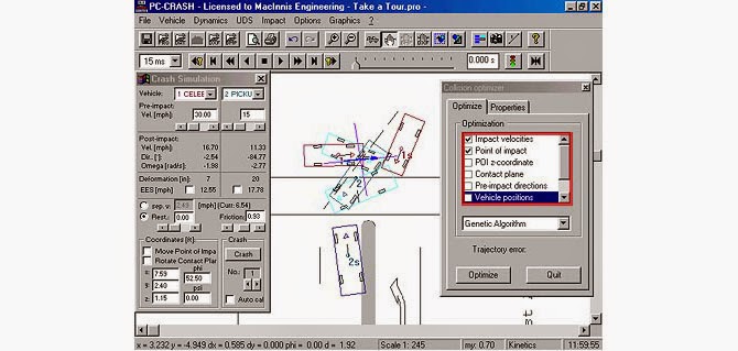
Screenshots of PC-Crash‘s “Collision Optimizer.” As the demo promises, “in PC-Crash 3D, the scene can be viewed from any angle desired.”

Often, you would have a Point A and a Point B, and you would need the animation to show how the vehicle got from one point to the other.

Point A might be where two vehicles have crashed into each other, which is called the “point of impact.” The point of impact was often fairly easy to figure out. When vehicles hit each other—especially in a head-on collision—the noses will go down and gouge into the road, and the radiator will break and release some fluid there, marking it.

Then, usually, you know exactly where the vehicle ended up, which is Point B, or the “point of rest.”

But connecting Points A and B was the tricky part.

Twilley: In real life, are you primarily using these kind of animations to test what you think happened, or is it more useful to generate a range of possibilities of which you can then look for evidence on the ground? In the book, for example, your reconstructionists seem to do both, going back and forth between the animation and the actual ground, generating and testing hypotheses.

Arvin: That’s right. That’s how it works in real life, too.

Sometimes we would come up with a theory of what happened and how the vehicles had moved, and then we’d recreate it in an animation, as a kind of test. Generating a realistic-looking animation is very expensive, but you can create a crude version pretty easily.

We’d watch the animation and say, “That just doesn’t look right.” You have a feel for how physics works; you can see when an animation just doesn’t look right. So, very often, we’d look at an animation and say to ourselves: we haven’t got this right yet.
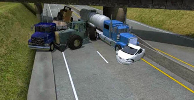
Screenshot from a sample 3D car crash animation created by Kineticorp; visit their website for the video.

One of the challenges of the business is that, when you’re creating an animation for court, every single thing in it has to have a basis that’s defensible. An animation can cost tens of thousands of dollars to generate, and if there is one detail that’s erroneous, the other side can say, “Hey, this doesn’t make sense!” Then the entire animation will be thrown out of court, and you’ve just flushed a lot of money down the toilet.

So you have to be very meticulous and careful about the basis for everything in the animation. You have to look at every single mark on the vehicle and try to figure out exactly where and how it happened.

In the novel there is an example of this kind of thinking when Boggs shows Ellis how, when looking at a vehicle that has rolled over, you literally examine each individual scratch mark on the vehicle, because a scratch can tell you about the orientation of the vehicle as it hit the ground, and it can also tell you where the vehicle was when the scratch was made, since asphalt makes one kind of scratch, while dirt or gravel will make a different type of scratch.

For one case I worked on—a high-speed rollover where the vehicle rolled three or four times—we printed out a big map of the accident site. In fact, it was so big we had to roll out down the hallway. It showed all of the impact points that the police had documented, and it showed all of the places where broken glass had been deposited as the vehicle rolled. We had a toy model of the car, and we sat there on the floor and rolled the toy from point to point on the map, trying to figure out which dent in the vehicle corresponded to which impact point on the ground.

I remember the vehicle had rolled through a barbed wire fence, and that there was a dent in one of the doors that looked like a pole of some kind had been jammed into the sheet metal. We figured it had to be one of the fence posts, but we struggled with it for weeks, because everything else in the roll motion indicated that, when the car hit the fence, the door with the dent in it would have been on the opposite side of the vehicle. We kept trying to change the roll motion to get that door to hit the fence, but it just didn’t make sense.

Finally, one of my colleagues was going back through some really poor-quality police photographs. We had scarcely looked at them, because they were so blurry you could hardly see anything. But he happened to be going back through them, and he noticed a fireman with a big crowbar. And we realized the crowbar had made the dent! They had crowbarred the door open.
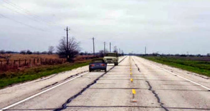
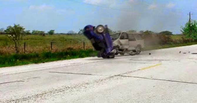
Screenshots from sample 3D car crash animations created by Kineticorp; visit their website for the video.

Sometimes, though, even after all that meticulous attention to detail, and even if you believe you have the physics right, you end up playing with it a little, trying to get the motion to look real. There’s wiggle room in terms of, for example, where exactly the driver begins braking relative to where tire marks were left on the road. Or, what exactly is the coefficient of friction on this particular roadway? Ultimately, you’re planning to put this in front of a jury and they have to believe it.

Twilley: So there’s occasionally a bit of an interpretive leeway between the evidence that you have and the reconstruction that you present.

Arvin: Yes. There’s a lot of science in it, but there is an art to it, as well. Pig Accident 2, the crash that Ellis is trying to recreate at the start of my book, is a good example of that.

It’s at the start of the book, but it was actually the last part that was written. I had written the book, we had sold it, and I thought I was done with it, but then the editor—Cal Morgan at Harper Perennial—sent me his comments. And he suggested that I needed to establish the characters and their dynamics more strongly, early in the book.

I wanted an accident to structure the new material around, but by this time I was no longer working as a reconstructionist, and all my best material from the job was already in the book. So I took a former colleague out for a beer and asked him to tell me about the stuff he’d been working on.

He gave me this incredible story: an accident that involved all these feral pigs that had been hit by cars and killed, lying all over the road. Then, as a part of his investigation, he built this stuffed pig hide on wheels, with a little structure made out of wood and caster wheels on the bottom. They actually spray-painted the pig hide black, to make it the right color.

He said it was like a Monty Python skit: he’d push it out on the road, then go hide in the bushes while the other guy took photographs. Then he’d have to run out and grab the pig whenever a car came by.
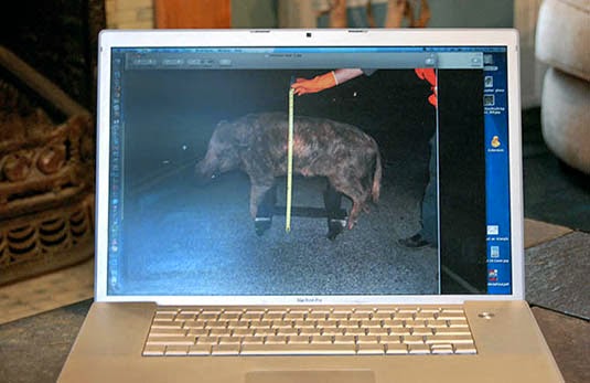
[Image: A stuffed pig on wheels, “like a Monty Python skit”; photo by Nicola Twilley].

But there wasn’t any data coming out of that process that they were feeding into their analysis; it was about trying to convince a jury whether you can or can’t see a feral pig standing in the middle of the road.

BLDGBLOG: That’s an interesting analogy to the craft of writing fiction, related to the question of what is sufficient evidence for something to be believable.

Arvin: Exactly. It’s so subjective.

In that case, my friend was working for the defense, which was the State Highway Department—they were being sued for not having built a tunnel under the road for the wild pigs to go through. In the novel, it takes place in Wisconsin, but in reality it happened in Monterey, California. They’ve got a real problem with wild pigs there.

Monterey has a phenomenal number of wild pigs running around. As it turned out, the defense lost this case, and my friend said that it was because it was impossible to get a jury where half the people hadn’t run into a pig themselves, or knew somebody who had had a terrible accident with a pig. The jury already believed the pigs were a problem and the state should be doing something about it.
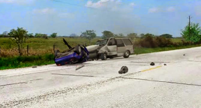
Screenshot from a sample 3D car crash animation created by Kineticorp; visit their website for the video.

BLDGBLOG: In terms of the narrative that defines a particular car crash, I’m curious how reconstructionists judge when a car crash really begins and ends. You could potentially argue that you crashed because, say, a little kid throws a water balloon into the street and it distracts you and, ten seconds later, you hit a telephone pole. But, clearly, something like a kid throwing a water balloon is not going to show up in PC-Crash.

For the purpose of the reconstructionist, then, where is the narrative boundary of a crash event? Does the car crash begin when tires cross the yellow line, or when the foot hits the brakes—or even earlier, when it started to rain, or when the driver failed to get his tires maintained?

Arvin: It’s never totally clear. That’s a grey area that we often ended up talking about and arguing about.

In that roll-over crash, for example, part of the issue was that the vehicle was traveling way over the speed limit, but another issue was that the tires hadn’t been properly maintained. And when you start backing out to look at the decisions that the drivers made at different moments leading up to that collision, you can always end up backing out all the way to the point where it’s: well, if they hadn’t hit snooze on the alarm clock that morning

Twilley: Or, in your novel’s case, if they weren’t married to the wrong woman.

Arvin: [laughs] Right.

We worked on one case where a guy’s car was hit by a train. He was a shoe salesman, if I remember right, and he was going to work on a Sunday. It just happened to be after the daylight savings time change, and he was either an hour ahead or an hour behind getting to work. The clock in the car and his watch hadn’t been reset yet. He’d had this job for four years, and he’d been driving to work at the same time all those years, so he had probably never seen a train coming over those tracks before—but, because he was an hour off, there was a train.

So, you know, if he’d remembered to change his clocks…
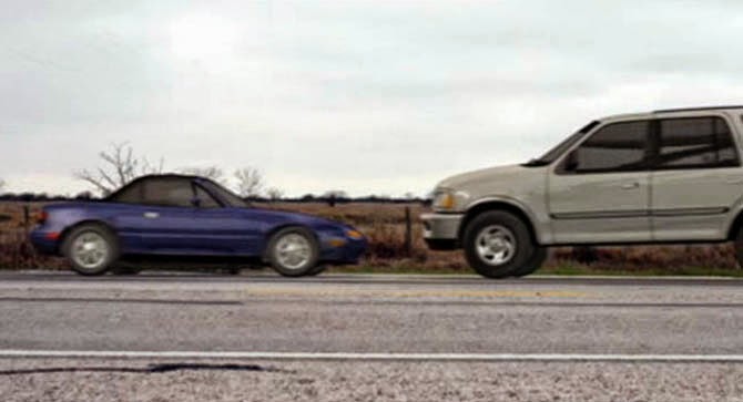
Screenshots from sample 3D car crash animations created by Kineticorp; visit their website for the video.

Twilley: That reminds me of something that Boggs says in the book: “It’s a miracle there aren’t more miracles.”

Arvin: Doing that work, you really start to question, where are those limits of causality and chance? You think you’ve made a decision in your life, but there are all these moments of chance that flow into that decision. Where do you draw a line between the choices you made in your life and what’s just happened to you? What’s just happenstance?

It’s a very grey area, but the reconstructionist has to reach into the grey area and try to establish some logical sequence of causality and responsibility in a situation.

Twilley: In the novel, you show that reconstructionists have a particular set of tools and techniques with which to gain access to the facts about a past event. Other characters in the book have other methods for accessing the past: I’m thinking of the way Ellis’s father stores everything, or Heather’s photography. In the end, though it seems as though the book is ambivalent as to whether the past is accessible through any of those methods.

Arvin: I think that ambivalence is where the book is. You can get a piece of the past through memory and you can get a piece through the scientific reconstruction of things. You can go to a place now, as it is physically; you can look of a photograph of how it was; you can create a simulation of the place as it was in your computer: but those are all representations of it, and none of them are really it. They are all false, to an extent, in their own way.

The best I think you can hope to do is to use multiple methods to triangulate and get to some version of what the past was. Sometimes they just contradict each other and there’s no way to resolve them.
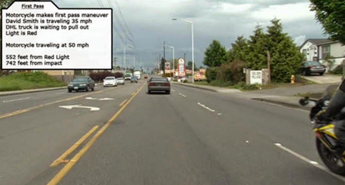
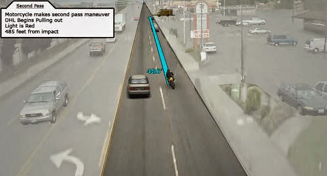
Screenshots from sample 3D car crash animations created by Kineticorp; visit their website for the video.

Working as a reconstructionist, I was really struck by how often people’s memories were clearly false, because they’d remember things that just physically were not possible. Newton’s laws of motion say it couldn’t have happened. In fact, we would do our best to completely set aside any witness testimony and just work from the physical evidence. It was kind of galling if there was not just enough physical evidence and you had to rely on what somebody said as a starting point.

Pedestrian accidents tended to be like that, because when a car runs into a person it doesn’t leave much physical evidence behind. When two cars run into each other, there’s all this stuff left at the point where they collided, so you can figure out where that point was. But, when a car runs into a person, there’s nothing left at that point; when you try to determine where the point of impact was, you end up relying on witness testimony.
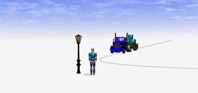
Screenshots from a PC-Crash demo showing load loss and new “multibody pedestrian” functionality.

Twilley: In terms of reconciling memory and physical evidence—and this also relates to the idea of tweaking the reconstruction animation for the jury—the novel creates a conflict about whether it’s a good idea simply to settle for a narrative you can live with, however unreliable it might be, or to try to pin it down with science instead, even if the final result doesn’t sit right with you.

Arvin: Exactly. It sets up questions about how we define ourselves and what we do when we encounter things that conflict with our sense of identity. If something comes up out of the past that doesn’t fit with who you have defined yourself to be, what do you do with that? How much of our memories are shaped by our sense of identity versus the things we’ve actually done?

Twilley: It’s like a crash site: once the lines have been repainted and the road resurfaced, to what extent is that place no longer the same place where the accident occurred, yet still the place that led to the accident? That’s what’s so interesting about the reconstructionist’s work: you’re making these narratives that define a crash for a legal purpose, yet the novel seems to ask whether that is really the narrative of the crash, whether the actual impact is not the dents in the car but what happens to people’s lives.

Arvin: I always felt that tension—you are looking at the physics and the equations in order to understand this very compressed moment in time, but then there are these people who passed through that moment of time, and it had a huge effect on their lives. Within the work, we were completely disregarding those people and their emotions—emotions were outside our purview. Writing the book for me was part of the process of trying to reconcile those things.

Screenshot from a sample 3D car crash animation created by Kineticorp; visit their website for the video.

BLDGBLOG: While reading the book, I found myself thinking about the discovery of the Higgs boson—how, in a sense, its discovery was really a kind of crash forensics.

Arvin: You’re right. You don’t actually see the particle; you see the tracks that it’s made. I love that. It’s a reminder that we’re reconstructing things all the time in our lives.

If you look up and a window is open, and you know you didn’t open it, then you try to figure out who in the house opened it. There are all these minor events in our lives, and we constantly work to reconstruct them by looking at the evidence around us and trying to figure out what happened.

BLDGBLOG: That reminds me of an anecdote in Robert Sullivan’s book, The Meadowlands, about the swamps of northern New Jersey. One of his interview subjects is a retired detective from the area who is super keyed into his environment—he notices everything. He explains that this attention to microscopic detail is what makes a good detective. So, in the case of the open window, he’ll notice it and file it away in case he needs it in a future narrative.

What he tells Sullivan is that, now that he is retired, it’s as though he’s built up this huge encyclopedia of little details with the feeling that they all were going to add up to some kind of incredible moment of narrative revelation. But then he retired. He sounds genuinely sad—he has so much information and it’s not going anywhere. The act of retiring as a police detective meant that he lost the promise of a narrative denouement.

Arvin: That’s great. I think of reconstruction in terms of the process of writing, too. Reconstruction plays into my own particular writing technique because I tend to just write a lot of fragments initially, then I start trying to find the story that connects those pieces together.

It also reminds me of one of my teachers, Frank Conroy, who used to talk about the contract between the reader and the writer. Basically, as a writer, you’ve committed to not wasting the reader’s time. He would say that the reader is like a person climbing a mountain, and the author is putting certain objects along the reader’s path that the reader has to pick up and put into their backpack; when they get to the top of the mountain there better be something to do with all these things in their backpack, or they are going to be pissed that they hauled it all the way up there.

That detective sounds like a thwarted reader. He has the ingredients for the story—but he doesn’t have the story.
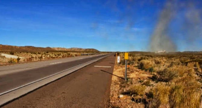
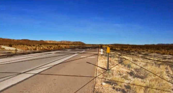
Screenshots from sample 3D car crash animations created by Kineticorp; visit their website for the video.

Twilley: In the novel, you deliberately juxtapose a creative way of looking—Heather’s pinhole photography—with Ellis’s forensic, engineering perspective. It seems rare to be equipped with both ways of seeing the world. How does being an engineer play into writing, or vice versa?

Arvin: I think the two things are not really that different. They are both processes of taking a bunch of little things—in engineering, it might be pieces of steel and plastic wire, and, in writing a novel, they’re words—and putting them together in such a way that they work together and create some larger system that does something pleasing and useful, whether that larger thing is a novel or a cruise ship.

One thing that I think about quite a bit is the way that both engineering and writing require a lot of attention to ambiguity. In writing, at the sentence level, you really want to avoid unintentional ambiguity. You become very attuned to places where your writing is potentially open to multiple meanings that you were not intending.

Similarly, in engineering, you design systems that will do what you want them to do, and you don’t have room for ambiguity—you don’t want the power plant to blow up because of an ambiguous connection.

But there’s a difference at the larger level. In writing, and writing fiction in particular, you actually look for areas of ambiguity that are interesting, and you draw those out to create stories that exemplify those ambiguities—because those are the things that are interesting to think about.

Whereas, in engineering, you would never intentionally take an ambiguity about whether the cruise ship is going to sink or not and magnify that!
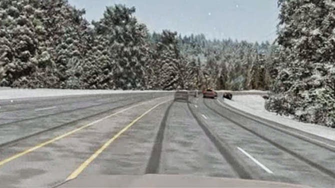
Screenshot from a sample 3D car crash animation created by Kineticorp; visit their website for the video.

Twilley: I wanted to switch tracks a little and talk about the geography of accidents. Have you come to understand the landscape in terms of its potential for automotive disaster?

Arvin: When you are working on a case—like that rollover—you become extremely intimate with a very small piece of land. We would study the accident site and survey it and build up a very detailed map of exactly how the land is shaped in that particular spot.

You spend a lot of time looking at these minute details, and you become very familiar with exactly how lands rolls off and where the trees are, and where the fence posts are and what type of asphalt that county uses, because different kinds of asphalt have different friction effects.

BLDGBLOG: The crash site becomes your Walden Pond.

Arvin: It does, in a way. I came to feel that, as a reconstructionist, you develop a really intimate relationship with the roadway itself, which is a place where we spend so much time, yet we don’t really look at it. That was something I wanted to bring out in the book—some description of what that place is, that place along the road itself.

You know, we think of the road as this conveyance that gets us from Point A to Point B, but it’s actually a place in and of itself and there are interesting things about it. I wanted to look at that in the book. I wanted to look at the actual road and the things that are right along the road, this landscape that we usually blur right past.

The other thing your question makes me think about is this gigantic vehicle storage yard I describe in the novel, where all the crashed vehicles that are still in litigation are kept. It’s like a museum of accidents—there are racks three vehicles high, and these big forklift trucks that pick the vehicles up off the racks and put them on the ground so you can examine them.

A vehicle scrapyard photographed by Wikipedia contributor Snowmanradio.

BLDGBLOG: Building on that, if you have a geography of crashes and a museum of crashes, is there a crash taxonomy? In the same way that you get a category five hurricane or a 4.0 earthquake, is there, perhaps, a crash severity scale? If so, could you imagine, at one end of it, a kind of super-crash—a crash that maybe happens only once a generation—

Arvin: The unicorn crash!

BLDGBLOG: Exactly. In fact, Nicky and I were talking about the idea of a “black swan” crash on the way over here. Do you think in terms of categories or degrees of severity, or is every crash unique?

Arvin: I haven’t come across a taxonomy like that, although it’s a great idea. The way you categorize crashes is single vehicle, multiple vehicle, pedestrian, cyclist, and so on. They also get categorized as rollover collision, collision that leads to a rollover, and so on.

So there are categories like that, and they immediately point you to certain kinds of analysis. The way you analyze a rollover is quite a bit different from how you analyze an impact. But there’s no categorization that I am aware of for severity.

I only did it for three years, so I’m not a grizzled reconstructionist veteran, but even in three years you see enough of them that you start to get a little jaded. You get an accident that was at 20 miles an hour, and you think, that’s not such a big deal. An accident in which two vehicles, each going 60 miles an hour, crash head-on at a closing speed of 120 miles an hour—now, that’s a collision!
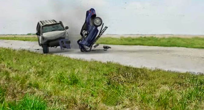
Screenshot from a sample 3D car crash animation created by Kineticorp; visit their website for the video.

You become a little bit of an accident snob, and resisting that was something that I struggled with. Each accident is important to the people who were in it. And, there was a dark humor that tended to creep in, and that worried me, too. On the one hand, it helps keep you sane, but on the other hand, it feels very disrespectful.

Twilley: Have you been in a car accident yourself?

Arvin: I had one, luckily very minor, accident while I was working as reconstructionist—around the time that I was starting to work on this book. I heard the collision begin before I saw it, and what I really remember is that first sound of metal on metal.

Immediately, I felt a lurch of horror, because I wasn’t sure what was happening yet, but I knew it could be terrible. You are just driving down the road and, all of a sudden, your life is going to be altered, but you don’t know how yet. It’s a scary place—a scary moment.

BLDGBLOG: Finally, I’m interested in simply how someone becomes a reconstructionist. It’s not a job that most people have even heard of!

Arvin: True. For me, it was a haphazard path. Remember how we talked earlier about that gray area between the choices you made in your life and what’s just happened to you?

I have degrees in mechanical engineering from Michigan and Stanford. When I finished my Masters at Stanford, I went to work for Ford. I worked there for about three years. Then I was accepted into Iowa Writer’s Workshop, so I quit Ford to go to Iowa. I got my MFA, and then I was given a grant to go write for a year. My brother had moved to Denver a year earlier, and it seemed like a cool town so I moved here. Then my grant money ran out, and I had to find a job.

I began looking for something in the automotive industry in Denver, and there isn’t much. But I had known a couple people at Ford who ended up working in forensics, so I started sending my resume to automobile forensics firms. It happened that the guy who got my resume was a big reader, and I had recently published my first book. He was impressed by that, so he brought me in for an interview.

In that business, you write a lot of reports and he thought I might be helpful with that.
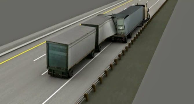
Screenshots from sample 3D car crash animation created by Kineticorp; visit their website for the video.

Twilley: Do you still work as an engineer, and, if so, what kinds of projects are you involved with?

Arvin: I work on power plants and oil and gas facilities. Right now, I am working on both a power plant and an oil facility in North Dakota—there’s lots of stuff going on out there as part of the Bakken play. It’s very different from the forensics.

Twilley: Do you take an engineering job, then quit and take some time to write and then go back into the engineering again? Or do you somehow find a way to do both?

Arvin: I do both. I work part time. Part-time work isn’t really easy to find as an engineer, but I’ve been lucky, and my employers have been great.

Engineers who write novels are pretty scarce. There are a few literary writers who started out in engineering but have gotten out of it—Stewart O’Nan is one, George Saunders is another. There’s Karl Iagnemma, who teaches at MIT. There are a few others, especially in the sci-fi universe.

I feel as though I have access to material—to a cast of characters and a way of thinking—that’s not available to very many writers. But the engineering work I’m doing now doesn’t have quite the same dramatic, obvious story potential that forensic engineering does.

I remember when I first started working in forensics, on day one, I thought, this is a novel right here.

• • •

A slightly longer version of this interview previously appeared on Venue.

Thanks to Scott Geiger for first recommending Arvin’s work!

Life on the Subsurface: An Interview with Penelope Boston

A landscape painting above Penny Boston’s living room entryway depicts astronauts exploring Mars.

Penelope Boston is a speleo-biologist at New Mexico Tech, where she is also Director of Cave and Karst Science. Her work examines subterranean lifeforms, often found very deep within cave systems, including the larger subterranean ecosystems those creatures are connected to. Her research focuses primarily on what are known as extremophiles for their ability to survive in seemingly inhospitable micro-environments here on Earth; these bizarre forms of life, thriving in acidic, anoxic, or highly pressurized situations, offer compelling analogies for the sorts of lifeforms and ecosystems that might exist, undetected, on other planets.

But the flip side of her research are those environments themselves: the caves, tunnels, and other underground spaces inside of which unearthly life might thrive. As you’ll see, this is an interview obsessed with space: how to define space, how space is formed geologically, and what sorts of speculative underground spaces and structures can form under radically different gravitational regimes, deep inside the polar glaciers of distant moons, or even in the turbulent skies of gas giants.

Boston has worked with the NASA Innovative Advanced Concepts program (NIAC) to develop protocols for both human extraterrestrial cave habitation and for subterranean life-detection missions on Mars, life which she believes is highly likely to exist.

On a hot summer afternoon, she graciously welcomed me and Nicola Twilley, traveling for our Venue project, into her home in Los Lunas, New Mexico, where we arrived with design futurist Stuart Candy in tow, en route to dropping him off at the Very Large Array later that day.

Over the course of our conversation, Boston told us about her experiences working at Mars analog sites; she explained why she believes there is a strong possibility for life below the surface of the Red Planet, perhaps inside billion-year-old networks of lava tubes; she detailed her own ongoing cave explorations beneath the U.S. Southwest; and we touched on some mind-blowing ideas seemingly straight out of science fiction, including extreme forms of extraterrestrial life (such as dormant life on comets, thawed and reawakened with every passage close to the sun) and the extraordinary potential for developing new pharmaceuticals out of cave microorganisms.

An edited transcript of our conversation appears below.

• • •

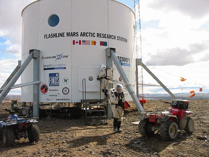
The Flashline Mars Arctic Research Station (FMARS) on Devon Island, courtesy of the Mars Society.

Geoff Manaugh: As a graduate student, you co-founded the Mars Underground and then the Mars Society. You’re a past President of the Association of Mars Explorers, and you’re also now a member of the science team taking part in Mars Arctic 365, a new one-year Mars surface simulation mission set to start in summer 2014 on Devon Island. How does this long-term interest in Mars exploration tie into your Earth-based research in speleobiology and subterranean microbial ecosystems?

Penelope Boston: Even though I do study surface things that have a microbial component, like desert varnish and travertines and so forth, I really think that it’s the subsurface of Mars where the greatest chance of extant life, or even preservation of extinct life, would be found.

Nicola Twilley: Is it part of NASA’s strategy to go subsurface at any point, to explore caves on Mars or the moon?

Boston: Well, yes and no. The “Strategy” and the strategy are two different things.

The Mars Curiosity rover is a very capable chemistry and physics machine and I am, of course, dying to hear the details of the geochemistry it samples. A friend of mine, for instance, with whom I’m also a collaborator, is the principal investigator of the SAM instrument. Friends of mine are also on the CheMin instrument. So I have a vested interest, both professionally and personally, in the Curiosity mission.

On the other hand, you know: here we go again with yet another mission on the surface. It’s fascinating, and we still have a lot to learn there, but I hope I will live long enough to see us do subsurface missions on Mars and even on other bodies in the solar system.

Unfortunately, right now, we are sort of in limbo. The downturn in the global economy and our national economy has essentially kicked NASA in the head. It’s very unclear where we are going, at this point. This is having profound, negative effects on the Agency itself and everyone associated with it, including those of us who are external fundees and sort of circum-NASA.

On the other hand, although we don’t have a clear plan, we do have clear interests, and we have been pursuing preliminary studies. NASA has sponsored a number of studies on deep drilling, for example. One of the most famous was probably about 15 years ago, and it really kicked things off. That was up in Santa Fe, and we were looking at different methodologies for getting into the subsurface.

I have done a lot of work, some of which has been NASA-funded, on the whole issue of lava tubes—that is, caves associated with volcanism on the surface. Now, Glenn Cushing and Tim Titus at the USGS facility in Flagstaff have done quite a bit of serious work on the high-res images coming back from Mars, and they have identified lava tubes much more clearly than we ever did in our earlier work over the past decade.

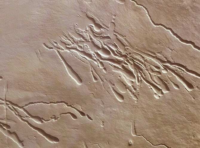
Surface features created by lava tubes on Mars; image via ESA

Twilley: Is it the expectation that caves as common on Mars as they are on Earth?

Boston: I’d say that lava tubes are large, prominent, and liberally distributed everywhere on Mars. I would guess that there are probably more lava tubes on Mars than there are here on Earth—because here they get destroyed. We have such a geologically and hydro-dynamically active planet that the weathering rates here are enormous.

But on Mars we have a lot of factors that push in the other direction. I’d expect to find tubes of exceeding antiquity—I suspect that billions-of-year-old tubes are quite liberally sprinkled over the planet. That’s because the tectonic regime on Mars is quiescent. There is probably low-level tectonism—there are, undoubtedly, Marsquakes and things like that—but it’s not a rock’n’roll plate tectonics like ours, with continents galloping all over the place, and giant oceans opening up across the planet.

That means the forces that break down lava tubes are probably at least an order of magnitude or more—maybe two, maybe three—less likely to destroy lava tubes over geological time. You will have a lot of caves on Mars, and a lot of those caves will be very old.

Plus, remember that you also have .38 G. The intrinsic tensile strength of the lava itself, or whatever the bedrock is, is also going to allow those tubes to be much more resistant to the weaker gravity there.

Surface features of lava tubes on Mars; images via ESA

Manaugh: I’d imagine that, because the gravity is so much lower, the rocks might also behave differently, forming different types of arches, domes, and other formations underground. For instance, large spans and open spaces would be shaped according to different gravitational strains. Would that be a fair expectation?

Boston: Well, it’s harder to speculate on that because we don’t know what the exact composition of the lava is—which is why, someday, we would love to get a Mars sample-return mission, which is no longer on the books right now. [sighs] It’s been pushed off.

In fact, I just finished, for the seventh time in my career, working on a panel on that whole issue. This was the E2E—or End-to-End—group convened by Dave Beatty, who is head of the Mars Program at the Jet Propulsion Laboratory [PDF].

About a year ago, we finished doing some intensive international work with our European Space Agency partners on Mars sample-return—but now it’s all been pushed off again. The first one of those that I worked on was when I was an undergraduate, almost ready to graduate at Boulder, and that was 1979. It just keeps getting pushed off.

I’d say that we are very frustrated within the planetary and astrobiology communities. We can use all these wonderful instruments that we load onto vehicles like Curiosity and we can send them there. We can do all this fabulous orbital stuff. But, frankly speaking, as a person with at least one foot in Earth science, until you’ve got the stuff in your hands—actual physical samples returned from Mars—there is a lot you can’t do.

Looking down through a “skylight” on Mars and into a Martian sinkhole; images via NASA/JPL/University of Arizona

Twilley: Could you talk a bit about your work with exoplanetary research, including what you’re looking for and how you might find it?

Boston: [laughs] The two big questions!

But, yes. We are working on a project at Socorro now to atmospherically characterize exoplanets. It’s called NESSI, the New Mexico Exoplanet Spectroscopic Survey Instrument. Our partner is Mark Swain, over at JPL. They are doing it using things like Kepler, and they have a new mission they’re proposing, called FINESSE. FINESSE will be a dedicated exoplanet atmospheric characterizer.

We are also trying to do that, in conjunction with them, but from a ground-based instrument, in order to make it more publicly accessible to students and even to amateur astronomers.

That reminds me—one of the other people you might be interested in talking to is a young woman named Lisa Messeri, who just recently finished her PhD in Anthropology at MIT. She’s at the University of Pennsylvania now. Her focus is on how scientists like me to think about other planets as other worlds, rather than as mere scientific targets—how we bring an abstract scientific goal into the familiar mental space where we also have recognizable concepts of landscape.

I’ve been obsessed with that my entire life: the concept of space, and the human scaling of these vastly scaled phenomena, is central, I think, to my emotional core, not just the intellectual core.

The Allan Hills Meteorite (ALH84001); courtesy of NASA.

Manaugh: While we’re on the topic of scale, I’m curious about the idea of astrobiological life inhabiting a radically, undetectably nonhuman scale. For example, one of the things you’ve written and lectured about is the incredible slowness it takes for some organisms to form, metabolize, and articulate themselves in the underground environments you study. Could there be forms of astrobiological life that exist on an unbelievably different timescale, whether it’s a billion-year hibernation cycle that we might discover at just the wrong time and mistake, say, for a mineral? Or might we find something on a very different spatial scale—for example, a species that is more like a network, like an aspen tree or a fungus?

Boston: You know, Paul Davies is very interested in this idea—the concept of a shadow biosphere. Of course, I had also thought about this question for many years, long before I read about Davies or before he gave it a name.

The conundrum you face is: how would you know—how you would study or even conceptualize—these other biospheres? It’s outside of your normal spatial and temporal comfort zone, in which all of your training and experience has guided you to look, and inside of which all of your instruments are designed to function. If it’s outside all of that, how will you know it when you see it?

Imagine comets. With every perihelion passage, volatile gases escape. You are whipping around the solar system. Your body comes to life for that brief period of time only. Now apply that to icy bodies in very elliptical orbits in other solar systems, hosting life with very long periods of dormancy.

There are actually some wonderful early episodes of The Twilight Zone that tap into that theme, in a very poetic and literary way. [laughs] Of course, it’s also the central idea of some of the earliest science fiction; I suppose Gulliver’s Travels is probably the earliest exploration of that concept.

In the microbial realm—to stick with what we do know, and what we can study—we are already dealing with itsy-bitsy, teeny-weeny things that are devilishly difficult to understand. We have a lot of tools now that enable us to approach those, but, very regularly, we’ll see things in electron microscopy that we simply can’t identify and they are very clearly structured. And I don’t think that they are all artifacts of the preparation—things that get put there accidentally during prep.

A lot of the organisms that we actually grow, and with which we work, are clearly nanobacteria. I don’t know how familiar you are with that concept, but it has been extremely controversial. There are many artifacts out there that can mislead us, but we do regularly see organisms that are very small. So how small can they be—what’s the limit?

A few of the early attempts at figuring this out were just childish. That’s a mean thing to say, because a lot of my former mentors have written some of those papers, but they would say things like: “Well, we need to conduct X, Y, and Z metabolic pathways, so, of course, we need all this genetic machinery.” I mean, come on, you know that early cells weren’t like that! The early cells—who knows what they were or what they required?

To take the famous case of the ALH84001 meteorite: are all those little doobobs that you can see in the images actually critters? I don’t know. I think we’ll never know, at least until we go to Mars and bring back stuff.

I have relatively big microbes in my lab that regularly feature little knobs and bobs and little furry things, that I am actually convinced are probably either viruses or prions or something similar. I can’t get a virologist to tell me yes. They are used to looking at viruses that they can isolate in some fashion. I don’t know how to get these little knobby bobs off my guys for them to look at.

The Allan Hills Meteorite (ALH84001); courtesy of NASA.

Twilley: In your paper on the human utilization of subsurface extraterrestrial environments [PDF], you discuss the idea of a “Field Guide to Unknown Organisms,” and how to plan to find life when you don’t necessarily know what it looks like. What might go into such a guide?

Boston: The analogy I often use with graduate students when I teach astrobiology is that, in some ways, it’s as if we are scientists on a planet orbiting Alpha Centauri and we are trying to write a field guide to the birds of Earth. Where do you start? Well, you start with whatever template you have. Then you have to deeply analyze every feature of that template and ask whether each feature is really necessary and which are just a happenstance of what can occur.

I think there are fundamental principles. You can’t beat thermodynamics. The need for input and outgoing energy is critical. You have to be delicately poised, so that the chemistry is active enough to produce something that would be a life-like process, but not so active that it outstrips any ability to have cohesion, to actually keep the life process together. Water is great as a solvent for that. It’s probably not the only solvent, but it’s a good one. So you can look for water—but do you really need to look for water?

I think you have to pick apart the fundamental assumptions. I suspect that predation is a relatively universal process. I suspect that parasitism is a universal process. I think that, with the mathematical work being done on complex, evolving systems, you see all these emerging properties.

Now, with all of that said, the details—the sizes, the scale, the pace, getting back to what we were just talking about—I think there is huge variability in there.

Caves on Mars; images courtesy of NASA/JPL-Caltech/ASU/USGS.

Twilley: How do you train people to look for unrecognizable life?

Boston: I think everybody—all biologists—should take astrobiology. It would smack you on the side of the head and say, “You have to rethink some of these fundamental assumptions! You can’t just coast on them.”

The organisms that we study in the subsurface are so different from the microbes that we have on the surface. They don’t have any predators—so, ecologically, they don’t have to outgrow any predators—and they live in an environment where energy is exceedingly scarce. In that context, why would you bother having a metabolic rate that is as high as some of your compatriots on the surface? You can afford to just hang out for a really long time.

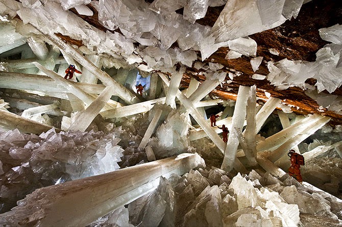
We have recently isolated a lot of strains from these fluid inclusions in the Naica caves—the one with those gigantic crystals. It’s pretty clear that these guys have been trapped in these bubbles between 10,000 and 15,000 years. We’ve got fluid inclusions in even older materials—in materials that are a few million years old, even, in a case we just got some dates for, as much as 40 million years.

Naica Caves, image from the official website. The caves are so hot that explorers have to wear special ice-jackets to survive.

One of the caveats, of course, is that, when you go down some distance, the overlying lithostatic pressure of all of that rock makes space impossible. Microbes can’t live in zero space. Further, they have to have at least inter-grain spaces or microporosity—there has to be some kind of interconnectivity. If you have organisms completely trapped in tiny pockets, and they never interact, then that doesn’t constitute a biosphere. At some point, you also reach temperatures that are incompatible with life, because of the geothermal gradient. Where exactly that spot is, I don’t know, but I’m actually working on a lot of theoretical ideas to do with that.

In fact, I’m starting a book for MIT Press that will explore some of these ideas. They wanted me to write a book on the cool, weird, difficult, dangerous places I go to and the cool, weird, difficult bugs I find. That’s fine—I’m going to do that. But, really, what I want to do is put what we have been working on for the last thirty years into a theoretical context that doesn’t just apply to Earth but can apply broadly, not only to other planets in our solar system, but to one my other great passions, of course, which is exoplanets—planets outside the solar system.

One of the central questions that I want to explore further in my book, and that I have been writing and talking about a lot, is: what is the long-term geological persistence of organisms and geological materials? I think this is another long-term, evolutionary repository for living organisms—not just fossils—that we have not tapped into before. I think that life gets recycled over significant geological periods of time, even on Earth.

That’s a powerful concept if we then apply it to somewhere like Mars, for example, because Mars does these obliquity swings. It has super-seasonal cycles. It has these little dimpled moons that don’t stabilize it, whereas our moon stabilizes the Earth’s obliquity level. That means that Mars is going through these super cold and dry periods of time, followed by periods of time where it’s probably more clement.

Now, clearly, if organisms can persist for tens of thousands of years—let alone hundreds of thousands of years, and possibly even millions of years—then maybe they are reawakenable. Maybe you have this very different biosphere.

Manaugh: Like a biosphere in waiting.

Boston: Yes—a biosphere in waiting, at a much lower level.

Recently, I have started writing a conceptual paper that really tries to explore those ideas. The genome that we see active on the surface of any planet might be of two types. If you have a planet like Earth, which is photosynthetically driven, you’re going to have a planet that is much more biological in terms of the total amount of biomass and the rates at which this can be produced. But that might not be the only way to run a biosphere.

You might also have a much more low-key biosphere that could actually be driven by geochemical and thermal energy from the inside of the planet. This was the model that we—myself, Chris McKay, and Michael Ivanoff, one of our colleagues from what was the Soviet Union at the time—published more than twenty years ago for Mars. We suggested that there would be chemically reduced gases coming from the interior of the planet.

That 1992 paper was what got us started on caves. I had never been in a wild cave in my life before. We were looking for a way to get into that subsurface space. The Department of Energy was supporting a few investigators, but they weren’t about to share their resources. Drilling is expensive. But caves are just there; you can go inside them.

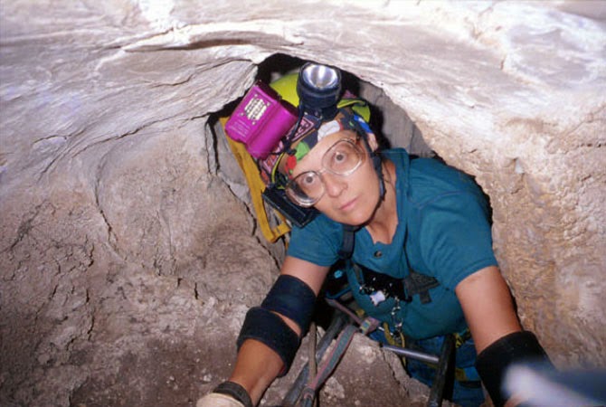
Penelope Boston caving, image courtesy of V. Hildreth-Werker, from “Extraterrestrial Caves: Science, Habitat, Resources,” NIAC Phase I Study Final Report, 2001.

So that’s really what got us into caving. It was at that point where I discovered caves are so variable and fascinating, and I really refocused my career on that for the last 20 years.

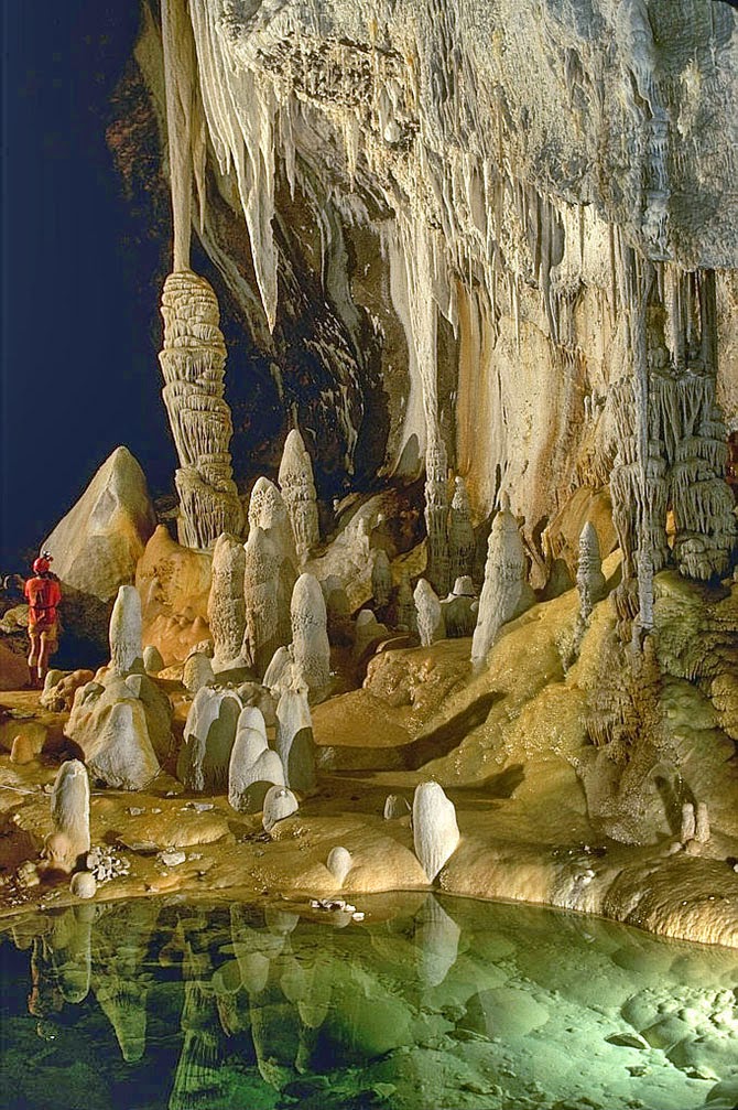
The first time I did any serious caving was actually in Lechuguilla Cave. It was completely nuts to make that one’s first wild cave. We trained for about three hours, then we launched into a five-day expedition into Lechuguilla that nearly killed us! Chris McKay came out with a terrible infection. I had a blob of gypsum in my eye and an infection that swelled it shut. I twisted my ankle. I popped a rib. Larry Lemke had a massive migraine. We were not prepared for this. The people taking us in should have known better. But one of them is a USGS guide and a super caving jock, so it didn’t even occur to him—it didn’t occur to him that we were learning instantaneously to operate in a completely alien landscape with totally inadequate skills.

Lechuguilla Cave, photograph by Dave Bunnell.

All I knew was that I was beaten to a pulp. I could almost not get across these chasms. I’m a short person. Everybody else was six feet tall. I felt like I was just hanging on long enough so I could get out and live. I’ve been in jams before, including in Antarctica, but that’s all I thought of the whole five days: I just have to live through this.

But, when I got out, I realized that what the other part of my brain had retained was everything I had seen. The bruises faded. My eye stopped being infected. In fact, I got the infection from looking up at the ceiling and having some of those gooey blobs drip down into my eye—but, I was like, “Oh my God. This is biological. I just know it is.” So it was a clue. And, when, I got out, I knew I had to learn how to do this. I wanted to get back in there.

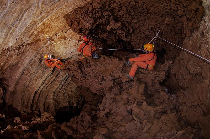
ESA astronauts on a “cave spacewalk” during a 2011 training mission in the caves of Sardinia; image courtesy of the ESA.

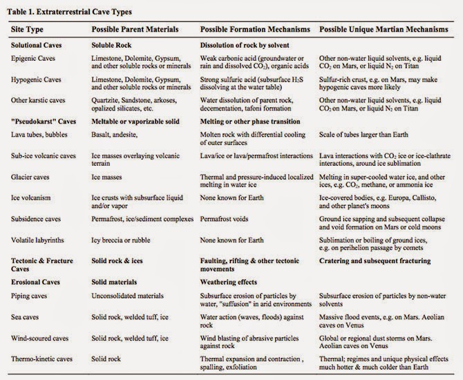
Manaugh: You have spoken about the possibility of entire new types of caves that are not possible on Earth but that might be present elsewhere. What are some of these other cave types you think might exist, and what sort of conditions would be required to form them? You’ve used some great phrases to describe those processes—things like “volatile labyrinths” and “ice volcanism” that create strange cave types that aren’t possible on Earth.

Boston: Well, in terms of ice, I’ll bet there are all sorts of Lake Vostok-like things out there on other moons and planets.

The thing with Lake Vostok is that it’s not a “lake.” It’s a cave: a cave in ice. The ice, in this case, acts as bedrock, so it’s not a lake at all. It’s a closed system.

Manaugh: It’s more like a blister: an enclosed space full of fluid.

Boston: Exactly. In terms of speculating on the kinds of caves that might exist elsewhere in the universe, we are actually working on a special issue for the Journal of Astrobiology right now, based on the extraterrestrial planetary caves meeting that we did last October. We brought people from all over the place. This is a collaboration between my Institute—the National Cave and Karst Research Institute in Carlsbad, where we have our headquarters—and the Lunar and Planetary Institute.

The meeting was an attempt to explore these ideas. Karl Mitchell from JPL, who I had not met previously, works on Titan; he’s on the Cassini Huygens mission. He thinks he is seeing karst-like features on Titan. Just imagine that! Hydrocarbon fluids producing karst-like features in water-ice bedrock—what could be more exotic than that?

That also shows that the planetary physics dominates in creating these environments. I used to think that the chemistry dominated. I don’t think so anymore. I think that the physics dominates. You have to step away from the chemistry at first and ask: what are the fundamental physics that govern the system? Then you can ask: what are the fundamental chemical potentials that govern the system that could produce life? It’s the same exercise with imagining what kind of caves you can get—and I have a lurid imagination.

From “Human Utilization of Subsurface Extraterrestrial Environments,” P. J. Boston, R. D. Frederick, S. M. Welch, J. Werker, T. R. Meyer, B. Sprungman, V. Hildreth-Werker, S. L. Thompson, and D. L. Murphy, Gravitational and Space Biology Bulletin 16(2), June 2003.

One of the fun things I do in my astrobiology class every couple of years is the capstone project. The students break down into groups of four or five, hopefully well-mixed in terms of biologists, engineers, chemists, geologists, physicists, and other backgrounds.

Then they have to design their own solar system, including the fundamental, broad-scale properties of its star. They have to invent a bunch of planets to go around it. And they have to inhabit at least one of those planets with some form of life. Then they have to design a mission—either telescopic or landed—that could study it. They work on this all semester, and they are so creative. It’s wonderful. There is so much value in imagining the biospheres of other planetary bodies.

You just have to think: “What are the governing equations that you have on this planet or in this system?” You look at the gravitational value of a particular body, its temperature regime, and the dominant geochemistry. Does it have an atmosphere? Is it tectonic? One of the very first papers I did—it appeared in one of these obscure NASA special publications, of which they print about 100 and nobody can ever find a copy—was called “Bubbles in the Rocks.” It was entirely devoted to speculation about the properties of natural and artificial caves as life-support structures. A few years later, I published a little encyclopedia article, expanding on it, and I’m now working on another expansion, actually.

I think that, either internally, externally, or both, planetary bodies that form cracks are great places to start. If you have some sort of fluid—even episodically—within that system, then you have a whole new set of cave-forming processes. Then, if you have a material that can exist not only in a solid phase, but also as a liquid or, in some cases, even in a vapor phase on the same planetary body, then you have two more sets of potential cave-forming processes. You just pick it apart from those fundamentals, and keep building things up as you think about these other cave-forming systems and landscapes.

ESA astronauts practice “cavewalking”; image courtesy ESA-V. Corbu.

Manaugh: One of my favorite quotations is from a William S. Burroughs novel, where he describes what he calls “a vast mineral consciousness at absolute zero, thinking in slow formations of crystal.”

Boston: Oh, wow.

Manaugh: I mention that because I’m curious about how the search for “extraterrestrial life” always tends to be terrestrial, in the sense that it’s geological and it involves solid planetary formations. But what about the search for life on a gaseous planet, for example—would life be utterly different there, chemically speaking, or would it simply be sort of dispersed, or even aerosolized? I suppose I’m also curious if there could be a “cave” on a gaseous planet and, if so, would it really just be a weather system? Is a “cave” on a gaseous planet actually just a storm? Or, to put it more abstractly, can there be caves without geology?

Boston: Hmm. Yes, I think there could be. If it was enclosed or self-perpetuating.

Manaugh: Like a self-perpetuating thermal condition in the sky. It would be a sort of atmospheric “cave.”

Twilley: It would be a bubble.

ESA astronauts explore caves in Sardinia; image courtesy ESA–R. Bresnik.

Boston: In terms of life that could exist in a permanent, fluid medium that was gaseous—rather than a compressed fluid, like water—Carl Sagan and Edwin Salpeter made an attempt at that, back in 1975. In fact, I use their “Jovian Gasbags” paper as a foundational text in my astrobiology classes.

But an atmospheric system like Jupiter is dominated—just like an ocean is—by currents. It’s driven by thermal convection cells, which are the weather system, but it’s at a density that gives it more in common with our oceans than with our sky. And we are already familiar with the fact that our oceans, even though they are a big blob of water, are spatially organized into currents, and they are controlled by density, temperature, and salinity. The ocean has a massively complex three-dimensional structure; so, too, does the Jovian atmosphere. So a gas giant is really more like a gaseous ocean I think.

Now, the interior machinations that go on in inside a planet like Jupiter are driving these gas motions. There is a direct analogy here to the fact that, on our rocky terrestrial planet, which we think of as a solid Earth, the truth is that the mantle is plastic—in fact, the Earth’s lower crust is a very different substance from what we experience up here on this crusty, crunchy top, this thing that we consider solid geology. Whether we’re talking about a gas giant like Jupiter or the mantle of a rocky planet like Earth, we are really just dealing with different regimes of density—and, here again, it’s driven by the physics.

ESA astronauts set up an experimental wind-speed monitoring station in the caves of Sardinia; image courtesy ESA/V. Crobu.

A couple of years ago, I sat in on a tectonics class that one of my colleagues at New Mexico Tech was giving, which was a lot of fun for me. Everybody else was thinking about Earth, and I was thinking about everything but Earth. For my little presentation in class, what I tried to do was think about analogies to things on icy bodies: to look at Europa, Titan, Enceledus, Ganymede, and so forth, and to see how they are being driven by the same tectonic processes, producing the same kind of brittle-to-ductile mantle transition, but in ice rather than rock.

I think that, as we go further and further in the direction of having to explain what we think is going on in exoplanets, it’s going to push some of the geophysics in that direction, as well. There is amazingly little out there. I was stunned, because I know a lot of planetary scientists who are thinking about this kind of stuff, but there is a big gulf between Earth geophysics and applying those lessons to exoplanets.

ESA astronauts prepare for their 2013 training mission in the caves of Sardinia; image courtesy ESA-V. Crobu.

Manaugh: We need classes in speculative geophysics.

Boston: Yeah—come on, geophysicists! [laughs] Why shouldn’t they get in the game? We’ve been doing it in astrobiology for a long time.

In fact, when I’ve asked my colleagues certain questions like, “Would we even get orogeny on a three Earth-mass planet?” They are like, “Um… We don’t know.” But you know what? I bet we have the equations to figure that out.

It starts with something as simple as that: in different or more extreme gravitational regimes, could you have mountains? Could you have caves? How could you calculate that? I don’t know the answer to that—but you have to ask it.

ESA astronauts take microbiological samples during a 2011 training mission in the caves of Sardinia; image courtesy of the ESA.

Twilley: You’re a member of NASA’s Planetary Protection Subcommittee. Could you talk a little about what that means? I’m curious whether the same sorts of planetary protection protocols we might use on other planets, like Mars, should also be applied to the Earth’s subsurface. How do we protect these deeper ecosystems? How do we protect deeper ecosystems on Mars, assuming there are any?

Boston: That’s a great question. We are working extremely hard to do that, actually.

Planetary protection is the idea that we must protect Earth from off-world contaminants. And, of course, vice versa: we don’t want to contaminate other planets—both for scientific reasons and, at least in my case, for ethical reasons—with biological material from Earth.

In other words, I think we owe it to our fellow bodies in the solar system to give them a chance to prove their biogenicity or not, before humans start casually shedding our skin cells or transporting microbes there.

That’s planetary protection, and it works both ways.

One thing I have used as a sales pitch in some of my proposals is the idea that we are attempting to become more and more noninvasive in our cave exploration, which is very hard to do. For example, we have pushed all of our methods in the direction of using miniscule quantities of sample. Most Earth scientists can just go out and collect huge chunks of rock. Most biologists do that, too. You grow E. coli in the lab and you harvest tons of it. But I have to take just a couple grams of material—on a lucky day—sometimes even just milligrams of material, with very sparse bio density in there. I have to work with that.

What this means is that the work we are doing also lends itself really well to developing methods that would be useful on extraterrestrial missions.

In fact, we are pushing in the direction of not sampling at all, if we can. We are trying to see what we can learn about something before we even poke it. So, in our terrestrial caving work, we are actually living the planetary protection protocol.

We are also working in tremendously sensitive wilderness areas and we are often privileged enough to be the only people to get in there. We want to minimize the potential contamination.

That said, of course, we are contaminant sources. We risk changing the environment we’re trying to study. We struggle with this. I struggle with it physically and methodologically. I struggle with it ethically. You don’t want to screw up your science and inadvertently test your own skin bugs.

I’d say this is one of those cases where it’s not unacceptable to have a nonzero risk—to use a double negative again. There are few things in life that I would say that about. Even in our ridiculous risk-averse culture, we understand that for most things, there is a nonzero risk of basically anything. There is a nonzero risk that we’ll be hit by a meteorite now, before we are even done with this interview. But it’s pretty unlikely.

In this case, I think it’s completely unacceptable to run much of a risk at all.

That said, the truth is that pathogens co-evolve with their hosts. Pathogenesis is a very delicately poised ecological relationship, much more so than predation. If you are made out of the same biochemistry I’m made of, the chances are good that I can probably eat you, assuming that I have the capability of doing that. But the chances that I, as a pathogen, could infect you are miniscule. So there are different degrees of danger.

There is also the alien effect, which is well known in microbiology. That is that there is a certain dose of microbes that you typically need to get in order for them to take hold, because they are coming into an area where there’s not much ecological space. They either have to be highly pre-adapted for whatever the environment is that they land in, or they have to be sufficiently numerous so that, when they do get introduced, they can actually get a toehold.

We don’t really understand some of the fine points of how that occurs. Maybe it’s quorum sensing. Maybe it’s because organisms don’t really exist as single strains at the microbial level and they really have to be in consortia—in communities—to take care of all of the functions of the whole community.

We have a very skewed view of microbiology, because our knowledge comes from a medical and pathogenesis history, where we focus on single strains. But nobody lives like that. There are no organisms that do that. The complexity of the communal nature of microorganisms may be responsible for the alien effect.

So, given all of that, do I think that we are likely to be able to contaminate Mars? Honestly, no. On the surface, no. Do I act as if we can? Yes—absolutely, because the stakes are too high.

Now, do I think we could contaminate the subsurface? Yes. You are out of the high ultraviolet light and out of the ionizing radiation zone. You would be in an environment much more likely to have liquid water, and much more likely to be in a thermal regime that was compatible with Earth life.

So you also have to ask what part of Mars you are worried about contaminating.

ESA teams perform bacterial sampling and examine a freshwater supply; top photo courtesy ESA–V. Crobu; bottom courtesy ESA/T. Peake.

Manaugh: There’s been some interesting research into the possibility of developing new pharmaceuticals from these subterranean biospheres—or even developing new industrial materials, like new adhesives. I’d love to know more about your research into speleo-pharmacology or speleo-antibiotics—drugs developed from underground microbes.

Boston: It’s just waiting to be exploited. The reasons that it has not yet been done have nothing to do with science and nothing to do with the tremendous potential of these ecosystems, and everything to do with the bizarre and not very healthy economics of the global drug industry. In fact, I just heard that someone I know is leaving the pharmaceutical industry, because he can’t stand it anymore, and he’s actually going in the direction of astrobiology.

Really, there is a de-emphasis on drug discovery today and more of an emphasis on drug packaging. It is entirely profit-driven motive, which is distasteful, I think, and extremely sad. I see a real niche here for someone who doesn’t want to become just a cog in a giant pharmaceutical company, someone who wants to do a small start-up and actually do drug discovery in an environment that is astonishingly promising.

It’s not my bag; I don’t want to develop drugs. But I see our organisms producing antibiotics all the time. When we grow them in culture, I can see where some of them are oozing stuff—pink stuff and yellow stuff and clear stuff. And you can see it in nature. If you go to a lava tube cave, here in New Mexico, you see they are doing it all the time.

A lot of these chemistry tests screen for mutagenic activity, chemogenic activity, and all of the other things that are indications of cancer-fighting drugs and so on, and we have orders of magnitude more hits from cave stuff than we do from soils. So where is everybody looking? In soils. Dudes! I’ve got whole ecosystems in one pool that are different from an ecosystem in another pool that are less than a hundred feet apart in Lechuguilla Cave! The variability—the non-homogeneity of the subsurface—vastly exceeds the surface, because it’s not well mixed.

ESA astronauts prepare their experiments and gear for a 2013 CAVES (“Cooperative Adventure for Valuing and Exercising human behaviour and performance Skills”) mission in Sardinia; image courtesy ESA–V. Crobu

Twilley: In your TED talk, you actually say that the biodiversity in caves on Earth may well exceed the entire terrestrial biosphere.

Boston: Oh, yes—certainly the subsurface. There is a heck of a lot of real estate down there, when you add all those rock-fracture surface areas up. And each one of these little pockets is going off on its own evolutionary track. So the total diversity scales with that. It’s astonishing to me that speleo-bioprospecting hasn’t taken off already. I keep writing about it, because I can’t believe that there aren’t twenty-somethings out there who don’t want to go work for big pharma, who are fascinated by this potential for human use.

There is a young faculty member at the University of New Mexico in Albuquerque, whose graduate student is one of our friends and cavers, and they are starting to look at some of these. I’m like, “Go for it! I can supply you with endless cultures.”

Twilley: In your “Human Mission to Inner Space” experiment, you trialed several possible Martian cave habitat technologies in a one-week mission to a closed cave with a poisonous atmosphere in Arizona. As part of that, you looked into Martian agriculture, and grew what you called “flat crops.” What were they?

Boston: We grew great duckweed and waterfern. We made duckweed cookies. Gus made a rice and duckweed dish. It was quite tasty. [laughs] We actually fed two mice on it exclusively for a trial period, but although duckweed has more protein than soybeans, there weren’t enough carbohydrates to sustain them calorically.

But the duckweed idea was really just to prove a point. A great deal of NASA’s agricultural research has been devoted to trying to grow things for astronauts to make them happier on the long, outbound trips—which is very important. It is a very alien environment and I think people underestimate that. People who have not been in really difficult field circumstances have no apparent understanding of the profound impact of habitat on the human psyche and our ability to perform. Those of us who have lived in mock Mars habitats, or who have gone into places like caves, or even just people who have traveled a lot, outside of their comfort zone, know that. Your circumstances affect you.

One of the things we designed, for example, was a way to illuminate an interior subsurface space by projecting a light through fluid systems—because you’d do two things. You’d get photosynthetic activity of these crops, but you’d also get a significant amount of very soothing light into the interior space.

We had such a fabulous time doing that project. We just ran with the idea of: what you can do to make the space that a planet has provided for you into actual, livable space.

From Boston’s presentation report on the Human Utilization of Subsurface Extraterrestrial Environments, NIAC Phase II study (PDF).

Twilley: Earlier on our Venue travels, we actually drove through Hanksville, Utah, where many of the Mars analog environment studies are done.

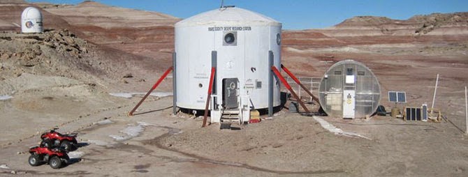
Boston: I’ve actually done two crews there. It’s incredibly effective, considering how low-fidelity it is.

Twilley: What makes it so effective?

Boston: Simple things are the most critical. The fact that you have to don a spacesuit and the incredible cumbersomeness of that—how it restricts your physical space in everything from how you turn your head to how your visual field is limited. Turning your head doesn’t work anymore, because you just look inside your helmet; your whole body has to turn, and it can feel very claustrophobic.

Then there are the gloves, where you’ve got your astronaut gloves on and you’re trying to manipulate the external environment without your normal dexterity. And there’s the cumbersomeness and, really, the psychological burden of having to simulate going through an airlock cycle. It’s tremendously effective. Being constrained with the same group of people, it is surprisingly easy to buy into the simulation. It’s not as if you don’t know you’re not on Mars, but it doesn’t take much to make a convincing simulation if you get those details right.

The Mars Desert Research Station, Hanksville, Utah; image courtesy of bandgirl807/Wikipedia.

I guess that’s what was really surprising to me, the first time I did it: how little it took to be transform your human experience and to really cause you to rethink what you have to do. Because everything is a gigantic pain in the butt. Everything you know is wrong. Everything you think in advance that you can cope with fails in the field. It is a humbling experience, and an antidote to hubris. I would like to take every engineer I know that works on space stuff—

Twilley: —and put them in Hanksville! [laughter]

Boston: Yes—seriously! I have sort of done that, by taking these loafer-wearing engineers—most of whom are not outdoorsy people in any way, who haunt the halls of MIT and have absorbed the universe as a built environment—out to something as simple as the lava tubes. I could not believe how hard it was for them. Lava tubes are not exactly rigorous caving. Most of these are walk-in, with only a little bit of scrambling, but you would have thought we’d just landed on Mars. It was amazing for some of them, how totally urban they are and how little experience they have of coping with a natural space. I was amazed.

I actually took a journalist out to a lava tube one time. I think this lady had never left her house before! There’s a little bit of a rigorous walk over the rocks—but it was as if she had never walked on anything that was not flat before.

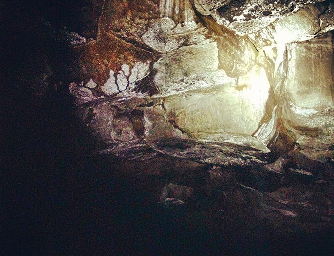
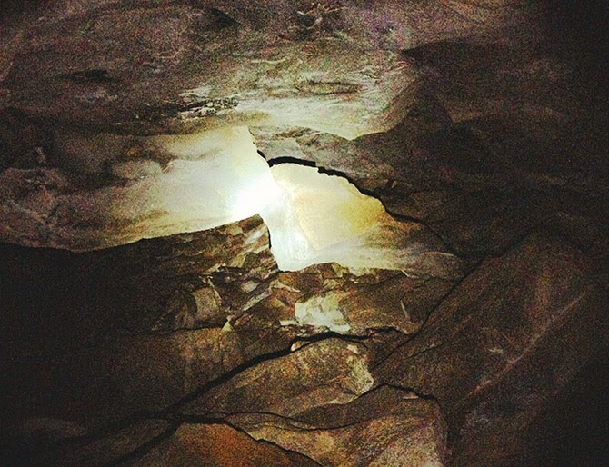
From Venue’s own visit to a lava tube outside Flagstaff, AZ.

It’s just amazing what one’s human experience does. This is why I think engineers should be forced to go out into nature and see if the systems they are designing can actually work. It’s one of the best ways for them to challenge their assumptions, and even to change the types of questions they might be asking in the first place.

(This interview was previously published on Venue).

Conic Sections: An Interview with Sol Yurick

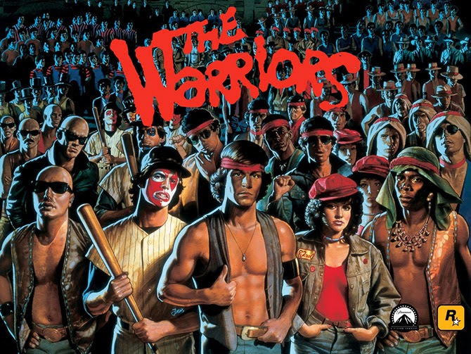
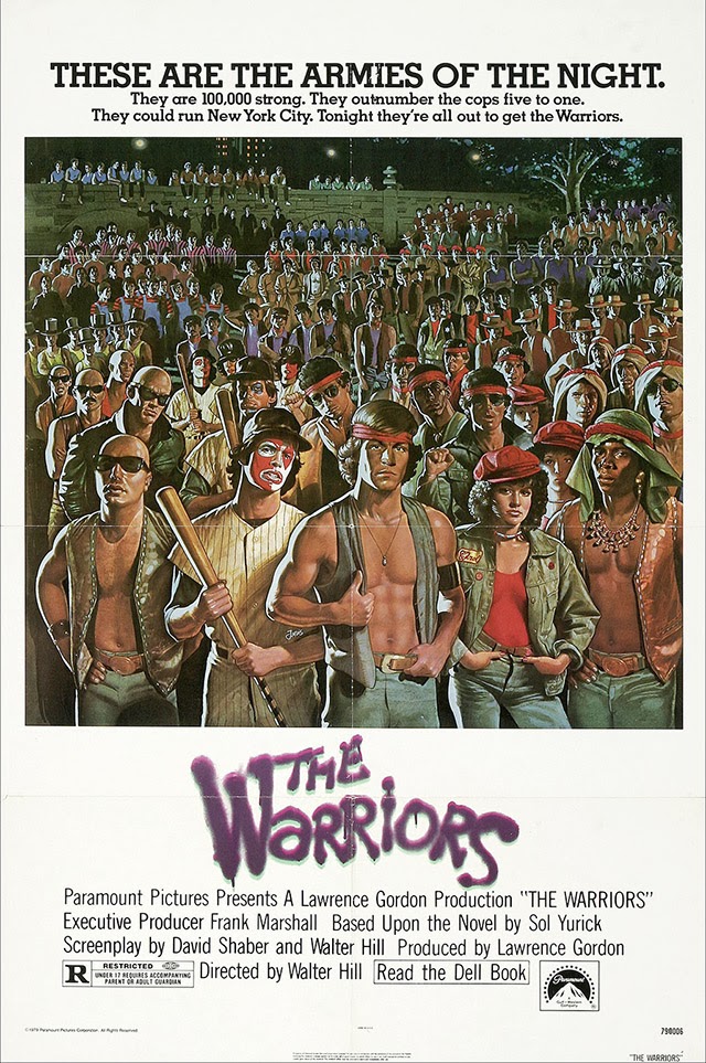
I interviewed novelist Sol Yurick back in March 2009. Rather than publish the interview on BLDGBLOG as I should have, however, I thought I’d try to find a place for it elsewhere, and began pitching it to a few design magazines. Yurick, after all, was the author of The Warriors—later turned into the cult classic film of the same name, in which New York City is transformed into a ruined staging ground for elaborately costumed gangs—and he was a familiar enough figure amidst a particular crowd of underground readers and independent press aficionados, those of us who might gravitate more toward Autonomedia pamphlets, for example, where you’d find Yurick’s strange and prescient Metatron: The Recording Angel, than anything on the bestseller list.

Looked at one way, The Warriors tells the story of a city gone out of control, become feral, taken over by criminal gangs and faceless police organizations, its infrastructure half-abandoned or, at the very least, fallen into a state of Piranesian decay. The everyday lives of its residents whirl on, while these cartoon-like groups of armed militants spiral toward violence and disaster. Yurick was thus an urban author, I thought, suitable for urban and architectural publications, his insights on cities far more useful than your average TED Talk and about one ten-thousandth as exposed.

In the interview, published for the first time below, Yurick freely discussed the back-story for The Warriors, which was the question that had motivated me to contact him in the first place. But he also drifted into his interests in the global financial system, which, at that point in time, was melting down through a domino game of bad mortgages and Ponzi schemes, and he went on to offer an even more dizzying perspective on Dante’s The Divine Comedy. Dante, in Yurick’s unexpected retelling, had actually written a series of concentric financial allegories, tales of monetary wizardry starring lost, beautiful souls searching for one another amongst the impenetrable mathematics of paradise.

Along the way, we touched on Mexican drug cartels, the Trojan War, the United Nations, and a handful of forthcoming books that Yurick was still, he claimed, energetically working on at the time. 

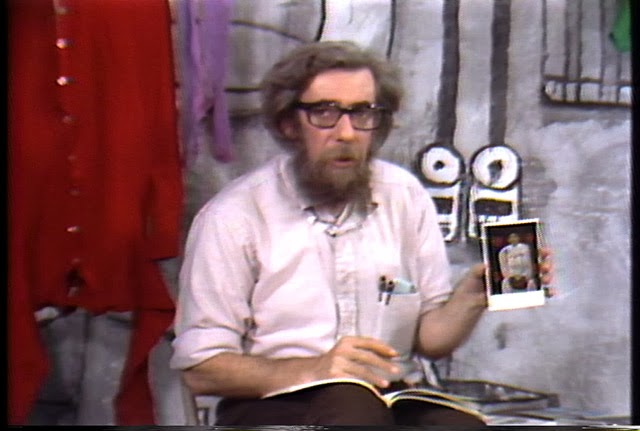
Image from Paper Tiger, via Sheepshead Bites

Alas, I pitched the wrong magazines and, soon thereafter, hit the road for a long period of travel and work; the interview simply disappeared into my hard drive and years went by. Then, worst of all, Yurick passed away in January of this year

The New York Times described him as “a writer whose best-known work, the 1965 novel The Warriors, recast an ancient Greek battle as a tale of warring New York street gangs and earned a cult following in print, on film and eventually in a video game.” Writing for The Nation, Samuel Fromartz specifically referred to several “out-of-the-blue interview requests” that had popped up in Yurick’s latter years, asking him about, yes, The Warriors. As Fromartz writes, “despite the delight he got in its cult status, it did not mean a lot more to him” than his other books, The Warriors being simply one project among many. 

And so this interview sat, unpublished, till I came across it again in my files recently and I thought I’d give it a second life online. It’s a fascinating discussion with an aging writer who unhesitatingly looked back at a long career of writing both fiction and political analysis, a life of deep reading and even a few eye-poppingly abstract interpretations of Dante.

What follows is the final edit of our conversation. Yurick was an engaged and pointed conversationalist, and, while I was obviously just another out-of-the-blue interviewer curious about the broken city of The Warriors, I hope this text does justice to his creative and sharp vision of the world. 

So this is for Sol Yurick, 1925-2013.

* * *

BLDGBLOG: I’d love to start with the most basic question of all, which is to ask about the back-story behind The Warriors. What motivated you to write it when you did?

Sol Yurick: Well, initially it started off when I was talking about some ideas with a friend in college. I’d just finished reading Xenophon and the concept popped into my head. This was the early 1940s.

Then, later, maybe in the 1950s, I read Outlaws of the Marsh, and the combination of ritual and violence in Outlaws of the Marsh just took my breath away. Those things mixed—Xenophon, ritual violence, Outlaws of the Marsh—and, on top of all that, I had already been working on a novel of my own. I was trying to get it published and it kept getting rejected—maybe 37 times?

BLDGBLOG: Wow.

Yurick: To move on to the next step, I wrote The Warriors. I did it in about three weeks. By this time, a lot of these ideas had matured. I’d been thinking about the whole question of gangs. First of all, the youth gangs at that point in time, running into the 1950s and ’60s, had no economic basis whatsoever. They mostly came from poverty-stricken families. You remember the film Rebel Without a Cause, right? That kind of stuff. It was viewed as kind of a national problem.
However, there were also gangs that came out of the suburbs—gangs nobody had ever heard about. No sociologist had wrote about this. In fact, I was big on sociology at the time, especially the works of Émile Durkheim and Max Weber, the founders of modern sociology. I wanted to write about stuff that approached reality—that was based in social reality—and that was not bound by a lot of the clichés or conventions of fiction as I knew it. I wanted to deal with a different stratum of society, something that wasn’t getting the attention it deserved in fiction at the time.

By the time I was actually writing the book, though, the whole 1960s had already started, and I eventually had a different take on it. In the book, it’s really about making a revolution, not just a criminal gang taking over the city. After all, it takes place on July 4th! But, in the book, that holiday is like a slap in the face for my characters—at least that’s the vision of the gang leader, looking at all the things that keep these people down. It’s Independence Day—but independence for whom? Independence from what?

Since that time, I’ve thought an awful lot about gangs and I began to see them in a very different way, as almost a biological formation. People make gangs—men and women, what have you. Cliques, clans, whatever you want to call it. There seems to be a big impulse there, something deeply social and political, but also maybe something biological.

I’d been thinking and meditating on this whole thing—this whole problem of the gang and what makes it. The interesting thing about gangs, as I wrote about them at that point in time, and as I mentioned, is that they had no economic basis. That all began to change during the period of the late 1950s and early 1960s, especially in relation to Vietnam, when more and more heroin began to be imported into the United States—a chunk of that coming through the good offices of the CIA. So, especially looking at the drug cartels in Mexico today, but also looking at this phenomenon of organized crime all over the world, the more you see that gangs are essentially capitalists. Within that system, they organize themselves: they have hierarchical principles and their leadership gets the best of everything. The lower strata are just the soldiers who risk their lives and don’t make out too well.

Look at the other gangs and mafia in ‘Ndrangheta, Calabria, the Camorra, the Japanese gangs, the Chinese triads, the Bulgarian gangs, the Russian gangs, all of that. It’s a business. Essentially, there are connections between these phenomena and corporate capitalism and politics, one way or another. On some level, there are always connections to something else—some other group, level, or economic phenomenon. In fact, no phenomenon, whether we’re talking physics or chemistry or what have you is totally isolated. Total isolation, or the making of discrete sets, is really an intellectual concept. No social formation is isolated in and of itself. It just isn’t.

What’s interesting is that, wherever you go, the gangs develop their own cultures. What makes them alike is generally their structures—their hierarchical structures—and the necessity for their leadership, whether it’s male or female, to exhibit charisma, machismo or machisma. And I don’t care whether you see this in corporations, which are supposedly rational entities but that, really, are not—because, otherwise, why would people talk about the “culture” of a corporation as something that can drive it into bankruptcy or make it successful? And how is that culture different from another corporation? So, in gangs and corporations both, we’re seeing a kind of driven necessity—maybe biological—to make and sustain a culture. But each culture is different.

Structurally, things look the same, but, culturally, things look different. That fascinates me.

Also, I grew up in a Communist household. Starting in the 1960s, I went back to reading Marx. In the back of my mind, though, there were aspects of Marx that seemed inadequate as a theory. It was very Western-centered; the number of classical and historical references in all of Marx’s work was just overwhelming to me. For all of his references, it felt limited. Then, as well, I began to think more in terms of neo-Darwinism. I don’t mean social Darwinism. Leftists and liberals deny the question of human nature, but what if it’s true? So that also became a consideration in my thinking—mixing the two: Marx and Darwin. 

All of that was part of the back-story for The Warriors.

BLDGBLOG: Before we move on to other topics, I think it’s interesting how much the built landscape of New York has changed since you wrote The Warriors. I’m curious, if you were to update the story of Xenophon again and rewrite The Warriors today, if there is a different location you might choose, whether that’s a different city or a different part of New York.

Yurick: Well, I would make it global, for one thing. And I would try to bring into it questions of finance—things like that. I’m not sure, though; I haven’t thought of that. Yes, there was a political and economic connection to Xenophon, and to Xenophon’s story—essentially, these gang members were mercenaries, and they were also a surplus population pushed to the edge of society. They were, after all, kids. And they were revolutionaries, not just street criminals. But I don’t know exactly how I’d handle it today.

Again, the whole question of making a revolution in the old way—it’s a tricky one. From my way of thinking, what happened in the Russian Revolution is: you had an uprising. People were discontented and what have you. Then a moment of opportunity came along, when it was a complete breakdown, and, at that point, Lenin stepped in. It was purely opportunistic. There was nothing decent in his move. There it was. It happened. Boom. He took advantage.
BLDGBLOG: In your book-length essay Metatron: The Recording Angel, you combine so many of these interests—everything from finance to electronic writing, looking ahead to what we now call the internet, and so on. I’m curious if we could talk a little bit about how Metatron came about, what you were seeking to do with that book, and where you might take its research today?
Yurick: When I wrote that, it was still early on. Computers were not universally around. I had a friend who was a computer expert—he had become an expert in the 1950s—so I was introduced to computers and the idea long before there were PCs or anything like that. I knew, when I saw stuff that would later become the internet—exchanges between scientists who had access to this kind of stuff—I knew I was looking at a different world. I began to see signs that this was going to become a big phenomenon, one of information and the effects of information. And again, this was before anybody had home computers.

Then computers began to come in, bit by bit. We’re talking maybe 1979. What happened then was that I got tied up with an organization trying to promote the use of satellites for global education. By this time, though, having been through the 1960s and 70s, I was telling them that this was just not going to happen. You’re not going to get money for this kind of thing; they’re going to use satellites for any other purpose for the most part, maybe military purposes, maybe propagandistic purposes, certainly for telecommunications.

But I went down to Washington with these people a couple of times, and we sat in on the committee hearings. Then I wrote a piece—an essay—to sort of introduce our organization. I forget when it was—maybe 1979 or 1978—but Jimmy Carter was coming to the UN and, because of the connections of several people in this organization, somebody got my essay to Jimmy Carter’s people. He almost incorporated a piece of it into his speech at the UN!

That didn’t happen, of course, so I decided I would submit it to this little publishing house, and they asked me to expand on it. I did that, and that was Metatron.

So my mind was ranging over all these things. I was trying to think of what the effect was going to be of computers and networks and satellites, trying to anticipate a lot of side effects. There was a lot I didn’t foresee, but there were some things I saw beginning to happen—that then, in fact, did happen maybe ten years later. Things like running factory farm machines by satellite and, now, running drones over Afghanistan from a place in Nevada. Things like that.

Anyway, having been getting more and more involved in many areas, while at the same time trying to find a basis for writing my fiction from new perspectives, became very destabilizing. Because most writers—most people—just stop growing at a certain point. They stop taking in more stuff because it gets in the way of their writing. But the opposite was happening. For instance, with The Warriors, I was able to make an outline chart of how the themes would develop. I could coordinate everything: what happened to the clothing, what happened at a certain time of day, and so forth and so on. Interestingly, the form of the chart I borrowed from a business model called program evaluation. It was a review technique. So I could do this thing and it came easy.

But when I tried to do it with The Bag, it didn’t work. I had such a hard time doing The Bag. The chart began to expand and expand till it was about ten feet long; I had different colors on it; it just didn’t work right. But I was learning so much.

Anyway, at certain points you’ve got to say enough. I forget which writer said this: “You don’t finish the work you abandon.”

BLDGBLOG: The financial aspects of your work are very interesting here, as well.

Yurick: Do you mean the economic?

BLDGBLOG: Well, I mean “financial” more specifically to refer to the system of writings, agreements, valuations, and so forth that constitute the world of international finance—which, if you take a very basic, material view of things, is just people writing. It’s numbers and spreadsheets, stock prices, contracts, and slips of paper, licenses and patents—its own sort of literature. You imply as much, in Metatron, with its titular reference to the archangel of writing.

Yurick: OK, yes. You know, I’ve been saying for years to people that this is coming, this moment [the financial crisis of 2007-2009], and it’s happening now. I read the newspaper and I see it: these people manufacturing money out of their imaginations. Sooner or later the bubble has got to burst, and it’s bursting.

In a certain sense, what’s taken place—what’s taking place now—is a series of mistakes. In other words, you don’t hire the people who caused the problem in the first place to try to rectify it, yet that’s what’s happening. It’s very interesting, I think, to look at this in terms of the criminal elements that we discussed—the gangs—and to see that what they do is done through extortion, prostitution, the selling of illegal things, illegal commodities, and what have you. They accumulate money and they launder it. But this also happens at the very top levels of finance: they imagine money and then they objectify it in terms of mansions and things like that.

When you’re dealing with this kind of stuff, you’re dealing with fiction—and when you’re dealing with fiction, you’re in my realm.

BLDGBLOG: The financial world that’s been created in the last decade or so often just seems like a dream world of overlapping fictions—of Ponzi schemes and collateralized agreements that no one can follow. It’s as is people are just telling each other stories, but the characters are mutual funds, and, rather than words, they’re written in numbers. To paraphrase Arthur C. Clarke, it’s as if sufficiently advanced financial transactions have become indistinguishable from magic.

Yurick: A long time ago, I started to write a book in which I invented a planet, and the planet was ultimately nothing but finance. I called it Malaputa. Do you know Jonathan Swift’s work at all? One of the trips Gulliver takes is to an island called Laputa, which really means, in Latin, the whore or the hole. There he encounters nothing but intellectuals building the most astonishing mental structures and doing the stupidest things imaginable. Now, Malaputa would be the evil whore.

So the planet I began to invent was a world that interpenetrates ours and it works by the rules of our world, but it’s not visible. Ultimately, it resides in the financial system in which, as you get to the center of it, its mass and velocity keep on increasing potentially. It’s the movement, ultimately, of symbols.

I realized, at a certain point, that what I was also talking about was, in a sense, The Divine Comedy. The descent into the Inferno, if you remember, is in the form of a cone—the inside of a cone. The ascent to the top of Mount Purgatory is also a cone, but you climb on the outside. Then, to move on to heaven, you have a series of concentric circles, at the center of which is the ultimate paradise, which is where God resides. The circles are spinning, but they’re spinning in an odd way. If you’re at the center of a spinning circle, you’re barely moving around. If you’re on the outside, you’re moving with great velocity.

In this case, Dante tells us that the center of the circle spins with the greatest velocity, and the further out you get away from it, the slower it moves. What does finance have to do with this? The woman who Dante idolized—Beatrice—was a banker’s daughter. You could say his interest in her was partly financial, pursued through these circles and cones of symbols. Anyway, that’s the architecture of The Divine Comedy that I was getting at.

From this point—as all of this was going into the stuff I’m writing now—I began to meditate on the question of surplus labor value. Which, as Marx said, is the unpaid part of what a worker doesn’t get, the part that the owner—the owner of the means of production—expropriates.

BLDGBLOG: The Malaputa idea was for an entire standalone novel, or it’s something that you’re now including in your current work? 

Yurick: It was originally going to be its own book, but I’m going to change that. I’ll incorporate it; I’ll reinvent it. 

I wrote a piece a long time ago for—I forget the name of the magazine. It was on the question of the information revolution, the dimensions of which were not yet clear at that point. I think it was the mid-1980s. I was talking about, even at that point in time, the speed of the transactions, and the infinitesimally small space in which transactions occur—against the space that you have to traverse either by foot or other means, like to the market village or the shopping mall or the warehouse floor.

In other words, I’m saying that finance has a space—it has an architecture. You might want to transfer billions of dollars from one country to another, but both are accounts in one computer space. What you’re doing might have enormous effects on the real world—the world of humans and geography—but what you’ve done is move it a fraction of an inch, at an enormous speed, with an enormous velocity and mass. And that has real effects thousands of miles away.

BLDGBLOG: I’m curious if you see other future developments of these works, or if there’s something new you’re working on at the moment.

Yurick: Yes—I’m working on two things that may intersect. One is a kind of biography that I call Revenge. What I realized, in a certain way—partly because I grew up in the Depression under bad circumstances, and now I see those same circumstances coming back again—I realized at a certain point that my novels Fertig and The Bag were revenge novels. That was a theme that was not clearly in my mind at the time, but that came into my consciousness relatively recently. 

Revenge begins with trying to pick a starting point—to impose a starting point—because wherever you begin, there is no ultimate beginning. Someone did something to someone else, in reaction to something that came before that, and so on and so forth. You start in the middle of things, and choose a starting point. It’s like a lot of the things we say about The Iliad, for instance. They start in the middle of things, in medias res.

There was an essay I wrote for The Nation on Truman Capote’s In Cold Blood, in which I panned the novel. But what I realized, even at the time I was writing it, was that, in a certain way, the story in that book—the true story it was based on—wasn’t just a random killing. It was a revenge killing. It was about two people who are, in a sense, dispossessed. But the person who got killed—not the family so much, but the farmer himself, Clutter—was no ordinary guy. He was no ordinary farmer, but a well-to-do guy with 3,000 acres and some cattle and maybe an oil-pumping system. He was important. He’d worked in government and he’d worked as a county agent. I won’t go into the history of the county agents and their ultimate role in making agribusiness as we know it today. But he was important enough in 1954 to have been interviewed about a kind of global crisis in agriculture in the magazine section of the New York Times.

This wasn’t the story Truman Capote told. Capote was given an assignment by the New Yorker and he went and he did it. He didn’t know or understand any of this background. He didn’t talk about the role of this guy. Not that this guy was the ultimate villain—this Clutter person—but, the fact is, he had a very key role. If he was important enough to be interviewed in a section on changes in agricultural policy in the New York Times Magazine, that means he’s not just nobody. The fact that he conjoined the outlaws, the killers—the fact that they conjoin, in a sense, with the Clutters—I think is a piece of, you can almost say, Dickensian chance. It’s like how some novelists will start out with two or three random incidents that are not connected at all and then mold them together.

I don’t know if you’ve read The Bridge of San Luis Rey? It’s about six or seven people who are on a bridge that collapses; it falls and they’re killed. What it is is an exercise in what brought these people together: what did they have, or not have, in common? Why this moment and not another moment? That’s what I wanted to develop with this, to go a little into the background of how I came to this line of thinking.

Now, one of the killers: his mother was an Indian [sic] and his father was a cowboy. The other one’s parents were poor farmers. So, here, we have three social groups expressed in these people. In the long struggle between corporate agriculture and the individual farmer, this is what develops: they get pushed off the land, these social groups. In fact, this also connects back to the old story of Joseph, in Egypt. With Joseph in Egypt, yes, he predicts the coming famine—the good times and the coming famine. But, when the famine does come, first he takes the farmer’s money, then he takes their land, and he moves them all into the cities. What you’ve got there is kind of an algorithm for the way agriculture develops: we’re talking Russia, the Soviet Union, China. We’re talking the United States. It looks different in different places, but the structure remains the same. You urbanize the people and you consolidate the land.

Then, of course, with the book I go into my own reactions to all kinds of literature, and I stop to try to rewrite that literature. For instance, suppose we think of The Iliad as one big trade war. Troy, as you know, sat on the route into the Black Sea, which means it commanded the whole hinterland where people like the Greeks and the Trojans did trading. The Trojan War was a trade war.

BLDGBLOG: The mergers and acquisitions of the ancient world.

Yurick: So that’s the kind of stuff I’m working on.

In the end, of course, the smaller farmer fought agribusiness tooth and nail, and they lost. We see what agribusiness has done to food itself, creating all kinds of mutational changes in seeds and so forth. Again, I think of the collectivization period in the Soviet Union in which, in order to win, you had to starve the peasants. That’s what the intellectuals of the time wanted, without understanding the practicality of life on the ground, so to speak. It was a catastrophe.

On the other hand, one of the images I had when I was a kid, during the Depression, was: you’d go see a newsreel and you’d see farmers spilling milk and grain on the ground because they couldn’t get their price. People didn’t have enough food, but they were just dumping their milk in the mud. These were smaller farmers—agribusiness hadn’t happened yet. So you’ve got two greed systems going on here.

Anyway, I use all that as the novel’s jumping-off point. In a sense, I’m saying Clutter had it coming to him—or his class had it coming to him.

But I’m in the very early stages. It becomes like a little race between living and doing it, and ultimately dying. I’m not rushing myself, but I’m having fun.

* * *

This interview was recorded in March 2009. Thank you to Sol Yurick for the conversation.

Spatial Delirium: An Interview with Michael Light

Michael Light, Gated “Monaco” Lake Las Vegas Homesites Looking West on Grand Corniche Drive, Bankrupt MonteLago Village and Ponte Vecchio Bridge Beyond, Henderson, Nevada (2010)

Photographer Michael Light divides his time between San Francisco and a remote house near Mono Lake, in the Sierra Nevada. An artist widely known for his aerial work, Light flies the trip himself in a small airplane, usually departing very early in the morning, near dawn, before the turbulence builds up.

Michael Light preps his airplane for flight; photo by Venue.

Venue, BLDGBLOG’s collaborative project with Nicola Twilley of Edible Geography and the Nevada Museum of Art’s Center for Art + Environment, not only had the pleasure of flying with Light around Mono Lake, but of staying in his home for a few nights and learning more, over the course of many long conversations, about his work.

Flying with Michael Light over Mono Lake; photos by Venue.

We took a nighttime hike and hunted for scorpions in the underbrush; we looked at aerial maps of the surrounding area—in fact, most of the U.S. Southwest—to discuss the invisible marbling of military & civilian airspace in the region; and we asked Light about his many projects, their different landscape emphases, the future of photography as a pursuit and profession, and what he might work on next.

From SCUBA diving amidst the nuked ruins of WWII battleships in the most remote waters of the Pacific Ocean to spending years touching up and republishing photos of U.S. nuclear weapons tests for a spectacular and deeply unsettling book called 100 Suns, to his look at the Apollo program of the 1960s as an endeavor very much focused around the spatial experience of another landscape—the lunar surface—to his ongoing visual investigation of housing, urbanization, and rabid over-development in regions like Phoenix and Las Vegas, Light was never less than compelling.

With several great phrases—that “the mine is a city reversed,” or that the sunken ruins of WWII battleships “are dissolving like Alka-Seltzer” in the depths of the Pacific—and with an always caustic sense of humor, Light patiently answered our questions about his work both above the ground and below sea level, discussing what nuclear weapons have done the Western notion of the landscape sublime, what cameraphones have done to the professional photographer, and what it means to transgress today into the corporate-controlled air spaces of vast mining and extraction sites out west.

Michael Light, Shadow at 300’, 1300 hours, Deep Springs Valley, CA (2001)

• • •
Geoff Manaugh: I’d like to start by asking how the aerial view ties into the nature of your work in general. You’ve spoken to William L. Fox in an interview for the Some Dry Space exhibition about a feeling of spatial “delirium,” suggesting that the experience of moving through the sky is something viscerally attractive to you. I’m curious if you could talk about that, as a physical sensation, but also about the representational effects of the bird’s eye—or pilot’s eye—view and how it so thoroughly changes the appearance of a landscape.

Michael Light, Clouds Over the Jonah Natural Gas Field, Pinedale, WY (2007)

Michael Light: The short answer is that the aerial view affords a breadth of scale that offers direct access to many of the bigger, more “meta” themes that have always been of interest to me.

But let me take a few steps back and try to explain where all this came from. I got a B.A. in American Studies from Amherst many years ago, and I have since been an Americanist—not in the sense of being an apologist for America, but in the sense of someone trying to figure out what makes this country tick. It is a very, very vast country.

Michael Light, Sheep Hole Mountains at 400’, 0700 hours, Twentynine Palms, CA (2000)

I grew up on the end of Long Island, and I was always getting onto Highway 80 or onto more southerly interstates and heading west. The metaphor that always accompanied me, oddly enough, was one of falling into America rather than crossing it. I was falling into the vastness of America and the sheer scale of it.

Of course, after I moved to California in 1986, I caught myself coming back east quite a bit, for family or for work, and those commercial air flights across the nation, flying coast to coast, were formative and endlessly interesting to me. I don’t ever lower the window shade as requested. If the weather is clear, the odds are that what’s unfolding below, geologically, is the main attraction for me. I just found myself looking down—or looking into—America a lot, and that sense of falling into the country just grew and evolved.

I did a big piece back in the 1990s, when I was still in graduate school. It took a couple of years, but I figured out how to make pretty decent images from 30,000 feet, from the seat of a commercial airliner. For instance, you have to sit in front of the engine so that the heat doesn’t blow the picture; and it’s a contrast game, trying to get enough clarity through all the atmospheric haze and through two layers of plexiglass, and so on and so forth. That piece was based specifically on commercial flights and it was liberating for me in lots of ways.

While working on one of those images, in particular, I had something of an epiphany—I think it was somewhere over Arizona. It’s very spare, arid country, and the incursions of human settlement into it that you see from above look very much like a colony on Mars might look, or the proverbial lunar colony, and I thought “Ah ha! Look at that!” And I realized, at that moment, that maybe I could try to find or document something like a planetary landscape: the way humans live at a planetary scale and through planetary settlements.

Michael Light, Chidago Canyon at 500’, 1800 hours, Chalfant, CA (2001)

This was what got me, pretty soon thereafter, thinking above and beyond the earth: looking toward NASA, and their various programs over the past few decades, and that eventually became Full Moon.

FULL MOON: Composite of David Scott Seen Twice on Hadley Delta Mountain; Photographed by James Irwin, Apollo 15, 1971 (1999)

Manaugh: There’s an interesting book called Moondust by Andrew Smith, which began with Smith’s realization that we are soon approaching an historical moment when every human being who has walked on the moon will be dead. He set about trying to interview every living person—every American astronaut—who has set foot there. What makes it especially fascinating is that Smith portrays the entire Apollo program as a kind of vast landscape project, or act of landscape exploration, as if the whole thing had really just been at attempt at staging a real-life Caspar David Friedrich painting with seemingly endless Cold War funds to back it up. The place of Full Moon in your own work seems to echo that idea, of NASA lunar photography as something like the apotheosis of American natural landscape photography.

Light: The Apollo program was absolutely a landscape project—but also an extreme aerial project. And Full Moon, of course, was also driven by my own interest in the aerial view, or the aerial exterior. That project is nothing if not a really serious exploration of the aerial: that is, if you keep going up and up, the world becomes quite circular and alien. You see the world quite literally as a planet.

FULL MOON: The Ocean of Storms and the Known Sea; Photographed by Kenneth Mattingly, Apollo 16, April 16-27, 1972 (1999)

Anyway, for me, yes, the aerial view has an intense physicality. I’ve been flying planes since before I was driving. I soloed in gliders—engineless aircraft—by 14, and, by 16, I had a private pilot’s license. A glider offers a particularly intimate and very physical way of flying, because you have to work with thermals and updrafts. You don’t have an engine. You actually want it to be turbulent and bumpy up there, because that means that the air is unstable—that parts of the atmosphere are going up and other parts are going down—and, if you can stay in those up parts and find the updrafts, then you can ride it out for hours.

Also, I was lucky enough to start SCUBA diving at the age of 9.

Michael Light at 9 years old, Bimini, Bahamas (1972)

Flying and going underwater are completely connected, at least in my mind. The three-dimensionality of each of them is something I’ve experienced from a very early age, and it is one of my greatest ongoing pleasures. I would say that there’s a tremendous amount of physical pleasure in both—and that, occasionally, it would even be accurate to call it ecstasy.

It’s like skiing or long-distance running: everything’s in the groove, everything sort of falls into place, you’re flying really beautifully, or, oftentimes in my work, you’re transgressing over something, or you’ve got a very intense subject, and you are trying to figure something out as an artist or as a citizen.

Michael Light at 49 years old, Petaluma, CA (2012)

You mentioned delirium. There’s also a certain kind of delirium—a spatial delirium, sure—simply in the pleasure of learning something new and, for me, hopefully putting that 3-dimensional experience into 2-dimensional photographic form. And if it’s good—if the image is good—then hopefully other people can get some of what I got.

Manaugh: This reminds me of a conversation I had with a writer named Kitty Hauser about the history of aerial archaeology. To make a long story short, aerial archaeology, using photographs, was born from military reconnaissance flights over the European front in World War I. The pilots there began noticing that they could see features in the landscape—such as buried or ruined buildings—that were invisible from the ground. When that technique of viewing from above was later exported to England, particularly as the leisure classes and retired military types found the free time and the personal wealth to purchase private airplanes, aerial archaeology as a pursuit really took off, if you’ll excuse the pun. And these early pioneers began to realize that, for example, there are certain times of day when things are more clearly revealed by the angle of the sun, including shadows appearing in wheat and barley fields that, when seen from above, are revealed to be an archaeological site otherwise hidden beneath the plant life. I’m curious how coming back to the same locations at certain times of day, or in certain kinds of light, can make sites or landscapes into radically different photographic experiences—with different depths or different reliefs—and how you plan for that in your shots.

Light: If I go out on an expedition for weeks shooting with an assistant, I don’t immediately fall into that groove. A few days in, everything will align. It certainly is a kind of discipline. You’re flying and imaging and circling—again and again and again, around and around and around—because you can’t just move the camera two inches to the left, or wait 15 minutes. You’re moving along at 60 miles an hour through space. So you have to shoot it again and again and again, until, finally, you get to a point where your physical senses are moving faster than your mind, and you’ve made all the shots that you think you should make—which are generally the worst ones—and it’s at that point that you come up with something genuinely new.

Specifically, I tend to shoot early in the morning and then again in the evening, which is pretty much standard practice because, of course, the lower axial light gives that 3-dimensionality and creates a feeling of revelation. Every once in a while, though, I will shoot in the desert at midday, but it’s usually only when I’m specifically seeking a flat, blown out, almost stunning or hallucinatory light.

Michael Light, Deep Springs Valley at 500’, 1600 hours, Big Pine, CA (2001)

But, early in the morning, the sun seems to go off in the desert like a gun—and, of course, the sun is much softer in the evening, because there’s so much more dust in the air. You really have to get up early. I’ll shoot for an hour and a half, which is all I can really take with the doors off of the aircraft. It’s very windy. It’s very intense. The camera I use is about 20 pounds. So we’ll come back and we’ll have some breakfast—and I’m exhausted. I’ll probably nap around noon for an hour or two then, come 4:00pm or so, we gather our forces and go back up.

It’s always much more turbulent in the afternoon in summer. Summer is when I tend to fly, though, because, of course, in the colder months it’s just too cold. It’s also just a lot more dangerous to cross the mountains when there’s snow on them.

But, on summer afternoons, it can be a wild ride. You strap in there tight. My glider background is helpful here; I know the plane will continue to fly, for instance, and that there’s nothing to be super-scared of. I know I’m at the edges of my equipment’s performance. The specifications on the plane degrade measurably when you take the doors off, because you generate a tremendous amount of drag. In hot temperatures, the engine also tends to run hot and, the hotter the summer air is, the fewer molecules there are under the wings of the aircraft, the fewer molecules there are to combust with the engine fuel, the fewer molecules there are for the propeller to bite into, and you get much more turbulent air. Your aircraft performance falls off measurably.

Michael Light, Afternoon Thunderstorm Looking West, Near Rock Springs, WY (2007)

For example, I often fly from San Francisco over the Sierras to Mono Lake in the summer. The Sierras, on the west side, have a very gradual slope. But on the east side it’s a very dramatic, very steep escarpment. It’s a drop of 7,000 feet almost in a straight line. You have a very smooth, very fast trip up the western slope, but, when you get to the escarpment, you hit what’s called a “rotor.” That’s a very turbulent place where the usual land-to-airflow relationship completely falls apart, because the support has been taken away. For those five miles or so, going east, you’re in a tumbly, sometimes chaotic atmosphere and it can be extremely dangerous, depending on the speed of the wind.

When I hit the rotor, I just think of it in terms of river rafting: looking for eddies, back-flow currents, whirlpools, and so forth. Even though it’s invisible, I know where I’m going to hit turbulence. Even though I can’t see the air, I know, extrapolating from the way that water behaves, where the turbulence will be—like, beyond that rock mountain spire over there, it’s going to be gnarly.

Michael Light, City-Owned Motocross Park Looking North, I-70 Beyond, Lakewood, CO (2009)

To go back to your question: in the six, almost seven years I’ve been flying with engines, the landscape is so perceptually dependent on the type of light that’s illuminating it. You really do get radically different spaces in different kinds of light. A different kind of vibe. Seasons will also change the way a landscape looks—or, I should say, the light itself seasonally changes.

On an artistic level, the ever-changing nature of what I do and how I do it, and even the instability of my position in the sky over the landscape—it’s all part of my process and it’s something I enjoy.

Manaugh: Let’s go back to SCUBA diving. When we talked four or five years ago in Nevada, you were heading off to the Bikini Atoll, to dive amidst the ruins of U.S. warships, and I’d love to learn more about that project. How did it come about, what were you seeking to document, and what were the results? I’m also fascinated by analogy of being in the empty volume of the sky versus being buried in the very full volume of the ocean and how that affects the sense of space in your photography.

Light: The Bikini work grew out of my earlier involvement with imagery of nuclear detonations, which, as you know, was a project called 100 Suns. That was an archival endeavor that came out in 2003.

100 Suns (2003)

As a photographer or maker of images, I’m always as interested in trying to figure out the meaning of the trillions of photographs that have already been made as I am in making new ones of my own. And, culturally, I find it interesting to think about the meaning of photography, in the very large American contexts of Full Moon and 100 Suns. I think of both projects as landscape projects and, certainly, they are also investigations into American power and the peculiarities of American scale.

Nicola Twilley: As a side note, how does an archival project like 100 Suns work, technically, as far as reproducing the images goes?

Light: You scan them. You go in and you clean them up. You do whatever the approach of the hour is. You wind up almost lovingly inside each of the historical photographs. And you get very fond of them; you think of them almost as your own. Of course, they’re not—primarily because you haven’t had the experience of actually going to that space at that particular time and choosing how to make that image.

But I had a very strong desire to go—to make a pilgrimage—to, if not the Nevada Test Site, which I never could get into, then at least to the Pacific Proving Grounds, which I could get to. I tried to get into the Nevada Test Site. You can visit it, physically, but to get over it—in the air—and to make images is basically impossible. The last person to get permission to do that was Emmet Gowin, with his remarkable images. He got in in the 1990s. It took him a decade, and that was before 9/11. I tried again, and I was negotiating directly with the head of the site, but I just could never do it.

However, one can get out to Bikini, and the way one gets to Bikini hasn’t changed. At the time I went, there was a dive operation there run by the people of Bikini—who actually live 500 miles away, on a rather awful rock without a lagoon, in a place that they were moved to in 1945. They were basically booted off their atoll by the U.S. government. The people run this dive operation really for propaganda reasons, using it as a method to tell their story.

Michael Light, Bikini Island, Radioactively Uninhabitable Since 1954, Bikini Atoll (2003)

What one goes to dive for there are ships that were sunk in the Operation Crossroads tests of 1946.

At that point, the U.S. Navy—this was, of course, right after Hiroshima and Nagasaki—wanted to know if naval warfare was now utterly obsolete. Could a single bomb destroy an entire navy or a flotilla of ships?

100 SUNS: 058 BAKER/21 kilotons/Bikini Atoll/1946 (2003)

So they gathered almost 100 vessels for the tests, making all sorts of strange, mythic gestures. For instance, they brought the Nagato, which Admiral Yamamoto was on when he orchestrated the attack on Pearl Harbor. They brought that all the way from Tokyo. They brought out the Prinz Eugen from Germany, which was Germany’s most modern battleship. They brought the first American aircraft carrier, the U.S.S. Saratoga, out.

The ships they chose were these giant wartime icons, and they were bombed both from the air, with the Able test, and from 90 feet underwater, by the Baker test. The Baker test gave us the most spectacularly iconic images of Bikini: a water column being blasted up into the sky with the Wilson bell cloud around it that we all know so well.

100 SUNS: 059 BAKER/21 kilotons/Bikini Atoll/1946 (2003)

Those ships are 180 feet down at the bottom of Bikini Lagoon, to this day. They were functional at the time, and they were fully loaded with weaponry and fuel. They were unpopulated, although there were farm animals chained to the decks of the ships. So it’s creepy.

Diving there is pretty hairy. It’s way beyond recreational safety diving limits. 180 feet is dark. 180 feet is cold. You take on a tremendous amount of nitrogen down there. It’s pretty technical. You have to do decompression diving, which is inherently dangerous—you have to breathe helium trimix at about thirty feet below the boat for nearly an hour after twenty minutes at depth, hoping that no tiger shark comes along to eat you, as you adjust.

Michael Light, Shark, Bikini Lagoon (2007)

Once you’re down there, you can penetrate the ships, which are dissolving like Alka-Seltzer. It’s very entropic. You’re suffering, at that depth, from nitrogen narcosis. It’s like having three martinis. You’re pretty zonked out.

I went twice: in 2003 and, again, in 2007. During those trips, I made images from the air, on the surface, and underwater. I dove Bikini Lagoon, down to those ships on the bottom, twice.

Michael Light, Diver descending to 180 feet, Bikini Lagoon (2007)

It was one of the most challenging landscapes I have ever worked in, because almost inconceivable violence occurred to these places—both to Bikini Atoll and to Enewetak Atoll. I only physically went to Bikini Atoll, although I did fly over Enewetak. But both atolls were subjected to human gestures that are, as I said, almost inconceivably violent. To try to represent that photographically is very, very difficult.

In fact, the radiological disaster that occurred in 1954 happened simply because the winds changed direction at the wrong time, blowing back over the atoll at Bikini. During the largest nuclear detonation the United States ever did out there, which was 15 megatons, the winds shifted and everything blew back over the islands. It’s the worst radiological disaster in U.S. history.

Manaugh: I don’t want to sound naïve, but is it safe even to be there? Can you walk around and swim in the water and not get radiation poisoning?

Light: Bikini Atoll is still radioactive and still uninhabited to this day, but, yes, you can go there. As long as you don’t drink the water or eat the coconuts—anything that actually comes in contact with the soil, which has a layer of Cesium-137 in it—then you’re fine. The islands have healed. You know, it’s tropical. They’ve healed. There aren’t five-headed crabs walking around. The fish are fine; you can eat the fish. But it’s still pretty radioactive. I’m walking around in a Speedo bathing suit, thinking, “Wow, I’m glad I’m never having kids, ever!” You can’t feel radiation, but it’s there.

So there you are, having a tropical paradise moment, surrounded by tropical paradise visuals, yet you know, in your head, that this is one of the most violent landscapes on earth.

100 SUNS: 086 MOHAWK/360 kilotons/Enewetak Atoll/1956 (2003)

Two commercial aircraft fly the Marshall Islands. There is no access to private aircraft. The distances are too great. Bikini and Enewetak are in the middle of nowhere—that’s why they were used as test sites in the first place. To get aerial access to them was extremely difficult. I had to shoot from those two commercial air shuttles.

Over Enewetak I was able to get some pretty great images of the Mike crater. Mike was the first H-bomb test or, I should say, the first test of a “thermonuclear device.” It was not a bomb.

Michael Light, Mile-Wide, 200’ Deep 1952 MIKE Crater, 10.4 Megatons, Enewetak Atoll (2003)

That was Edward Teller’s baby, and one big-ass crater. That was 10.4 megatons. The scale of that kind of explosion dwarfs all of the ordinance detonated in both world wars combined. Five seconds after that detonation, the fireball alone was five miles wide. These were really, really big explosions. It’s hard to get your head around how big they were.

100 SUNS: 065 MIKE/10.4 megatons/Enewetak Atoll/1952 (2003)

Getting above and working with the Mike crater was terrific. I was able to get above Bikini, but not above the Bravo crater or out to the farthest edge of the atoll. Bravo was the 15-megaton test that left Bikini radioactive.

100 SUNS: 099 BRAVO/15 megatons/Bikini Atoll/1954 (2003)

However, I was able to dive in the Bravo crater while I was there, which was one of the creepiest experiences of my life. It’s still quite radioactive out on the edge of the crater. There’s a bunker right on the edge of Bravo Crater that’s sheared off at the top.

Michael Light, Radioactive Bunker Facing Mile-Wide, 200’ Deep 1954 BRAVO Crater, Bikini Atoll (2003)

Anyway, it’s obviously very deep and very rich territory. It was pretty amazing to be able to make the pilgrimage after having spent so much time with the archival material as I worked on 100 Suns. I have always felt ambivalent about the Bikini work. I’ve never known quite what to do with it. It is hard to work out there. I think that, ultimately, I will do a small book that will move between historical imagery of the ships and of the servicemen. There were 40,000 servicemen stationed there for several years while the Crossroads tests were happening.

I went back in 2007—I think that was right after you and I first talked about this. I got to do some aerial work and some more work on the ground, but, primarily, that trip was about bringing out a digital camera, which I did not have in 2003, and using it underwater. I had a housing and some lights, but I was not very successful in imaging those ships recognizably at those depths. It’s hard.

Michael Light, Ship Sunk by 1946 Crossroads Tests, Bikini Lagoon (2007)

There’s a lot of organic matter in the water. It’s incredibly dark. It’s very difficult to figure out, conceptually, a way to image the country’s first aircraft carrier. For example, I can’t back away from it enough, underwater, to get the whole thing. In theory, one could put together composite images, shot at a fairly close level, and then sort of stitch together what should look like a ship. But it’s a challenge.

Michael Light, Growth on Ship Sunk By 1946 Crossroads Tests, Bikini Lagoon (2007)

For me, throughout the Bikini work, both in 2003 and in 2007, I have taken the approach of reversing the positive as a conceit toward a sense of visually representing radiation and visually suggesting multiple energy sources other than the sun—multiple sources of light. There are also questions about narrative: about entropy, light, Hades, narcosis, dissolution.

You’ve got this kind of X-ray death trip, if you will.

Michael Light, Tower of the IJN Nagato Battleship, Sunk By 1946 Crossroads Tests, Bikini Lagoon (2007)

It’s a very, very strong feeling, diving amongst those ships, and the ghosts of all the people who died on those ships, and knowing what they were used for and how they were sunk. It almost feels like the last gasp of an industrial era that’s now long over and gone. It was really an age of iron. It’s as far from the digital world that we live in now that you can imagine. It’s a dead era, and the work is tough. It’s not warm and fuzzy, or nostalgic. None of that is what Bikini is about. It’s about as dark as you can get.

Michael Light, Along the USS Saratoga, Sunk By 1946 Crossroads Tests, Bikini Lagoon (2007)

Manaugh: In the context of 100 Suns and even hearing you say things like, “as dark as you can get,” it almost seems as though sites like the Mike crater and even these tropical ruins are like spatial byproducts of very large-scale light events. It’s as if the light of a counter-sun—the nuclear explosion—has created its own landscapes of extreme over-exposure and violence. The scenes you’re documenting, in a sense, are byproducts of light.

Light: Yes, some of this is important to me, and I do tend to think oppositionally, in rather binary terms.

Michael Light, Inside Radioactive Photographic Bunker Built In 1956, Aomon Island, Bikini Atoll (2003)

There are so many levels of meaning to the bomb. There are landscape meanings. There are political meanings. There are industrial meanings. There are scientific meanings. To me, as I mentioned, this is a landscape book at bottom.

I personally see the moment that the Mike device detonated in 1952 as the moment when the classical landscape sublime—which, of course, up to that point was the domain of either the divine or of massively powerful natural forces beyond human control—switched. In 1952, the landscape sublime shifted wholly over to humans as the architect.

I was interested in looking closer at that moment when humans became “the divine”—as powerful as, if not more powerful than, the natural forces that they’re subject to on the planet. What was the effect of that—what did that do to landscape representation—when the sublime became an architecture of ourselves?

100 SUNS: 081 TRUCKEE/210 kilotons/Christmas Island/1962 (2003)

With the attainment of a thermonuclear fusion device, humans are igniting their own stars. What does that mean in landscape terms? What does that mean in architectural terms? When you talk about light itself creating a landscape and leaving behind these giant craters, it’s very resonant territory.

Arguably, humans firing up their own stars could be seen as the absolute pinnacle of a tool-bearing civilization—although it’s equally fair to say that it could be seen as humanity’s greatest tragedy, because it came out of a cauldron of violence and was immediately put back into a cauldron of violence.

100 SUNS: 093 BRAVO/15 megatons/Bikini Atoll/1954 (2003)

To bring us back to ground a little bit here, I did 100 Suns, and I did Full Moon, and I continue to do my aerial forays into the American West, because these are things that I want to learn about and try to understand. I just truly didn’t understand fusion and fission; I really didn’t understand space. I think that, while I have a taste—and the human mind has a taste—for scale, there’s only so much scale that we can take. Even then, we need to have it served to us in smaller chunks.

I found that other books and investigations pertaining to outer space were just way too broad and, in the end, didn’t tell me anything. I don’t get much out of the Hubble images, for example. They’re too big. I have no entranceway into those to conceptualize or think about the subject, so I wind up with cotton candy or some nebula image that’s pretty, sure, but I can’t get any substance out of it.

100 Suns never would have happened without having spent five years on the surface of the moon, metaphorically. Studying the nature of light in a vacuum—that was really the primary interest of mine, artistically, in taking on that project.

FULL MOON: Astronaut’s Shadow; Photographed by Harrison Schmitt, Apollo 17, 1972 (1999)

How does light work without atmosphere to break it up? It’s sharper than anything our eyes have evolved to see, and it behaves very differently than it does when diffused by an atmosphere. What does that do to the physical act—the actual technology—of photography as it tries to capture that light? What does that light do to a landscape?

What does that landscape do to all the other landscapes we’ve already seen in the history of landscape photography?

FULL MOON: Morning Sun Near Surveyor Crater, With Blue Lens Flare; Photographed by Charles Conrad, Apollo 12, 1969 (1999)

I spent a lot of time looking at the sun’s effects on the surface of the moon, in near-vacuum conditions, and I thought, “Well, what’s the next logical step for this?”

FULL MOON: Solar Wind Collector; Photographed by Alan Bean, Apollo 12, 1969 (1999)

Certainly, it’s not Mars, as so many publishers would suggest. It seemed more logical to go look directly into that sun and, at least in terms of the 20th century, very clear that I should step back just two or three decades, and deal with the bomb. Of course, the Apollo program never would have happened without ICBMs.

On that level, it’s logical—but it also acts as a kind of psychological journey. In 100 Suns, there’s no handholding that occurs for the viewer to guide them between attraction and repulsion. You’re just thrown into it. There’s science afterward; there’s text afterward; there are explanations afterward; there are politics afterward. But that kind of frontal experience was what I wanted you to feel, as a viewer.

It was a very daunting subject. The scale of America, and the scale of its power, offers an infinite mountain of mystery.

Twilley: In terms of both the moon and some of these military ruins, like the Nevada Test Site, physical access for the photographer is all but impossible. Has this made you interested in remote-viewing, remotely controlled cameras, or even drone photography? What might those technologies do, not necessarily to the future of photography, but to the future of the photographer?

Light: Absolutely. I think it’s important to remember that the vast majority of the Apollo photographs were made without anyone looking through a viewfinder.

Those cameras were mounted on the surface of the moon or on the chest area of the spacesuit. With a proper wide-angle lens and an electric advance, the astronauts basically just pointed their bodies in 360-degree circles, at whatever area they were collecting the samples from, and that was the photograph. They were trained very carefully to make sure they could operate the cameras, and there are certainly examples of handheld camera images on the surface of the moon, but a lot of the images were these sort of automatic images you’re talking about—photography without a photographer.

FULL MOON: Alan Bean at Sharp Crater With the Handtool Carrier; Photographed by Charles Conrad, Apollo 12, 1969 (1999)

It’s one of those things that I find interesting about Full Moon, that what we consider to be interesting, photographically, can happen absent of a human set of eyes making the image. Today, as you mention, it’s only getting more extreme.

I should say, at this particular photographic moment, as a photographer myself, I feel overwhelmed. I have not figured out where photography is going. I don’t think anyone has. I certainly know that it’s changing, radically, and sometimes in ways that make me want to run back to the 19th century.

For one thing, everyone’s a photographer now, because everyone has a phone, and those cameras are getting very good. The cameras themselves are doing more and more of the work, as well, work that, traditionally, was the field of the photographer, so the quality of photographs—in the classic sense of things like quality of exposure, density, resolution, contrast, and so forth—is going up and up and up. And, of course, as you well know, there are now systems in place for total and instantaneous publishing of one’s work via the Internet. I think we are entering a world of total documentation.

Obviously, all of this visual information is going to continue to proliferate. I don’t know how to navigate my way through that. I tell myself—because I have my own methods, my own cameras, and my own crazy aerial platform—that my pictures have a view that you are not going to get from a drone.

Personal drones are going to proliferate, and our eyes, soon enough, are going to be able to go anywhere and everywhere without our bodies. Humans have a tremendous interest—they always have had—in extending themselves where they physically cannot go. That’s just picking up more speed now—it’s going faster and faster—and the density of the data is thickening, becoming smog.

I think that photography, or what we currently consider photography, will become more about the concept or the idea driving the picture than the actual picture itself. Maybe that has always been the case. Metaphors are obviously applicable to everything, and you can find them in everything, if you want to. It’s not so much the picture—or, it’s not so much the information in the picture—it’s the spin on it. Information does not equal meaning. Meaning is bigger than information.

I used to fly model aircraft as a kid. It’s a powerful fantasy: mounting a camera on a little electric helicopter and running it around the corner, lifting off over the fence, the hedgerow, the border, and seeing what you can see. I actually do it physically now, in airplanes, and I’m very invested in the physical experience of that. It’s a big part of my aerial work: the politics of transgressing private property in a capitalist society.

I may not be able to get into that gated community on the outskirts of Las Vegas—which is what I’m photographing now, a place called Lake Las Vegas—but, legally, I can get above it and I can make the stories and the images I want to make.

Michael Light, “Monaco” Lake Las Vegas Homes on Gated Grand Corniche Drive, Henderson, NV (2010)

That homeowners’ association, or that world created by developers, wants total control over its narrative, and, in general, they have it. They exclude anyone who wants to tell a different story. So far, with the exception of military air space and occasional prohibited air space around nuclear power plants and that sort of thing, I can still tell my own stories, and I do.

A couple of years ago I went out to Salt Lake City. I sold one of my big handmade books to the art museum there, and I also made an effort to see Kennecott Copper, which is owned by Rio Tinto. I thought they might be interested in buying some of the work—but, as it turned out, they were not at all interested, and, in fact, seemed to wish I didn’t exist.

I met with their PR person—a very nice, chatty PR kind of lady. I showed her this spectacular, 36-inch high and 44-inch wide book of photographs featuring this incredible, almost Wagnerian hole in the ground. And the only thing that she could say, upon seeing the book, was: “How on earth did you get permission?” Not: Wow, these are interesting pictures, or whatever. She instantly zoomed into the question of the legal permission to represent or tell the story of this site. I said: “Well, I didn’t get permission, actually, because I didn’t need permission.” And that was anathema to her; it was anathema to the whole corporate structure that wants to control the story of the Bingham Mine.

Michael Light, Earth’s Largest Excavation, 2.5 Miles Wide and .5 Miles Deep, Bingham Copper Mine, UT (2006)

Anyway, I think it’s through my own selfishness that I would not want to send a drone up to transgress over a site when I could do it, instead. I could just sit at my computer screen and kick back in my chair—but we spend enough time in chairs as it is. It’s more that I am putting my butt on the line; I’m breaking no laws, but there is the experience of physical exploration that I would be denied by using drones. Obviously, in areas where I truly cannot go—like the moon—or where I wouldn’t want to go—like on the edge of one of those nuclear detonations—then I’d be thrilled to have a remote.

Manaugh: You mentioned control over the narrative of the copper mine. It’s as if Kennecott has two-dimensional control over their narrative, through image rights, but they don’t have volumetric, or three-dimensional, control over the narrative, which you can enter into with an airplane and then relate to others in a totally different way.

Light: Of course.

My particular approach, aerially, is very different. The obvious answer is: why not just Google Map it, and zoom in, and then throw a little three-dimensionality on it by moving a little Google Earth lever? But the actual act of going in at the low altitudes that I do lets me make these particular images. I don’t do verticals; I do obliques, because they allow for a relational tableau to happen. To go in low—to make that physical transgression over Bingham or over Lake Las Vegas or over this or that development—is great, and I think it’s a viewpoint that is unique.

Michael Light, Looking East Over Unbuilt “Ascaya” Lots, Black Mountain Beyond, Henderson, NV (2010)

Manaugh: You’ve mentioned Las Vegas, but I’d also like to talk about your Los Angeles work. You basically have two oppositional series—L.A. Day and L.A. Night—which really makes explicit the role light plays in changing how we see a landscape. For instance, in L.A. Night, the city is represented as this William Blake-like microcosm of the universe, with the lights of the houses in the Hollywood hills, and the cars on the freeways, mimicking the stars above them. The city becomes a copy of the sky.

Michael Light, Untitled/Downtown Dusk, Los Angeles (2005)

Then there’s L.A. Day, which confronts the massive Ballardian geometry of the freeways themselves, baking under the sun.

Michael Light, Long Beach Freeway and Atlantic Boulevard Looking Southeast, L.A. River Beyond (2004)

I’m interested in what the city is doing for you in these photographs. Is it a representation of the end of civilization, or is it a strange depiction of new, golden dawn for urban form? What is your attraction to and metaphoric use of the city—of Los Angeles, in particular?

Light: Well, these are very interesting questions. One thing to bear in mind, first of all, is that the day work and the night work is now quite old work to me. The day work was shot in 2004 and the night work was shot in 2005 and it’s just a Los Angeles; it’s not the Los Angeles. It’s very much a particular spot in time that I found myself at that moment. I’ll get into that in a little more detail in a minute.

Back in 1986, when I moved to San Francisco, I wanted to come west for a lot of reasons, one of which was to work for the environment. I had worked for the Sierra Club doing political lobbying with their D.C. office for a couple of years right out of school in the late 1980s. I’ve remained a pretty strong environmentalist, although I try not to make my work tendentious or overtly activist in that sense. I want to be more complicated than that.

Michael Light, Looking Northwest, Somewhere Near Torrance (2004)

Anyway, in San Francisco, the default attitude is to look down your nose at the Southland—like, “Oh, yeah, Los Angeles. It’s everything that’s wrong with America.” The more I’ve lived in California, though, which is 26 years now, the more I have come to realize that this is an extraordinarily common, but very facile, view of Los Angeles. I hope I have grown in the depth of my views about L.A., I’d say, because, if there’s any one thing I’ve learned about photographing Los Angeles—like anywhere else, but particularly L.A.—it’s that, every time you shoot, it’s a different city. L.A. in the spring is one thing. L.A. in the dry summer is another. L.A. day. L.A. night. L.A. color. L.A. black and white. I have been humbled, I think, in a positive way in my views of Los Angeles. Of course, maybe I’ve just gotten more cynical or maybe I’ve gotten a little more complicatedly environmental. But I’m not condemnatory about that city the way I used to be.

L.A. is a massive thing. This is one of the reasons why I was drawn to it in the first place. It’s so big. It’s so complex. Is it apocalyptic? Well, yes; it has a certain apocalyptic quality to it. But, if I’m trying to understand America, or trying to understand the bomb, how could I not try to understand L.A.?

So L.A. Day came directly out of doing 100 Suns. 100 Suns came out in 2003 and I had been spending a tremendous amount of time metaphorically looking at “suns.” Obviously, in L.A. Day, one of the major tropes is that I am shooting directly into the sun, and I’m dealing with air, light, and atmosphere. In that regard, I’m also exploring many of the same things as Full Moon.

I was also just beginning to work with 4×5 negatives, and wanted to go as high-key as possible, to go back into that annihilating desert light. A lot of it was shot either early in the morning or very late in the day, but the whiteness of the light at midday is a very dry, Western, annihilating light that I was also interested in investigating. There’s an image that I’m particularly fond of: it’s downtown L.A. with the river in front, and the city is almost vaporizing. It’s almost just lifting up into the ether. I guess I wasn’t overtly looking for a nuclear moment, something coming so literally from 100 Suns, but, in my mind, that image really—at least, metaphorically—bridges those two projects.

Michael Light, Downtown Los Angeles Looking West, 1st Street Bridge and L.A. River in Foreground (2004)

The night work was kind of a binary reflex. I had been thinking about the old 19th-century blue-sensitive films, where the skies would go pure white, for a while. Full Moon, obviously, is the reversal of that, where the ground—the surface of the moon—is white with undiluted sunlight and the sky is endlessly black.

In the day in L.A. you get the obverse: a terrestrial sky, if you will. L.A. Night is another reversal and a kind of the binary analogue to the moon and its vacuum sky.

Michael Light, Untitled/River Stars, Los Angeles (2005)

Those things were operating in my mind, although the night work also came out of a technical challenge I wanted to face. I wanted to get this 4×5 camera to work from a helicopter. I can only go one-sixtieth of a second. Slower than that and I get a blur. The challenge was: can I actually get enough light on the film at one-sixtieth of a second, either at dusk or in pure dark? Can I even make this work?

I discovered very cheap—relatively speaking—Robinson R22 helicopters, operating out of Van Nuys, that I could get for something like $230 an hour with a pilot. The physical thrill of having your own private dragonfly, really, which is what these helicopters are, also drove my interest. I was doing all this day work and I thought, well: let’s try a night flight. Let’s actually drift over the vastness and the endlessness of the city, and all the light washing around in that basin. It is exquisitely sparkly. It’s delightful. It has some enchantment in a way that Los Angeles, in daylight, does not. It’s rife with metaphor with all the little lights standing in for all the little people.

Michael Light, Untitled/Hollywood, Los Angeles (2005)

I think that, in all of my work since the late 1980s, there has been a transposition between up and down, or a loss of gravitational pull, and that’s very important to me.

FULL MOON: Edward White at 17,500 mph Over the Gulf of Mexico; Photographed by James McDivitt, Gemini 4, 1965 (1999)

A sense of vertigo or spinning in space, the full 3-dimensionality of space—the spatial delirium we were talking about earlier. I’ve always been interested in imagery that gives me a sense of looking up when I am actually looking down. That reversal is something I try to look for.

Michael Light, Sawtooth Mountains Diptych, ID (2012)

But that night work was very much of a moment in time in my own production—meaning that I would not go back to L.A. and make pictures like that again.

The work I’m doing over Vegas couldn’t be more different. It’s color. It’s very much lower to the ground. It’s much more specific to its content. In aerial work for me, not only is there tremendous pleasure in moving through space, 3-dimensionally, there is also tremendous pleasure in moving over and around and amongst geology and amongst actual formations of the land. Much of the content of the western work is about that dialogue between geology and the built world.

Michael Light, Empty Lots in the “Marseilles” Lake Las Vegas Community, Henderson, NV (2011)

The subtitle of my larger project, Some Dry Space, is An Inhabited West. My point is that there is no place that’s untouched anymore. The west is a giant human park.

But, that said, there is still lot of space left and it’s really fun to move through that space. It’s fun to say, well, okay, here’s Phoenix or here’s Los Angeles, but how can I make images that actually show the power of the geology of a place? How do I represent two different time scales? How do I photograph the human one and the tectonic one? I find that dialogue, between a human time frame and the time frame of the land, to be an interesting one. I try to capture both when I can, preferably adjacent to each other in the same picture.

Michael Light, New Construction On East Porter Drive, Camelback Mountain Beyond, Scottsdale, AZ (2007)

Twilley: What have you been trying to capture or represent in your most recent trips out there?

Light: Every flight is different. Every mindset is different. I find that I take radically different pictures each time I go up. It’s an interesting thing. I’ve contained myself to two areas—Lake Las Vegas and the MacDonald Ranch, which is this whole side of a mountain that’s been completely sculpted into house pads. It is the most spectacular, simple engineering project I think I’ve ever seen. It’s very dramatic. Parts of it are built out; parts of it aren’t. I don’t know what the final awful sales name of the development will be, but these will be very high-end homes.

I’ve really taken on the domestic side of Las Vegas, where “California dreams” are to be had on the cheap—and then on the extraordinarily inflated side of things, the delusional, opulent side of things.

Vegas is a very easy target for the sophisticated East Coast cultural critic to come out and judge. But that line of critique is a dead end. It’s not new territory, and it also dismisses the people—the end-users—without asking any questions about how they got there. I’ll nail the developers any day of the week: this is a calculated, rationalized capitalist agenda for them. But the people at the end, on the receiving side of it, the people who are trying to build their lives and their dreams, on whatever unstable sands that they can or can’t afford out there—I would like to present them critically but without condemnation.

Michael Light, Halted “Bella Fiore” Houses and Bankrupt “Falls” Golf Course, Lake Las Vegas, Henderson, NV (2011)

The L.A. work was too high and atmospheric to get political. Now that I’m down, flying much lower and getting closer and closer to the material, I think the work can carry more of an agenda. It is a presentation with sophisticated layering, I hope, rather than a blanket condemnation. Otherwise, I’m looking down my nose, saying, “Oh, look at these poor fools living in Las Vegas, while I’m up in San Francisco living the way people should live.”

The more work I do in Las Vegas, the more I see parallels between the mining industry—and the extraction history of the west—and the inhabitation industry. They do the same sort of things to the land; they grade, flatten, and format the land in similar ways. It can be hard to tell the difference sometimes between a large-scale housing development being prepped for construction and a new strip mine where some multinational firm is prospecting for metals.

Michael Light, Unbuilt “Ascaya” Lots and Cul De Sac Looking West, Henderson, NV (2011)

In other words, the extraction industry and the inhabitation industry are two sides of the same coin. The terraforming that takes place to make a massive development on the outskirts of a city has the same order, and follows the same structure, as much of the terraforming done in the process of mining.

That was a revelation for me. The mine is a city reversed. It is its own architecture.

Michael Light, Hiking Trail and Unbuilt “Ascaya” Lots, Black Mountain Beyond, Henderson, NV (2010)

This latest shoot also resulted in some structural advances in the photographs, in the way that they are composed and the way that they are offset and fragmenting. I was pleased with it. I was also testing out a new camera I had rented.

Twilley: Are you shooting digital?

Light: I am beginning to. I’m trying. I’m renting all the Hasselblads—60 megapixels—that I can get my hands on.

Michael Light, Houses on the Edge of the Snake River Lava Plain, Jerome, ID (2009)

Anyway, the more I photograph, the more I have become attracted to architecture and the meanings of architecture. As it appears here and there out west in the landscape, architecture stands out so much. It’s just plunked down, naked and exposed. Whatever intentions it has, if there are any, are so apparent.

As I have come to photograph these inhabited landmarks, it’s more and more obvious how the affluent choose to manifest their affluence through architecture. They manifest it by getting or obtaining a certain piece of land—a spectacular piece of land in the spectacular west—and then by building some sort of structure there. They want to insert themselves into the most sublime location possible.

They take in the sublime, as we all would, and as I do, but then they try to project it back out again through a generally dirty and dark architectural mirror. You see it on the Snake River, with the potato barons. You see it in Colorado. You see it in ski towns. In my view, it’s just a re-projection of the American business ego—let’s just call it the American ego—back out into the landscape, via this or that villa. It’s an architectural version of wanting now to be the true authors of the landscape sublime, and part of this abrupt shift from classical, uninhabited landscapes to built landscapes of our own monumental and violent design. That’s all part of what I mean by “the inhabited west.”

Ghosts of Planets Past: An Interview with Ron Blakey

[Image: The west coast of North America as it appeared roughly 215 million years ago; map by Ron Blakey].
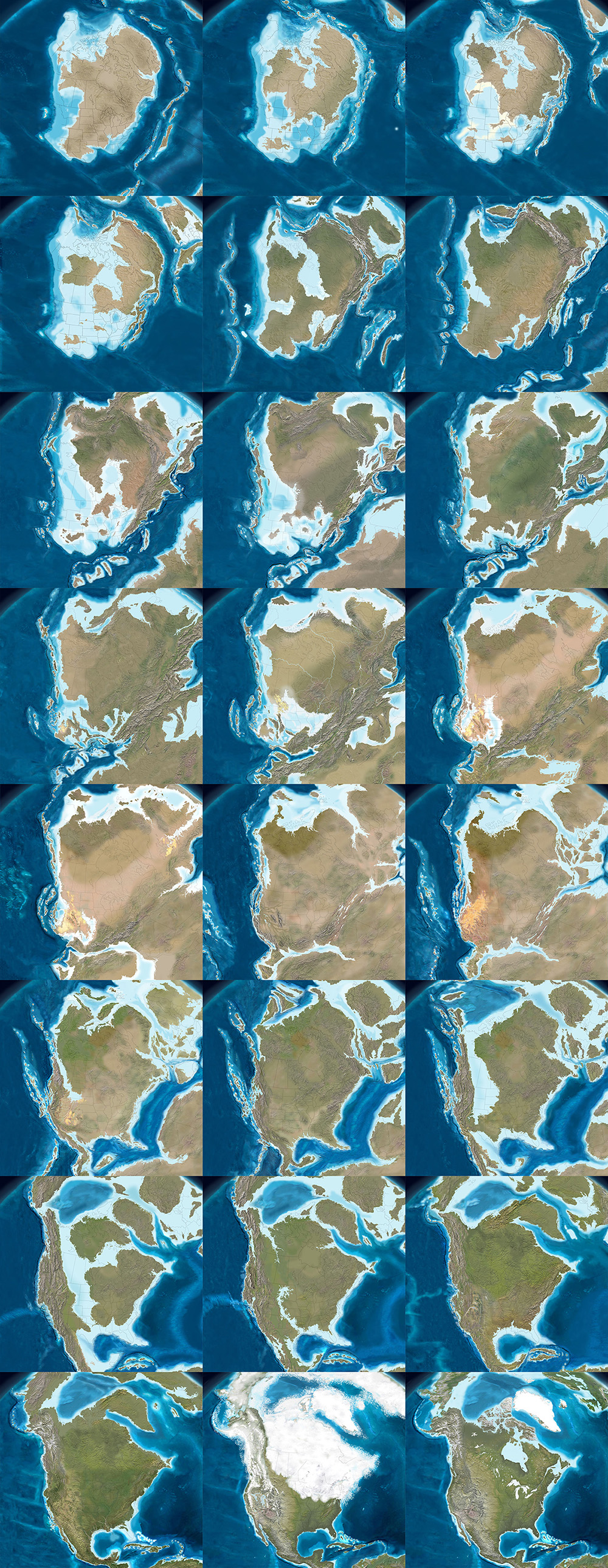
The paleo-tectonic maps of retired geologist Ronald Blakey are mesmerizing and impossible to forget once you’ve seen them. Catalogued on his website Colorado Plateau Geosystems, these maps show the world adrift, its landscapes breaking apart and reconnecting again in entirely new forms, where continents are as temporary as the island chains that regularly smash together to create them, on a timescale where even oceans that exist for tens of millions of years can disappear leaving only the subtlest of geological traces.

With a particular emphasis on North America and the U.S. Southwest—where Blakey still lives, in Flagstaff, Arizona—these visually engaging reconstructions of the Earth’s distant past show how dynamic a planet we live on, and imply yet more, unrecognizable changes ahead.

The following images come from Ron Blakey‘s maps of the paleotectonic evolution of North America. The first map shows the land 510 million years ago, progressing from there—reading left to right, top to bottom—through the accretion and dissolution of Pangaea into the most recent Ice Age and, in the final image, North America in its present-day configuration.


As part of BLDGBLOG’s collaborative side-project, Venue, Nicola Twilley and I met with Blakey in his Flagstaff home to talk about the tectonic processes that make and remake the surface of the Earth, the difficulty in representing these changes with both scientific accuracy and visual panache, and the specific satellite images and software tools he uses to create his unique brand of deep-time cartography.

Like film stills from a 600-million year-old blockbuster, Blakey’s maps take us back to the Precambrian—but there are much older eras still, stretching unmapped into far earlier continents and seas, and there are many more billions of years of continental evolution to come. Blakey talked us through some of the most complex changes in recent geological history, including the opening of the North Atlantic Ocean, and he allowed himself to speculate, albeit briefly, about where Earth’s continental crust might yet be headed (including a possible supercontinent in the Antarctic).

Many of Blakey’s maps are collected in the book Ancient Landscapes of the Colorado Plateau, written with Wayne Ranney, where Blakey also describes some of the research and methods that went into producing them. Blakey also contributed to the recent, new edition of a textbook by Wolfgang Frisch and Martin Meschede, Plate Tectonics: Continental Drift and Mountain Building, a thorough exploration of landscapes disassembling and colliding over vast spans of time.

• • •

[Image: The west coast of North America, depicted as it would have been 130 million years ago; the coast is a labyrinth of islands, lagoons, and peninsulas slowly colliding with the mainland to form the mountains and valleys we know today. Map by Ron Blakey].
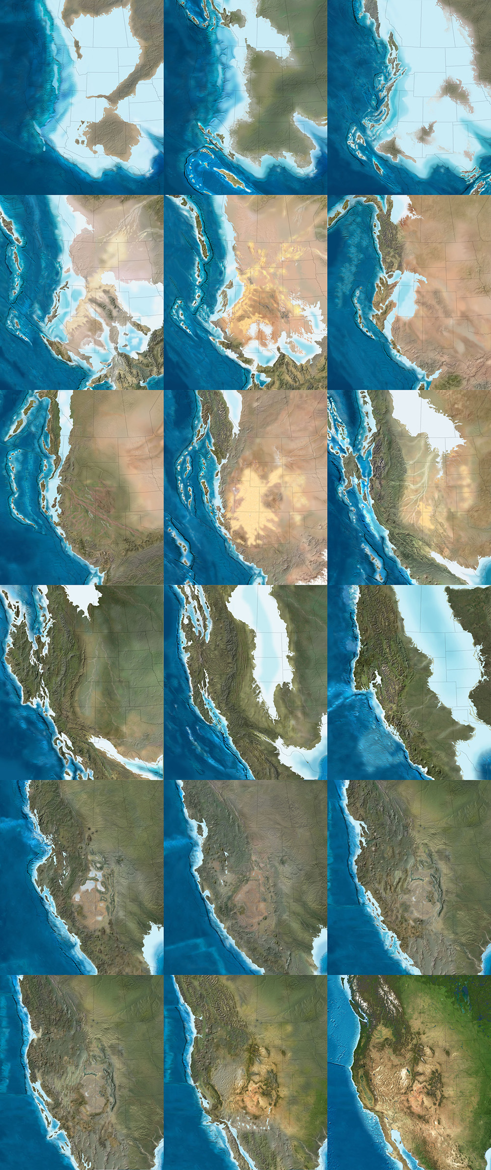
Geoff Manaugh: When I first discovered your maps showing the gradual tectonic re-location of the continents over hundreds of millions of years, I thought this was exactly what geologists should be doing: offering clear, step-by-step visual narratives of the evolution of the earth’s surface so that people can better understand the planet we live on. What inspired you to make the maps, and how did you first got started with them?

Ronald Blakey: Well, the very first maps I made were in conjunction with my doctoral thesis, back in the early 1970s. Those were made with pen and ink. I made sketches to show what the paleogeography would have looked like for the specific formation I was studying with my doctorate. Three or four of those maps went into the thesis, which was then published by the Utah Geologic Survey. I’ve also done a number of papers over the years where I’ve made sketches.

But I was late getting into the computer. Basically, during my graduate work I never used a computer for anything. I kind of resisted it, because, for the kind of work I was doing, I just didn’t see a need for it—I didn’t do quantifiable kinds of things. Then, of course, along comes email and the Internet. I actually forget when I first started with Photoshop—probably in the mid-1990s. When I found that, I just thought, wow: the power of this is incredible. I quickly learned how to use the cloning tool, so that I could clone modern topography onto ancient maps, and that made things even simpler yet.

Another thing I started doing was putting these maps into presentations. There were something like five different programs back there, in the late 90s, but the only one that survived was PowerPoint—which is too bad, because it was far from the best of the programs. I was using a program called Astound, which was far superior, particularly in the transitions between screens. I could do simple animations. I could make the tectonic plates move, create mountain belts, and so forth.

I retired in May of 2009, but all of my early maps are now online. With each generation of maps that I’ve done, there has been a noted improvement over earlier maps. I find new techniques and, when you work with Photoshop as much as I do, you learn new ideas and you find ways to make things that were a little clumsy look more smooth.

Manaugh: Where does the data come from?

Blakey: It comes from various publications. You can get a publication and have that PDF open, showing what something looked like in the past, and work from that. Usually, what I’m working from are fairly simple sketches published in the literature. They’ll show a subduction zone and a series of violent arcs, or a collision zone. What I do is take this information and make it more pictorial.

If you create a series of maps in sequence, you can create them in such a way that certain geologic events, from one time slice to the next, to the next, to the next, will blend. It depends a lot on the scale of what you’re trying to show—the whole world versus just four or five states in the West.

Now, throughout the years from, let’s say, 2004 until I retired in 2009, I kept improving the website. I envisioned most of this as educational material, and I didn’t pay much attention to who used it, how they used it, and so forth. But, then, shortly before I retired, various book companies and museums—and, most recently, oil companies—have approached me. So I started selling these and I tried very diligently not to allow this to overlap with what I was doing for my teaching and my research at the University.

In the following long sequence of images, we see the evolution of the west coast of North America, its state boundaries ghosted in for reference. Sea levels rise and fall; island chains emerge and collide; mountains form; inland seas proliferate and drain; and, eventually, modern day California, Vancouver Island, and the Baja peninsula take shape, among other recognizable features. The time frame represented by these images is approximately 500 million years. All maps by Ron Blakey.


Nicola Twilley: What do the oil companies want them for?

Blakey: They’re my biggest customers now. Usually, the geologists at oil companies are working with people who know either much less geology than they do or, in some cases, almost no geology at all, yet they’re trying to convince these people that this is where they need to explore, or this is what they need to do next.

They find these maps very useful to show what the Devonian of North Dakota looked like, for example, which is a hot spot right now with all the shales that they’re developing in the Williston Basin. What they like is that I show what the area might have really looked like. This helps, particularly with people who have only a modest understanding of geology, particularly the geologic past.

Manaugh: What have been some of the most difficult regions or geological eras to map?

Blakey: The most difficult thing to depict is back in the Paleozoic and the Mesozoic. Large areas of the continent were flooded, deep into the interior.

During certain periods, like the Ordovician, the Devonian, and parts of the Jurassic—especially the Cretaceous—as much as two-thirds of the continents were underwater. But they’re still continents; they’re still continental crusts. They’re not oceans. The sea level was just high enough, with respect to where the landscape was at the time, that the area was flooded. Of course, this is a concept that non-geologists really have problems with, because they don’t understand the processes of how continents get uplifted and subside and erode and so forth, but this is one of the concepts that my maps show quite nicely: the seas coming in and retreating.

But it’s very difficult—I mean, there is no modern analog for a seaway that stretched from the Mackenzie River Delta in Canada to the Gulf of Mexico and that was 400 miles wide. There’s nothing like that on Earth today. But the styles of mountains have not dramatically changed over the last probably two billion years—maybe even longer than that. I don’t go back that far—I tend to stick with the last 600 million years or so—but the styles of mountains haven’t changed. The nature of island arcs hasn’t changed, as far as we know.

What has changed is the amount of vegetation on the landscape. My maps that are in the early part of the Paleozoic—the Cambrian and the Ordovician early part of the Silurian—tend to be drab-colored. Then, in the late Silurian and in the Devonian, when the land plants developed, I start bringing vegetation colors in. I try to show the broad patterns of climate. Not in detail, of course—there’s a lot of controversy about certain paleoclimates. But, basically, paleoclimates follow the same kinds of regimens that the modern climates are following: where the oceans are, where the equator is, where the mountain ranges are, and so forth.

That means you can make broad predictions about what a paleoclimate would have been based on its relationship to the equator or based on the presence or absence of nearby mountains. I use these kinds of principles to show more arid areas versus more humid areas.

The next three sequences show the evolution of the Earth’s surface in reverse, from the present day to, at the very bottom, 600 million years ago, when nearly all of the planet’s landmasses were joined together in the Antarctic. The first sequence shows roughly 90 million years of backward evolution, the continents pulling apart from one another and beginning a slow drift south. They were mapped using the Mollweide projection, and, in all cases, are by Ron Blakey.


Twilley: And you paint the arid area based on a contemporary analog?

Blakey: Right. I know the modern world reasonably well and I’ll choose something today that might have matched the texture and aridity of that older landscape.

I use a program called GeoMapApp that gives me digital elevation maps for anywhere in the world. Most recently, they have coupled it with what they call the “Blue Marble.” NASA has stitched together a bunch of satellite photos of the world in such a way that you can’t tell where one series of photos come in or another. It’s a fairly true-color representation of what Earth would look like from space. So this Blue Marble is coupled with the GeoMapApp’s digital elevation topography; you put the Blue Marble over it, and you use a little slider to let the topography show through, and it gives you a fairly realistic looking picture of what you’re looking for.

For example, if I’m working with a mountain range in the southern Appalachians for a Devonian map—well, the southern Appalachians, during the Devonian, were probably far enough away from the equator that it was in the arid belt. There are some indications of that, as well—salt deposits in the Michigan Basin and in parts of New York and so forth. Plus, there are red-colored sediments, which don’t prove but tend to indicate arid environments. This combination tells me that this part of the world was fairly arid. So I’m going to places like modern Afghanistan, extreme western China, northern Turkey, or other places where there are somewhat arid climates with mountain belts today. Then I clone the mountains from there and put them in the map.

But you have to know the geologic background. You have to know how the mountains were formed, what the grain of the mountains was. That’s not always easy, although there are ways of doing it. To know the grain of the mountains, you need to know where the hinterland and the center of the mountains were. You need to know where the foreland area is, so that you can show the different styles of mountains. You have to move from foreland areas—which tends to be a series of parallel ridges, usually much lower than the hinterlands—to the center and beyond.

I use this kind of information to pick the right kind of modern mountain to put back in the Devonian, based on what that Devonian landscape probably had a good chance of looking like. Do we know for certain? Of course not. We weren’t around in the Devonian. But we have a good rock record and we have a lot of information; so we use that information and, then, voilà.

To give another example, let’s look at the Devonian period of the east coast. The big European continent that we call Baltica collided with Greenland and a series of micro-continents collided further south, all the way down at least as far as New Jersey, if not down as far the Carolinas. We know that there are places on Earth today where these same kinds of collisions are taking place—in the Alps and Mediterranean region, and the Caucasus region, and so forth.

We can use the concept that, if two plates are colliding today to produce the Caucasus mountains, and if we look at the style of mountains that the Caucasus are, then it’s reasonable to think that, where Greenland and Baltica collided in the Silurian and the Devonian, the mountains would have had a similar style. So we can map that.

This second sequence shows the continents drifting apart, in reverse, from 105 million years ago to 240 million years ago. They were mapped using the Mollweide projection, and, in all cases, are by Ron Blakey.


Manaugh: That collision alone—Baltica and Greenland—sounds like something that would be extremely difficult to map.

Blakey: Absolutely. And it’s not a one-to-one relationship. You have to look at the whole pattern of how the plates collided, how big the plates were, and so forth.

Then there’s the question of the different histories of particular plates. So, for example, most of Scotland started out as North America. Then, when all the continents collided to form Pangaea, the first collisions took place in the Silurian-Devonian and the final collisions took place in the Pennsylvanian-Permian. By, say, 250 million years ago, most of the continents were together. Then, when they started to split apart in the Triassic and Jurassic—especially in the Triassic and Cretaceous—the split occurred in such a way that what had been part of North America was actually captured, if you will, by Europe and taken over to become the British Isles.

Scotland and at least the northern half of Ireland were captured and began to drift with Europe. On the other hand, North America picked up Florida—which used to be part of Gondwana—and so forth.

One of the things that is interesting is the way that, when mountains come together and then finally break up, they usually don’t break up the same way that they came together. Sometimes they do, but it has to do with weaknesses, stress patterns, and things like this. Obviously, all time is extremely relative, but mountains don’t last that long. A given mountain range that’s been formed by a simple collision—not that there’s any such thing as a simple collision—once that collision is over with, 40 or 50 million years after that event, there is only low-lying landscape. It may have even have split apart already into a new ocean basin.

But here’s the important part: the structure that was created by that collision is still there, even though the mountains have been worn down. It’s like when you cut a piece of wood: the grain is still inherited from when that tree grew. The pattern of the grain still shows where the branches were, and the direction of the tree’s growth in response to wind and sun and its neighbors. You can’t reconstruct the tree exactly from its grain, but, if you’re an expert with wood, you should be able to look and say: here are the tree rings, and here’s a year where the tree grew fast, here’s a year where the tree grew slow, here’s where the tree grew branches, etc.

In a sense, as geologists, we’re doing the same things with rock structure. We can tell by the pattern of how the rocks are deformed which direction the forces came from. With mountains, you can tell the angle at which the plates collided. It’s usually very oblique. What that tends to do is complicate the geologic structure, because you not only get things moving one way, but you get things dragging the other way, as well. But we can usually tell the angle at which the plates hit.

Then, in many cases, based upon the nature of how the crust has been deformed and stacked up, we can tell the severity of the mountain range. It doesn’t necessarily mean that we can say: oh, this structure would have been a twenty-thousand-foot high mountain range. It’s not that simple at all, not least of which because rocks can deform pretty severely without making towering mountains.

This final of the three global sequences shows the continents drifting apart, in reverse, from 260 million years ago to 600 million years ago. There was still nearly 4 billion years of tectonic evolution prior to where these maps begin. They were mapped using the Mollweide projection, and, in all cases, are by Ron Blakey.


Manaugh: Are you able to project these same tectonic movements and geological processes into the future and show what the earth might look like in, say, 250 million years?

Blakey: I’ve had a number of people ask me about that, so I did make some global maps. I think I made six of them at about 50-million-year intervals. For the fifteen to 100-million-year range, I think you can say they are fairly realistic. But, once you get much past 75 to 100 million years, it starts to get really, really speculative. The plates do strange things. I’ll give you just a couple of quick examples.

The Atlantic Ocean opened in the beginning of the Jurassic. The actual opening probably started off the coasts of roughly what is now Connecticut down to the Carolinas. That’s where the first opening started. So the central part of the Atlantic was the first part to open up. It opened up reasonably simply—but, again, I’m using the word simple with caution here.

The north Atlantic, meanwhile, didn’t open up until about 60 to 50 million years ago. When it opened up, it did a bunch of strange things. The first opening took place between Britain and an offshore bank that’s mostly submerged, called Rockall. Rockall is out in the Atlantic Ocean, northwest of Ireland—near Iceland—but it’s continental crust. That splitting process went on for, let’s say, ten million years or so—I’m just going to talk in broad terms—as the ocean started opening up.

Then the whole thing jumped. A second opening began over between Greenland and North America, as Greenland and North America began to separate off. That lasted for a good 40 or 50 million years. That’s where you now get the Labrador Sea; that is actual ocean crust. So that was the Atlantic Ocean for thirty or forty million years—but then it jumped again, this time over between Greenland and what is now the west coast of Europe. It started opening up over there, before it jumped yet again. There’s an island in the middle of the North Atlantic, way the heck up there, called Jan Mayen. At one time, it was actually part of Greenland. The Atlantic opened between it and Greenland and then shifted to the other side and made its final opening.

The following two sequences show the evolution of Europe from an Antarctic archipelago to a tropical island chain to the present day Europe we know and recognize. The first sequence starts roughly 450 million years ago and continues to the Jurassic, 200 million years ago. All maps by Ron Blakey.


So it’s very complicated. And that’s just the Atlantic Ocean.

The Northern Atlantic took at least five different paths before the final path was established, and it’s all still changing. In fact, the south Atlantic is actually even worse; it’s an even bigger mess. You’ve got multiple openings between southwest Africa and Argentina, plus Antarctica was up in there before it pulled away to the south.

These complications are what makes this stuff so interesting. If we look at events that we can understand pretty well over the last, let’s say, 150 or 200 million years of time—where we have a good indication of where the oceans were because we still have ocean crusts of that age—then we can extrapolate from that back to past times when oceans were created and destroyed. We can follow the rules that are going on today to see all of the oddities and the exceptions and so forth.

These are the kinds of things I try to keep track of when I’m making these maps. I’m always asking: what do we know? Was it a simple pull-apart process? There are examples where continents started to split across from one another, then came back together, then re-split in a different spot later on. That’s not just speculation—there is geologic evidence for this in the rock record.

So, when it comes to extrapolating future geologies, things become very complicated very quickly. If you start thinking about the behavior of the north Atlantic, creating a projection based on what’s going on today seems, at first, like a fairly simple chore. North America is going on a northwesterly path at only one or two centimeters a year. Europe is moving away, at almost a right angle, at about another centimeter a year. So the Atlantic is only opening at three centimeters a year; it’s one of the slowest-opening oceans right now.

OK, fine—but what else is happening? The Caribbean is pushing up into the Atlantic and, off South America, there is the Scotia Arc. Both of those are growing. They’ve also identified what looks like a new island arc off the western Mediterranean region; that eventually would start to close the Atlantic in that area. Now you start to speculate: well, these arcs will start to grow, and they’ll start to eat into the oceans, and subduct the crusts, and so forth.

Again, for the first 50, 75, or even 100 million years, you can say that these particular movements are fairly likely. But, once you get past that, you can still use geologic principles, but you’re just speculating as to which way the continents are going to go.

For instance, the one continent that does not seem to be moving at all right now, relative to anything else, is Antarctica. It seems to be really fixed on the South Pole. That’s why some people think that everything will actually coagulate back towards the South Pole. However, there are also a bunch of subduction zones today along southern Asia, and those are pretty strong subduction zones. Those are the ones that created the big tsunami, and all the earthquakes off of Indonesia and so forth. Eventually, those could pull either parts of Antarctica or all of Antarctica up toward them.

But I’m more interested in reconstructing the past than I am the future, so I’ve only played around with those five or six maps.

This second sequence, showing the next phase in the evolution of Europe, begins approximately 150 million years ago and extends to the present day. All maps by Ron Blakey.


Manaugh: To ground things a bit, we’re having this conversation in Flagstaff, on the Colorado Plateau, which seems like a great place to teach geology. I wonder whether there might be another Colorado Plateau, so to speak, elsewhere in the world—something geologically similar to the extraordinary landscapes we see here that just hasn’t had the chance to emerge. Maybe the tectonics aren’t right, and it’s still just a crack, rather than a canyon, or maybe it’s covered in vegetation or ice so we can’t see it yet. Conversely, I’m curious if you might have found evidence of other great geological districts in the earth’s past—lost Grand Canyons, other Arches National Parks—that have been lost to time. How could we detect those, and where are they?

Blakey: This is indeed a great place to teach geology. It’s a great place to live.

As for Colorado Plateau analogs—it’s an interesting question. There’s an area in South America that I’d say is fairly similar. It’s got a couple of famous national parks that I can’t remember the name of. It’s a smaller version, but it’s very similar to the Colorado Plateau. It’s between the Andes and the Amazon basin, part of the general pampas region there of South America. It even has similarly aged rocks. Parts of northern Africa would also be similar.

But you have to look at all the characteristics of the Plateau. Number one: the rocks are flat. Number two: the rocks have been uplifted. Number three: the rocks are dissected by a major river system. Number four: it’s a semi-arid climate. There are probably five or six defining characteristics in total, and I’ve heard many people say that there is no other place else on Earth that has all those characteristics in exactly the same way. But I went to an area in eastern Mauritania many years ago, where, for all the world, it looked like the Grand Canyon. It wasn’t as colorful, but it was a big, deep canyon.

In fact, the Appalachian Plateau would be somewhat similar, except it’s in a humid climate, which means the land has been shaped and formed differently. But the Appalachian plateau has flat-lying rocks; it’s dissected by some major rivers; it’s experienced uplift; and so forth.

The next two sequences of images, followed from left to right, top to bottom, illustrate the gradual evolution of the Colorado Plateau, where, in its modern day incarnation, this interview with Ron Blakey took place (specifically, in Flagstaff, Arizona. The earliest map included here depicts the Proterozoic; the first sequence ends in the Triassic. All maps by Ron Blakey.


Twilley: I’m interested in the representational challenges you face when you decide to make a map, and, specifically, when you’re in Photoshop, what your most-used tools might be. I thought it was fascinating when you said that the cloning tool really changed how you make geological maps. What other techniques are important to you, in order to represent geological histories?

Blakey: Oh, the cloning tool is the most important, by far—at least when I’m actually painting. Of course, I use the outline tool to select areas, but, when I’m actually painting, it would be impossible to paint these different maps pixel by pixel. I couldn’t do it. Occasionally, I will actually hand-draw some things in the flatlands, where I want to put a river system, for example, but, at least for mountains and rugged terrain, I clone everything.

Some times, I’ll cut and paste. I’ll select an area in the GeoMapApp, I save it as a JPEG, and then I can select it and copy it and paste it in, and I can rotate and deform it a little bit. Are you familiar with the warp tool in Photoshop? I use that a lot, because you can change the shape of mountains a little. If you do it too dramatically, it really looks flaky. But, if you do it right, it still looks pretty realistic.

This second sequence, also showing the evolution of the Colorado Plateau, begins with the Triassic and ends roughly 5 million years ago—basically the present day, in geological terms. All maps by Ron Blakey.


Twilley: And do you have certain filters you rely on for particular geological effects?

Blakey: A little bit. I like to use the craquelure filter. It actually gives you little bumps and valleys and so forth. I use that especially for continental margins. Continental margins are anything but regular slopes, going down to the abyssal depths. They’re very irregular. There are landslides and all kinds of things going on there at the margins, so I add a little texture with craquelure.

It can be difficult to use, though, and it doesn’t work at really high resolutions—so, what I actually have to do some times, is that I will actually copy a part of my map, take it out, make it smaller, do the craquelure on it, and then blow it back up and paste it in again.

[Image: A painting by Ron Blakey depicts a geological landscape near Sedona, Arizona].

Dee Blakey, Ron’s Wife: I think the other reason that he can do what he does is that he paints. That’s one of his paintings over there. [gestures above fireplace]

Blakey: Well, I guess I should have said that right away, when you asked me why I got interested in this, because I am interested in the artistic aspect of geology. The artistic aspect of science, in general, but especially geology. Astronomy, for example, would be another field where artistic visualizations are useful—any time you’re trying to show things that can’t easily be visualized with something comparable here on present-day planet Earth, you have to use an artistic interpretation.

Anyway, I can’t explain it, but I understand color pretty well. I use the hue saturation tool a lot. I’ll select an area and then I’ll feather it, let’s say, because you don’t want the edges to be sharp. I’ll feather it by thirty, forty, fifty pixels. Then I’ll take the slider for hue saturation, where, if you go to the left, you make things redder and, if you go to the right, you make things greener. If I’ve got a landscape that looks a little too humid, I’ll just slide it slightly to the left to make it a bit redder. You can also change the lightness and darkness when you do that. There’s also regular saturation. By killing the saturation, you can really kill the nature of a landscape quite a bit.

And I use hue saturation a lot. That took me a long time to master, because it’s really easy to screw things up with that tool. You start sliding things a little too far and, whoa—wait a minute! All of a sudden, you’ve got purple mountains.

• • •

For more Venue interviews, be sure to stop by the Venue website.

Captive America: An Interview with Alyse Emdur

[Image: Prison Visiting Room Backdrop, Woodbourne Correctional Facility, New York; photograph by Alyse Emdur].
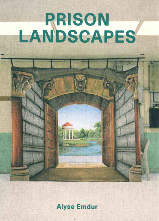
Earlier this year, Venue published an interview with Los Angeles-based photographer Alyse Emdur discussing her project Prison Landscapes. I thought Emdur’s work—a look at the unexpected landscape paintings used as photographic backdrops in prison waiting rooms throughout the United States—deserved a second look, so I am re-posting the interview here.

Venue, of course, is a joint project between BLDGBLOG and Nicola Twilley of Edible Geography, and it is supported by the Nevada Museum of Art‘s Center for Art + Environment.

The full interview, along with its original introduction, appears below.

[Image: Prison Landscapes, published January 2013 by Four Corners Books].

Some of the most unsettling examples of contemporary landscape painting in the United States are to be found in its prison visiting rooms, where they function as visual backdrops for family photographs.

[Image: James Bowlin, United States Penitentiary, Marion, Illinois; photograph courtesy Alyse Emdur. Note the fake trout].
Ranging in subject matter from picturesque waterfalls to urban streetscapes, and from ski resorts to medieval castles, these large-format paintings serve a dual purpose: for the authorities, they help to restrict photography of sensitive prison facilities; for the prisoners and their families, they are an escapist fiction, constructing an alternate reality for later display on fridge doors and mantlepieces.

With nearly 2.3 million Americans in prison today—an astonishing one out of every hundred adults in the United States, according to a 2008 Pew study (PDF)—this school of landscape art is critically overlooked but has a mass-market penetration comparable to the work of Thomas Kinkade. And, like Kinkade’s work, these backdrops—which are usually painted by talented, self-taught inmates—are simultaneously photo-realistic and highly idealized. Cumulatively, they represent a catalog of imagined utopias: scenes from an abstracted and perfect elsewhere, painted from behind bars.

[Image: Prison Visiting Room Backdrop, Shawangunk Correctional Facility, New York; photograph by Alyse Emdur. Unlike the family portraits, Emdur’s own large-format photographs deliberately show the prison context that surrounds the backdrop landscape, for an unsettling contrast].

Several years ago, artist Alyse Emdur was looking through a family album when she came across a photo of herself as a little girl, posing in front of a tropical beach scene while visiting her elder brother in prison. She spent the next few years exploring this surprising body of vernacular landscape imagery, tracking down examples across the United States.

[Image: Emdur family photo in front of prison visiting room backdrop; photograph courtesy Alyse Emdur].
At first, she wrote to prison administrators to ask permission to photograph the backdrops herself—a request that was inevitably firmly denied. Instead, she joined prisoner pen-pal sites, asking inmates to send her pictures of themselves posed in front of their prison’s backdrops; through this method, Emdur eventually assembling several hundred photos and more than sixteen binders full of correspondence. Finally, in summer 2011, she gained permission to visit and photograph several prison visiting room backdrops herself.

[Image: Michael Parker and Geoff Manaugh looking at Alyse Emdur‘s correspondence and work in Emdur’s studio space; photograph by Venue].

Venue visited Emdur’s studio in downtown Los Angeles in the summer of 2012, as she was collecting all this material for a book, Prison Landscapes, published in January 2013 by Four Corners Books. After a studio tour conducted by her partner, artist Michael Parker, we followed up with Emdur by phone: the edited transcript of our conversation follows.

• • •

[Image: Alyse Emdur‘s large-format photographs of prison visiting room backdrops on her studio walls; photograph by Venue].

Nicola Twilley: From the hundreds of photographs that prisoners sent you, as well as the ten or so backdrops that you were able to photograph yourself, it seems as though there is almost a set list of subject matter: glittering cityscapes, scenes of natural landscapes, like beaches and sunsets, and then historical or fantasy architecture, such as medieval castles. Did you notice any patterns or geographic specificity to these variations in subject matter?

Alyse Emdur: You do see some regional realism—so, prisons in Washington State will have evergreen trees in their backdrops, prisons in Florida will have white sand beaches, and prisons in Louisiana will have New Orleans French Quarter-style features. There’s also the question of where the prisoners are from: one thing that I’ve observed is that in upstate New York, for example, many of the prisoners are actually from New York City, so many of the backdrops in upstate New York prisons show New York City skylines.

Fantastical scenes are actually much less common—from what I gather from my correspondence, realism is like gold in prison. That’s the form of artistic expression that’s most appreciated and most respected, so that’s often the goal for the backdrop painter.

[Image: Brandon Jones, United States Penitentiary, Marion, Illinois; photograph courtesy Alyse Emdur].

Twilley: Do you have a sense of how you get to be a backdrop painter—do inmates chose amongst themselves or do the prison authorities just make a selection? And, on a similar note, how much artistic freedom does the backdrop painter actually have, in terms of needing approval of his or her subject matter from fellow inmates or the authorities?

Emdur: That’s one of the questions that I’ve asked of all the backdrop painters who I’ve been in touch with over the years. The answer is always that if you are a “good artist” in prison, then you’re very well-respected within the prison—people in the prison all know you. You’ll be making greeting cards for people or you’ll be doing hand calligraphy for love letters for friends in prison—you’ll be known for your skills. The prison administration is already aware of the respected artists, because they shine within the culture, and so they are usually the ones that are chosen. And when you’re chosen, it’s a huge honor.

[Image: Genesis Asiatic, Powhatan Correctional Center, Statefarm, Virginia; photograph courtesy Alyse Emdur].
Something to keep in mind, though, is that backdrops do get painted over. In some prisons, the backdrop can change a few times a year.

One of the artists I’ve kept in touch with is Darrell Van Mastrigt—I interviewed him for the book, and he painted a backdrop for me that was in my thesis show. In the prison that he’s in, the portrait studios are organized by the NAACP. He said that the NAACP had seen his paintings in the past, and when they selected him, they gave him creative control over what sort of landscape he chose to paint.

Obviously, there are some rules. The main restriction is that you can’t use certain colors that are affiliated with gangs. So, for instance, Darrell painted a mural with two cars and they had to be green and purple—they couldn’t be red or blue. But, from what Darrell has told me and from what I understand from other painters, they don’t get much input from other prisoners. At the same time, they’re very conscious of wanting to please people and maintain their status within the prison, of course, and they get a lot of pleasure out of doing something positive for families in the visiting room.

One of sixteen binders full of letters and prisoner portraits mailed to Emdur; photograph by Venue].
Another interesting thing a painter told me was that she was very conscious of not wanting to do a specific, recognizable cityscape, because she knew that not everyone in the prison was from the city. So she deliberately tried to paint a more abstract landscape that she thought anyone could relate to. And a lot of imagery they work from is from books in the prison library, rather than just their memories.

Twilley: In some of the photographs you were sent, the prisoners are in front of off-the-shelf printed backdrops—some offering multiple pull-down choices—rather than hand-painted ones. Are these standardized commercial backdrops gradually replacing the inmate-produced landscapes?

Emdur: The backdrop-painting tradition is definitely still vibrant and strong, but my sense is that these store-bought backdrops are becoming more and more common.

For one thing, the hand-painted backdrops are not always as realistic as a photograph, and, often, the prisoners and their families are looking to create the illusion that they really are somewhere else. So, the more realistic, the better. When I went to photograph a backdrop in one New York State prison, I found an amazing hand-painted mural of a New York City skyscraper with a cartoon-like Statue of Liberty in front—she almost looked alive. But it had been completely covered up by a pull-down, store-bought, photographic backdrop of the New York City skyline. I tried to photograph the backdrop in Fort Dix Federal Prison in New Jersey and they told me that they had just painted over the hand-painted backdrop and replaced it with a commercial photography backdrop.

[Image: Small prints of Emdur‘s backdrop photographs on her studio wall, alongside a few examples of her extensive collection of self-help books; photograph by Venue. Note the hand-painted cityscape featuring the Statue of Liberty on the left].

Of course, another thing is that it’s easier to buy a backdrop than it is to engage with a prisoner, you know? And attitudes vary from prison to prison. In some prisons, you’ll find murals throughout the facility, not just in the visiting rooms. I went on a tour of a privately-operated women’s prison in Florida, for instance, that lasted four hours because there were paintings everywhere—in all the hallways, dorm rooms, and offices. The PR person who assisted me on that tour explained that having prisoners paint murals is really a way to keep them busy and out of trouble, so they saw it as a really positive activity.

Of course, I see these paintings as a way for people in prison to temporarily escape the architecture and culture of confinement, and that’s what makes them so important for me.

[Image: Antoine Ealy, Federal Correctional Complex, Coleman, Florida; photograph courtesy Alyse Emdur].

Twilley: There’s an uncomfortable overlap between the escapism of the landscapes and then the other purpose of the backdrops, which is to not allow photographs of the prison interior to get out.

Emdur: Yes—I found that really concerning. The prison administration either thinks that photographs of the interior of the prison could help inmates escape or, at the very least, the administrators are trying to control the imagery of the prison that reaches the outside world.

During my research, I’ve been trying to figure out how long these kinds of backdrops have been used. From prison administrators to PR people to wardens and prisoners, everyone told me they don’t even remember—these kinds of painted backdrops have been used in visiting rooms for as long as they can remember. I’ve spoken to a sixty-five-year-old warden who just said, “You know, they’ve been here longer than I have.”

[Image: Robert RuffBey, United States Penitentiary, Atlanta, Georgia; photograph courtesy Alyse Emdur].

I do know that at some point in the last twenty years, companies came along that would charge inmates to substitute in a different backdrop. If you’re a prisoner and you have a photograph of yourself or yourself and your kids in front of the painted backdrop in the visiting room, then you could send your photograph to one of these companies and they would take out the painting and then put in a Photoshop background. That’s not very common at all, but it’s pretty bizarre—one fake landscape being replaced by another.

Going along with that is the replacement of Polaroid with digital photography. All these portraits were Polaroid up until the last five to ten years, I would say. Some prisons still use Polaroids, but from what I gather, it’s basically all digital now.

[Image: One of sixteen binders full of letters and prisoner portraits mailed to Emdur; photograph by Venue].

One thing to remember is that all the prisons have slightly different rules and they all organize their prison portrait programs differently. In most state and federal prisons in America, the only place where a prisoner can be photographed is in front of these backdrops, and the only time they can be photographed in front of the backdrops is when they have a visitor—but, then, there are all these exceptions.

At some prisons, for instance, you can get your picture taken at special events, like graduations or holiday parties. Then, some prisons have murals elsewhere in the prison, not in the visiting room, that you can sign up once a month or something to have your picture taken in front of.

[Image: Kimberly Buntyn, Valley State Prison for Women, Chowchilla, California; photograph courtesy Alyse Emdur].

This question of the kinds of images of prisons that are allowed out is quite interesting. In fact, I’m working with a photographer who’s been in prison for almost 30 years in Michigan, on what I think will be my next book. In the 1970s and 80s, he ran the photo lab in Jackson Prison, and he was in charge of developing and printing all the inmates’ photographs. At that time, the rules of photography were very different in prison—there just weren’t as many rules, basically. This guy has hundreds of photographs from all over Jackson State Prison.

It’s just fascinating to see the differences between these very staged and framed visiting room portraits and the reality of the prison as seen through this guy’s eyes—through an insider’s eyes. I think his situation was extremely rare when it happened, but today it’s totally unheard of. The majority of photographs that come out of prisons today are these visiting room portraits. I suppose some prisoners are smuggling cell phones with cameras into prison, but those images aren’t easy to find!

[Images: Sixteen binders’ worth of letters and prisoner portraits have been mailed to Emdur over the course of her project; photographs by Venue. Several of Emdur‘s pen-pals adopted the so-called “prison pose“—a low crouch—while others incorporated props or flexed their muscles].
Geoff Manaugh: Both Nicky and I were amazed by the amount of correspondence you’ve gathered in the process of researching these backdrops—binder after binder organized and shelved in your studio—but I can’t imagine that it’s been easy to edit it all down into a book, or to get releases from all the prisoners, for example. How has that process worked?

Emdur: It’s been really tough. With 2.3 million Americans in prison today, just think how many of these portrait studio photographs there are circulating in family albums and frames all across the country. A big part of me wants to document more and more and more. But, for a book, I figured it was really important to step back a little bit and not go crazy, and instead try to focus and pull out the different genres of backdrops and the different poses and the stories.

In terms of the process of getting releases, that was a huge effort. As you know, I collected the images through contacting prisoners on pen-pal websites. I sent out something like 300 letters and about 150 inmates responded really quickly with photographs of themselves in front of these backdrops.

A lot of prisoners are looking for engagement with the outside world, so it was very easy to collect the images. The challenging thing was getting releases for publication. Tracking down people who’d been released was one thing. For minors, we wanted to get our release approvals from both the incarcerated parents and also from the non-incarcerated parents, and that really was challenging.

[Image: A binder of letters and prisoner portraits mailed to Emdur; photograph by Venue].

But, really, the most difficult thing for me about this project is just how emotionally challenging it is—how draining it is—to correspond with hundreds of people who have a very different reality than I have and live a very different life than I do and who don’t have the privileges that I would normally take for granted.

The relationship between the incarcerated and the free is a very complex relationship, and that’s something that I’m interested in showing in the book, and that I hope comes out in the correspondence.

• • •

For more Venue interviews, focusing on human interactions with the built, natural, and virtual environments, check out the Venue website in full.

Meanwhile, Michael Parker—the artist who showed us around the studio space he shares with Alyse Emdur—has some projects of his own worth checking out, in particular, his work Lineman, which documents, in film, photographs, and interviews, “an electrical lineman class at Los Angeles Trade-Technical College” where adult students learn “how to become power-pole technicians.”

Sim City: An Interview with Stone Librande

[Image: Screenshot of our own SimCity—called, for reasons that made sense at the time, We Are The Champignons—after three hours of game play].

(This interview was originally published on Venue).

In the nearly quarter-century since designer Will Wright launched the iconic urban planning computer game, SimCity, not only has the world’s population become majoritatively urban for the first time in human history, but interest in cities and their design has gone mainstream.

Once a byword for boring, city planning is now a hot topic, claimed by technology companies, economists, so-called “Supermayors,” and cultural institutions alike as the key to humanity’s future. Indeed, if we are to believe the hype, the city has become our species’ greatest triumph.

[Image: A shot from photographer Michael Wolf‘s extraordinary Architecture of Density series, newly available in hardcover].

In March 2013, the first new iteration of SimCity in a decade was launched, amidst a flurry of critical praise mingled with fan disappointment at Electronic Arts’ “always-online” digital rights management policy and repeated server failures.

A few weeks before the launch, Venue—BLDGBLOG’s ongoing collaboration with Edible Geography‘s Nicola Twilley, supported by the Nevada Museum of Art‘s Center for Art + Environment—had the opportunity to play the new SimCity at its Manhattan premiere, during which time we feverishly laid out curving roads and parks, drilled for oil while installing a token wind turbine, and tried to ignore our city’s residents’—known as Sims—complaints as their homes burned before we could afford to build a fire station.


We emerged three hours later, blinking and dazed, into the gleaming white and purple lights of Times Square, and were immediately struck by the intensity of abstraction required to translate such a complex, dynamic environment into a coherent game structure, and the assumptions and values embedded in that translation.

Fortunately, the game’s lead designer, Stone Librande, was happy to talk with us further about his research and decision-making process, as well as some of the ways in which real-world players have already surprised him. We spoke to him both in person and by telephone, and our conversation appears below.

• • •


Nicola Twilley: I thought I’d start by asking what sorts of sources you used to get ideas for SimCity, whether it be reading books, interviewing urban experts, or visiting different cities?

Stone Librande: From working on SimCity games in the past, we already have a library here with a lot of city planning books. Those were really good as a reference, but I found, personally, that the thing I was most attracted to was using Google Earth and Google Street View to go anywhere in the world and look down on real cities. I found it to be an extremely powerful way to understand the differences between cities and small towns in different regions.

Google has a tool in there that you can use to measure out how big things are. When I first started out, I used that a lot to investigate different cities. I’d bring up San Francisco and measure the parks and the streets, and then I’d go to my home town and measure it, to figure out how it differed and so on. My inspiration wasn’t really drawn from urban planning books; it was more from deconstructing the existing world.

Then I also really got into Netflix streaming documentaries. There is just so much good stuff there, and Netflix is good at suggesting things. That opened up a whole series of documentaries that I would watch almost every night after dinner. There were videos on water problems, oil problems, the food industry, manufacturing, sewage systems, and on and on—all sorts of things. Those covered a lot of different territory and were really enlightening to me.


Geoff Manaugh: While you were making those measurements of different real-world cities, did you discover any surprising patterns or spatial relationships?

Librande: Yes, definitely. I think the biggest one was the parking lots. When I started measuring out our local grocery store, which I don’t think of as being that big, I was blown away by how much more space was parking lot rather than actual store. That was kind of a problem, because we were originally just going to model real cities, but we quickly realized there were way too many parking lots in the real world and that our game was going to be really boring if it was proportional in terms of parking lots.

Manaugh: You would be making SimParkingLot, rather than SimCity.

Librande: [laughs] Exactly. So what we do in the game is that we just imagine they are underground. We do have parking lots in the game, and we do try to scale them—so, if you have a little grocery store, we’ll put six or seven parking spots on the side, and, if you have a big convention center or a big pro stadium, they’ll have what seem like really big lots—but they’re nowhere near what a real grocery store or pro stadium would have. We had to do the best we could do and still make the game look attractive.

[Image: Using the zoning tool for the city designed by We Are the Champignons].

Twilley: I’d love to hear more about the design process and how you went about testing different iterations. Did you storyboard narratives for possible cities and urban forms that you might want to include in the game?

Librande: The way the game is set up, it’s kind of infinite. What I mean by that is that you could play it so many different ways that it’s basically impossible to storyboard or have a defined set of narratives for how the player will play it.

[Images: Stone Librande’s storyboards for “Green City” and “Mining City” at the start of play].
Instead, what I did was that I came up with two extreme cases—around the office we call them “Berkeley” and “Pittsburgh,” or “Green City” and “Dirty City.” We said, if you are the kind of player who wants to make utopia—a city with wind power, solar power, lots of education and culture, and everything’s beautiful and green and low density—then this would be the path you would take in our game.

But then we made a parallel path for a really greedy player who just wants to make as much money as possible, and is just exploiting or even torturing their Sims. In that scenario, you’re not educating them; you’re just using them as slave labor to make money for your city. You put coal power plants in, you put dumps everywhere, and you don’t care about their health.

[Image: Stone Librande’s storyboard for “Green City” at mid-game].
I made a series of panels, showing those two cities from beginning to late stage, where everything falls apart. Then, later on, when we got to multiplayer, I joined those two diagrams together and said, “If both of these cities start working together, then they can actually solve each other’s problems.”

The idea was to set them up like bookends—these are the extremes of our game. A real player will do a thousand things that fall somewhere in between those extremes and create all sorts of weird combinations. We can’t predict all of that.

Basically, we figured that if we set the bookends, then we would at least understand the boundaries of what kind of art we need to build, and what kind of game play experiences we need to design for.

[Image: Stone Librande’s storyboard for “Mining City” at mid-game].

Twilley: In going through that process, did you discover things that you needed to change to make game play more gripping for either the dirty city or the clean city?

Librande: It was pretty straightforward to look at Pittsburgh, the dirty city, and understand why it was going to fail, but you have to try to understand why the clean one might fail, as well. If you have one city—one path—that always fails, and one that always succeeds, in a video game, that’s really bad design. Each path has to have its own unique problems.

What happened was that we just started to look at the two diagrams side-by-side, and we knew all the systems we wanted to support in our game—things like power, utilities, wealth levels, population numbers, and all that kind of stuff—and we basically divided them up.

We literally said: “Let’s put all of this on this side over in Pittsburgh and the rest of it over onto Berkeley.” That’s why, at the very end, when they join together, they are able to solve each other’s problems because, between the two of them, they have all the problems but they also have all the answers.

[Image: Stone Librande’s storyboard for the “Green City” and “Mining City” end-game symbiosis].

Twilley: One thing that struck me, after playing, was that you do incorporate a lot of different and complex systems in the game, both physical ones like water, and more abstract ones, like the economy. But—and this seems particularly surprising, given that one of your bookend cities was nicknamed Berkeley—the food system doesn’t come into the game at all. Why not?

Librande: Food isn’t in the game, but it’s not that we didn’t think about it—it just became a scoping issue. The early design actually did call for agriculture and food systems, but, as part of the natural process of creating a video game, or any situation where you have deadlines and budgets that you have to meet, we had to make the decision that it was going to be one of the things that the Sims take care of on their own, and that the Mayor—that is, the player—has nothing to do with it.

I watched some amazing food system documentaries, though, so it was really kind of sad to not include any of that in the game.

[Image: Data layer showing ore deposits].

[Image: Data layer showing happiness levels. In SimCity, happiness is increased by wealth, good road connections, and public safety, and decreased by traffic jams and pollution].

Manaugh: Now that the game is out in the world, and because of the central, online hosting of all the games being played right now, I have to imagine that you are building up an incredible archive of all the decisions that different players have made and all the different kind of cities that people have built. I’m curious as to what you might be able to make or do with that kind of information. Are you mining it to see what kinds of mistakes people routinely make, or what sorts of urban forms are most popular? If so, is the audience for that information only in-house, for developing future versions of SimCity, or could you imagine sharing it with urban planners or real-life Mayors to offer an insight into popular urbanism?

Librande: It’s an interesting question. It’s hard to answer easily, though, because there are so many different ways players can play the game. The game was designed to cover as many different play patterns as we could think of, because our goal was to try to entertain as many of the different player demographics as we could.

So, there are what we call “hardcore players.” Primarily, they want to compete, so we give them leader boards and we give them incentives to show they are “better” than somebody else. We might say: “There’s a competition to have the most people in your city.” And they are just going to do whatever it takes to cram as many people into a city as possible, to show that they can win. Or there might be a competition to get the most rich people in your city, which requires a different strategy than just having the most people. It’s hard to keep rich people in a city.

Each of those leader boards, and each of those challenges, will start to skew those hardcore people to play in different ways. We are putting the carrot out there and saying: “Hey, play this way and see how well you can do.” So, in that case, we are kind of tainting the data, because we are giving them a particular direction to go in and a particular goal.

On the other end of the spectrum, there are the “creative players” who are not trying to win—they are trying to tell a story. They are just trying to create something beautiful. For instance, when my wife plays, she wants lots of schools and parks and she’s not at all concerned with trying to make the most money or have the most people. She just wants to build that idealized little town that she thinks would be the perfect place to live.

[Image: A regional view of a SimCity game, showing different cities and their painfully small footprints].

So, getting back to your question, because player types cover such a big spectrum, it’s really hard for us to look at the raw data and pull out things like: “This is the kind of place that people want to live in.” That said, we do have a lot of data and we can look at it and see things, like how many people put down a park and how many people put in a tram system. We can measure those things in the aggregate, but I don’t think they would say much about real city planning.

Twilley: Building on that idea of different sorts of players and ways of playing, are there a variety of ways of “winning” at SimCity? Have you personally built cities that you would define as particularly successful within the game, and, if so, what made them “winners”?

Librande: For sure, there is no way to win at SimCity other then what you decide to put into the game. If you come in with a certain goal in mind—perhaps, say, that you want a high approval rating and everyone should be happy all the time— then you would play very differently than if you went in wanting to make a million dollars or have a city with a million people in it.

As far as my personal city planning goes, it has varied. I’ve played the game so much, because early on I just had to play every system at least once to understand it. I tried to build a power city, a casino city, a mining city—I tried to build one of everything.

Now that I’m done with that phase, and I’m just playing for fun at home, I’ve learned that I enjoy mid-density cities much more then high-density cities. To me, high-density cities are just a nightmare to run and operate. I don’t want to be the mayor of New York; I want to be the mayor of a small town. The job is a lot easier!

Basically, I build in such a way as to not make skyscrapers. At the most, I might have just one or two because they look cool—but that’s it.

[Image: Screenshot from SimCity 4].

Manaugh: I’m curious how you dealt with previous versions of SimCity, and whether there was any anxiety about following that legacy or changing things. What are the major innovations or changes in this version of the game, and what kinds of things did you think were too iconic to get rid of?

Librande: First of all, when we started the project, and there were just a few people on the team, we all agreed that we didn’t want this game to be called SimCity 5. We just wanted to call it SimCity, because if we had a 5 on the box, everybody would think it had to be SimCity 4 with more stuff thrown in. That had the potential to be quite alienating, because SimCity 4 was already too complicated for a lot of people. That was the feedback we had gotten.

Once we made that title decision, it was very liberating—we felt like, “OK, now we can reimagine what the brand might be and how cities are built, almost from scratch.”

Technically, the big difference is the “GlassBox” engine that we have, in which all the agents promote a bottom-up simulation. All the previous SimCity games were literally built on spreadsheets where you would type a number into a grid cell, and then it propagated out into adjacent grid cells, and the whole city was a formula.

SimCity 4 was literally prototyped in Excel. There were no graphics—it was just a bunch of numbers—but you could type a code that represented a particular type of building and the formulae built into the spreadsheet would then decide how much power it had and how many people would work there. It just statically calculated the city as if it were a bunch of snapshots.

[Image: A fire breaks out in the city designed by We Are The Champignons].

Because our SimCity—the new SimCity—is really about getting these agents to move around, it’s much more about flows. Things have to be in motion. I can’t look at anybody’s city as a screenshot and tell you what’s going on; I have to see it live and moving before I can fully understand if your roads are OK, if your power is flowing, if your water is flowing, if your sewage is getting dumped out, if your garbage is getting picked up, and so on. All that stuff depends on trucks actually getting to the garbage cans, for example, and there’s no way to tell that through a snapshot.

[Image: Sims queue for the bus at dawn].
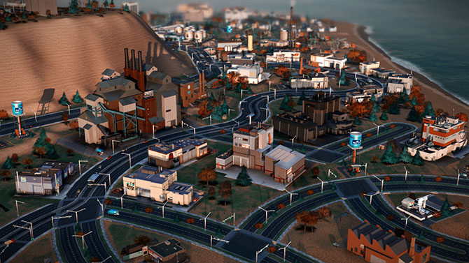
Once we made that decision—to go with an agent-driven simulation and make it work from the bottom up—then all the design has to work around that. The largest part of the design work was to say: “Now that we know agents are going to run this, how do schools work with those agents? How do fire and police systems work with these agents? How do time systems work?” All the previous editions of SimCity never had to deal with that question—they could just make a little table of crimes per capita and run those equations.

Manaugh: When you turned things over to the agents, did that have any kind of spatial effect on game play that you weren’t expecting?

Librande: It had an effect, but it was one that we were expecting. Because everything has to be in motion, we had to have good calculations about how distance and time are tied together. We had to do a lot of measurements about how long it would really take for one guy to walk from one side of the city to the other, in real time, and then what that should be in game time—including how fast the cars needed to move in relationship to the people walking in order to make it look right, compared to how fast would they really be moving, both in game time and real time. We had all these issues where the cars would be moving at eighty miles an hour in real time, but they looked really slow in the game, or where the people were walking way, way too fast, but actually they were only walking at two miles an hour.

We knew this would happen, but we just had to tweak the real-life metrics so that the motion and flow look real in the game. We worked with the animators, and followed our intuition, and tried to mimic the motion and flow of crowds.

[Image: We Are The Champignons’ industrial zone, carefully positioned downwind of the residential areas].

In the end, it’s not one hundred percent based on real-life metrics; it just has to look like real life, and that’s true throughout the game. For example, if we made the airport runways actual size, they would cover up the entire city. Those are the kinds of things where we just had to make a compromise and hope that it looked good.

Twilley: Actually, one of the questions we wanted to ask was about time in the game. I found it quite intriguing that there are different speeds that you can choose to play at, but then there’s also a distinct sense of the phases of building a city and how many days and nights have to pass for certain changes to occur. Did you do any research into how fast cities change and even how the pace of city life is different in different places?

Librande: We found an amazing article about walking speeds in different cities. That was something I found really interesting. In cities like New York, people walk faster, and in medium-sized or small towns, they walk a lot slower. At one point, we had Sims walking faster as the city gets bigger, but we didn’t take it that far in the final version.


I know what you are talking about, though: in the game, bigger cities feel a lot busier and faster moving. But there’s nothing really built into the game to do that; it’s just the cumulative effect of more moving parts, I guess. In kind of a counter-intuitive way, when you start getting big traffic jams, it feels like a bigger, busier city even though nothing is moving—it’s just to do with the way we imagine rush-hour gridlock as being a characteristic of a really big city.

The fact that there’s even a real rush hour shows how important timing is for an agent-based game. We spent a lot of time trying to make the game clock tick, to pull you forward into the experience. In previous SimCities, the day/night cycle was just a graphical effect—you could actually turn it off if you didn’t like it, and it had no effect on the simulation. In our game, there is a rush hour in the morning and one at night, there are school hours, and there are shopping hours. Factories are open twenty-four hours a day, but stores close down at night, so different agents are all working on different schedules.


The result is that you end up getting really interesting cycles—these flows of Sims build up at certain times and then the buses and streets are empty and then they build back up again. There’s something really hypnotic about that when you play the game. I find myself not doing anything but just watching in this mesmerized state—almost hypnotized—where I just want to watch people drive and move around in these flows. At that point, you’re not looking at any one person; you’re looking at the aggregate of them all. It’s like watching waves flow back and forth like on a beach.

For me, that’s one of the most compelling aspects of our game. The timing just pulls you forward. We hear this all the time—people will say, “I sat down to play, and three hours had passed, and I thought, wait, how did that happen?” Part of that is the flow that comes from focusing, but another part of it is the success of our game in pulling you into its time frame and away from the real-world time frame of your desk.


Twilley: Has anything about the way people play or respond to the game surprised you? Is there anything that you already want to change?

Librande: One thing that amazed me is that, even with the issues at the launch, we had the equivalent of nine hundred man-years put into SimCity in less than a week.

Most of the stuff that people are doing, we had hoped or predicted would happen. For example, I anticipated a lot of the story-telling and a lot of the creativity—people making movies in the cities, and so on—and we’re already seeing that. YouTube is already filled with how-to videos and people putting up all these filters, like film noir cities, and it’s just really beautiful.

[Video: SimCity player Calvin Chan’s film noir montage of his city at night].

The thing I didn’t predict was that, in the first week, two StarCraft players—that’s a very fast-paced space action game, in case you’re not familiar with it, and it’s fairly common for hardcore players to stream their StarCraft battles out to a big audience—decided to have a live-streamed SimCity battle against each other. They were in a race to be the first to a population of 100,000; they live-streamed their game; and there were twenty thousand people in the chat room, cheering them on and typing in advice—things like “No, don’t build there!” and “ What are you doing—why are you putting down street cars?” and “Come on, dude, turn your oil up!” It was like that, nonstop, for three hours. It was like a spectator sport, with twenty thousand people cheering their favorite on, and, basically, backseat city planning. That really took me by surprise.

I’m not sure where we are going to go with that, though, because we’re not really an eSport, but it seems like the game has the ability to pull that out of people. I started to try to analyze what’s going on there, and it seems that if you watch people play StarCraft and you don’t know a lot about it, your response is going to be something like, “I don’t know what I’m looking at; I don’t know if I should be cheering now; and I don’t know if what I just saw was exciting or not.”

But, if you watch someone build a city, you just know. I mean, I don’t have to teach you that putting a garbage dump next to people’s houses is going to piss them off or that you need to dump sewage somewhere. I think the reason that the audience got so into it is that everyone intuitively knows the rules of the game when it comes to cities.

• • •

For more Venue interviews, on human interactions with the built, natural, and virtual environments, check out the Venue website in full.

Mountain Lab: An Interview with Scott McGuire

Photo courtesy Scott McGuire.

(This interview originally published on Venue).

Several years ago, while I was still on the editorial staff at Dwell magazine, I took a daytrip down to the head office of The North Face to visit their equipment design team and learn more about the architecture of tents.

“As a form of minor architecture,” the resulting short article explained, “tents are strangely overlooked. They are portable, temporary, and designed to withstand even the most extreme conditions, but they are usually viewed as simple sporting goods. They are something between a large backpack and outdoor lifestyle gear—certainly not small buildings. But what might an architect learn from the structure and design of a well-made tent?”

Amongst the group of people I spoke with that day was outdoor equipment strategist Scott McGuire, an intense, articulate, and highly focused advocate for all things outdoors. As seen through Scott’s eyes, the flexibility, portability, ease of use, and multi-contextual possibilities of outdoor equipment design began to suggest a more effective realization, I thought, of the avant-garde legacy of 1960s architects like Archigram, who dreamed of impossible instant cities and high-tech nomadic settlements in the middle of nowhere.

Scott McGuire talks to Venue in Lee Vining, California; Mono Lake can be seen in the background.

Intrigued by his perspective on the ways in which outdoor gear can both constrain and expand the ways in which human beings move around in and inhabit wild landscapes, and traveling with Nicola Twilley as part of our collaborative Venue project, I was thrilled to catch up with Scott at a deli in Lee Vining, California, near his home in the Eastern Sierra.

McGuire, who recently left The North Face to set up his own business, called The Mountain Lab, was beyond generous with his time and expertise, happily answering Nicola’s and my questions as the sun set over Mono Lake in the distance. His answers combined a lifelong outdoor enthusiast’s understanding of the natural environment with a granular, almost anthropological analysis of the activities that humans like to perform in those contexts, as well as a designer’s eye for form, function, and material choices.

Indeed, as Scott’s description of the design process makes clear in the following interview, a 40-liter mountaineering pack is revealed literally as a sculpture produced by the interaction between the human body and a particular landscape: the twist to squeeze through a crevasse, or the backward tilt of the head during a belay.

Our conversation ranged from geographic and generational differences in outdoor experiences to the emerging spatial technologies of the U.S. military, and from the rise of BMX and the X Games to the city itself as the new “outdoors,” offering a fascinating perspective on the unexpected ways in which technical equipment can both enable and redefine our relationship with extreme environments.

• • •

Geoff Manaugh: I’d like to start by asking you about the constraints you face in the design of outdoor athletic equipment, and how that affects the resulting product. For instance, in designing architecture, you might think about factors such as a building’s visual impact, its environmental performance, or the historic context of where your future structure is meant to be. But if you’re designing something like a tent—a kind of athletic architecture, if you will—then you’re talking about factors like portability, aerodynamism, cost, weather-proofing, etc.. What design constraints do you face, and how do you prioritize them?

Scott McGuire: The first thing is always the user. Everything has to be very user-centric, in a way that’s perhaps unlike conventional architecture. You might say, “I’m building a house; it’s about this site; it’s about this view; people are going to live in it in a certain way,” but you would rarely design a house based on whether or not someone has a propensity, for example, to use their kitchen utensils with their left hand or their right hand. But when you’re creating a technical product, you become really myopically focused on how that product interacts with an individual. It’s about establishing who that person is.

Of course, if I’m talking about doing a small technical pack that will hold 40 liters for someone who’s going mountaineering—well, I know that same pack may very well be used by someone riding on a bike as a commuter in New York City. Still, when we’re talking about that product, it’s very much about things like: what’s the person who’s going mountaineering wearing? What are they carrying? Where are they going? What environment are they going to be in? How much wear and tear is their pack going to get? As you study the user, you usually end up discovering a lot of nuances about the way they’ll use the product, and they’re often things you wouldn’t normally think about.

Mt. Blanc from Le Jardin“; “The Finsteraarhorn“; another view of the Finsteraarhorn; and “Glacier of the Rhone.” All photos taken between 1860 and 1890. Courtesy of the U.S. Library of Congress Prints and Photographs Division.

I’ll give you some examples of how that would work. I’ll stick with the 40-liter technical pack, which is the one you usually find in an area that’s high alpine, above 8000 feet, with year-round glaciers, where there’s lots of climbing and mountaineering. What you’re going to find, obviously, is that people are carrying it. They’re moving at a relatively athletic pace. They want to have the ability to fit the pack.

When we think about fit, it’s not as simple as saying: “This person’s got a 34″ waist, a 19″ back, a 42″ chest, and that’s what we need to focus on.” It’s also the fit based off the way someone moves—what I would call the interaction between the user and the device. The way a 65-liter pack fits someone who’s walking down a manicured trail, doing eight miles a day—the height that their knee climbs and the amount that their body twists—is different than the fit of a 40-liter pack for somebody who’s going up a mountain, where they might be climbing a 45-degree slope. Or they might have somebody on belay and they need to be able to look up, so they need to have a tiny pocket of space so that, with a helmet, they can crane their head back and look up at their partner. The pack can’t get in the way of that.

Three 65-liter packs by The North Face, High Sierra, and Kelty, respectively.

Then you add to all that not just an ability to carry weight, but questions like: what does it feel like when an arm comes up to reach for a hold? Or: what happens when you’re trying to twist through a crevasse? There’s a fair amount of time spent really thinking about all of those elements on the body.

And then you run into some really interesting places when you start thinking about how the pack comes off the body. What does everybody do when they come to a stop? They take their packs off, throw them on the ground, and sit on them. So you have to think about how your frame system can carry the load one way, while being carried on someone’s back, but also what happens to that frame system when someone sits on it when it’s on the ground. That really nice zipper pocket on the face, the one that’s so great for getting access at the front of the pack—well, what happens when that thing spends a year lying zipper-down, crammed full of mud, with 150 to 200 pounds of person sitting on top of it? A lot of these observations need to take place in the very beginning, to think through these things.

Mountain climbers, Zermatt, Switzerland (1954); photograph by Toni Frissell, courtesy of the U.S. Library of Congress Prints & Photographs Division.

That’s basically the fit component of the interaction to the person. The second element is really going to be: what goes into the product? What is the user carrying, and how do they access it? Those two questions live in a symbiotic relationship with each other. It’s also not just about what goes in the pack, but when it goes in, when it comes out, and how it goes back in again.

Taking a conventional top design, you have an open bucket; you open the lid; and you put stuff inside. There are shapes that inherently lend themselves to technical packs: they’re slightly tapered at the bottom, so they stay within the lumbar area, keeping the weight centered over the sacrum. That makes it a little easier when those narrow slots are on your waist, and the V-shape of the pack mimics the shape of your shoulders and chest. What it also does is it creates a bucket that can feed stuff down into the bottom. You want to keep your heavier stuff near your center of gravity—you want to keep it low and tight—preferably right underneath the shoulder blades.

But you also need to think about what’s going in there, in what order. Things like an extra shell, or your spare jacket, or the rope you may or may not need—those can all go in the bottom. But what are the things that are coming on and off, all the time? On a technical climb, if you’re wearing a puffy jacket, well, every time you’re hot, that jacket’s going to come off—maybe ten or fifteen times a day. So how does that go in and how do you maintain access to it in the easiest possible way? How do you make sure you’ve got easy access to things like a first aid kit, in case you’ve got to get to it quick? Where does your headlamp sit so that, when it’s late and you’re finally getting the headlamp out, and it’s probably already dark, you know, intuitively, that it’s in this pocket right here and you don’t have to fumble around and find the headlamp and risk having everything else dump out?

The view from Scott McGuire’s back porch; photo courtesy Scott McGuire.

And then there are even simpler things, like small pockets for access to things like a point-and-shoot camera that can go in and out quickly, or your lip balm, or that nutritional bar that allows you to get a shot of quick energy. A lot of thought needs to go into where those things go—where pocketing and storage should be, both from an organizational standpoint but also from a load-dispersion standpoint. These are all maybe a little comparable to how an architect might think: it’s about organizing the space, but down to a level of detail that takes into consideration very different people doing very different things with their gear.

Once you’re talking about the load—about what you’re carrying and how that gets managed—the next thing is going to be materials. The materials are so important. Like in conventional architecture and design, materials obviously have an aesthetic appeal. On the business side of it, the value equation is always about cost versus value. For example, there are things that can cost very little but have a very high value based off their perceived benefit: they’re lightweight, durable, attractive. Things can also have a very high cost but not necessarily have a value that the customer perceives, such as highly technical specialized fabrics that may not really contribute a benefit to your average end user. The benefit’s lost. It’s as if you build a house and you install gold pipes—no one sees it. Do they really make the water taste better?

You need to be really careful about those decisions. When you’re talking about the material selection and if somebody has to carry it, then there’s a balance not only in terms of cost versus value, but also around weight versus durability. In a general analysis, you’ve got price, weight, and durability—and, usually, you only get to pick two. You want something that’s really cheap and super lightweight? You give up durability. You want something that’s super durable and incredibly lightweight? It’s going to cost you a lot of money—you give up price.

Ascension of Mt. Blanc” and Glacier of the Rhone.” Photos taken between 1860 and 1890. Courtesy of the U.S. Library of Congress Prints and Photographs Division.

To get back to the example of a 40-liter mountaineering pack, that customer typically is investing in a product that is high-quality, with high-durability, designed to take a lot of abuse. And there’s an expectation there that a slightly more expensive product, with greater durability and less failure potential, has higher value. It’s worth the extra money. There’s a huge difference between someone who’s going for their very first backpacking trip versus the person who’s been training for an objective for the last year. That person doesn’t want, after all the hours spent planning, looking at topo maps, and waiting for the weather window, to be hampered by gear. That person’s going to choose quality and durability over price.

Photo courtesy Scott McGuire.

Manaugh: When it comes to materials, I’m curious if there are things that you or the designers you work with are aware of, that are perfect for certain functions, but they’re so expensive or simply so foreign to the average consumer that the market can’t bear them. In other words, how do you navigate the market with new materials and new designs?

McGuire: One of the Holy Grails here, from a design standpoint, is the side-release buckle. From a functional standpoint, the ability to have a buckle, pop it, have it separate, put it back together, click it, including that audible signal that it’s now secure—that has a simplicity and intuitiveness to it. I think a lot of people in design still look at that and say, gosh, that’s one of the things that’s been around for a long time. But is it the best solution?


It’s always a question of whether you’re building a better mouse trap, or if you’re just trying to do something that’s different—something that’s gimmicky. You’re always balancing what’s unique for the sake of being unique—not necessarily because it’s providing a better solution—versus what’s unique because it’s actually offers a functional improvement.

There are a couple of examples like that. Nobody’s really figured out a better solution than a zipper. But zippers fail; they wear out over a certain period of time. The side-release buckle is a design that is ubiquitous across all packs, and there are different aesthetic treatments to it, but, functionally, they all do the same thing: a two-part click. But there are always people exploring what could be better in that space.

Manaugh: One of the things we talked about a few years ago when I first met you at The North Face was that there are differences in tent design between the North American and the European markets. You mentioned then that, in Europe, campgrounds are so crowded that a different level of privacy is expected from a tent, whereas, in the U.S., you can get away with using much more transparent materials, because you might be the only people at a certain campsite for two or three nights in a row and you don’t need as much privacy.

The REI Half Dome 2 Plus Tent, with and without cover; via REI.

I’m curious, now that you’re doing consulting with different companies, different regions, and different markets, how these sorts of cultural differences play out in the design of outdoor equipment in general.

McGuire: The commercial world has gotten a lot smaller, and the ability now to connect with people in those very different cultures has become much more commonplace. That’s true everywhere, I think. I mean, sitting where we are today, we have a lot of people coming through the Eastern Sierra who have traveled all the way from Europe.

I actually just talked to a guy over there in the parking lot on a motorcycle who’s over here from Germany, on his way to Jackson Hole. He said he happened to be swinging by here on his way from Atlanta. I still haven’t figured out the geographical connection to Atlanta, if you’re on your way to Wyoming, but…

Manaugh: [laughs] He was too embarrassed to ask for directions.

McGuire: But it is interesting to see a foreign product in a local environment—you can see where it seems a little odd, and you can try to find out why those little moments are there in the design. There’s also a need to expose yourself to those other places. That means being in Europe and seeing that user; it means being in Japan and seeing that user.

The Big Agnes Copper Spur UL1 Tent with and without cover; via REI.

Oftentimes, there are unique, local solutions to global problems, and these can influence global gear designs and become ubiquitous. Just as often, there are very specific needs to solve a local issue that are non-transferable. I’ll give you a classic case in point. We just talked about mountaineering in the Eastern Sierras. Well, all of our access is car-based. Everybody drives to a trail head, gets out of their car, and walks up a trail that is highly likely to have no one else on it, and, from there, they end up at the place they’re climbing, and so on. It’s not uncommon for people here to go out and, from the time they leave their car until they bag their peak and come back, they never see anybody—not even a trace of another person.

But in Chamonix, over in France, there’s a parade from 7:00 am every morning. If you sit at the base, where the trail goes up Mont Blanc, you can watch people coming down with their coffee and their croissant, and they’ve got their crampons in the back of their pack. They’ve got all of their gear. They’re going to climb into a tightly packed gondola with 50 or even 100 other people, and that’s all before they even start their climb.

Two photos of architecture on the Aiguille du Midi in Chamonix, France; uncredited; found via Google Image Search.

So, here, in the Eastern Sierra, you can just say, Jed Clampett-style, eh, my crampons are over here, my ice axe is here, and, as long as my hiking partner isn’t within five feet of me, well—hook, swing—who cares? But when people start getting into a packed tram system in Chamonix, and they’ve all got to scoot together, you really need to start thinking about how you protect all those sharp points. How do you make sure no one’s exposed to those? You’ve got to know where those are.

Those differences are where I think a lot of the challenges are. It’s not necessarily intuitive that something that’s highly successful in one region will automatically have traction in another. Creating a globalized product in a highly specialized market can be very challenging and, oftentimes, there has to be a tolerance. You either have to have tolerance for a broader product assortment to meet regional needs, or you have to accept the fact that you may have a product that’s not specialized enough to hit the local super-user, because you’ve traded off specificity for an ambiguity that will reach more people.

Nicola Twilley: It seems to me that, although in your work you’re responding to the user, the user is also responding to the landscape—so, in effect, you’re responding to the landscape, too. When you look at a landscape, do you more typically see it in terms of what sort of activities you might do there, or are you looking at the landscape from the perspective of the gear you might need?

McGuire: In terms of gear, you do see the differences. I mean, take the west coast of the United States. The climbing conditions for a 40-liter pack in the North Cascades involve a much wetter environment, with much wetter snow and a more volatile climate all around, as far as sudden changes in weather go. But, here in the Eastern Sierra, you can probably plan on the fact that it’s not going to get any precipitation for the next 90 days. You don’t really have to think about bringing a ton of rain gear with you, because we just don’t get storms that show up out of nowhere or weather patterns that suddenly convert. That nuance in meteorological conditions will change what the customer’s wearing, which will change how their pack fits, which will change what they’re carrying, which will change how they store things inside the pack, because of what comes on and off and what they need access to. All those things come into effect.

Then you have geographic nuances—the way the different physical characteristics of the environment that you’re in are going to damage the pack. For example, if you are in a volcanic area, where you’re doing a lot of chimneying, you’re going to end up with a high abrasion area. The impacts of a granite environment and a lot of scree will have a different impact on gear than someone in a classic glacier environment.

So there are geologic elements and there are meteorological elements—and both have an impact on the product itself and an impact on what the user does there. The gear you need in a landscape and the activities you are going to do in that landscape are always going to feed into one another.

Twilley: So you can’t optimize a technical pack for the Eastern Sierra and for climbing in Washington State simultaneously, right? That wouldn’t be the same pack?

McGuire: True. All design at some point is a compromise. If you use vehicles as an analogy, the SUV is the ultimate compromise. It doesn’t really carry everything and it doesn’t drive like a sports car, but it’s still managed to fulfill this niche for people. It does enough things pretty well that it allows them to find their solution in one product. That’s an elusive role for packs. It’s why people who end up being pretty active rarely own one pack—they own two, three, or four of different literages, different weights, different carrying capacities, and different materials.

An early U.S. Geological Survey field camp; photo courtesy of the USGS/U.S. Department of the Interior.

Manaugh: This is a fairly silly question, but I’m curious if, on a day where you have a lot of free time—you’re lying in a hammock in the mountains somewhere—you ever find yourself thinking that you could design a pack that would be absolutely perfect, but only for a very, very specific place. It would be the ultimate pack for a particular trail in Arizona—but for that trail only. It would be useless in Utah or on a trail in the Alps. And maybe it would cost $5,000—but it’s the perfect pack. Do you have dream gear like that?

McGuire: [laughs, pauses] At the end of the day, that’s what every gear head does. Not just the pack—they’re on the quest for the perfect kit. Unfortunately, what happens is that a large factor in enjoying the outdoor environment is wanderlust. As soon as your kit is perfect in one place, not only does the gear itself change over time or through use, but, usually, your reaction is, “Great! Now that I’ve experienced this, let me go to this other place…” And all of your metrics have been thrown off. You start building the perfect kit all over again. So, as soon as that’s obtainable, your own interest level changes, and it goes away.

Of course, I’m not actually a designer, in that I don’t really put pen to paper. I work on strategy and process, with people who do the pen-to-paper side of things—people who are highly creative and sometimes even have an arts background.

Courtesy Osprey Packs.

One of the best examples of that kind of designer, and one of the people I admire the most in this space, is Mike Pfotenhauer, who’s the owner and designer of Osprey Packs. Mike is classically trained as a sculptor so, when you look at Mike’s pack design, there’s an aesthetic to his product that speaks to his ability as a sculptor. It’s very rare that you see straight lines. I’m convinced that if Mike could get someone to weave for him a curved webbing, his packs would all have curved webbing on them. He wants things to have this organic flow, which means there’s a signature to his packs, because he’s only worked on one brand as an owner and designer for his entire career.

Courtesy Osprey Packs.

But, when you look at the actual function of his designs, he’s a real user. He’s a backpacker. He doesn’t let his aesthetic override the fact that, as a user, he knows his end product has to work. Case in point: take the webbing. At the end of the day, something needs to be able to pull and compress. If the pieces of webbing that are the most effective at doing that require straight lines to pull, then he knows the pack’s aesthetic needs to give way to the fact that there’s a functional need calling for something different.

Courtesy Osprey Packs.

Twilley: Given the importance of the user and the landscape, can you talk a little about how this gear is tested? Are there labs filled with simulated environments where packs are repeatedly rubbed against things, or sprayed with water and then flash-frozen to see what happens?

McGuire: There are three legitimate forms of testing. There’s the ASTM/EN, with the ASTM being the American Standard Testing Method and EN being the European Norm. These are scientific methodologies around proving whether something’s working in the right way. Those are usually at an item level. Then, there are ASTM things around complete packages like insulation warmth ratings for sleeping bags. There are rules around how to properly gauge the square footage and volume of a tent or the volume of the inside of a pack. So these are metrics that can be tested.

On the testing from a durability standpoint, oftentimes it’s specific devices that measure individual materials.

Twilley: Oh, so it’s not the complete pack. You just test a particular buckle, for example.

McGuire: Yeah. You might pull-test the buckle to make sure it can survive a 300-pound pull test. You might take a piece of material and put it on a Taber machine and see how many cycles it takes until the machine rubs a hole through it to see what the material’s abrasion durability is. Or you might do a tensile tear strength test to see how a tear would propagate in a rip-stop and how functional the rip-stop is.

These are functional tests that are relatively close to reality, but then there are also reality tests. The classic example of that is a lot of factories and companies will have access to things like very, very large commercial dryers; somebody has taken the time to open them up and bolt 2x4s and climbing holds and all kinds of stuff to the inside of the dryer. Then you throw a pack or a piece of luggage onto it, turn the dryer on, and let it just beat the daylights out of something till you see where your failures are.

Or you’ll have jerk tests on handles, where you’ll have a weight that—over and over again—will simulate the grabbing of a shoulder strap with a 60-pound pack and throwing it over your shoulder. What does that do to that seam? You’ll simulate it over and over again, and you’ll see, as you grab the shoulder strap and yank on it, if you yank a little this way or you yank a little that way, you end up putting different seam stresses on each place.

These sorts of reality-based testing devices are, oftentimes, custom manufactured. They’re not necessarily scientific. They’ll run through the cycles so that you see where there need to be improvements, but there’s not really a standardized test to measure it against.

But, still, today, in this industry, nothing beats human use.

Twilley: You mean field-testing?

McGuire: Product failures in this space are rarely attributable only to one thing. It’s almost always systematic. For instance, the shoulder strap didn’t fail because it was getting pulled up and down; the shoulder strap failed because of the way it was stitched, and then the way it was worn by the user, which created a spot where it sat on the shoulder blade, and that wore the stitching down over the course of a 600-mile trip, which then exposed the motion to a failure. An abrasion test on its own or a jerk test on its own wouldn’t expose that, but, in real world use, those two things combined expose a weakness. This is where human testing really is the quintessential component to make sure things work right.

This is also why so many people in design—in fact, every single person I know who was an inventor of an outdoor product in the 50s and 60s, during the real heyday of our industry—came into prominence not because they were designers. They were users who, by necessity, turned to design to solve a problem.

Image courtesy of Skipedia.

This is how Scot Schmidt created the original Steep Tech gear for North Face. Scot didn’t want to be a clothing designer—at least, from everything I heard from him. Scot just wanted to be a skier who didn’t have to deal with duct taping his knees and shoulders because he was skiing in such horrendous conditions and he kept tearing the fabric.

The original North Face Mountain Light jacket with its “iconic black shoulder”; photo courtesy ZONE7STYLE.

The iconic black shoulder of the original North Face Mountain Light jacket came about not because someone thought, “Wow, straight lines and bold blocking is going to look awesome.” It came about because someone said, “I need a super-durable material because, when I throw my skis over my shoulder to hike up this ridge, the straight skis of the 1970s and 80s rub a hole through my jacket”—and the only thing available at the time was a 1680 ballistic nylon that only came in black because it was for the military.

You end up with an iconic design that was never intended to be an iconic design. It just happened that way because of a specific need, and it evolved to become an icon.

Photo courtesy The North Face.

Twilley: Are there landscapes that gear innovation has opened up, in a way? Obviously, there are extreme landscapes, like Mt. Everest or Antarctica, where the right gear can be the difference between making it or not, but are other types of landscapes now opening up through innovations in outdoors gear?

McGuire: For sure. I think ever since people started pushing the limits of where they could survive, the types of landscapes available to people have changed. There are the extremes, like you mention, of being up in the Himalayas—up at high altitude—where gear has had an absolutely huge impact. But I would say that one of the challenges in our industry has actually been that, for the most part, for better or worse, most of the impacts on design from extreme environments happened more than a decade ago.

What’s happening today, I think, that’s now driving some of the greatest innovation aren’t the extremes of the environment, but what people are trying to do in that environment on either end. It’s the book-ends of either extreme. In other words, design is being driven now by people who are going much farther, much faster, and much harder than they ever did before.

Take the idea of building a product for hiking the Pacific Crest Trail—which is 2,400 miles. Typically, that would take four to six months—and, in 1970 or 1980, that was a pretty extreme environment. Now, that environment hasn’t really changed—there’s global warming, of course, so there have been changes in the glaciers and so on—but, effectively, that trail is the same as it was for the past forty or fifty years. What has changed now is that people are coming in and saying: “I want to do the entire Pacific Crest Trail, and I want to do it in ninety days. Instead of doing eight to ten miles a day, I want to do twenty-five or thirty miles a day.” In order to do that, people who were comfortable with carrying a 60-pound pack on the trip are now saying that there’s no way they’d go out there with more than 30 pounds. In fact, on the far end of that, people are saying they should be perfectly comfortable, and fully safe and functional, with only a 15-pound pack. Put all that together, and that necessitates a new kind of design.

Aletsch Glacier“; “Lac des Morts, Grimsell“; and”Aletsch Glacier, Eggischorn.” All photos taken between 1860 and 1890. Courtesy of the U.S. Library of Congress Prints and Photographs Division.

But there’s also the other extreme. We have a society that is spending less and less time in the outdoors. What we’re finding, on the other end, is that the goal is to just make sure the approachability of the outdoors is simple enough, and convenient enough, and affordable enough, that, when people are trading a weekend in front of their Wii for a weekend taking their family camping on the side of a river, that it’s not intimidating. It’s not scary. For instance, how do you design a tent for someone who’s never set up a tent before, or who thinks a tent is so expensive that it’s a barrier to entry? A tent that’s not so complex that I can’t even imagine using it? Or a tent that’s not so small that I can’t stand up and change my clothes? What does that look like?

So you have these very divergent activities, these very different spaces, but, in each one, you have people who basically need something—they need a piece of gear or equipment—that can allow them to have this experience. That’s where I think most of the innovations have come from in the last decade. It’s not the middle ground. It’s these extreme fringes on either side.

Manaugh: Do you find, ironically, that the guy who wants to be home playing Wii all day in the suburbs is actually the more challenging design client?

McGuire: Well, let me back up a bit. If you go to a company like Procter & Gamble, for example, you find people there who are working as industrial designers, and they’re trying to think like a customer who they just might not be. But, in this industry, you have people who are really just trying to solve their own problems, in their own tinkering way.

Photos courtesy of the Outdoor Retailer show.

The Outdoor Retailer trade show is a very unique environment, in that regard. It’s like a tribe. You walk into that outdoor retailer environment and, if you’re in the outdoor industry, you can see straightaway who’s there and who’s not there—meaning, who’s part of the tribe and who’s a visitor. It’s a group of a lot of the same people, over decades now, doing a lot of the same things. You might see different companies and different brands over time, but what you don’t see is a lot of people from outside of that space showing up there. If you’re an outsider and you show up—if you’re trying to pose like you’re there, and trying to sell into that space—that group smells your inauthenticity right away. But, now, this tribe mentality is starting to recognize that the future of the industry is outside of our own doors. In fact, not enough people are finding their way into the tribe on their own and we have to bring in more people.

Photos courtesy of the Outdoor Retailer show.

So the industry itself has been wrestling with this. How do we go out and approach someone? I’ll use an analogy. In the industry, there have been three rings of people: there’s your hardcore ring of people who are absolute purists: “I make it all myself. And I’m so badass, no one even knows where I go.”

They’re almost elitist in their pursuit of their sport. But then you have another side, which is a group of people who like the outdoors, but they’ve recognized that there’s commercial value there. They are mostly driven by the business side of it. They’re people who want to work in the outdoor company sector because they like the idea of going to work in a T-shirt and jeans, versus wearing a suit, and their skills lend themselves to this space, but you also kind of know that a person like that isn’t really from here because their core motivation is: “Wow, we can make money off of this!”

So the ex-suits don’t get the hardcores, and the hardcores resent the fact that all these ex-suits are showing up. Then there’s this tiny group in the middle who are interested in the business side, but they also come from the hardcore side at one point—and, what’s interesting is that all of these people in this group of three circles in the industry right now are wondering: “Who’s going to come in from outside our three circles? Who’s going to drive the business going forward? Who are those people?”

Photos courtesy of the Outdoor Retailer show.

There were some good industry numbers that came out recently where, for the first time, we’re seeing the number of young people getting exposed to the outdoors is on a slight uptick. I would say it’s encouraging news. It’s not good news, because we still have a long way to go. But, from a design standpoint in the industry, that’s something that appeals both to the suits—“Wow, new customers! More money!”—and also that center group, along with the old hardcores, who love seeing the interest and the energy grow. They all see that, from a culture standpoint, we need this: the stronger our tribe is—the more people who come into it—the better it’s all going to be.

But I have a love/hate relationship with some of the solutions that have come up in the past few years. Here, in the Eastern Sierras, we have a pretty robust program where you can get on the phone in Los Angeles and call a company that will deliver a camping trailer to a campground here for you. You drive up in your little economy car from the city, and you pull into a campground, and the there’s this 26-foot trailer sitting there waiting for you, with all the comforts of home. It’s got a mattress; it’s got running water; it’s got a toilet; the refrigerator is eve pre-stocked. The stoves are there. There’s propane in the tanks. It’s like a pop-up hotel.

The “love” part of me is that more people are now actually making the trip. It’s like a gateway drug. Somebody who might not have got in their car is at least opening their door at 6:00 in the morning and smelling trees and not being in a parking lot at a hotel somewhere. So it’s a start.

The difference, though—the “hate” part of me—is that there’s nothing like being out there in the dark, putting a tent up, finding a site. You know, maybe I’m a little bit of a sadomasochist in this regard. But, for me, when you’re in the outdoors, tripping over the picnic table and trying to figure out where the guylines go, and dropping stakes and wondering if you remembered to put them all in… Not that I want to see people suffer! But part of it is actually about the dirt under the fingernails—it’s that sharp rock under the tent that keeps you awake at night.

But, as long as people are making the trip, and, from a design standpoint, as long as we’re making a product that eases that transition for people as much as possible…

The LogPlug and RokPlug projects by Archigram, courtesy of the Archigram Archival Project at the University of Westminster.

Manaugh: It’s funny, your trailer example actually reminded me of this group of architectural designers in England in the 1960s/early 70s called Archigram. They were somewhere between science fiction and Woodstock. They had this one series of designs—and it was all totally speculative—for fake logs with electrical outlets that could be put out in the woods somewhere, and even fake rocks that could act as speakers, and so on.

The LogPlug and RokPlug projects by Archigram, courtesy of the Archigram Archival Project at the University of Westminster.

But the funny thing is that the intention of the project was to get more people in 1960s England out of their middle-class houses and into the wilderness, to experience a non-urban environment. Of course, though, the perhaps unanticipated side effect of a proposal like that is that they were actually just extending the city out into the woods, letting you take all these ridiculous things, like TVs and toasters, in the great outdoors with you, things that you don’t ever really need in that environment in the first place.

The LogPlug and RokPlug projects by Archigram, courtesy of the Archigram Archival Project at the University of Westminster.

In other words, it seems like an almost impossibly thin line between enticing people to go out into a new environment versus simply taking their ubiquitous home environment and infecting someplace new with it. The next thing you know, the woods are just like London and the Eastern Sierra are just like Los Angeles.

REI’s portable, pop-up, outdoor Camp Kitchen. Are outdoor equipment manufacturers the true inheritors of Archigram‘s speculative design mantle?

In any case, I wanted to return to something you said earlier about ballistic nylon materials that had originally been developed by the military. Are you still finding materials and technical innovations coming out of the military that can be “civilianized,” so to speak, for use by outdoors enthusiasts? For instance, I recently read that the military has developed silent Velcro, which seems like it could be useful for backpackers.

McGuire: Definitely, yes. On the military side of things, what’s different now, is that, except on very rare occasions, people today are not humping huge loads over long distances to fight wars. Soldiers are now incredibly mobile. They’re vehicle-based; they move in; they move out; they carry just what they need; they get the job done; and they’re gone. We have a lot of people coming back from wars today—and I’m not at all taking away from what they’re doing—but their war experience is unlike even just a few generations ago, where you put your pack on and everything you needed was in your pack and you were gone out in the wilderness somewhere for a year. We increasingly have soldiers who get in a Humvee, go out for a day, maybe two days, and then they’re back at base.

“New York Central Issue Facility Strives to Get National Guard Troops Latest Gear.” Image and caption courtesy of the U.S. Army.

What I think we’re seeing, culturally, is a lot like this. The patience for long-term adventures is waning. People want to go out and have an experience. They want it to be quick. They want it to be impactful. They want it to be memorable. And, to be honest, they want it to be easy. It’s the “I want to see Europe in five days and here are all my pictures” thing. It’s speed and efficiency. Well, one area where the military is lending some benefit is that they’re developing a lot of specialized gear for these in quick/out quick, intense experiences. You’re seeing things like the MOLLE system—what is it, Modular, Lightweight, Load-carrying Equipment?—and that modularity is seeping out of the military to influence outdoor gear design, where you’re able to have a base system that can increase or decrease in size, depending on the specifics of your day and what you’re going to go out and do. These are influences that that are now starting to show up.

“The Army is able to swiftly deploy soldiers where they’re needed and part of that is ensuring soldiers are properly equipped. The materials they need-they need fast, and that’s where a rapid fielding initiative team comes in.” Image and caption courtesy of the U.S. Army.

And there are some strong crossovers, in things like hydration, that are now becoming much more ubiquitous. We aren’t seeing that crossover quite as influentially as the original A-frame tents, or the development of sleeping bags coming out of World War I and World War II, but we’re certainly still seeing it. But I would say that the most significant recent impact are things like GPS—highly specialized technical solutions that make things work much better and much easier, and that don’t take up a lot of space.

GPS is military-based, and the ability to know where you are, where you’re going, and how to get back, without having to rely on map knowledge, has opened up all kinds of confidence for people to get into new places. Personally, I love using a GPS, but I still think you ought to know which way north is and how to read a map—because batteries die.

We’re also still seeing new materials come out of the military, like super-lightweight parachute fabrics that are allowing people to have highly tear-resistant, lighter-weight equipment. And, even with helmets, the foams used in lighter-weight, highly protective helmets are changing, mostly as a result of IEDs.

Combat helmets with sensors attached are part of “the next generation of protective equipment” for the U.S. Army. Image courtesy of the U.S. Army.

So, yes, we are seeing elements of the military trickle into outdoor gear. I just think that, with the needs of the military being what they are today, and the way that wars are being fought now, it just happens to serendipitously fall in line with a cultural desire for short, fast, light outdoors experiences—you’re done and you’re back. It is a bizarre overlap, but you’d be hard-pressed to say it’s attributable to one or the other.

Manaugh: To build on that question of cultural shifts, when you said that more kids are starting to go outdoors, I immediately wondered if at least part of that is due to a pretty huge rise in popularity of things like alternative sports: X Games, BMX, skateboarding, and so on, all those urban subcultures that I grew up with, but that had no real media attention at the time. They’re now becoming more and more mainstream. I suppose my question is: is the city its own form of “outdoors” now, and are alternative urban sports a kind of indirect way of getting kids interested in forests, or rock-climbing, or going bouldering?

Twilley: I might even add to that, to speculate that kids exploring sewers or breaking into abandoned steel mills are perhaps experiencing the same kind of thrills that the first generation of outdoors enthusiasts did in the West. Is urban exploration the next big opportunity for gear in the future, given our increasingly urbanized world?

McGuire: I think I’d say yes to both. Something that’s endemic to the outdoor industry is, first and foremost, the idea of having an experience. It’s about stretching where your comfort level is. So I would say pick whichever sport you want—skate, snowboard, mountain bike—those sports have allowed people to stretch what they believe they’re capable of. Whether you think that what people are doing on the west shore of Vancouver with mountain biking, and pushing the mountain biking free-ride space, is good or not, at the end of the day what we have is a generation of people who are having an experience that’s not inside of four walls. They’re pushing their comfort levels, and they’re having an experience and a memory that involves fresh air.

Martin Söderström in a timelapse jump, courtesy of Red Bull.

What we’re seeing among the youngest generation today is there is much less identity around sport specificity. I’m almost 40. When I grew up, you were a surfer or you were a skater or you were a climber or you were a road biker. But kids today don’t think anything like that—they think, “I do all of those things!” Why would I not be someone who is a skier who’s also into bouldering who’s taking up trail running and who competes in Wii dance competitions? Why can’t I be that person? There’s a sense that I will be whoever I want to be, whenever, and of course I will be multifaceted.

When we start talking about trying to build gear for those kids, you want to make sure that the gear allows them to do the current activity—and that might be more urban-influenced, like skating and biking—but, as they grow and stretch, it isn’t a hindrance to their next thing. Does your free-ride hydration pack let you try trail running? I think people are discovering on their own where their next challenge is, but the way they’re discovering it, and the tools they’re using to discover it, aren’t yet in the view of the popular side of the industry.

Spanish freerider Andreu Lacondeguy from Where The Trail Ends; photo by Blake Jorgenson for the Red Bull Content Pool, courtesy of Red Bull.

I’ll give you an example. I live in a place just down the road from here called McGee Canyon. It’s a beautiful canyon. I was going for a trail run the other morning; it was relatively early, about 7:30 in the morning, and I see these kids walking toward me. The guy is in jeans, Vans, his hat’s cocked off to the side; he’s got a hoodie, a t-shirt. It’s got some outdoor qualities to it, but it’s got some hip graphics. Kind of unshaven. He could just as easily have been walking down the street in the Mission District. His girlfriend’s in Toms shoes with knee-high, super bright-colored stockings, board shorts, a hoodie, big sunglasses, a hat. A very, very unlikely couple to see walking down this trail at sunrise. It was kind of surprising.

Photos courtesy of Poler.

I actually stopped running and I said, “Hey, where are you guys from?” They’re from Los Angeles. What they’d done is they’d taken their iPhones and they’d decided to go for a hike up to a place and take some Instagrams of waterfalls and flowers with their phones to share with their friends.

Photo courtesy of Poler.

So, are they hikers? I mean, she’s hiking in a pair of Toms and knee-highs, which are not really hiking products. But this is a generation who don’t see why they can’t leave the trail, go to town, have lunch, and go to the skate park and skate all afternoon, and not change gear. But the outdoor industry is having a hard time reconciling that.

Photos courtesy of Poler.

How do you talk to a customer who is that different from us? There is, right now, in the industry, a huge generational gap where most of the people in the industry, culturally, simply don’t understand their audience. What we’re seeing out of that is that new brands are starting to emerge that are able to translate the surf-skater or the city-hipster culture into this interest in outdoor experience in unique ways. Brands like Poler out of Portland, or Alite in San Francisco, with Tae Kim: these guys are actually starting to create brand identities that appeal to a customer that the outdoor industry still doesn’t get… You know, the outdoor industry has always tried to say, “Come to us!” And Poler and these other guys are saying: “We make a product that’s coming to you and to your aesthetic.”

Photos courtesy of Poler.

Twilley: Is figuring out how to serve that new kind of customer part of the work you do with Mountain Lab?

McGuire: What I’ve been doing is working with companies that know they need something, but they aren’t quite sure what it is yet. Of course, I don’t necessarily have all the answers for them, but my job is to help assemble the right teams of people—to find the people who can work on and solve that problem. I rely very heavily on a vast network of people: people who are professors of ethnography and cultural anthropology, people who are designers in Sweden and have a background in a very clean aesthetic, and people who are, you know, hipster skaters into trail running who live in New York City.

How do you take those people and put them together on a team with a common problem? Here’s the designer who has the right aesthetic, something that matches the brand value, and here’s the ethnographer who can say that this is who the customer is today, and this is what the design experience will need to look like, from a marketing standpoint, to communicate something to that customer.

The “lab” part of Mountain Lab is really the assembly. What are all the things that go in the pot to make the special sauce? It’s putting those things together.

Twilley: And what’s the product at the end? A recommendation? A prototype?

McGuire: It’s a mix of things. We’ve done things as simple as assembling business plans for startup companies, so they can go out and receive their second or third level of funding, to actually creating design briefs and pricing metrics, all the way through to completed design packages presented back for line review. Our main focus is not just what the solution is now, but what the solution will be—how things are changing, and how you know what customers need—that incremental step of asking “What does this look like in phases A, B, C and D?”

Manaugh: Finally, how does the internal structure of Mountain Lab work?

McGuire: It’s a revolving door. I’m the only constant within the Mountain Lab today. I would say that there are eight to ten people who, on any given week, are part of my regular repertoire of who I go to. Some I go to more than others, but, at this point, everyone is independent.

In Steven Johnson’s book, Where Good Ideas Come From, he talks about the coffee shops of the Renaissance period. For me, a lot of what Mountain Lab is about is having that kind of network of people—I know that I want to have these eight people around the coffee table to share ideas. And, on the next project, or even the next phase of the same project, it might be that these four need to stay, but then we need fresh insight from these other four. And we keep changing it up. There are times where I’m not part of the conversation at all. I may be introducing two or three people, setting the stage for their dialogue, but then just taking what they’ve reported back out and adding it into another dialogue next year.


That’s part of what allows me to live in the Eastern Sierra. I live in the middle of nowhere, where nobody I work with lives, but I also live in a place that, in my industry, is deeply rooted with all the customers I work with. So technology allows me to move well beyond the Eastern Sierra, but my proximity to the end-user here allows me to stay really focused on being close to what they do and what they need.

I didn’t think, though, when I started the Mountain Lab, that it was going to be quite the way it’s been. I thought there would be a lot more design work being done in-house with people. The virtual nature of the teams, and the success we’ve found in that virtual collaboration, has surprised me. I’ve also been really surprised—pleasantly surprised—by the people I’ve been able to connect with. I didn’t, in my wildest dreams, ever think I was going to have some of these opportunities twenty years ago, when I first got into the outdoor industry.

I remember going to the very first Outdoor Retailer show with a close friend of mine, walking through the doors, and looking around, and feeling like a kid in a candy store. Now I have friends in those companies, and I can call up these industry legends and say, “Hey, I’m working on this new idea. What do you think?” Or, “Do you know the right person? Where would you go?” I’m so grateful for that opportunity, and for being able to keep that creative stoke alive.

• • •

For more Venue interviews, on human interactions with the built, natural, and virtual environments, check out the Venue website in full.

They Come From Everywhere: An Interview with Mike Elizalde

Many of today’s most original and bizarre visions of alternative worlds and landscapes come from the workshops of Hollywood effects studios. Behind the scenes of nondescript San Fernando Valley offices and warehouse spaces (if not outside California altogether, in many of the other nodes in the ever-expanding global network of cinematic effects production, from suburban London to Wellington, New Zealand), lurk the multidisciplinary teams whose job it is to create tomorrow’s monsters.

Mike Elizalde of Spectral Motion applies make-up to actor Ron Perlman, as Hellboy.

Spectral Motion, the effects house responsible for some of the most technically intricate and physically stunning animatronic creatures seen in feature film today, is no exception. Based in a small strip of anonymous one-story warehouse spaces squeezed in between a freeway and rail tracks, and overshadowed by a gargantuan Home Depot, Spectral Motion has developed monsters, effects, and other mechanical grotesqueries that have since become household nightmares, if not names.

Since its founding, by Mike & Mary Elizalde in 1994, the firm has worked on such films as Hellboy & Hellboy II: The Golden Army, Looper, Attack the Block, Blade 2 & Blade: Trinity, X-Men: First Class, The Watch, and this summer’s highly anticipated Pacific Rim.


This winter, while out in Los Angeles on a trip for Venue, I had the enormous pleasure of stopping by Spectral Motion with Nicola Twilley in order to interview Mike Elizalde, CEO of Spectral Motion, on a cloudy day in Glendale to talk all things monstrous and disturbing. To a certain extent, this interview thus forms the second part in a series with BLDGBLOG’s earlier interview with Hellboy creator Mike Mignola, and the present conversation, reproduced below, pairs well with Mignola’s thoughts on what we might call landscapes of monstrosity.

Our conversation with Elizalde ranged from the fine line that separates the grotesque and the alien to the possibility of planetary-scale creatures made using tweaked geotextiles, via the price of yak hair and John Carpenter’s now-legendary Antarctic thriller, The Thing.

Mike Elizalde behind his desk at Spectral Motion.

Elizalde, a good-humored conversationalist, not only patiently answered our many questions—with a head cold, no less—but then took us on a tour through Spectral Motion‘s surprisingly large workshop. We saw miniature zombie heads emerging from latex molds (destined for a film project by Elizalde’s own son), costumes being sewn by a technician named Claire Flewin for an upcoming attraction at Disneyland, and a bewildering variety of body parts—heads, torsos, claws, and even a very hairy rubber chest once worn by footballer Vinnie Jones in X-Men: The Last Stand—that were either awaiting, or had already performed, their celluloid magic.

The visit ended with a screening of Spectral Motion‘s greatest hits, so to speak, with in-house photographer and archivist Kevin McTurk—a chance to see the company’s creations in their natural habitat. We walked back out into the flat light and beige parking lots of the Valley, a landscape enlivened by our heightened sense of the combination of close observation and inspired distortion required to transform the everyday into the grotesque.

• • •

Geoff Manaugh: I’d love to start with the most basic question of all: how would you describe Spectral Motion and what the company does?

Mike Elizalde: We are principally a prosthetics, animatronics, and special effects creature studio, but we are also a multifaceted design studio. We do a lot of different kinds of work. Most recently, for example, in partnership with one of my long-time colleagues, Mark Setrakian, we built anthropomorphic bipedal hydraulic robots that engage in battle, for a reality show for Syfy. It’s called RCLRobot Combat League. It’s pretty astounding what these machines can do, including what they can do to each other.

Battling it out in Robot Combat League with two robots—”eight-feet tall, state-of-the-art humanoid robots controlled by human ‘robo-jockeys,'” in the words of Syfy—designed by Mark Setrakian of Spectral Motion.

Nicola Twilley: Are the robot battles choreographed, or do you genuinely not know which robot will win?

Elizalde: Oh, no, absolutely—it’s a contest. It really is about which robot will emerge as the victorious contender.

RCL is not only one of our most recent projects, but it also shows that, here at the studio, we can do everything from a very delicate prosthetic application on an actor, to an animatronic character in a film, to something that’s completely out of our comfort zone—like building battling robots.

I always tell people that, if they come in here with a drawing of a car, we could build that car. It is a very diverse group that we work with: artists, technicians, and, of course, we use all the available or cutting-edge technologies out there in the world to realize whatever it is that we are required to make.

Mike Elizalde of Spectral Motion shows us a creature.

Manaugh: What kind of design briefs come to you? Also, when a client comes to you, typically how detailed or amorphous is their request?

Elizalde: Sometimes it is very vague. But, typically, what happens is we’re approached with a script for a project. Our job is to go through the script and create a breakdown and, ultimately, a budget based on those breakdowns. We take whatever we think we should build for that script and we make suggestions as to how each thing should look—what should move, what the design should be, and so on.

Other times, we’ll be working with a director who’s very involved and who maybe even has some technical knowledge of what we do—especially someone like Guillermo del Toro. He’s completely savvy about what we do because he used to own a creature shop of his own, so working with someone like him is much more collaborative; he comes to us with a much more clear idea of what he wants to see in his films. Lots of times, he’ll even show us an illustration he’s done. He’s the first one to say, “I’m not an artist!” But he really is. He’s quite gifted.

The creature known as Wink from Hellboy II: The Golden Army, designed by Spectral Motion, including a shot of the mechanical understructure used inside Wink’s left hand.

So he’ll bring us his illustrations and say, you know, “You tell me if it’s going to be a puppet, an animatronic puppet, or a creature suit that an actor can wear.” And that’s where our knowhow comes in. That’s how it evolves.

There are also times—with the robot show, for example—where they know exactly what they need but they don’t know how to achieve it. In those cases, they come to us to do that for them.

Twilley: Can you talk us through one of the projects you’ve worked on where you had to create your vision based solely on what’s in the script, rather than more collaborative work with the director? What’s that process like?

Elizalde: Well, I’d actually say that ninety percent of our work is that way. For most of the projects we work on, we do, in fact, just get a script and the director says, “Show me what this looks like.” But we love that challenge. It’s really fun for us to get into the artistic side of developing what the appearance of something will end up looking like.

We had a lot of fun working with a director named Tommy Wirkola, for example, who directed Hansel & Gretel: Witch Hunters. He was the director of Dead Snow, a really strange Norwegian film that involved this group of young kids who go off to a cabin where they’re hunted down by a hoard of horrifying zombie Nazi monsters. It’s really grisly.

Anyway, although Tommy did have really good ideas about what he wanted his characters to look like for Hansel & Gretel, there were certain characters whose descriptions were much more vague—also because there was such a broad scope of characters in the film. So they did rely on us to come up with a lot of different looks based on loose descriptions. In the end, the principal characters in the film were total collaborations between Tommy, myself, and Kevin Messick, the producer, and the rest of my team here at Spectral Motion, of course.

I’d say that’s a good example of both worlds, where you have some clear ideas about a few characters, but, for another group of characters, there really isn’t a whole lot of information or a detailed description. You have to fill in a lot of blanks.

Mark Setrakian, Thom Floutz , and Mike Elizalde of Spectral Motion pose with Sammael from Hellboy.

Twilley: What kinds of things do you look for in a script to give you a clue about how a character might work—or is that something that simply comes out when you’re sketching or modeling?

Elizalde: In a script, we basically know what we’re looking for: “Enter a monster.” We know that’s what we’re going be doing, so we look for those moments in the script. Sometimes there’s a brief description—something like, “the monster’s leathery hide covered in tentacles.” That kind of stuff gives us an immediate visual as to what we want to create. Then we explore it with both two-dimensional artwork and three-dimensional artwork, and both digital and physical.

In fact [gestures at desk], these are some examples of two-dimensional artwork that we’ve created to show what a character will look like. This [points to statuette above desk] is a maquette for one of the characters in Hellboy II—the Angel of Death. This was realized at this scale so that del Toro could see it and say, “That’s it. That’s what I want. Build that.” This actually began as an illustration that Guillermo did in his sketchbook, a very meticulous and beautiful illustration that he came to us with.

The Angel of Death from Hellboy II: The Golden Army.

But that’s the process: illustration and then maquette. Sometimes, though, we’ll do a 3D illustration in the computer before we go to the next stage, just to be able to look at something virtually, in three dimensions, and to examine it a little bit more before we invest the energy into creating a full-blown maquette.

The maquette, as a tool, can be very essential for us, because it allows us to work out any bugs that might be happening on a larger scale, design-wise. Practically speaking, it doesn’t give us a lot of information as to how the wings are going to work, or how it’s going to function; but it does tell us that a human being could actually be inside of it and that it could actually work as a full-scale creature. It’s essential for those reasons.

Simon, the mechanical bird from Your Highness, before paint has been applied, revealing the internal workings.

Because you can show a director a drawing, and it might look really terrific—but, when it comes to actually making it, in a practical application at scale, sometimes the drawing just doesn’t translate. Sometimes you need the maquette to help describe what the finished piece will look like.

Manaugh: You mentioned animatronics and puppeteering. We were just up at the Jet Propulsion Lab in Pasadena yesterday afternoon, talking to them about how they program certain amounts of autonomy into their instruments, especially if it’s something that they’re putting on Mars. It has to be able to act on its own, at times, because it doesn’t have enough time to wait for the command signal from us back on Earth. I’m curious, especially with something like the robot combat show, how much autonomy you can build into a piece. Can you create something that you just switch on and let go, so that it functions as a kind of autonomous or even artificially intelligent film prop?

Elizalde: It really depends on the application. For example, when we’re filming something, a lot of times there’s a spontaneity that’s required. Sometimes actors like to ad lib a little bit. If we need to react to something that an actor is saying via a puppet—an animatronic puppet—then that live performance really is required. But we always have the option of going to a programmable setup, one where we can have a specific set of parameters, performance-wise, to create a specific scene.

For live performances on a stage, we’d probably want to program that with the ability to switch over to manual, if required. But, if it’s scripted—if it’s a beat-by-beat performance—then we know that can be programmable. We can turn on the switch and let it go. In the middle of that, you can then stop it, and have a live show, with puppeteers in the background filling in the blanks of whatever that performance is, and then you can continue with the recorded or programmed performance.

It really goes back and forth, depending on what it is the people who are putting on the production need.

The mechanical skull under structure of the Ivan the Corpse from Hellboy.

Twilley: That’s an interesting point—the idea of how a live actor responds to your creatures. Have there been any surprises in how an actor has responded, or do they all tend to know what they’re getting into by the time you’re filming?

Elizalde: They do know what they’re getting into, but it’s always rewarding to have an actor go over to the thing that you built, and stare at it, and say, “Oh, my God! Look at that thing!” They can feed off of that. I think they are able to create a more layered performance, with a lot more depth in their reactions to something if it’s actually there—if it’s present, if it has life to it, and it’s tactile.

A lot of times people turn to digital solutions. That’s also good, if the application is correct. But, you know, a lot of directors that we talk to are of the mind that a practical effect is far better for exactly that reason—because the actor does have a co-actor to work with, to play off of, and to have feelings about.

That’s one of the things that keeps us going. And, the fact is, with this business, no matter what walks through that door we know that it’s going to be a completely different set of challenges from the last thing that we did.

Mechanical puppet of Drake from a Sprite commercial. Scott Millenbaugh and Jurgen Heimann of Spectral Motion are seen here making mechanical adjustments.

Manaugh: About six years ago, I interviewed a guy who did concept art for the Star Wars prequels, and he had a kind of pet obsession with building upside-down skyscrapers—that is, skyscrapers that grew downwards like stalactites. He kept trying to get them into a movie. He would build all of these amazing 3D models and show them to the director, and the director was always excited—but then he’d turn the model upside-down and say, “Let’s do it like this!” So all the upside-down skyscrapers would just be right-side up again. In any case, this artist was then working on the recent Star Trek reboot, and there’s a brief moment where you see upside-down skyscrapers on the planet Vulcan. It’s only on screen for about a second and a half, but he finally did it—he got his upside-down skyscrapers into a film.

Elizalde: [laughs] But, ohhh! For half-a-second! [laughter]

Manaugh: Exactly. Anyway, in the context of what you do here at Spectral Motion, I’m curious if there is something like that, that you’ve been trying to get into a movie for the last few years but that just never quite makes it. A specific monster, or a new material, or even a particular way of moving, that keeps getting rejected.

Elizalde: That’s an interesting question. [pauses] You know, I’d have to say no. I’d say it seems like the more freely we think, the better the result is. So it’s quite the contrary: most of the stuff we suggest actually does make it into the film, because it’s something that someone else didn’t think about. Or perhaps we’ve added some movement to a character, or we’ve brought something that will elicit a more visceral reaction from the audience—bubbly skin, for instance, or cilia that wiggle around.

I don’t think I’ve really encountered a situation where I thought something would look great, but, when I brought it to a director, they said, “Nah—I don’t think that’s going to go. Let’s not try that.” They always seem to say, “Let’s try it! It sounds cool!”

Mike Elizalde applies some last-minute touch-ups to actor Ron Perlman on the set of Hellboy.

We really haven’t had a whole lot of frustration—maybe only when it turns into a very large committee making a decision on the film. Then, I suppose, a certain degree of frustration is more typical. But that happens in every industry, not just ours: the more people are involved in deciding something, the more difficult it is to get a clear image of what it is we’re supposed to do.

Manaugh: When we first spoke to set-up this interview, I mentioned that we’d be touring the landfill over at Puente Hills this morning, on our way here to meet you—it’s the biggest active landfill in the United States. What’s interesting is that it’s not only absolutely massive, it’s also semi-robotic, in the sense that the entire facility—the entire landscape—is a kind of mechanical device made from methane vents and sensors and geotextiles, and it grows everyday by what they call a “cell.” A “cell” is one square-acre, compacted twenty feet deep with trash. Everyday!

But I mention this because, during our visit there, I almost had the feeling of standing on top of a mountain-sized creature designed by Spectral Motion—a strange, half-living, half-mechanical monstrosity in the heart of the city, growing new “cells” every day of its existence. It’s like something out of Hellboy II. So I’m curious about the possibilities of a kind of landscape-scale creature—how big these things can get before you need to rely on CGI. Is it possible to go up to that scale, or what are the technical or budgetary limitations?

A Tyrannosaurus rex in a bathtub in the back prep rooms of Spectral Motion.

Elizalde: We can’t build mountains yet but, absolutely, we can go way up in scale! Many times, of course, we have to rely, at least to some degree, on digital effects—but that just makes our job easier, by extending what is possible, practically, and completing it cinematically, on screen, at a much larger scale.

For example, on Pacific Rim, Guillermo del Toro’s new film that comes out this summer, we designed what are called Jaegers. They’re basically just giant robots. And we also designed the Kaiju, the monsters in the film. First, we created maquettes, just like the ones here, and we made several versions of each to reflect the final designs you’ll see in the film. Those were taken and re-created digitally so they could be realized at a much larger scale.

To that degree, we can create something enormous. There’s a maquette around here somewhere of a character we designed for the first Hellboy movie—actually, there are two of them. One of those characters is massive—about the size of a ten-story building—and the other one is much, much bigger. It’s the size of… I don’t know, a small asteroid. There really is no limit to the scale, provided we can rely on a visual effects company to help us realize our ultimate goal.

The animatronic jaws and bioluminescent teeth (top) of the alien creature (bottom) designed by Spectral Motion for Attack the Block.

But going the opposite direction, scale-wise, is also something that interests us. We can make something incredibly tiny, depending on what the film requires. There is no limit in one direction or the other as to what can be achieved, especially with the power of extension through digital effects.

Manaugh: Just to continue, briefly, with the Puente Hills reference, something that we’ve been interested in for the past few years is the design of geotextiles, where companies like TenCate in the Netherlands are producing what are, effectively, landscape-scale blankets made from high-quality mesh, used to stabilize levees or to add support to the sides of landfills. But some of these geotextiles are even now getting electromagnetic sensors embedded in them, and there’s even the possibility of a geotextile someday being given mechanical motion—so it’s just fascinating, I think, to imagine what you guys could do with a kind of monstrous or demonic geotextile, as if the surface of the earth could rise up as a monster in Hellboy III.

Elizalde: [laughs] Well, now that I know about it, I’ll start looking into it!

Twilley: Aside from scale, we’re also curious about the nature of monsters in general. This is a pretty huge question, but what is a monster? What makes something monstrous or grotesque? There seems to be such a fine line between something that is alien—and thus frightening—and something that is so alienating it’s basically unrecognizable, and thus not threatening at all.

Elizalde: Exactly. Right, right.

Twilley: So how do you find that sweet spot—and, also, how has that sweet spot changed over time, at least since you’ve been in the business? Are new things becoming monstrous?

Elizalde: Well, I think my definition of a monster is simply a distortion: something that maybe looks close to a human being, for example, but there’s something wrong. It can be something slight, something subtle—like an eye that’s just slightly out of place—that makes a monster. Even a little, disturbing thing like that can frighten you.

So it doesn’t take a lot to push things to the limit of what I would consider the grotesque or the monstrous. At that point, it runs the gamut from the most bizarre and unimaginable things that you might read in an H. P. Lovecraft story to something simple, like a tarantula with a human head. Now there’s something to make me scream! I think there’s a very broad range. But you’re right: it’s a huge question.

Mark Setrakian of Spectral Motion working on the animatronic head of Edward the Troll from Hansel and Gretel: Witch Hunters.

And sometimes the monstrous defies definition. I guess it’s more of a primal reaction—something you can’t quite put your finger on or describe, but something that makes you feel uneasy. It makes you feel uncomfortable or frightened. A distortion of what is natural, or what you perceive as natural, something outside what you think is the order of things—or outside what you think is acceptable within what we’ve come to recognize as natural things—then that’s a monster. That’s a monstrous thing.

Do you recall seeing John Carpenter’s The Thing?

Manaugh: It’s one of my favorite movies.

Elizalde: My goodness, the stuff in that film is the stuff of nightmares. It really is brilliantly executed, and it’s a great inspiration to all of the people in our industry who love monsters, and to all the fans all over the world who love monstrous things.

Actor Ron Perlman gets make-up applied for his role as Hellboy, as director Guillermo del Toro and Mike Elizalde from Spectral Motion stop in for a visit.

Twilley: Have there been trends over time? In other words, do you find directors look for a particular kind of monster at a particular moment in time?

Elizalde: I do think there are trends—although I think it’s mainly that there’s a tendency here in Hollywood where somebody hears a rumor that someone down the street is building a film around this particular creature, so that guy’s now got to write a similar script to compete. But sometimes the trends are set by something groundbreaking, like The Thing. Once that movie was released, everybody paid attention and a whole new area of exploration became available to create amazing moments in cinema.

Those are the real trends, you know. It’s a symbiosis that happens between the artistic community and the technological community, and it’s how it keeps advancing. It’s how it keeps growing. And it keeps us excited about what we do. We feed off of each other.

Technician Claire Flewin uses her hand to demonstrate how yak hair looks stretched over a mold.

Manaugh: Speaking of that symbiosis, every once in a while, you’ll see articles in a magazine like New Scientist or you’ll read a press release coming out of a school like Harvard, saying that they’ve developed, for instance, little soft robots or other transformable, remote-control creatures for post-disaster reconnaissance—things like that. I mention this because I could imagine that you might have multiple reactions to something like that: one reaction might be excitement—excitement to discover a new material or a new technique that you could bring into a film someday—but the other reaction might be something almost more like, “Huh. We did that ten years ago.” I’m curious as to whether you feel, because of the nature of the movies that you work on, that the technical innovations you come up with don’t get the attention or professional recognition that they deserve.

Elizalde: I think your assessment is accurate on both counts. There are times when we see an innovation, or a scientific development, that we think could be beneficial to our industry; in fact, that happens all the time. There’s cross-pollination like that going on constantly, where we borrow from other industries. We borrow from the medical industry. We borrow from the aerospace industry. We borrow, really, from whatever scientific developments there are out there. We seek them out and we do employ some of those methods in our own routines and systems.

In fact, one of our main designers, and a very dear friend of mine whom I’ve worked side by side with for years now, is Mark Setrakian. When he’s not working here with us, he is a designer at one of the labs you just described.

So there is a lot of crossover there.

The mechanical skull of the scrunt from Lady in the Water.

Manaugh: That’s interesting—do the people who work for you tend to come from scientific or engineering backgrounds, like Mark, or are they more often from arts schools? What kinds of backgrounds do they tend to have?

Elizalde: Generally speaking, I think they’re people like myself who just have a love for monsters. That’s honestly where a lot of people in our industry come from. There are people who started their careers as dental technicians and people who started out as mold-makers in a foundry. In all of those cases, people from those sorts of technical fields gravitate toward this work because of, first of all, a love for monsters and creatures, and, secondly, a technical ability that isn’t necessarily described as an art form per se. Electronics people love to work for us. People who design algorithms love to work for us. Even people with a background in dentistry, like I say, love to work for us.

There’s really no limit to the fields that bring people to this industry—they come from everywhere. The common thread is that we all love movies and we all love creatures. We love making rubber monsters for a living.

The shelves at Spectral Motion gives a good sense of the workshop’s range of reference. Highlights include the Third Edition of the Atlas of Clinical Dermatology (in color), The National Audubon Society: Speaking for Nature, Marvel’s Fantastic Four, The Graphic Works of Odilon Redon, and a Treasury of Fantastic and Mythological Creatures.

To go back to your previous question, there are definitely times when I think we don’t get a lot of exposure for what we do, but there is also, at some level, a kind of “don’t pay attention to the man behind the curtain” thing going on, where we don’t really want people to look backstage at what makes a movie work. We are creating a living creature for film, and that’s what we want to put across to the audience. In some ways, it’s actually better if there isn’t too much exposure as to how something was created; it’s like exposing a magic trick. Once you know the secret, it’s not that big a deal.

So we do live in a little bit of a shroud of secrecy—but that’s okay. After a film is released, it’s not unusual for more of what we did on that film to be exposed. Then, we do like to have our technicians, our artists, and what we’ve developed internally here to be recognized and shown to the public, just so that people can see how cool it all is.

I think, though, that my response to those kinds of news stories is really more of a happiness to see new technologies being developed elsewhere, and an eagerness to get my hands on it so I can see what we could do with it in a movie. And, of course, sometimes we develop our very own things here that maybe someone hadn’t thought of, and that could be of use in other fields, like robotics. And that’s kind of cool, too.

Mike Elizalde of Spectral Motion sculpting an old age Nosferatu as a personal project.

Manaugh: Finally, to bring things full circle, we’re just curious as to how Spectral Motion got started.

Elizalde: Well, I became involved in the effects industry back in 1987. It sort of just dawned on me one day that I wanted to do this for a living. I had been in the Navy for eight years when it really started getting to me—when I realized I wasn’t doing what I wanted to do with my life.

I decided that I’d come back to my home, which is Los Angeles, California, and look into becoming a creature effects guy. I was totally enamored of Frankenstein’s Monster when I was a kid. I grew up watching all the horror movies that I could see—a steady diet of Godzilla, Frankenstein, you name it. All the Universal monsters, and even more modern things like An American Werewolf in London. They just really fascinated me. That was a real catalyst for me to start exploring how to do this myself.

I also learned from books. I collected books and started using my friends as guinea pigs, creating very rudimentary makeup effects on them. And, eventually, I landed my first job in Hollywood.

Cut to fifteen years later, and I had my first experience on set with Guillermo del Toro. I was working with him on Blade II. I had done an animatronic device for the characters he was using in his film, and I was also on set puppeteering. We became very good friends. That’s when he offered me the script for Hellboy and that’s how we started Spectral Motion. I became independent. Prior to that I had worked for Rick Baker, and Stan Winston, and all the other big names in town. But this was our opportunity to make our own names—and here we are, today.

You know, this is one of those industries where you can come in with a desire and some ability, and people around you will instruct you and nurture you. That’s how it happened for me. I was taught by my peers. And it really is a great way to learn. There are schools where you can learn this stuff, as well, but my experience proved to me that the self-taught/mentored method is a very good way to go.

• • •

This interview was simultaneously published on Venue, where a long list of other interviews discussing the human relationship to the virtual, built, and natural landscapes can be found.

Spacesuit: An Interview with Nicholas de Monchaux

[Image: From Spacesuit: Fashioning Apollo by Nicholas de Monchaux].

Nicholas de Monchaux is an architect, historian, and educator based in Berkeley, California. His work spans a huge range of topics and scales, as his new and utterly fascinating book, Spacesuit: Fashioning Apollo, makes clear.

From the fashionable worlds of Christian Dior and Playtex to the military-industrial complex working overtime on efforts to create a protective suit for U.S. exploration of the moon, and from early computerized analyses of urban management to an “android” history of the French court, all by way of long chapters on the experimental high-flyers and military theorists who collaborated to push human beings further and further above the weather—and eventually off the planet itself—de Monchaux’s book shows the often shocking juxtapositions that give such rich texture and detail to the invention of the spacesuit: pressurized clothing for human survival in space.

[Image: From Spacesuit: Fashioning Apollo by Nicholas de Monchaux].

Bridging the line between clothing and architecture, the spacesuit is a portable environment: a continuation of habitable space, safe for human beings, capable of radical detachment from the Earth. That a “soft” and pliable suit designed by Playtex—manufacturer of women’s underwear—would beat the “hard,” armor-like suit design of military contractors is the surprising core story of de Monchaux’s research.

[Image: From Spacesuit: Fashioning Apollo by Nicholas de Monchaux].

In the following Q&A, BLDGBLOG speaks with de Monchaux about his book; about his newly announced architectural design track at UC-Berkeley, called Studio One; about the risks and rewards of parametric design on an urban scale; and about his ongoing experiments with architectural representation, including analyses of food production and delivery and a technical interrogation of the complex digital tools we use to map empty spaces in our cities. We video-chatted on Skype.

• • •

[Image: From Spacesuit: Fashioning Apollo by Nicholas de Monchaux].

BLDGBLOG: I’m curious about the origins of the book: did you start off researching the history of systems engineering, only to stumble upon this emblematic object—the Apollo spacesuit—or were you hoping to write a design history of the spacesuit, only to discover that it was connected to these hugely diverse topics, such as postwar urban management and complexity theory?

Nicholas de Monchaux: The project itself really has two origin stories. One is when I first began to research spacesuits, as a graduate student: I expected there to be a single historical narrative. I expected that someone had already written extensively about the Apollo spacesuit, because it’s such an iconic object of the 20th century. But there was very little writing to be found.

Then, in 2003, I was invited to give a lecture at the Santa Fe Institute, which was a slightly intimidating thing to do—I was on the same bill as James Crick, Stewart Brand, and all these other heavyweights! I was looking for a way to discuss the essential lessons of complexity and emergence—which, even in 2003, were pretty unfamiliar words in the context of design—and I hit upon this research on the spacesuit as the one thing I’d done that could encapsulate the potential lessons of those ideas, both for scientists and for designers.

The book really was a melding of these two things. One is very much a situation where the chapters alternate between a focus on the object itself and its astonishing history—being made by Playtex, who was an underdog in the whole suit-design process, and that suit’s hand-crafted nature, etc.—and the other is an equally layered but very outward-looking narrative, from the vacuum of outer space to early ideas of computing, simulation, the body, cybernetic theories of urbanism, etc. etc.

Just as the structure of the spacesuit allowed many different approaches to be hybridized, from girdle-making to military-industrial engineering, so too did the structure of the book allow these complex internal and external narratives to be bound together into a single volume.

[Images: From Spacesuit: Fashioning Apollo by Nicholas de Monchaux].

BLDGBLOG: At its most basic, your book tells the story of how humans have costumed themselves for extreme exploration. From the Mongolfiers’ balloon to Wiley Post and the high-altitude jump suit, you reveal some fascinating design precedents for the Apollo spacesuit—suggesting that it’s almost more of a technical outgrowth from the history of baroque costume design. Could you speak a little bit more about this background?

de Monchaux: One of the things I find most fascinating about the idea of the spacesuit is that space is actually a very complex and subtle idea. On the one hand, there is space as an environment outside of the earthly realm, which is inherently hostile to human occupation—and it was actually John Milton who first coined the term space in that context.

On the other hand, you have the space of the architect—and the space of outer space is actually the opposite of the space of the architect, because it is a space that humans cannot actually encounter without dying, and so must enter exclusively through a dependence on technological mediation.

Whether it’s the early French balloonists bringing capsules of breathable air with them or it’s the Mongolfier brothers trying to burn sheep dung to keep their vital airs alive in the early days of ballooning, up to the present day, space is actually defined as an environment to which we cannot be suited—that is to say, fit. Just like a business suit suits you to have a business meeting with a banker, a spacesuit suits you to enter this environment that is otherwise inhospitable to human occupation.

From that—the idea of suiting—you also get to the idea of fashion. Of course, this notion of the suited astronaut is an iconic and heroic figure, but there is actually some irony in that.

For instance, the word cyborg originated in the Apollo program, in a proposal by a psycho-pharmacologist and a cybernetic mathematician who conceived of this notion that the body itself could be, in their words, reengineered for space. They regarded the prospect of taking an earthly atmosphere with you into space, inside a capsule or a spacesuit, as very cumbersome and not befitting what they called the evolutionary progress of our triumphal entry into the inhospitable realm of outer space. The idea of the cyborg, then, is the apotheosis of certain utopian and dystopian ideas about the body and its transformation by technology, and it has its origins very much in the Apollo program.

But then the actual spacesuit—this 21-layered messy assemblage made by a bra company, using hand-stitched couture techniques—is kind of an anti-hero. It’s much more embarrassing, of course—it’s made by people who make women’s underwear—but, then, it’s also much more urbane. It’s a complex, multilayered assemblage that actually recapitulates the messy logic of our own bodies, rather than present us with the singular ideal of a cyborg or the hard, one-piece, military-industrial suits against which the Playtex suit was always competing.

The spacesuit, in the end, is an object that crystallizes a lot of ideas about who we are and what the nature of the human body may be—but, then, crucially, it’s also an object in which many centuries of ideas about the relationship of our bodies to technology are reflected.

[Images: From Spacesuit: Fashioning Apollo by Nicholas de Monchaux].

BLDGBLOG: The spacesuit’s history implies a sort of David Bowie-like situation where astronauts are really cosmic cross-dressers—genderless and post-terrestrial, with no obligation to stay on Earth. But there are at least three different ways, I’d say, of preparing humans for inhospitable circumstances, whether that’s the moon, Antarctica, or Mars: one, you can turn humans into cyborgs, as you just explained; two, you can build them a spacesuit, which makes our ability to visit other planets a kind of unexpected outgrowth of the fashion industry; or, three, you can actually alter the atmosphere of the target destination itself, terraforming it, making it more Earth-like. It’s neither fashion nor architecture, but more like planetary-scale weather engineering.

de Monchaux: Well, I’d say that those are actually still two approaches. The cyborg approach and the climate-modification approach are not only one idea, conceptually, but they are also one and the same historically. The same individuals and organizations who were presuming to engineer the internal climate of the body and create the figure of the cyborg were the same institutions who, in the same context of the 1960s, were proposing major efforts in climate-modification.

Embedded in both of those ideas is the notion that we can reduce a complex, emergent system—whether it’s the body or the planet or something closer to the scale of the city—to a series of cybernetically inflected inputs, outputs, and controls. As Edward Teller remarked in the context of his own climate-engineering proposals, “to give the earth a thermostat.”

[Images: From Spacesuit: Fashioning Apollo by Nicholas de Monchaux].

BLDGBLOG: I’m curious about other uses of spacesuit technology. For instance, biosafety suits allow humans to clean up after virological outbreaks or to enter Level 4 bioresearch labs without become infected—it’s clothing as quarantine, we might say. But there is also a different kind of space exploration, which is terrestrial exploration into the earth itself, through caving. The complex rebreathing apparatuses and wetsuits used in cave diving, in particular, are perhaps earthbound cousins of the Apollo spacesuit that you describe so well in the book.

de Monchaux: Absolutely. It’s the same notion. In the devices, mechanisms, and portable environments that we make for ourselves, and that we bring with us into these extreme situations, we see both the inconvenient truths and the convenient untruths of the relationships between technology and the body.

In the 1960s, which was a very anxious time in terms of the safety of the body, you have the image of the space traveler—but it was also an era of films like Fantastic Voyage where the human body itself was deemed to be this fantastic environment that we could enter using technologically mediated tools. And, in films like The Andromeda Strain, there’s that fabulous scene where the wall becomes the suit of the medical worker in quarantine. The architecture literally becomes a piece of clothing that you can wear.

In a sense, though, the diving suit is a fundamentally different technical project from a spacesuit. For instance, a diving suit has to protect against external compressive forces, whereas, in the spacesuit, it’s the internal expansion of a breathable atmosphere that the suit needs to hold in.

Other than that simple difference, though, the technologies end up being quite similar. For instance, the hard suits proposed by Litton Industries for use on the moon were never used, because, though they were conceptually very clear, they were logistically more cumbersome than the soft, mutable suits by Playtex. However, they ended up being adapted into a series of deep-sea diving suits—in fact, becoming the first jointed diving suits engineered in the 1960s.

Further, the same industrial division of Playtex that produced the Apollo spacesuit produces many of the suits used today by the EPA for major threat-level spills and contamination events, because the fundamental lessons about how to suit the body for these hostile environments are very similar.

As we’re discovering, we don’t have to go a quarter-million miles to the surface of the moon to discover environments that are inhospitable to the human body.

[Images: From Spacesuit: Fashioning Apollo by Nicholas de Monchaux].

BLDGBLOG: On a more speculative level, your research implies, in a sense, that architects could simply design portable environments, in the form of elaborate, pressurized clothing and so on, instead of stationary structures called buildings. Put another way, is it no longer an avant-garde question to ask if clothing is the future of architecture?

de Monchaux: There are at least two levels at which that is very much true. An interesting history has yet to be written about the architectural influence of the Space Race. We’re used to understanding groups like Archigram and Coop Himmelb(l)au as being very influenced by inflatable environments and space habitats in the 1960s—and they truly were, and that’s a fascinating history. Even in the Soviet context, you see a kind of heroic architecture that springs directly out of the Space Race, such as the use of gigantic trusses and frames.

But if you look at American architectural magazines from the same era, you don’t see any of that at all. What you actually see is a kind of utopian vision of the systems-management that was at the core of NASA’s own technical approach, as if it could offer its own revolutionary hopes for architecture. In other words, there was something about the European perspective that seized on the actual, physical architectures of the American and Soviet space programs. For the American architectural psyche, the complex systems of the space race implied that any complex situation—cities, in particular—could be subject to principles of management.

This is interesting, especially as we see a return to the intimate as a zone for design in today’s architectural scene. We have many of the same anxieties and hopes now as were the case in the 1960s, when things like Michael Webb’s “Cushicle” first made their appearance. You only have to look at the work of someone like Hussein Chalayan, in fashion design, to see a vision of clothing itself embedded with sensors and actuators and HVAC and infrastructure, that recalls the complexity and function of a building more than anything like traditional clothing. And I would contrast this with the current architectural fascination for extending parametric systems to every scale.

As for the architecture of fabric more broadly, I think, as was the case in the Apollo program, fabric has a discourse of softness, protection, and layering that is very appropriate to our current architectural moment, despite the hard logic of systems that underlies much of what passes for fashion in architecture these days.

It’s also important to note that, in a world that is moving so fast, and in such uneasy and unsettling directions with issues such as climate change, peak oil, and the resilience of cities, that something like a clothing-based solution is probably more credible than parametrically designing whole future cities from scratch. Of course, as was pointed out by Walter Benjamin, fashion and the city have an intimate and particular relationship that I think is of clear relevance to this discussion.

I love the word fashion, by the way, because, on the one hand, it speaks to a kind of utter fabulousness that none of us, as designers, could live without; but, at the same time, fashion means to make something out of something else, often with a connotation that this is something it wasn’t originally intended for.

[Images: From Spacesuit: Fashioning Apollo by Nicholas de Monchaux].

BLDGBLOG: The application of cybernetic and systems-based approaches to the management and administration of cities is also explored by another recent book—The Fires by Joe Flood. Flood’s book specifically looks at the limitations of cybernetic management as applied to firefighting in New York City. The failures of this era of city management seem increasingly of interest today, in fact, when places like New York now have “Chief Digital Officers” and so-called Smart Cities are all the rage. Your book seems, really, to be a prehistory for all this.

de Monchaux: When I presented the original lecture that turned into the Spacesuit book, I made a link between the spacesuit and the urban and environmental scale, mostly through what I would call a system of analogy; the body and the city have been talked about as models for each other at least since Vitruvius. Yet as I delved into the history of NASA, I discovered that what I had thought of initially as an analogy was, in fact, a dense web of historical and material connections.

In the book, I write about a figure named Harold Finger, who was, first, the director of research into nuclear propulsion for something called NACA, a predecessor of NASA. Finger did things like put the only nuclear reactor ever in an airplane—in a B-36 Peacemaker nuclear bomber. The windows to the cockpit needed to be 9-inch thick plexiglass to protect the pilots from radiation. You couldn’t make this stuff up! By 1962, the same figure—Finger—is designing long-range, nuclear-propelled, interplanetary spacecraft. He actually designed the spacecraft that Kubrick lifted and used as a model for the “Discovery” in 2001, with the nuclear reactor at one end, a long spur, and then a habitation module at the other end. And then he becomes NASA’s administrative director.

In 1968, though, he makes a shift to become the director of research for the Department of Housing and Urban Development. And this was not some unusual, crazy thing, where the director of research from NASA moves to HUD. This was very much the tenor of the time.

When Hubert Humphrey made his famous speech—where he said that the same techniques that got us to the moon would also solve the problems of American cities—he wasn’t operating by analogy. He was actually talking very explicitly about a direct transfer of techniques and ideas. You had this historical moment where there was a perceived crisis in the American city; you had the heroic victory of Apollo; and, of course, you then had the radical defunding of the space program. After all, the space program was only ever designed to produce a single TV image of an American man on the moon. In 1968, once they’d succeeded in doing that, you had all of the original engineers losing their jobs.

For instance, at Berkeley, where I teach, and also at MIT, there was a summer school in 1968 explicitly organized to train engineers who had been let go from NASA for new jobs in urban administration—for NASA engineers to become city managers. You can’t underestimate the extent to which this attempt to transfer the techniques of systems management from the national space program to cities was very self-conscious.

Also in 1968, for example, Jay Forrester wrote a book called Urban Dynamics, a very comprehensive cybernetic analysis of urban problems. Forrester was the guy who invented magnetic core memory—RAM—as well as early systems of computer networking for something called the semi-automatic ground environment, or SAGE, a nuclear defense system for the Air Force. And General Bernard Schriever, commander of the Air Force’s Western Development Division from 1954, developed systems engineering with Simon Ramo and Dean Wooldrige of what would become TRW; Neil Sheehan just wrote a marvelous biography of this moment in Schriever’s career. By 1968, Schriever was running a firm called Urban Systems Associates, or U.S.A. Simon Ramo also published his own book on applying systems engineering to urban problems in the same year, called Cure for Chaos.

Yet much like the attempts of the military-industrial complex to design, in the context of the space race, for the human body, most attempts to cybernetically optimize urban systems were spectacular failures, from which very few lessons seem to have been learned.

For instance, in our current architectural moment, our popular discourses of parametric urbanism and digital urban design seem to have been cut from the very same cloth. I was at the Parametric Urbanism conference at USC eighteen months ago and, just for my own amusement, I juxtaposed a series of quotations that came out of USC in a previous era, from a book written by a guy named Glen Swanson, who gave a symposium on the “Cybernetic Approach to Urban Analysis” in 1964.

If you lay, side by side, quotations from USC’s discourse on parametric urbanism now and USC’s discourse on cybernetic urbanism thirty years ago, for better or for worse, you can read them as a complete narrative. It’s impossible to distinguish which is which. Both are born out of a fundamental faith in technology and a fundamental notion that, if you feed enough variables into a problem-solving system—now we call it parametric, then we would have called it cybernetic—that an appropriate and robust solution will emerge. I’m not, myself, so sure that’s the case; in fact, I’m pretty certain that it’s not.

[Image: From Spacesuit: Fashioning Apollo by Nicholas de Monchaux].

BLDGBLOG: I’m curious, then, how you’ll incorporate this criticism into your own Studio One program at Berkeley, which will include the use of parametric design tools as well as your own custom modeling software. How will you differentiate Studio One from the overtly technocratic approach that you just described, and what, in the end, is the ultimate goal for the studio?

de Monchaux: I wrote the Spacesuit book very much in the spirit of my own heroes and teachers—people like Alan Colquhoun, Liz Diller, and a whole generation of architects who were also theorists. They intended to figure out the meaning of the moment in which they found themselves, but then also to design for it. That means, of course, that I can’t just sit back and talk about these issues of technology and the city; I actually have to imagine what a constructive practice might be. That’s what I’ve focused on most in the past two to three years, and what has led to Studio One.

But the Studio One project really builds on the work that I’ve published as “Local Code.” I think one interesting point of intersection between them—and, I think, a shared interest with you—is the work of Gordon Matta-Clark. “Local Code” was very much a take on Matta-Clark’s “Fake Estates,” which was not actually conceived as a documentary project. Matta-Clark was interested, in the 1970s, in the kind of fissures and overlaps between the official and systematized vision of property assumed by the cadastral map and the actual nature of property on the ground.

One of the things I think is important about technology in the current moment is that it allows us ever more completely to visualize and very precisely map the fissures between a technologically mediated understanding of the world and the world as it actually is—and then to exploit those fissures as designers.

A bit like my stumbling on the links between the space race and the urban history of the late 1960s, when I went into the “Local Code” project, I thought that “Fake Estates” was just a great analogy. Now, though, you can find 5,000 sites in New York instead of 15, and you can even figure out, parametrically, what to do with them and how to turn them into an ecological resource. But then, when I went into the history, it turns out that, by 1975-77, Matta-Clark was deeply excited about the prospects of computing and digital mapping, and he had conceived a whole project using left-over urban space—in his case, I kid you not, for a whole series of what he called “pneumatic network enclosures” that would have provided resources to underprivileged neighborhoods.

So we can look to his practice not just as a kind of analogical inspiration but, more literally, as an interesting alternative model for architecture: that architecture can be informed by technology and, at the same time, avoid what I view as the dead-end of an algorithmically inflected formalism from which many of the, to my mind, less convincing examples of contemporary practice have emerged.

I’m actually speaking to you right now from the Autodesk office in downtown San Francisco. I don’t know if you can see the Ferry Building over my shoulder [N.b. picks up laptop and angles camera outside the window toward the Ferry Building], but they’ve invited us to do a residency here and to complete the parametric design of the 5,000 leftover spaces in New York that we’ve identified. We’ll have that project going on all spring here, hoping to publish it this summer.

[Images: From Spacesuit: Fashioning Apollo by Nicholas de Monchaux].

BLDGBLOG: I would love to see the non-urban equivalent of this project. In other words, it would be fascinating to see what scraps of land, in extremely rural areas, also fall into these sorts of federal, municipal, and even just gerrymandered blindspots. Spatial fissures, as you call them, can be just as complex outside the context of, say, downtown San Francisco or Manhattan.

de Monchaux: Of course! The modernist notion that the world needs to be perfect is something that is so fundamental to how architects think about design, yet so potentially problematic in its actual application. Matta-Clark said very directly that “the availability of leftover and unplanned space is one of the primary critiques of progress through modernization.”

[Image: From “Meatropolis” by Nicholas de Monchaux].

BLDGBLOG: One other aspect of your work that I want to touch on briefly is an essay of yours called “Meatropolis,” on food and the city—in particular, on meat and Manhattan. I’d love to hear more about your research into how urban form can be seen as a graph of shifting consumption practices.

de Monchaux: Many people have looked at the history of the city and meat, of course, but that paper was my attempt to see how and whether there was any further truth behind the formal resonance. In the case of my essay, I showed the butcher diagram of a cow and a map of all the neighborhoods of Manhattan—and they do look fairly similar—but the essay tries to examine whether there’s anything more to that superficial similarity.

And, in my mind, there actually is. In both cases, you have complex tissue reduced to a simplified diagram for the sake of its consumption. But we confuse the butchering diagram with the cow, and the neighborhood diagram with the city, at our peril. That’s a highly consumptive and highly simplistic lens—the lens of neighborhoods, the lens of cuts of meat.

Robert Moses once said that, in order to make the city work, you have to cut through it with a meat axe—but it turns out the city has a whole complex set of tissues and connections that are, in Jane Jacobs’s words, inherently irreducible to diagrams. They are, in her words, as slippery as an eel—to use another food metaphor.

I think that, between those two, you have a really interesting space. One of the other historical connections that turned up in my own work is between the early writing of Jane Jacobs, in the case of Death and Life of Great American Cities, and the early research done in the 1950s and 60s on complexity and emergence under the aegis of the Rockefeller Foundation. The Rockefeller Foundation not only funded Jacobs’s work to the tune of about $5,000 in 1962, which was a lot of money back then, but also gave her office space with the then-president of the Rockefeller Foundation, Warren Weaver. Weaver was a seminal founding figure of complexity science, and was, in fact, the first to coin the phrase “the science of organized complexity”—this notion that our attempts at measurement both freeze and oversimplify something fundamental to natural systems at every scale, from our own body to the city, upward to the ecology of the planet as a whole.

Interestingly, just to bring it full-circle, when I gave my spacesuit lecture at the Santa Fe Institute in 2003, the notion that the city itself should essentially be seen as a complex system was something that people took for granted, but it didn’t have a lot to do with the work that was going on there in complex systems and emergence.

Since that time, however, in the last couple of years, I’ve been engaged with the work of two scientists at the Institute—Geoffrey West and Luis Bettencourt—who have gone a long way in showing that, not only should cities be viewed through the analogical lens of complex natural systems, but, in fact, some of the mathematics—in particular, to do with scaling laws, the consumption of resources, and the production of innovation by cities—proves itself far more susceptible to analyses that have come out of biology than, say, conventional economics.

And at the same time, current work in more conventional biology—for example, with the internal biome and ecology of our bodies, where bacterial cells outnumber our own cells by 10 to 1—uses economic and statistical techniques developed to understand cities.

So, without falling too far into sensationalism, we’re getting really interesting indications that intuitions by anyone flying in an airplane at night—that cities look like amoebae or giant life forms—might be a lot closer to the truth than we’ve ever had a chance to understand before, both in the sense that they have their own kind of biology and that organisms are turning out to have their own kind of urbane, material economy.

[Images: From Spacesuit: Fashioning Apollo by Nicholas de Monchaux].

BLDGBLOG: Even the design tools and software packages that we use often have surprising and unexpected connections across disciplines, from urban mapping to missile guidance and from cancer research to special effects. Software archaeology becomes really interesting, in this context—looking at the shared codes and subroutines of otherwise very different software programs. For instance, Auto-Tune, which is now used on basically every pop record, was actually designed as a seismic-analysis tool for Exxon, to find underground oil deposits. My point is that many, seemingly unrelated disciplines can actually have a lively and engaged conversation together simply on the level of shared research tools.

de Monchaux: Yes. For instance, it’s become fashionable—probably rightly so—to talk about the formal and analogical links between the technological systems and media by which we design today and the midcentury systems of the military-industrial complex. But I didn’t fully realize, for instance, how much of the CAD system that I’m sitting in front of right now here at Autodesk, or the GIS technologies that I make use of in the office, come out of very direct historical and material connections.

For instance, not only is the GIS software that I used to make “Local Codelike the software that was developed to target defensive nuclear missiles; it, in many ways, is that system. It shares code with it; it shares conceptual and algorithmic approaches with it, including the projection of cartographic information onto screens in an interactive way.

As designers, we stand much more shoulder-to-shoulder with the missile-men and systems engineers of midcentury than we might even feel comfortable with, in terms of the tools that we’re increasingly using to shape the physical world.

An awareness of the true nature of those tools is essential, I think, for us to unlock their actual, potentially liberating possibilities; knowing their origins, you can be much more strategic in your relationship to that history, and use these tools not as they were intended to be used—or even directly as they weren’t intended to be used—but from more oblique perspectives, more uncanny angles of incidence. It’s in this territory, I think, that much more essential and interesting architectural research needs to be done.

• • •

[Image: From Spacesuit: Fashioning Apollo by Nicholas de Monchaux].

Thanks again to Nicholas de Monchaux for having this conversation! For more, pick up a copy of his book, about which you can read more at its website, Fashioning Apollo.

Unsolving the City: An Interview with China Miéville

The work of novelist China Miéville is well-known—and increasingly celebrated—for its urban and architectural imagery.

In his 2000 novel Perdido Street Station, for instance, an old industrial scrapyard on the underside of the city, full of discarded machine parts and used electronic equipment, suddenly bootstraps itself into artificial intelligence, self-rearranging into a tentacular and sentient system. In The Scar, a floating city travels the oceans, lashed together from the hulls of captured ships:

They were built up, topped with structure, styles and materials shoved together from a hundred histories and aesthetics into a compound architecture. Centuries-old pagodas tottered on the decks of ancient oarships, and cement monoliths rose like extra smokestacks on paddlers stolen from southern seas. The streets between the buildings were tight. They passed over the converted vessels on bridges, between mazes and plazas, and what might have been mansions. Parklands crawled across clippers, above armories in deeply hidden decks. Decktop houses were cracked and strained from the boats’ constant motion.

In his story “The Rope of the World,” originally published in Icon, a failed space elevator becomes the next Tintern Abbey, an awe-inspiring Romantic ruin in the sky. In “Reports Of Certain Events In London,” from the collection Looking for Jake, Miéville describes how constellations of temporary roads flash in and out through nighttime London, a shifting vascular geography of trap streets, only cataloged by the most fantastical maps.

And in his 2004 novel Iron Council, Miéville imagines something called “slow sculpture,” a geologically sublime new artform by which huge blocks of sandstone are “carefully prepared: shafts drilled precisely, caustic agents dripped in, for a slight and so-slow dissolution of rock in exact planes, so that over years of weathering, slabs would fall in layers, coming off with the rain, and at very last disclosing their long-planned shapes. Slow-sculptors never disclosed what they had prepared, and their art revealed itself only long after their deaths.”

BLDGBLOG has always been interested in learning how novelists see the city—how spatial descriptions of things like architecture and landscape can have compelling effects, augmenting both plot and emotion in ways that other devices, such as characterization, sometimes cannot. In earlier interviews with such writers as Patrick McGrath, Kim Stanley Robinson, Zachary Mason, Jeff VanderMeer, Tom McCarthy, and Mike Mignola, we have looked at everything from the literary appeal and narrative usefulness of specific buildings and building types to the descriptive influence of classical landscape painting, and we have entertained the idea that the demands of telling a good story often give novelists a more subtle and urgent sense of space even than architects and urban planners.

Over the course of the following long interview, China Miéville discusses the conceptual origins of the divided city featured in his recent, award-winning novel The City and The City; he points out the interpretive limitations of allegory, in a craft better served by metaphor; we take a look at the “squid cults” of Kraken (which arrives in paperback later this month) and maritime science fiction, more broadly; the seductive yet politically misleading appeal of psychogeography; J.G. Ballard and the clichés of suburban perversity; the invigorating necessities of urban travel; and much more.

[Image: China Miéville, photographed by Andrew Testa, courtesy of the New York Times].

• • •

BLDGBLOG: I’d like to start with The City and The City. What was your initial attraction to the idea of a divided city, and how did you devise the specific way in which the city would be split?

China Miéville: I first thought of the divided city as a development from an earlier idea I had for a fantasy story. That idea was more to do with different groups of people who live side-by-side but, because they are different species, relate to the physical environment very, very differently, having different kinds of homes and so on. It was essentially an exaggeration of the way humans and rats live in London, or something similar. But, quite quickly, that shifted, and I began to think about making it simply human.

For a long time, I couldn’t get the narrative. I had the setting reasonably clear in my head and, then, once I got that, a lot of things followed. For example, I knew that I didn’t want to make it narrowly, allegorically reductive, in any kind of lumpen way. I didn’t want to make one city heavy-handedly Eastern and one Western, or one capitalist and one communist, or any kind of nonsense like that. I wanted to make them both feel combined and uneven and real and full-blooded. I spent a long time working on the cities and trying to make them feel plausible and half-remembered, as if they were uneasily not quite familiar rather than radically strange.

I auditioned various narrative shapes for the book and, eventually, after a few months, partly as a present to my Mum, who was a big crime reader, and partly because I was reading a lot of crime at the time and thinking about crime, I started realizing what was very obvious and should have been clear to me much earlier. That’s the way that noir and hard-boiled and crime procedurals, in general, are a kind of mythic urbanology, in a way; they relate very directly to cities.

Once I’d thought of that, exaggerating the trope of the trans-jurisdictional police problem—the cops who end up having to be on each other’s beats—the rest of the novel just followed immediately. In fact, it was difficult to imagine that I hadn’t been able to work it out earlier. That was really the genesis.

I should say, also, that with the whole idea of a divided city there are analogies in the real world, as well as precursors within fantastic fiction. C. J. Cherryh wrote a book that had a divided city like that, in some ways, as did Jack Vance. Now I didn’t know this at the time, but I’m also not getting my knickers in a twist about it. If you think what you’re trying to do is come up with a really original idea—one that absolutely no one has ever had before—you’re just kidding yourself.

You’re inevitably going to tread the ground that the greats have trodden before, and that’s fine. It simply depends on what you’re able to do with it.

BLDGBLOG: Something that struck me very strongly about the book was that you manage to achieve the feel of a fantasy or science fiction story simply through the description of a very convoluted political scenario. The book doesn’t rely on monsters, non-humans, magical technologies, and so on; it’s basically a work of political science fiction.

Miéville: This is impossible to talk about without getting into spoiler territory—which is fine, I don’t mind that—but we should flag that right now for anyone who hasn’t read it and does want to read it.

But, yes, the overtly fantastical element just ebbed and ebbed, becoming more suggestive and uncertain. Although it’s written in such a way that there is still ambiguity—and some readers are very insistent on focusing on that ambiguity and insisting on it—at the same time, I think it’s a book, like all of my books, for which, on the question of the fantastic, you might want to take a kind of Occam’s razor approach. It’s a book that has an almost contrary relation to the fantastic, in a certain sense.

[Image: The marbled intra-national sovereignties of Baarle-Hertog].

BLDGBLOG: In some ways, it’s as if The City and The City simply describes an exaggerated real-life border condition, similar to how people live in Jerusalem or the West Bank, Cold War Berlin or contemporary Belfast—or even in a small town split by the U.S./Canada border, like Stanstead-Derby Line. In a sense, these settlements consist of next-door neighbors who otherwise have very complicated spatial and political relationships to one another. For instance, I think I sent you an email about a year ago about a town located both on and between the Dutch-Belgian border, called Baarle-Hertog.

Miéville: You did!

BLDGBLOG: I’m curious to what extent you were hoping to base your work on these sorts of real-life border conditions.

Miéville: The most extreme example of this was something I saw in an article in the Christian Science Monitor, where a couple of poli-sci guys from the State Department or something similar were proposing a solution to the Arab-Israeli conflict. In the case of Jerusalem, they were proposing basically exactly this kind of system, from The City and The City, in that you would have a single urban space in which different citizens are covered by completely different juridical relations and social relations, and in which you would have two overlapping authorities.

I was amazed when I saw this. I think, in a real world sense, it’s completely demented. I don’t think it would work at all, and I don’t think Israel has the slightest intention of trying it.

My intent with The City and The City was, as you say, to derive something hyperbolic and fictional through an exaggeration of the logic of borders, rather than to invent my own magical logic of how borders could be. It was an extrapolation of really quite everyday, quite quotidian, juridical and social aspects of nation-state borders: I combined that with a politicized social filtering, and extrapolated out and exaggerated further on a sociologically plausible basis, eventually taking it to a ridiculous extreme.

But I’m always slightly nervous when people make analogies to things like Palestine because I think there can be a danger of a kind of sympathetic magic: you see two things that are about divided cities and so you think that they must therefore be similar in some way. Whereas, in fact, in a lot of these situations, it seems to me that—and certainly in the question of Palestine—the problem is not one population being unseen, it’s one population being very, very aggressively seen by the armed wing of another population.

In fact, I put those words into Borlu’s mouth in the book, where he says, “This is nothing like Berlin, this is nothing like Jerusalem.” That’s partly just to disavow—because you don’t want to make the book too easy—but it’s also to make a serious point, which is that, obviously, the analogies will occur but sometimes they will obscure as much as they illuminate.

[Image: The international border between the U.S. and Canada passes through the center of a library; photo courtesy of the Center for Land Use Interpretation. “Technically, any time anyone crosses the international line, they are subject to having to report, in person, to a port of entry inspection station for the country they are entering,” CLUI explains. “Visiting someone on the other side of the line, even if the building is next door, means walking around to the inspection station first, or risk being an outlaw. Playing catch on Maple Street/Rue Ball would be an international event, and would break no laws presumably, so long as each time the ball was caught, the recipient marched over to customs to declare the ball.”].
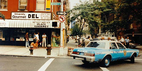
BLDGBLOG: Your books often lend themselves to political readings, on the other hand. Do you write with specific social or political allegories in mind, and, further, how do your settings—as in The City and The City—come to reflect political intentions, spatially?

Miéville: My short answer is that I dislike thinking in terms of allegory—quite a lot. I’ve disagreed with Tolkien about many things over the years, but one of the things I agree with him about is this lovely quote where he talks about having a cordial dislike for allegory.

The reason for that is partly something that Frederic Jameson has written about, which is the notion of having a master code that you can apply to a text and which, in some way, solves that text. At least in my mind, allegory implies a specifically correct reading—a kind of one-to-one reduction of the text.

It amazes me the extent to which this is still a model by which these things are talked about, particularly when it comes to poetry. This is not an original formulation, I know, but one still hears people talking about “what does the text mean?”—and I don’t think text means like that. Texts do things.

I’m always much happier talking in terms of metaphor, because it seems that metaphor is intrinsically more unstable. A metaphor fractures and kicks off more metaphors, which kick off more metaphors, and so on. In any fiction or art at all, but particularly in fantastic or imaginative work, there will inevitably be ramifications, amplifications, resonances, ideas, and riffs that throw out these other ideas. These may well be deliberate; you may well be deliberately trying to think about issues of crime and punishment, for example, or borders, or memory, or whatever it might be. Sometimes they won’t be deliberate.

But the point is, those riffs don’t reduce. There can be perfectly legitimate political readings and perfectly legitimate metaphoric resonances, but that doesn’t end the thing. That doesn’t foreclose it. The text is not in control. Certainly the writer is not in control of what the text can do—but neither, really, is the text itself.

So I’m very unhappy about the idea of allegoric reading, on the whole. Certainly I never intend my own stuff to be allegorical. Allegories, to me, are interesting more to the extent that they fail—to the extent that they spill out of their own bounds. Reading someone like George MacDonald—his books are extraordinary—or Charles Williams. But they’re extraordinary to the extent that they fail or exceed their own intended bounds as Christian allegory.

When Iron Council came out, people would say to me: “Is this book about the Gulf War? Is this book about the Iraq War? You’re making a point about the Iraq War, aren’t you?” And I was always very surprised. I was like, listen: if I want to make a point about the Iraq War, I’ll just say what I think about the Iraq War. I know this because I’ve done it. I write political articles. I’ve written a political book. But insisting on that does not mean for a second that I’m saying—in some kind of unconvincing, “cor-blimey, I’m just a story-teller, guvnor,” type-thing—that these books don’t riff off reality and don’t have things to say about it.

There’s this very strange notion that a writer needs to smuggle these other ideas into the text, but I simply don’t understand why anyone would think that that’s what fiction is for.

BLDGBLOG: There are also very basic historical and referential limits to how someone might interpret a text allegorically. If Iron Council had been written twenty years from now, for instance, during some future war between Taiwan and China, many readers would think it was a fictional exploration of that, and they’d forget about the Iraq War entirely.

Miéville: Sure. And you don’t want to disavow these readings. You may think, at this point in this particular book, I actually do want to make a genuine policy prescription. With my hand on my heart, I don’t think I have ever done that, but, especially if you write with a political texture, you certainly have to take readings like this on the chin.

So, when people say: are you really talking about this? My answer is generally not no—it’s generally yes, but… Or yes, and… Or yes… but not in the way that you mean.

[Image: “The way a cop inhabits the city is doubtless a fascinating thing…” Photo courtesy of the NYPD].
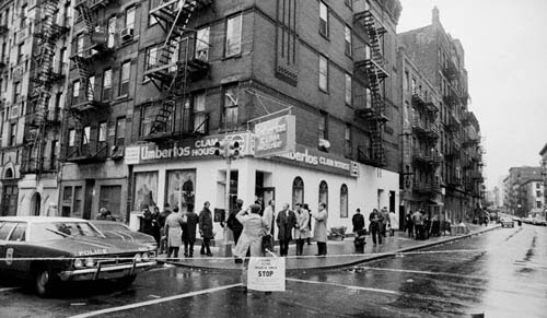
BLDGBLOG: Let’s go back to the idea of the police procedural. It’s intriguing to compare how a police officer and a novelist might look at the city—the sorts of details they both might notice or the narratives they both might pick up on. Broadly speaking, each engages in detection—a kind of hermeneutics of urban space. How did this idea of urban investigation—the “mythic urbanology” you mentioned earlier—shape your writing of The City and The City?

Miéville: On the question of the police procedural and detection, for me, the big touchstones here were detective fiction, not real police. Obviously they are related, but they’re related in a very convoluted, mediated way.

What I wanted to do was write something that had a great deal of fidelity—hopefully not camp fidelity, but absolute rigorous fidelity—to certain generic protocols of policing and criminology. That was the drive, much more than trying to find out how police really do their investigations. The way a cop inhabits the city is doubtless a fascinating thing, but what was much more important to me for this book was the way that the genre of crime, as an aesthetic field, relates to the city.

The whole notion of decoding the city—the notion that, in a crime drama, the city is a text of clues, in a kind of constant, quantum oscillation between possibilities, with the moment of the solution really being a collapse and, in a sense, a kind of tragedy—was really important to me.

Of course, I’m not one of those writers who says I don’t read reviews. I do read reviews. I know that some readers were very dissatisfied with the strict crime drama aspect of it. I can only hold up my hands. It was extremely strict. I don’t mean to do that kind of waffley, unconvincing, writerly, carte blanche, get-out-clause of “that was the whole point.” Because you can have something very particular in mind and still fuck it up.

But, for me, given the nature of the setting, it was very important to play it absolutely straight, so that, having conceived of this interweaving of the cities, the actual narrative itself would remain interesting, and page-turning, and so on and so forth. I wanted it to be a genuine who-dunnit. I wanted it to be a book that a crime reader could read and not have a sense that I had cheated.

By the way, I love that formulation of crime-readers: the idea that a book can cheat is just extraordinary.

BLDGBLOG: Can you explain what you mean, in this context, by being rigorous? You were rigorous specifically to what?

Miéville: The book walks through three different kinds of crime drama. In section one and section two, it goes from the world-weary boss with a young, chippy sidekick to the mismatched partners who end up with grudging respect for each other. Then, in part three, it’s a political conspiracy thriller. I quite consciously tried to inhabit these different iterations of crime writing, as a way to explore the city.

But this has all just been a long-winded way of saying that I would not pretend or presume any kind of real policing knowledge of the way cities work. I suspect, probably, like most things, actual genuine policing is considerably less interesting than it is in its fictionalized version—but I honestly don’t know.

[Images: New York City crime scene photographs].

BLDGBLOG: There’s a book that came out a few years ago called The Meadowlands, by Robert Sullivan. At one point, Sullivan tags along with a retired detective in New Jersey who reveals that, now that he’s retired, he no longer really knows what to do with all the information he’s accumulated about the city over the years. Being retired means he basically knows thousands of things about the region that no longer have any real use for him. He thus comes across as a very melancholy figure, almost as if all of it was supposed to lead up to some sort of narrative epiphany—where he would finally and absolutely understand the city—but then retirement came along and everything went back to being slightly pointless. It was an interpretive comedown, you might say.

Miéville: That kind of specialized knowledge, in any field, can be intoxicating. If you experience a space—say, a museum—with a plumber, you may well come out with a different sense of the strengths and weaknesses of that museum—considering the pipework, as well, of course, as the exhibits—than otherwise. This is one reason I love browsing specialist magazines in fields about which I know nothing.

Obviously, then, with something that is explicitly concerned with uncovering and solving, it makes perfect sense that seeing the city through the eyes of a police detective would give you a very self-conscious view of what’s happening out there.

In terms of fiction, though, I think, if anything, the drive is probably the opposite. Novelists have an endless drive to aestheticize and to complicate. I know there’s a very strong tradition—a tradition in which I write, myself—about the decoding of the city. Thomas de Quincey, Michael Moorcock, Alan Moore, Neil Gaiman, Iain Sinclair—that type-thing. The idea that, if you draw the right lines across the city, you’ll find its Kabbalistic heart and so on.

The thing about that is that it’s intoxicating—but it’s also bullshit. It’s bullshit and it’s paranoia—and it’s paranoia in a kind of literal sense, in that it’s a totalizing project. As long as you’re constantly aware of that, at an aesthetic level, then it’s not necessarily a problem; you’re part of a process of urban mythologization, just like James Joyce was, I suppose. But the sense that this notion of uncovering—of taking a scalpel to the city and uncovering the dark truth—is actually real, or that it actually solves anything, and is anything other than an aesthetic sleight of hand, can be quite misleading, and possibly even worse than that. To the extent that those texts do solve anything, they only solve mysteries that they created in the first place, which they scrawled over the map of a mucky contingent mess of history called the city. They scrawled a big question mark over it and then they solved it.

Arthur Machen does this as well. All the great weird fiction city writers do it. Machen explicitly talks about the strength of London, as opposed to Paris, in that London is more chaotic. Although he doesn’t put it in these words, I think what partly draws him to London is this notion that, in the absence of a kind of unifying vision, like Haussmann’s Boulevards, and in a city that’s become much more syncretic and messy over time, you have more room to insert your own aestheticizing vision.

As I say, it’s not in and of itself a sin, but to think of this as a real thing—that it’s a lived political reality or a new historical understanding of the city—is, I think, a misprision.

BLDGBLOG: You can see this, as well, in the rise of psychogeography—or, at least, some popular version of it—as a tool of urban analysis in architecture today. This popularity often fails to recognize that, no matter how fun or poetic an experience it genuinely might be, randomly wandering around Boston with an iPhone, for instance, is not guaranteed to produce useful urban insights.

Miéville: Some really interesting stuff has been done with psychogeography—I’m not going to say it’s without uses other than for making pretty maps. I mean, re-experiencing lived urban reality in ways other than how one is more conventionally supposed to do so can shine a new light on things—but that’s an act of political assertion and will. If you like, it’s a kind of deliberate—and, in certain contexts, radical—misunderstanding. Great, you know—good on you! You’ve productively misunderstood the city. But I think that the bombast of these particular—what are we in now? fourth or fifth generation?—psychogeographers is problematic.

Presumably at some point we’re going to get to a stage, probably reasonably soon, in which someone—maybe even one of the earlier generation of big psychogeographers—will write the great book against psychogeography. Not even that it’s been co-opted—it’s just wheel-spinning.

BLDGBLOG: In an interview with Ballardian, Iain Sinclair once joked that psychogeography, as a term, has effectively lost all meaning. Now, literally any act of walking through the city—walking to work in the morning, walking around your neighborhood, walking out to get a bagel—is referred to as “psychogeography.” It’s as if the experience of being a pedestrian in the city has become so unfamiliar to so many people, that they now think the very act of walking around makes them a kind of psychogeographic avant-garde.

Miéville: It’s no coincidence, presumably, that Sinclair started wandering out of the city and off into fields.

[Image: Art by Vincent Chong for the Subterranean Press edition of Kraken].
BLDGBLOG: This brings us to something I want to talk about from Kraken, which comes out in paperback here in the States next week. In that book, you describe a group of people called the Londonmancers. They’re basically psychogeographers with a very particular, almost parodically mystical understanding of the city. How does Kraken utilize this idea of an occult geography of greater London?

Miéville: Yes, this relates directly to what we were just saying. For various reasons, some cities refract, through aesthetics and through art, with a particular kind of flamboyancy. For whatever reason, London is one of them. I don’t mean to detract from all the other cities in the world that have their own sort of Gnosticism, but it is definitely the case that London has worked particularly well for this. There are a couple of moments in the book of great sentimentality, as well, written, I think, when I was feeling very, very well disposed toward London.

I think, in those terms, that I would locate myself completely in the tradition of London phantasmagoria. I see myself as very much doing that kind of thing. But, at the same time, as the previous answer showed, I’m also rather ambivalent to it and sort of impatient with it—probably with the self-hating zeal of someone who recognizes their own predilections!

Kraken, for me, in a relatively light-hearted and comedic form, is my attempt to have it both ways: to both be very much in that tradition and also to take the piss out of it. Reputedly, throughout Kraken, the very act of psychogeographic enunciation and urban uncovering is both potentially an important plot point and something that does uncover a genuine mystery; but it is also something that is ridiculous and silly, an act of misunderstanding. It’s all to do with what Thomas Pynchon, in Gravity’s Rainbow, called kute korrespondences: “hoping to zero in on the tremendous and secret Function whose name, like the permuted names of God, cannot be spoken.”

The London within Kraken feels, to me, much more dreamlike than the London of something like King Rat. That’s obviously a much earlier book, and I now write very differently; but King Rat, for all its flaws, is a book very much to do with its time. It’s not just to do with London; it’s to do with London in the mid-nineties. It’s a real, particular London, phantasmagorized.

But Kraken is also set in London—and I wanted to indulge all my usual Londonisms and take them to an absurd extreme. The idea, for example, as you say, of this cadre of mages called the Londonmancers: that’s both in homage to parts of that tradition, and also, hopefully, an extension of it to a kind of absurdity—the ne plus ultra, you know?

BLDGBLOG: Kraken also makes some very explicit maritime gestures—the squid, of course, which is very redolent of H.P. Lovecraft, but also details such as the pirate-like duo of Goss and Subby. This maritime thread pops up, as well, in The Scar, with its floating city of linked ships. My question is: how do your interests in urban arcana and myth continue into the sphere of the maritime, and what narrative or symbolic possibilities do maritime themes offer your work?

Miéville: Actually, I think I was very restrained about Lovecraft. I think the book mentions Cthulhu twice—which, for a 140,000 or 150,000-word novel about giant squid cults, is pretty restrained! That’s partly because, as you say, if you write a book about a tentacular monster with a strange cult associated with it, anyone who knows the field is going to be thinking immediately in terms of Lovecraft. And I’m very, very impressed by Lovecraft—he’s a big presence for me—but, partly for that very reason, I think Kraken is one of the least Lovecrafty things I’ve done.

As to the question of maritimism, like a lot of my interests, it’s more to do with how it has been filtered through fiction, rather than how it is in reality. In reality, I have no interest in sailing. I’ve done it, I think, once.

But maritime fiction, from Gulliver’s Travels onward, I absolutely love. I love that it has its own set of traditions; in some ways, it’s a kind of mini-canon. It has its own riffs. There are some lovely teasings of maritime fiction within Gulliver’s Travels where he gets into the pornography of maritime terminology: mainstays and capstans and mizzens and so on, which, again, feature quite prominently in The Scar.

[Image: “An Imaginary View of the Arsenale” by J.M.W. Turner, courtesy of the Tate].

BLDGBLOG: In the context of the maritime, I was speaking to Reza Negarestani recently and he mentioned a Russian novella from the 1970s called “The Crew Of The Mekong,” suggesting that I ask you about your interest in it. Reza, of course, wrote Cyclonopedia, which falls somewhere between, say, H.P. Lovecraft and ExxonMobil, and for which you supplied an enthusiastic endorsement.

Miéville: Yes, I was blown away by Reza’s book—partly just because of the excitement of something that seems genuinely unclassifiable. It really is pretty much impossible to say whether you’re reading a work of genre fiction or a philosophical textbook or both of the above. There’s also the slightly crazed pseudo-rigor of it, and the sense that this is philosophy as inspired by schlocky horror movies as much as by Alain Badiou.

There’s a phrase that Kim Newman uses: post-genre horror. It’s a really nice phrase for something which is clearly inflected in a horror way, and clearly emerges out of the generic tradition of horror, but is no longer reducible to it. I think that Reza’s work is a very, very good example of that. As such, Cyclonopedia is one of my favorite books of the last few years.

BLDGBLOG: So Reza pointed me to “The Crew of the Mekong,” a work of Russian maritime scifi. The authors describe it, somewhat baroquely, as “an account of the latest fantastic discoveries, happenings of the eighteenth century, mysteries of matter, and adventures on land and at sea.” What drew you to it?

Miéville: I can’t remember exactly what brought me to it, to be perfectly honest: it was in a secondhand bookshop and I bought it because it looked like an oddity.

It’s very odd in terms of the shape of its narrative; it sort of lurches, with a story within a story, including a long, extended flashback within the larger framing narrative, and it’s all wrapped up in this pulp shell. In terms of the story itself, if I recall, it was actually me who suggested it to Reza because it has loads of stuff in it about oil, plastic resins, and pipelines, and one of the characters works for an institute called the Institute of Surfaces, which deals with the weird physics and uncanny properties of surfaces and topology.

Some of the flashback scenes and some of the background I’ve seen described as proto-steampunk, which I think is highly anachronistic: it’s more of an elective affinity, that, if you like retro-futurity, you might also like this. At a bare minimum, it’s a book worth reading simply because it’s very odd; at a maximum, some of the things going on it are philosophically interesting, although in a bizarre way.

But foreign pulp always has that peculiar kind of feeling to it, because you have a distinct cultural remove. At its worst, that can lead to an awful kind of orientalism, but it’s undeniably fascinating as a reader.

BLDGBLOG: It’s interesting that depictions of maritime journeys can maintain such strong mythic and imaginative resonance, even across wildly different cultures, eras, genres, and artforms—whether it’s “The Crew of the Mekong” or The Scar, Valhalla Rising or Moby Dick.

Miéville: The maritime world in general is an over-determined symbol of pretty much anything you want it to be—just fill in the blank: yearning, manifest destiny, whatever. It’s a very fecund field. My own interest in it comes pretty much through fiction and, to a certain extent, art. I wish I had a bit more money, in fact, because I would buy a lot of those fairly cheap, timeless, uncredited, late 19th-century, early 20th-century seascapes that you see on sale in a lot of thrift shops.

You also mentioned Goss and Subby. Goss and Subby themselves I never thought of as pirates, in fact. They were my go at iterating the much-masticated trope of the freakishly monstrous duo, figures who are, in some way that I suspect is politically meaningful, and that one day I’ll try to parse, generally even worse than their boss. They often speak in a somewhat odd, stilted fashion, like Hazel and Cha-Cha, or Croup and Vandemar, or various others. The magisterial TV Tropes has a whole entry on such duos called “Those Two Bad Guys.” The tweak that I tried to add with Goss and Subby was to integrate an idea from a Serbian fairy-tale called—spoiler!—“BasCelik.” For anyone who knows that story, this is a big give-away.

Again, though, I think you have to ration your own predilections. I have always been very faithful to my own loves: I look at my notebooks or bits of paper from when I was four and, basically, my interests haven’t changed. Left to my own devices, I would probably write about octopuses, monsters, occasionally Tarzan, and that’s really it. From a fairly young age, the maritime yarn was one of those.

But you can’t just give into your own drives, or you simply end up writing the same book again and again.

[Image: Mapping old London].

BLDGBLOG: Along those lines, are there any settings or environments—or even particular cities—that would be a real challenge for you to work with? Put another way, can you imagine giving yourself a deliberate challenge to write a novel set out in the English suburbs, or even in a place like Los Angeles? How might that sort of unfamiliar, seemingly very un-Miéville-like landscape affect your plots and characters?

Miéville: That’s a very interesting question. I really like that approach, in terms of setting yourself challenges that don’t come naturally. It’s almost a kind of Oulipo approach. It’s tricky, though, because you have to find something that doesn’t come naturally, but, obviously, you don’t want to write about something that doesn’t interest you. It has to be something that interests you contradictorally, or contrarily.

To be honest, the suburbs don’t attract me, for a bunch of reasons. I think it’s been done to death. I think anyone who tried to do that after J. G. Ballard would be setting themselves up for failure. As I tried to say when I did my review of the Ballard collection for The Nation, one of the problems is that, with an awful lot of suburban art today, it is pitched as this tremendously outré and radical claim to say that the suburbs are actually hotbeds of perversity—whereas, in fact, that is completely the cliché now. If you wanted to do something interesting, you would have to write about terribly boring suburbs, which would loop all the way back round again, out of interesting, through meta-interesting, and back down again to boring. So I doubt I would do something set in the suburbs.

I am quite interested in wilderness. Iron Council has quite a bit of wilderness, and that was something that I really liked writing and that I’d like to try again.

But, to be honest, it’s different kinds of urban space that appeal to me. If you’re someone who can’t drive, like I can’t, you find a lot of American cities are not just difficult, but really quite strange. I spend a lot of time in Providence, Rhode Island, and it’s a nice town, but it just doesn’t operate like a British town. A lot of American towns don’t. The number of American cities where downtown is essentially dead after seven o’clock, or in which you have these strange little downtowns, and then these quite extensive, sprawling but not quite suburban surroundings that all call themselves separate cities, that segue into each other and often have their own laws—that sort of thing is a very, very strange urban political aesthetic to me.

I’ve been thinking about trying to write a story not just set, for example, in Providence, but in which Providence, or another city that operates in a very non-English—or non-my-English—fashion, is very much part of the structuring power of the story. I’d be interested in trying something like that.

But countries all around the world have their own specificities about the way their urban environments work. I was in India recently, for example. It was a very brief trip, and I’m sure some of this was just wish fulfillment or aesthetic speculation, but I became really obsessed with the way, the moment you touched down at a different airport, you got out and you breathed the air, Mumbai felt different to Delhi, felt different to Kolkata, felt different to Chennai.

Rather than syncretizing a lot of those elements, I’d like to try to be really, really faithful to one or another city, which is not my city, in the hopes that, being an outsider, I might notice certain aspects that otherwise one would not. There’s a certain type of ingenuous everyday inhabiting of a city, which is very pre-theoretical for something like psychogeography, but it brings its own insights, particularly when it doesn’t come naturally or when it goes wrong.

There’s a lovely phrase that I think Algernon Blackwood used to describe someone’s bewilderment: he describes him as being bewildered in the way a man is when he’s looking for a post box in a foreign city. It’s a completely everyday, quotidian thing, and he might walk past it ten times, but he doesn’t—he can’t—recognize it.

That kind of very, very low-level alienation—the uncertainty about how do you hail a taxi, how do you buy food in this place, if somebody yells something from their top window, why does everyone move away from this part of the street and not that part? It’s that kind of very low-level stuff, as opposed to the kind of more obvious, dramatic differences, and I think there might be a way of tapping into that knowledge, knowledge that the locals don’t even think to tell you, that might be an interesting way in.

To that extent, it would be cities that I like but in which I’m very much an outsider that I’d like to try to tap.

• • •

Thanks to China Miéville for finding time to have this conversation, including scheduling a phone call at midnight in order to wrap up the final questions. Thanks, as well, to Nicola Twilley, who transcribed 95% of this interview and offered editorial feedback while it was in process, and to Tim Maly who first told me about the towns of Derby Line–Stanstead.

Miéville’s newest book, Embassytown, comes out in the U.S. in May; show your support for speculative fiction and pre-order a copy soon. If you are new to Miéville’s work, meanwhile, I might suggest starting with The City and The City.