They Come From Everywhere: An Interview with Mike Elizalde

Many of today’s most original and bizarre visions of alternative worlds and landscapes come from the workshops of Hollywood effects studios. Behind the scenes of nondescript San Fernando Valley offices and warehouse spaces (if not outside California altogether, in many of the other nodes in the ever-expanding global network of cinematic effects production, from suburban London to Wellington, New Zealand), lurk the multidisciplinary teams whose job it is to create tomorrow’s monsters.

Mike Elizalde of Spectral Motion applies make-up to actor Ron Perlman, as Hellboy.

Spectral Motion, the effects house responsible for some of the most technically intricate and physically stunning animatronic creatures seen in feature film today, is no exception. Based in a small strip of anonymous one-story warehouse spaces squeezed in between a freeway and rail tracks, and overshadowed by a gargantuan Home Depot, Spectral Motion has developed monsters, effects, and other mechanical grotesqueries that have since become household nightmares, if not names.

Since its founding, by Mike & Mary Elizalde in 1994, the firm has worked on such films as Hellboy & Hellboy II: The Golden Army, Looper, Attack the Block, Blade 2 & Blade: Trinity, X-Men: First Class, The Watch, and this summer’s highly anticipated Pacific Rim.


This winter, while out in Los Angeles on a trip for Venue, I had the enormous pleasure of stopping by Spectral Motion with Nicola Twilley in order to interview Mike Elizalde, CEO of Spectral Motion, on a cloudy day in Glendale to talk all things monstrous and disturbing. To a certain extent, this interview thus forms the second part in a series with BLDGBLOG’s earlier interview with Hellboy creator Mike Mignola, and the present conversation, reproduced below, pairs well with Mignola’s thoughts on what we might call landscapes of monstrosity.

Our conversation with Elizalde ranged from the fine line that separates the grotesque and the alien to the possibility of planetary-scale creatures made using tweaked geotextiles, via the price of yak hair and John Carpenter’s now-legendary Antarctic thriller, The Thing.
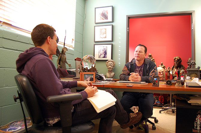
Mike Elizalde behind his desk at Spectral Motion.

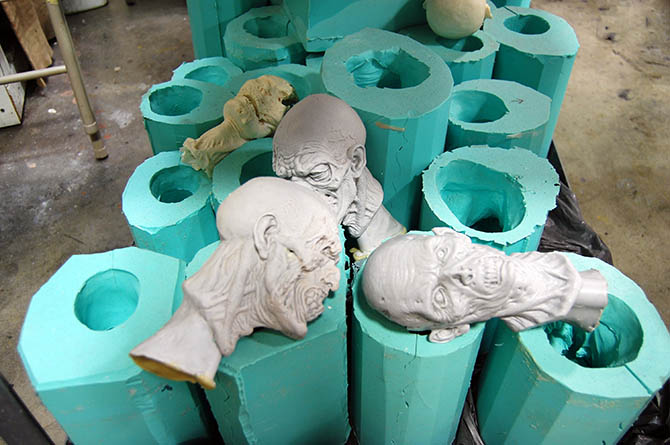
Elizalde, a good-humored conversationalist, not only patiently answered our many questions—with a head cold, no less—but then took us on a tour through Spectral Motion‘s surprisingly large workshop. We saw miniature zombie heads emerging from latex molds (destined for a film project by Elizalde’s own son), costumes being sewn by a technician named Claire Flewin for an upcoming attraction at Disneyland, and a bewildering variety of body parts—heads, torsos, claws, and even a very hairy rubber chest once worn by footballer Vinnie Jones in X-Men: The Last Stand—that were either awaiting, or had already performed, their celluloid magic.

The visit ended with a screening of Spectral Motion‘s greatest hits, so to speak, with in-house photographer and archivist Kevin McTurk—a chance to see the company’s creations in their natural habitat. We walked back out into the flat light and beige parking lots of the Valley, a landscape enlivened by our heightened sense of the combination of close observation and inspired distortion required to transform the everyday into the grotesque.

• • •

Geoff Manaugh: I’d love to start with the most basic question of all: how would you describe Spectral Motion and what the company does?

Mike Elizalde: We are principally a prosthetics, animatronics, and special effects creature studio, but we are also a multifaceted design studio. We do a lot of different kinds of work. Most recently, for example, in partnership with one of my long-time colleagues, Mark Setrakian, we built anthropomorphic bipedal hydraulic robots that engage in battle, for a reality show for Syfy. It’s called RCLRobot Combat League. It’s pretty astounding what these machines can do, including what they can do to each other.

Battling it out in Robot Combat League with two robots—”eight-feet tall, state-of-the-art humanoid robots controlled by human ‘robo-jockeys,'” in the words of Syfy—designed by Mark Setrakian of Spectral Motion.

Nicola Twilley: Are the robot battles choreographed, or do you genuinely not know which robot will win?

Elizalde: Oh, no, absolutely—it’s a contest. It really is about which robot will emerge as the victorious contender.

RCL is not only one of our most recent projects, but it also shows that, here at the studio, we can do everything from a very delicate prosthetic application on an actor, to an animatronic character in a film, to something that’s completely out of our comfort zone—like building battling robots.

I always tell people that, if they come in here with a drawing of a car, we could build that car. It is a very diverse group that we work with: artists, technicians, and, of course, we use all the available or cutting-edge technologies out there in the world to realize whatever it is that we are required to make.

Mike Elizalde of Spectral Motion shows us a creature.

Manaugh: What kind of design briefs come to you? Also, when a client comes to you, typically how detailed or amorphous is their request?

Elizalde: Sometimes it is very vague. But, typically, what happens is we’re approached with a script for a project. Our job is to go through the script and create a breakdown and, ultimately, a budget based on those breakdowns. We take whatever we think we should build for that script and we make suggestions as to how each thing should look—what should move, what the design should be, and so on.

Other times, we’ll be working with a director who’s very involved and who maybe even has some technical knowledge of what we do—especially someone like Guillermo del Toro. He’s completely savvy about what we do because he used to own a creature shop of his own, so working with someone like him is much more collaborative; he comes to us with a much more clear idea of what he wants to see in his films. Lots of times, he’ll even show us an illustration he’s done. He’s the first one to say, “I’m not an artist!” But he really is. He’s quite gifted.

The creature known as Wink from Hellboy II: The Golden Army, designed by Spectral Motion, including a shot of the mechanical understructure used inside Wink’s left hand.

So he’ll bring us his illustrations and say, you know, “You tell me if it’s going to be a puppet, an animatronic puppet, or a creature suit that an actor can wear.” And that’s where our knowhow comes in. That’s how it evolves.

There are also times—with the robot show, for example—where they know exactly what they need but they don’t know how to achieve it. In those cases, they come to us to do that for them.

Twilley: Can you talk us through one of the projects you’ve worked on where you had to create your vision based solely on what’s in the script, rather than more collaborative work with the director? What’s that process like?

Elizalde: Well, I’d actually say that ninety percent of our work is that way. For most of the projects we work on, we do, in fact, just get a script and the director says, “Show me what this looks like.” But we love that challenge. It’s really fun for us to get into the artistic side of developing what the appearance of something will end up looking like.

We had a lot of fun working with a director named Tommy Wirkola, for example, who directed Hansel & Gretel: Witch Hunters. He was the director of Dead Snow, a really strange Norwegian film that involved this group of young kids who go off to a cabin where they’re hunted down by a hoard of horrifying zombie Nazi monsters. It’s really grisly.

Anyway, although Tommy did have really good ideas about what he wanted his characters to look like for Hansel & Gretel, there were certain characters whose descriptions were much more vague—also because there was such a broad scope of characters in the film. So they did rely on us to come up with a lot of different looks based on loose descriptions. In the end, the principal characters in the film were total collaborations between Tommy, myself, and Kevin Messick, the producer, and the rest of my team here at Spectral Motion, of course.

I’d say that’s a good example of both worlds, where you have some clear ideas about a few characters, but, for another group of characters, there really isn’t a whole lot of information or a detailed description. You have to fill in a lot of blanks.

Mark Setrakian, Thom Floutz , and Mike Elizalde of Spectral Motion pose with Sammael from Hellboy.

Twilley: What kinds of things do you look for in a script to give you a clue about how a character might work—or is that something that simply comes out when you’re sketching or modeling?

Elizalde: In a script, we basically know what we’re looking for: “Enter a monster.” We know that’s what we’re going be doing, so we look for those moments in the script. Sometimes there’s a brief description—something like, “the monster’s leathery hide covered in tentacles.” That kind of stuff gives us an immediate visual as to what we want to create. Then we explore it with both two-dimensional artwork and three-dimensional artwork, and both digital and physical.

In fact [gestures at desk], these are some examples of two-dimensional artwork that we’ve created to show what a character will look like. This [points to statuette above desk] is a maquette for one of the characters in Hellboy II—the Angel of Death. This was realized at this scale so that del Toro could see it and say, “That’s it. That’s what I want. Build that.” This actually began as an illustration that Guillermo did in his sketchbook, a very meticulous and beautiful illustration that he came to us with.

The Angel of Death from Hellboy II: The Golden Army.

But that’s the process: illustration and then maquette. Sometimes, though, we’ll do a 3D illustration in the computer before we go to the next stage, just to be able to look at something virtually, in three dimensions, and to examine it a little bit more before we invest the energy into creating a full-blown maquette.

The maquette, as a tool, can be very essential for us, because it allows us to work out any bugs that might be happening on a larger scale, design-wise. Practically speaking, it doesn’t give us a lot of information as to how the wings are going to work, or how it’s going to function; but it does tell us that a human being could actually be inside of it and that it could actually work as a full-scale creature. It’s essential for those reasons.
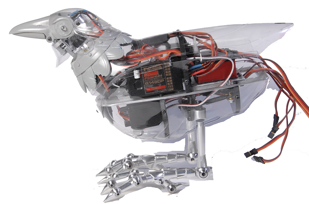
Simon, the mechanical bird from Your Highness, before paint has been applied, revealing the internal workings.

Because you can show a director a drawing, and it might look really terrific—but, when it comes to actually making it, in a practical application at scale, sometimes the drawing just doesn’t translate. Sometimes you need the maquette to help describe what the finished piece will look like.

Manaugh: You mentioned animatronics and puppeteering. We were just up at the Jet Propulsion Lab in Pasadena yesterday afternoon, talking to them about how they program certain amounts of autonomy into their instruments, especially if it’s something that they’re putting on Mars. It has to be able to act on its own, at times, because it doesn’t have enough time to wait for the command signal from us back on Earth. I’m curious, especially with something like the robot combat show, how much autonomy you can build into a piece. Can you create something that you just switch on and let go, so that it functions as a kind of autonomous or even artificially intelligent film prop?

Elizalde: It really depends on the application. For example, when we’re filming something, a lot of times there’s a spontaneity that’s required. Sometimes actors like to ad lib a little bit. If we need to react to something that an actor is saying via a puppet—an animatronic puppet—then that live performance really is required. But we always have the option of going to a programmable setup, one where we can have a specific set of parameters, performance-wise, to create a specific scene.

For live performances on a stage, we’d probably want to program that with the ability to switch over to manual, if required. But, if it’s scripted—if it’s a beat-by-beat performance—then we know that can be programmable. We can turn on the switch and let it go. In the middle of that, you can then stop it, and have a live show, with puppeteers in the background filling in the blanks of whatever that performance is, and then you can continue with the recorded or programmed performance.

It really goes back and forth, depending on what it is the people who are putting on the production need.
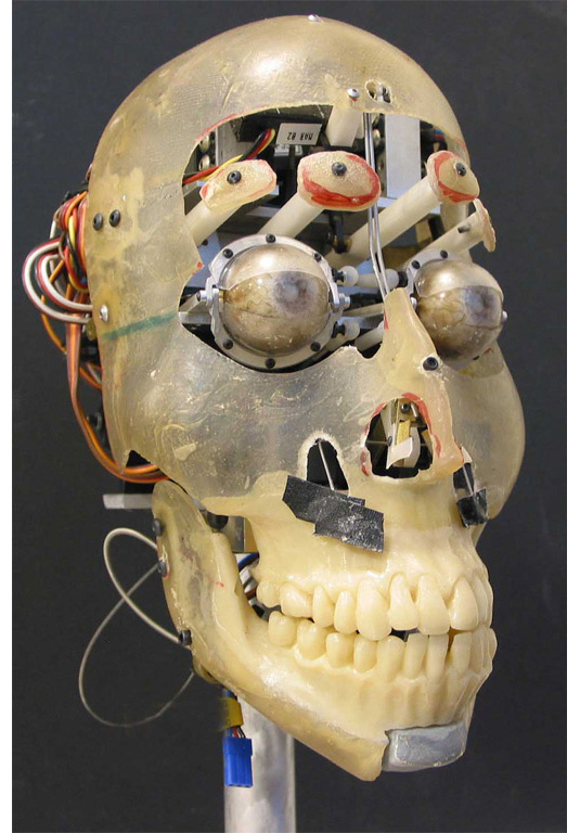
The mechanical skull under structure of the Ivan the Corpse from Hellboy.

Twilley: That’s an interesting point—the idea of how a live actor responds to your creatures. Have there been any surprises in how an actor has responded, or do they all tend to know what they’re getting into by the time you’re filming?

Elizalde: They do know what they’re getting into, but it’s always rewarding to have an actor go over to the thing that you built, and stare at it, and say, “Oh, my God! Look at that thing!” They can feed off of that. I think they are able to create a more layered performance, with a lot more depth in their reactions to something if it’s actually there—if it’s present, if it has life to it, and it’s tactile.

A lot of times people turn to digital solutions. That’s also good, if the application is correct. But, you know, a lot of directors that we talk to are of the mind that a practical effect is far better for exactly that reason—because the actor does have a co-actor to work with, to play off of, and to have feelings about.

That’s one of the things that keeps us going. And, the fact is, with this business, no matter what walks through that door we know that it’s going to be a completely different set of challenges from the last thing that we did.
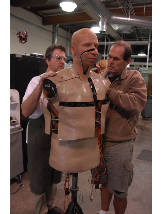
Mechanical puppet of Drake from a Sprite commercial. Scott Millenbaugh and Jurgen Heimann of Spectral Motion are seen here making mechanical adjustments.

Manaugh: About six years ago, I interviewed a guy who did concept art for the Star Wars prequels, and he had a kind of pet obsession with building upside-down skyscrapers—that is, skyscrapers that grew downwards like stalactites. He kept trying to get them into a movie. He would build all of these amazing 3D models and show them to the director, and the director was always excited—but then he’d turn the model upside-down and say, “Let’s do it like this!” So all the upside-down skyscrapers would just be right-side up again. In any case, this artist was then working on the recent Star Trek reboot, and there’s a brief moment where you see upside-down skyscrapers on the planet Vulcan. It’s only on screen for about a second and a half, but he finally did it—he got his upside-down skyscrapers into a film.

Elizalde: [laughs] But, ohhh! For half-a-second! [laughter]

Manaugh: Exactly. Anyway, in the context of what you do here at Spectral Motion, I’m curious if there is something like that, that you’ve been trying to get into a movie for the last few years but that just never quite makes it. A specific monster, or a new material, or even a particular way of moving, that keeps getting rejected.

Elizalde: That’s an interesting question. [pauses] You know, I’d have to say no. I’d say it seems like the more freely we think, the better the result is. So it’s quite the contrary: most of the stuff we suggest actually does make it into the film, because it’s something that someone else didn’t think about. Or perhaps we’ve added some movement to a character, or we’ve brought something that will elicit a more visceral reaction from the audience—bubbly skin, for instance, or cilia that wiggle around.

I don’t think I’ve really encountered a situation where I thought something would look great, but, when I brought it to a director, they said, “Nah—I don’t think that’s going to go. Let’s not try that.” They always seem to say, “Let’s try it! It sounds cool!”

Mike Elizalde applies some last-minute touch-ups to actor Ron Perlman on the set of Hellboy.

We really haven’t had a whole lot of frustration—maybe only when it turns into a very large committee making a decision on the film. Then, I suppose, a certain degree of frustration is more typical. But that happens in every industry, not just ours: the more people are involved in deciding something, the more difficult it is to get a clear image of what it is we’re supposed to do.

Manaugh: When we first spoke to set-up this interview, I mentioned that we’d be touring the landfill over at Puente Hills this morning, on our way here to meet you—it’s the biggest active landfill in the United States. What’s interesting is that it’s not only absolutely massive, it’s also semi-robotic, in the sense that the entire facility—the entire landscape—is a kind of mechanical device made from methane vents and sensors and geotextiles, and it grows everyday by what they call a “cell.” A “cell” is one square-acre, compacted twenty feet deep with trash. Everyday!

But I mention this because, during our visit there, I almost had the feeling of standing on top of a mountain-sized creature designed by Spectral Motion—a strange, half-living, half-mechanical monstrosity in the heart of the city, growing new “cells” every day of its existence. It’s like something out of Hellboy II. So I’m curious about the possibilities of a kind of landscape-scale creature—how big these things can get before you need to rely on CGI. Is it possible to go up to that scale, or what are the technical or budgetary limitations?

A Tyrannosaurus rex in a bathtub in the back prep rooms of Spectral Motion.

Elizalde: We can’t build mountains yet but, absolutely, we can go way up in scale! Many times, of course, we have to rely, at least to some degree, on digital effects—but that just makes our job easier, by extending what is possible, practically, and completing it cinematically, on screen, at a much larger scale.

For example, on Pacific Rim, Guillermo del Toro’s new film that comes out this summer, we designed what are called Jaegers. They’re basically just giant robots. And we also designed the Kaiju, the monsters in the film. First, we created maquettes, just like the ones here, and we made several versions of each to reflect the final designs you’ll see in the film. Those were taken and re-created digitally so they could be realized at a much larger scale.

To that degree, we can create something enormous. There’s a maquette around here somewhere of a character we designed for the first Hellboy movie—actually, there are two of them. One of those characters is massive—about the size of a ten-story building—and the other one is much, much bigger. It’s the size of… I don’t know, a small asteroid. There really is no limit to the scale, provided we can rely on a visual effects company to help us realize our ultimate goal.

The animatronic jaws and bioluminescent teeth (top) of the alien creature (bottom) designed by Spectral Motion for Attack the Block.

But going the opposite direction, scale-wise, is also something that interests us. We can make something incredibly tiny, depending on what the film requires. There is no limit in one direction or the other as to what can be achieved, especially with the power of extension through digital effects.

Manaugh: Just to continue, briefly, with the Puente Hills reference, something that we’ve been interested in for the past few years is the design of geotextiles, where companies like TenCate in the Netherlands are producing what are, effectively, landscape-scale blankets made from high-quality mesh, used to stabilize levees or to add support to the sides of landfills. But some of these geotextiles are even now getting electromagnetic sensors embedded in them, and there’s even the possibility of a geotextile someday being given mechanical motion—so it’s just fascinating, I think, to imagine what you guys could do with a kind of monstrous or demonic geotextile, as if the surface of the earth could rise up as a monster in Hellboy III.

Elizalde: [laughs] Well, now that I know about it, I’ll start looking into it!

Twilley: Aside from scale, we’re also curious about the nature of monsters in general. This is a pretty huge question, but what is a monster? What makes something monstrous or grotesque? There seems to be such a fine line between something that is alien—and thus frightening—and something that is so alienating it’s basically unrecognizable, and thus not threatening at all.

Elizalde: Exactly. Right, right.

Twilley: So how do you find that sweet spot—and, also, how has that sweet spot changed over time, at least since you’ve been in the business? Are new things becoming monstrous?

Elizalde: Well, I think my definition of a monster is simply a distortion: something that maybe looks close to a human being, for example, but there’s something wrong. It can be something slight, something subtle—like an eye that’s just slightly out of place—that makes a monster. Even a little, disturbing thing like that can frighten you.

So it doesn’t take a lot to push things to the limit of what I would consider the grotesque or the monstrous. At that point, it runs the gamut from the most bizarre and unimaginable things that you might read in an H. P. Lovecraft story to something simple, like a tarantula with a human head. Now there’s something to make me scream! I think there’s a very broad range. But you’re right: it’s a huge question.
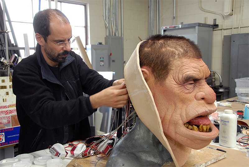
Mark Setrakian of Spectral Motion working on the animatronic head of Edward the Troll from Hansel and Gretel: Witch Hunters.

And sometimes the monstrous defies definition. I guess it’s more of a primal reaction—something you can’t quite put your finger on or describe, but something that makes you feel uneasy. It makes you feel uncomfortable or frightened. A distortion of what is natural, or what you perceive as natural, something outside what you think is the order of things—or outside what you think is acceptable within what we’ve come to recognize as natural things—then that’s a monster. That’s a monstrous thing.

Do you recall seeing John Carpenter’s The Thing?

Manaugh: It’s one of my favorite movies.

Elizalde: My goodness, the stuff in that film is the stuff of nightmares. It really is brilliantly executed, and it’s a great inspiration to all of the people in our industry who love monsters, and to all the fans all over the world who love monstrous things.
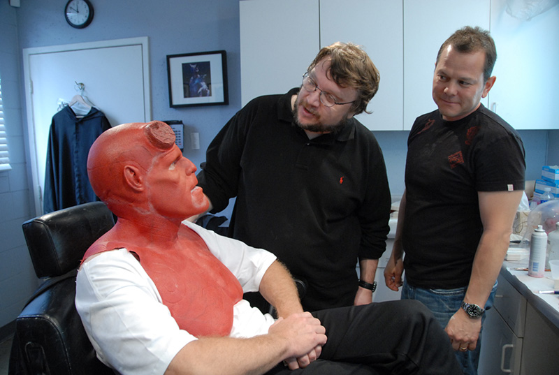
Actor Ron Perlman gets make-up applied for his role as Hellboy, as director Guillermo del Toro and Mike Elizalde from Spectral Motion stop in for a visit.

Twilley: Have there been trends over time? In other words, do you find directors look for a particular kind of monster at a particular moment in time?

Elizalde: I do think there are trends—although I think it’s mainly that there’s a tendency here in Hollywood where somebody hears a rumor that someone down the street is building a film around this particular creature, so that guy’s now got to write a similar script to compete. But sometimes the trends are set by something groundbreaking, like The Thing. Once that movie was released, everybody paid attention and a whole new area of exploration became available to create amazing moments in cinema.

Those are the real trends, you know. It’s a symbiosis that happens between the artistic community and the technological community, and it’s how it keeps advancing. It’s how it keeps growing. And it keeps us excited about what we do. We feed off of each other.
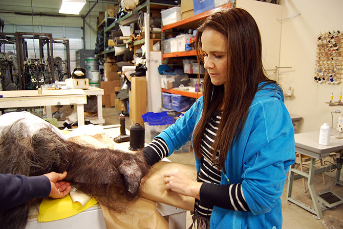
Technician Claire Flewin uses her hand to demonstrate how yak hair looks stretched over a mold.

Manaugh: Speaking of that symbiosis, every once in a while, you’ll see articles in a magazine like New Scientist or you’ll read a press release coming out of a school like Harvard, saying that they’ve developed, for instance, little soft robots or other transformable, remote-control creatures for post-disaster reconnaissance—things like that. I mention this because I could imagine that you might have multiple reactions to something like that: one reaction might be excitement—excitement to discover a new material or a new technique that you could bring into a film someday—but the other reaction might be something almost more like, “Huh. We did that ten years ago.” I’m curious as to whether you feel, because of the nature of the movies that you work on, that the technical innovations you come up with don’t get the attention or professional recognition that they deserve.

Elizalde: I think your assessment is accurate on both counts. There are times when we see an innovation, or a scientific development, that we think could be beneficial to our industry; in fact, that happens all the time. There’s cross-pollination like that going on constantly, where we borrow from other industries. We borrow from the medical industry. We borrow from the aerospace industry. We borrow, really, from whatever scientific developments there are out there. We seek them out and we do employ some of those methods in our own routines and systems.

In fact, one of our main designers, and a very dear friend of mine whom I’ve worked side by side with for years now, is Mark Setrakian. When he’s not working here with us, he is a designer at one of the labs you just described.

So there is a lot of crossover there.

The mechanical skull of the scrunt from Lady in the Water.

Manaugh: That’s interesting—do the people who work for you tend to come from scientific or engineering backgrounds, like Mark, or are they more often from arts schools? What kinds of backgrounds do they tend to have?

Elizalde: Generally speaking, I think they’re people like myself who just have a love for monsters. That’s honestly where a lot of people in our industry come from. There are people who started their careers as dental technicians and people who started out as mold-makers in a foundry. In all of those cases, people from those sorts of technical fields gravitate toward this work because of, first of all, a love for monsters and creatures, and, secondly, a technical ability that isn’t necessarily described as an art form per se. Electronics people love to work for us. People who design algorithms love to work for us. Even people with a background in dentistry, like I say, love to work for us.

There’s really no limit to the fields that bring people to this industry—they come from everywhere. The common thread is that we all love movies and we all love creatures. We love making rubber monsters for a living.

The shelves at Spectral Motion gives a good sense of the workshop’s range of reference. Highlights include the Third Edition of the Atlas of Clinical Dermatology (in color), The National Audubon Society: Speaking for Nature, Marvel’s Fantastic Four, The Graphic Works of Odilon Redon, and a Treasury of Fantastic and Mythological Creatures.

To go back to your previous question, there are definitely times when I think we don’t get a lot of exposure for what we do, but there is also, at some level, a kind of “don’t pay attention to the man behind the curtain” thing going on, where we don’t really want people to look backstage at what makes a movie work. We are creating a living creature for film, and that’s what we want to put across to the audience. In some ways, it’s actually better if there isn’t too much exposure as to how something was created; it’s like exposing a magic trick. Once you know the secret, it’s not that big a deal.

So we do live in a little bit of a shroud of secrecy—but that’s okay. After a film is released, it’s not unusual for more of what we did on that film to be exposed. Then, we do like to have our technicians, our artists, and what we’ve developed internally here to be recognized and shown to the public, just so that people can see how cool it all is.

I think, though, that my response to those kinds of news stories is really more of a happiness to see new technologies being developed elsewhere, and an eagerness to get my hands on it so I can see what we could do with it in a movie. And, of course, sometimes we develop our very own things here that maybe someone hadn’t thought of, and that could be of use in other fields, like robotics. And that’s kind of cool, too.

Mike Elizalde of Spectral Motion sculpting an old age Nosferatu as a personal project.

Manaugh: Finally, to bring things full circle, we’re just curious as to how Spectral Motion got started.

Elizalde: Well, I became involved in the effects industry back in 1987. It sort of just dawned on me one day that I wanted to do this for a living. I had been in the Navy for eight years when it really started getting to me—when I realized I wasn’t doing what I wanted to do with my life.

I decided that I’d come back to my home, which is Los Angeles, California, and look into becoming a creature effects guy. I was totally enamored of Frankenstein’s Monster when I was a kid. I grew up watching all the horror movies that I could see—a steady diet of Godzilla, Frankenstein, you name it. All the Universal monsters, and even more modern things like An American Werewolf in London. They just really fascinated me. That was a real catalyst for me to start exploring how to do this myself.

I also learned from books. I collected books and started using my friends as guinea pigs, creating very rudimentary makeup effects on them. And, eventually, I landed my first job in Hollywood.

Cut to fifteen years later, and I had my first experience on set with Guillermo del Toro. I was working with him on Blade II. I had done an animatronic device for the characters he was using in his film, and I was also on set puppeteering. We became very good friends. That’s when he offered me the script for Hellboy and that’s how we started Spectral Motion. I became independent. Prior to that I had worked for Rick Baker, and Stan Winston, and all the other big names in town. But this was our opportunity to make our own names—and here we are, today.

You know, this is one of those industries where you can come in with a desire and some ability, and people around you will instruct you and nurture you. That’s how it happened for me. I was taught by my peers. And it really is a great way to learn. There are schools where you can learn this stuff, as well, but my experience proved to me that the self-taught/mentored method is a very good way to go.

• • •

This interview was simultaneously published on Venue, where a long list of other interviews discussing the human relationship to the virtual, built, and natural landscapes can be found.

Books Received

[Image: A riverboat library in Bangladesh; image courtesy of the Gates Foundation].

Many, many books have arrived at the home office here, and I’m thus once again woefully behind in tallying up all the titles that have come my way. Accordingly, there are still many more write-ups to come, but it will be next month, after some upcoming travels, before I get to those other books.

Meanwhile, as has always been the case with Books Received posts, I have not read all of the books linked here and not all of them are necessarily new. However, in all cases, these are included for the interest of their approach or subject matter, and the following list should easily give just about anyone at least one good book to read over the coming summer.


1) City: A Guidebook for the Urban Age by P.D. Smith (Bloomsbury) — P.D. Smith’s voluminous look at the history of urbanism stretches from the Sumerians to the 2012 London Olympics, from Tenochtitlán to Dubai, from the Code of Hammurabi to J.G. Ballard, and from the Italian Renaissance to the urban ruins of nuclear war. Smith has organized his book like a travel guide, albeit not for a particular metropolis but for the city in and of itself. Chapters are thus divided into overarching categories such as “arrival,” “where to stay,” “getting around,” and more, and while the result can sometimes conflate otherwise quite different urban phenomena found in disparate cities around the world, that slight sense that things are starting to blur is evened out by Smith’s eye for detail in the stories and anecdotes he relates, particularly in the book’s many boxed texts and sidebars. Migration, food security, global tourism, natural disasters, economic expansion, and war: these are all perennial influences on urban form—and urban futures—and Smith works hard to show their role in shaping the life of what he calls “the ape that shapes [its] environment, the city builders.” City comes out in the United States in June 2012.

2) Tubes: A Journey to the Center of the Internet by Andrew Blum (Ecco) — I had the pleasure of receiving periodic email updates from author Andrew Blum as he traveled to the unmarked buildings and coastal warehouses—amongst many other sites—that enable, store, and protect what we broadly refer to as the internet. The resulting book, released earlier this week, tells the story of those travels: it is Blum’s field guide to the physical infrastructure of contemporary data, tracking the internet’s actual geography, the sites where the switches are kept and the servers are cooled, where the cables come out of the sea and relay onward, deeper into cities and suburbs, into office and apartments like the one from which I’m posting this. “The Internet couldn’t just be everywhere,” Blum writes, questioning ethereal metaphors like “the cloud” or the abstract “tubes” of the book’s title. “But then where was it? If I followed the wire, where would it lead? What would that place look like? Why were they there? I decided to visit the Internet.” In one particularly memorable description, Blum quips that he “had begun to notice that the Internet had a smell, an odd but distinctive mix of industrial-strength air conditioners and the ozone released by capacitors,” as if even the most amorphous realms of data have their own peculiar body odor. This body—the “tubes” of the internet—leads Blum from underground London to the middle of nowhere in central Oregon, from downtown Milwaukee to locked rooms in Amsterdam, on the trail of the “pulses of light” that give the internet physical and geographic form.

3) The Appian Way: Ghost Road, Queen of Roads by Robert A. Kaster (University of Chicago Press) — As Kaster’s book claims on its opening page, “No road in Europe has been so heavily traveled, by so many different people, with so many different aims, over so many generations.” The Appian Way, which cuts broadly southeast from the old city walls of Rome, gives Kaster—a Classicist at Princeton—a long and meandering geography on which to base this otherwise concise, almost pamphlet-length look at the Italian landscape and how it has evolved over the past two millennia. From marshes and town centers to incongruously 21st-century wind farms where the ancient road all but disappears into gravel-strewn ruins, by way of endless crumbling tombs that will be familiar to any fan of Piranesi, Kaster’s book describes the sites, monuments, churches, cemeteries, and more that give readers an opportunity to explore the historical—usually archaeological—context for this legendary piece of transportation infrastructure. The Appian Way is part of the “Culture Trails” series from the University of Chicago Press.


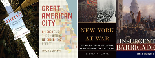
4) Ghetto at the Center of the World: Chungking Mansions, Hong Kong by Gordon Mathews (University of Chicago Press) — Mathews offers a kind of anthropological critique of globalization in the guise of architectural reportage, telling the story of Chungking Mansions, “a dilapidated seventeen-story commercial and residential structure in the heart of Hong Kong’s tourist district,” and using close descriptions of everyday life in the complex to build a cross-section of the global economy. “A remarkably motley group of people call the building home,” we read in the book’s own description: “Pakistani phone stall operators, Chinese guesthouse workers, Nepalese heroin addicts, Indonesian sex workers, and traders and asylum seekers from all over Asia and Africa live and work there—even backpacking tourists rent rooms. In short, it is possibly the most globalized spot on the planet.”

5) Great American City: Chicago and the Enduring Neighborhood Effect by Robert J. Sampson (University of Chicago Press) — Sampson’s very academic book—less narrative than statistical and analytic, and keenly based in empirical research—weighs the importance of community in defining, empowering, and uniting the city of Chicago, neighborhood by neighborhood.

6) New York at War: Four Centuries of Combat, Fear, and Intrigue in Gotham by Steven H. Jaffe (Basic Books) — Jaffe has written an incredibly interesting military history of New York City, beginning well before it was either New York or a city. Jaffe’s detailed accounts of early colonial battles and Revolutionary battlegrounds reveal the, to me, surprising number and topographic diversity of combat sites that dot the greater New York landscape. In the process, he offers little-known historical anecdotes—for instance, not only that Wall Street is so named after the defensive wall once constructed there, from one side of the island to the other, but that the wall was the first example of debt-financed urban infrastructure in what were then Dutch colonies. Jaffe’s look at a military urbanism peculiar to New York, from the 1600s to WWII to the security bollards of post-9/11 NYC, has proven hard to put down.

7) The Insurgent Barricade by Mark Traugott (University of California Press) — Traugott’s history of the barricade as a uniquely successful “technique of insurrection” is, first and foremost, a look at the spatial politics of the built environment. These politics operate in at least two primary, and clearly oppositional, ways, Traugott suggests. The first is the deliberate mis-use or counter-use of the city, transforming it into something that, through improvisatory re-design, can be express the political demands of an otherwise overlooked constituency. This is the production of barricades, which interfere with and strategically realign the internal movements of the city. The other side of this story, however, is the purposeful and systematic alteration of a city’s fabric precisely so that its everyday spaces cannot be used as outlets for political expression. In the latter example, streets can be widened or public spaces closely surveilled; in the former, makeshift tools and ad hoc materials, from cobblestones to wheelbarrows, can be transformed at a moment’s notice into walls that clog the city’s arteries and bring its streets to a halt. Traugott shows how all this has played out over more than four centuries of European urban history, also looking at what future spatial possibilities exist, on both sides of the barricade, for the political life of the metropolis.


8) Horseshoe Crabs and Velvet Worms: The Story of the Animals and Plants That Time Has Left Behind by Richard Fortey (Alfred A. Knopf) — Fortey is easily one of my favorite natural history writers, and his Earth: An Intimate History remains high on my list of recommended books. With this new book, Fortey takes on the question of survival—or super-survival—in creatures whose wildly successful evolutionary paths mean they have had a disproportionately deep effect on whole ecosystems still thriving today. This is “life’s history told not through the fossil record but through the stories of organisms that have survived, almost unchanged, throughout time,” in the book’s own words. The horseshoe crabs and velvet worms of the title are only two of the most-cited creatures in Fortey’s unsurprisingly enjoyable book.

9) The Prehistory of Home by Jerry D. Moore (University of California Press) — Moore starts things off with the unfortunate claim that “various animals build shelters, but only humans build homes,” an unprovable statement that belongs on the sadly endless pile of false comparisons made about humans and animals. Indeed, only four pages later, Moore himself writes that “we [humans] have been building homes longer than we have been Homo sapiens,” which can literally only be true if animals—that is, non-humans or non-Homo sapiens—can, after all, build homes, not just shelters, and have been doing so all along. In any case, this minor but by no means inconsequential quibble shouldn’t hold you back from enjoying Moore’s engaging history of the home—that is, the symbolically rich personal shelter—which he takes on a wide and exciting run from hand-woven walls and mud floors on the coast of Peru all the way to maximum security prisons, from Mesopotamian walled cities to gated suburbs, and from bachelor pads to underground “dwellings” built for the recently deceased in globally diverse burial practices. Part archaeological survey dating back, as Moore explains, to before humans were Human, and part speculative treatise as to why humans have an emotional need for homes at all, Moore’s book spans hundreds of thousands of years and nearly every continent.

10) The Last Imaginary Place: A Human History of the Arctic World by Robert McGhee (Oxford University Press) — McGhee, an archaeologist at the Canadian Museum of Civilization, “paints a vivid portrait of Viking farmers, entrepreneurial Inuit, and Western explorers” in their encounter with, and long-term settling of, the Arctic. Though the book has been out for several years, it just crossed my desk and I look forward to jumping in over the summer.

11) Rough-Hewn Land: A Geologic Journey from California to the Rocky Mountains by Keith Heyer Meldahl (University of California Press) — Meldahl’s book is, in its own words, “a 1000-mile-long field trip back through more than 100 million years of deep time to explore America’s most spectacular and scientifically intriguing landscapes.” Those landscapes are the western plateaus, mountains, and deserts of the southwestern United States, a region whose terrain now verges on the over-exposed—hardly a season goes by without a new book on the subject—but, as Meldahl suggests, “geology is stranger than fiction,” and the book he’s built around that statement is a worthwhile read.


12) American Sunshine: Diseases of Darkness and the Quest for Natural Light by Daniel Freund (University of Chicago Press) — Freund’s book is a delightfully idiosyncratic look at the “quest for natural light” in American culture, from the earliest use of tanning beds as a kind of surrogate sun to the mainstream acceptance of “light therapy” as a cure for Seasonal-Affective Disorder, and from the marketing of climate tourism to the development of specialty lighting rigs for use in industrial food preparation. Freund explains in his introduction that the book was motivated by three otherwise unrelated historical figures—Akhenatan, Vitruvius, and Linnaeus—all of whom represent for Freund “the universality of sunlight as a subject for consideration.” The results are this unique look at the confluence of personal health, urban design, and near-religious popular beliefs about the purifying power of sunlight over roughly 150 years of American culture.

13) Sealab: America’s Forgotten Quest to Live and Work on the Ocean Floor by Ben Hellwarth (Simon & Schuster) — Hellwarth relates the surprisingly overlooked story of U.S. Navy “saturation divers” and the international oceanographers whose research helped to pioneer the construction of deepsea equipment and large-scale architectural environments that almost made living on the ocean floor an everyday reality. Equal parts tropical retro-futurism, complete with scenes of Jacques Cousteau assembling his Conshelf habitats in the Mediterranean Sea, and high-tech adventure story populated by military super-athletes and entrepreneurial gear manufacturers few of us even knew existed—including surreal high-pressure diving experiments involving presumably quite bewildered farm animals—Hellwarth’s book tells the true history of what have been (and what might still be) for human inhabitation of the oceans. Best of all, it’s almost entirely set in a quasi-utopian underwater world, like Archigram crossed with The Abyss.

14) American Urban Form: A Representative History by Sam Bass Warner and Andrew H. Whittemore (MIT Press) — Warner and Whittemore have produced an illustrated historical survey of U.S. urbanism, with short chapters ranging from “the city’s seventeenth-century beginnings” on the Atlantic coast to “the federally supported city” of the 1950s, ending with a somewhat obligatory overview of the “global city” and its suburban fringe. The book is a great introduction to the processes that have influenced and restrained urban development in the United States for more than three centuries, but it focuses more on presenting a coherent narrative—often reading more like a special issue of The Economist—as opposed to developing an original or otherwise surprising new interpretation of American urban form.

15) The Chicago River: An Illustrated History and Guide to the River and Its Waterways by David M. Solzman (University of Chicago Press) — Re-released in its current, second edition back in 2006, Solzman’s book will no doubt already be familiar to many readers of BLDGBLOG, but his history of the Chicago River, its ecological context and industrial re-engineering, complete with a hands-on guide for anyone who might want to explore it, was new to me.


16) Pyongyang: Architectural and Cultural Guide edited by Philipp Meuser (DOM Publishers) — In print for less than three months, Meuser’s guide is already something of a cult classic in architectural circles, offering as it does a photographic and textual survey of the gonzo dictatorial postmodernism of Pyongyang, North Korea. A genuinely fascinating look at the political symbology of a capital city—Stefano Boeri’s memorable description of Pyongyang as a “rogue city” comes to mind—this slipcased, two-volume set offers “photographs and descriptions” in one book, including brief lessons on Pyongyang’s overall urban organization, and, in the other, what Meuser calls “background and comments.” These latter categories include—incredibly—excerpts from an architectural pamphlet written by the late Kim Jong-Il, who explains to his readers that, among other things, “architects are creative workers and operations officers,” spatially gifted functionaries of the State. Many of the photographs found in each volume can unfortunately resemble washed-out tourist postcards, and the buildings themselves are often striking for their super-ornamental, propagandistic absurdity—in a city whose natural setting makes it look oddly like Memphis, Tennessee—but to mock the city so easily and dismissively would be to miss the guide’s more interesting insight, which is that Pyongyang is, in fact, a remarkably assembled collection of processional spaces and monumental object-buildings, aesthetically arranged in a kind of 3-dimensional essay extolling the wonders of uncontested state power.

17) How to Make a Japanese House by Catherine Nuijsink (NAi Publishers) — Although architecture blogs have perfected the art of Japanese house fatigue over the past few years—in which it seems like a central server somewhere has been auto-feeding photos of small Japanese houses to the same design blogs over and over again every week—Nuijsink’s book is, refreshingly, a more substantive exploration of 21st-century domestic space in Japan, complete with one-on-one architectural interviews and occasional floor plans. Many of the projects you will already have seen online, but, given the breadth of context here, some great photographs, and three framing “monologues” written by architects Yoshiharu Tsukamoto, Taro Igarashi, and Jun Aoki, it more than justifies its publication.

18) Dash 5: The Urban Enclave edited and produced by Delft Architectural Studies on Housing (NAi Publishers) — Dash—not quite a magazine, more of a subscription book series—continued last autumn with this look at the “urban enclave,” which the editors have framed as an often progressively intended urban mega-project. These developments, both privately and publicly funded, can create what one of the book’s essays calls “a city-within-the-city” or a city “made up of miniature utopias”: social developments and architectural forms that appear, at first glance, to be entirely disconnected from one another but that, the authors argue, actually invigorate the city through these clear and obvious contrasts. The enclave offers—in fact, it does not let you avoid—”the proximity and the accessibility of ‘the other.'” Agree or disagree, it’s another well-produced issue in the ongoing Dash series, including an interesting look at Oswald Mathias Ungers’s notion of Grossform by historian Lara Schrijver, author of Radical Games.

19) Toward A Minor Architecture by Jill Stoner (MIT Press) — Stoner’s book looks to “dissect and dismantle prevalent architectural mythologies,” and to do so through a turn toward fiction—but the result is an often somewhat timid and unnecessarily academic entry in what should be a very rich conversation. Stoner relies too much on citations from the usual suspects found in your, mine, and everyone else’s thesis papers from the 1990s (Deleuze & Guattari, Walter Benjamin, Leibniz, Sigmund Freud, Italo Calvino, and even the now sadly over-exposed J.G. Ballard). But, having said that, it’s hard not to find pleasure in a book that takes, well, J.G. Ballard, Walter Benjamin, Sigmund Freud, Franz Kafka, James Joyce, and more—even the Berlin Wall—as fuel for a descriptive expansion of architecture into various other genres and media.


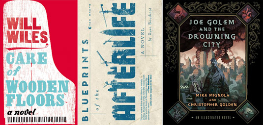
20) Care of Wooden Floors by Will Wiles (Amazon) — Many of you will recognize Will Wiles from his work as deputy editor of ICON magazine or his excellent though infrequent blog Spillway, but here he turns to fiction in a debut novel that tells the story of a man slowly going mad whilst house-sitting for a friend in Eastern Europe. From the book’s own description: “A British copywriter house-sits at his composer friend Oskar’s ultra-modern apartment in a glum Eastern European city. The instructions are simple: Feed the cats, don’t touch the piano, and make sure nothing damages the priceless wooden floors. Content for the first time in ages, he accidentally spills some wine. The apartment and the narrator’s sanity gradually fall apart in this unusual and satisfying novel.” The book has already been released in the UK, where it’s been receiving good reviews as a dark-humored “disaster novel,” but it’s not due out in the States until later this year, when it will become part of the first crop of books published directly and exclusively by Amazon.com.

21) Blueprints of the Afterlife by Ryan Boudinet (Grove Press) — Boudinet’s “bracingly weird new novel” has been receiving high praise and enviable comparisons for the author’s style, including to such writers as Philip K. Dick, William Burroughs, and Neal Stephenson, as Blueprints of the Afterlife picks up considerable buzz in the scifi/speculative fiction world. Fans of odd settings and spatial details will presumably appreciate the book’s “sentient glacier” or its “full-scale replica of Manhattan under construction in Puget Sound.” I’m looking forward to reading this while traveling over the next few weeks.

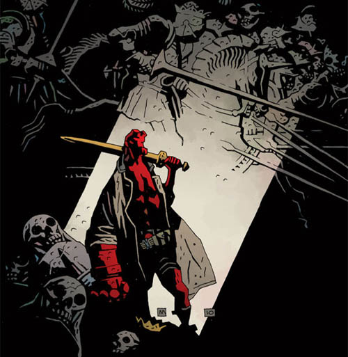
22) Joe Golem and the Drowning City by Mike Mignola and Christopher Golden (St. Martin’s Press) — It’s no secret that I’m a huge fan of Mike Mignola’s work, and his novelistic collaborations with Christopher Golden have so far been great, if not quite as gripping as Mignola’s own early Hellboy tales. Joe Golem tells the story of a flooded Manhattan, or, in the book’s own words: “In 1925, earthquakes and a rising sea level left Lower Manhattan submerged under more than thirty feet of water, so that its residents began to call it the Drowning City. Those unwilling to abandon their homes created a new life on streets turned to canals and in buildings whose first three stories were underwater.” The results, set 50 years after the flooding, are somewhere between H.P. Lovecraft and Central European urban folklore, featuring occasional black and white drawings by Mignola.

* * *

All Books Received: August 2015, September 2013, December 2012, June 2012, December 2010 (“Climate Futures List”), May 2010, May 2009, and March 2009.

Ruin, Space, and Shadow: An Interview with Mike Mignola

[Image: From a cover by Mike Mignola for Hellboy: The Storm, courtesy of Dark Horse Comics].

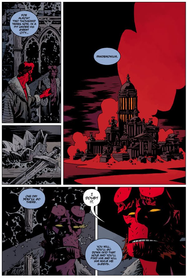
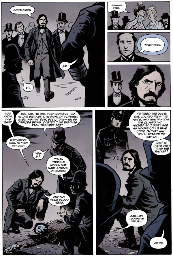
For half a decade now, I’ve been an avid fan of the work of Mike Mignola, creator of Hellboy, the B.P.R.D., and Abe Sapien, among many others, including, most recently, the new series Witchfinder and Baltimore. When my wife and I moved back to California last August, the heaviest boxes were the ones I’d stuffed full of graphic novels by Mike Mignola, which I’ve been hoarding whenever money allows. It’s become an addiction: the incredible old castle interiors and snowbound mountain landscapes of Conqueror Worm, the Mesoamerican design motifs emerging like mazes from pitch black walls of shadow in Seed of Destruction, the graveyards of ships wrecked on rocks before coastal citadels in Strange Places, and all of it shot through with Mignola’s dark sarcasm and humor.

Mignola’s work outlines an endlessly captivating world, somewhere between H.P. Lovecraft and Norse epics, Dracula—as rewritten by Jules Verne—and the Discovery Channel. Equal parts archaeology and horror fiction, Indiana Jones and The Thing, heretical mythology and conspiracy science, once Mignola’s work digs its plot lines and landscapes into you, it seems impossible to shake.

The buildings, terrains, and spaces Mignola’s plots take place within are equally extraordinary: there are remote, factory-like castles north of the Arctic Circle, wired floor-to-ceiling with arcane laboratory equipment; maritime plagues and New England shipwrecks; intelligent geological formations in space, larger than planets, signaling down to Army radar stations at the end of World War II; abandoned mines and ruined churches; Mayan fragments mounted on the luxurious, candlelit walls of Alpine mansions; Nazi conspiracies and fallen astronauts; derelict Victorian houses wrapped in fog on the coastal moor.

In addition to his prolific work as a graphic artist, Mignola has served as a visual consultant on three films by Guillermo Del Toro, each better than the previous: Blade II, Hellboy, and Hellboy 2: The Golden Army. With Christopher Golden, he is co-author of the recent novel Baltimore; he has drawn covers for Conan the Barbarian, X-Men, Aliens versus Predator, Superman, and dozens of others; and his Eisner Award-winning graphic novel, The Amazing Screw-On Head and Other Curious Objects, was republished in 2010.

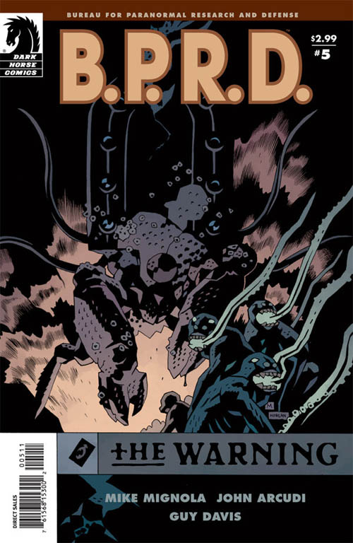
[Image: A cover by Mike Mignola for B.P.R.D.: The Warning, courtesy of Dark Horse Comics].

Mike Mignola recently talked to BLDGBLOG about his interests, including H.P. Lovecraft, wartime landscapes, and houses on the verge of collapse, with a specific focus on what it means to draw spaces of horror and mythology. We spoke by phone.

• • •

BLDGBLOG: I’ve long been interested in how people outside of the architectural world use buildings, landscapes, cities, and other spaces as a way to frame mood or character. Your own work, from Hellboy and the B.P.R.D. to Abe Sapien and Baltimore, is full of ruined churches, old battlefields, houses with flooded basements, warped floors and empty attics, and other straightforwardly Gothic landmarks. What draws you to these particular building types and locations, and how do these settings then affect your plot lines and characters?

Mike Mignola: Well, I am unapologetically old-fashioned in my use of Gothic settings. Ever since I was a kid, when I read Dracula, I’ve just loved those kinds of places.

I have never done a story in a shopping mall because, even if I’m not drawing it myself, I don’t want to see somebody draw a shopping mall. In the Hellboy world, and in other things I’ve done, those places almost don’t exist. When I do Eastern Europe—and I’ve been to Eastern Europe, and I’ve seen the shopping malls and the god-awful housing projects and things, and there are horror stories that take place in there, I have no doubt—but I gravitate toward the classic, clichéd, spooky places, whether they truly exist in this world or not.

But that’s the world I want to live in, and it’s the world my characters live in.

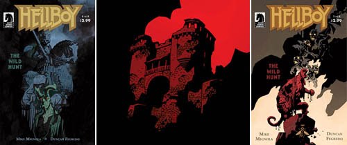
[Images: (left) A cover from Hellboy: The Wild Hunt; (middle) from the cover of Rex Mundi by Arvid Nelson and Juan Ferreyra; (right) a cover from Hellboy: The Wild Hunt. All artwork by Mike Mignola, courtesy of Dark Horse Comics].

BLDGBLOG: Beyond shopping malls, I’m curious if there are other sorts of anti-Mignola settings, so to speak—places where you just could never set a story, even if it’s just a bank in London.

Mignola: I’m not going to do any stories that I don’t want to draw—and, for the most part, those are places that also just aren’t particularly interesting for me to write about.

It’s interesting, because the spin-off book from HellboyB.P.R.D.—is written by another writer. I have some involvement there, but the books are written by somebody else. You look at that book now, and the current storyline takes place in a trailer park. It’s entirely made of the places I have no interest in writing about—but the other writer doesn’t have my overwhelming love of the Gothic. He’s a much more modern type of writer, so we differ on our choice of locations.

But, now, a haunted bank? You know, that would be cool—but it would have to be a really, really old bank. And preferably a bank that’s been abandoned for a bunch of years, so you have cobwebs and things. I just like those old, spooky settings.

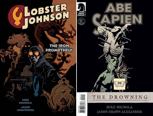
[Images: Covers by Mike Mignola, from Lobster Johnson: The Iron Prometheus and Abe Sapien: The Drowning, courtesy of Dark Horse Comics].

BLDGBLOG: There’s a maritime undercurrent in much of your work, including Hellboy, Abe Sapien, and, of course, the plague ships of Baltimore. It’s a kind of maritime Gothic—a world of shipwrecks and sea monsters and lighthouses on foggy coasts.

Mignola: Shipwrecks are great—but ships in general, even when they’re not wrecked, as long as they’re old school sailing ships, are wonderfully Gothic. I don’t know that I’ve done a lot of stories—if any stories—with ships that are 20th-century ships. I like the romance and the spookiness and the tragedy that goes with that old time sea travel. Those stories pertaining to ships are huge. I love them. They’re a big genre within ghost story fiction.

One of my favorite authors—a guy named William Hope Hodgson—most of his career, or a large chunk of his career, was writing supernatural ships-at-sea stories. There’s a romance in that old school, Gothic-y way to the world. And, basically, everything I love, I try to bring into my work. This world, or these different worlds that I’m creating, are entirely made of stuff that I love and think about.

Everything that I’m a fan of, I want to put into these worlds.

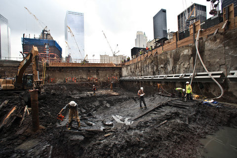
[Images: Photos by Fred R. Conrad, courtesy of The New York Times].

BLDGBLOG: Last summer, construction workers uncovered the remains of an old ship buried in the mud beneath the World Trade Center site in Manhattan, and some of the photos later printed in the New York Times, taken by Fred R. Conrad, were like something straight out of a Mike Mignola story. In some ways, it seemed like the perfect opening scene for a film version of Abe Sapien or for Hellboy 3—as if beneath, or even inside, the island of Manhattan we find this rotting, Gothic, semi-forgotten maritime history.

Mignola: Yeah, you know, I love history. I’m not a scholar—I’m not an historian—but it’s mostly because I just don’t have time. There’s too much other stuff I’m trying to keep on top of. But I love that sense of the buried past.

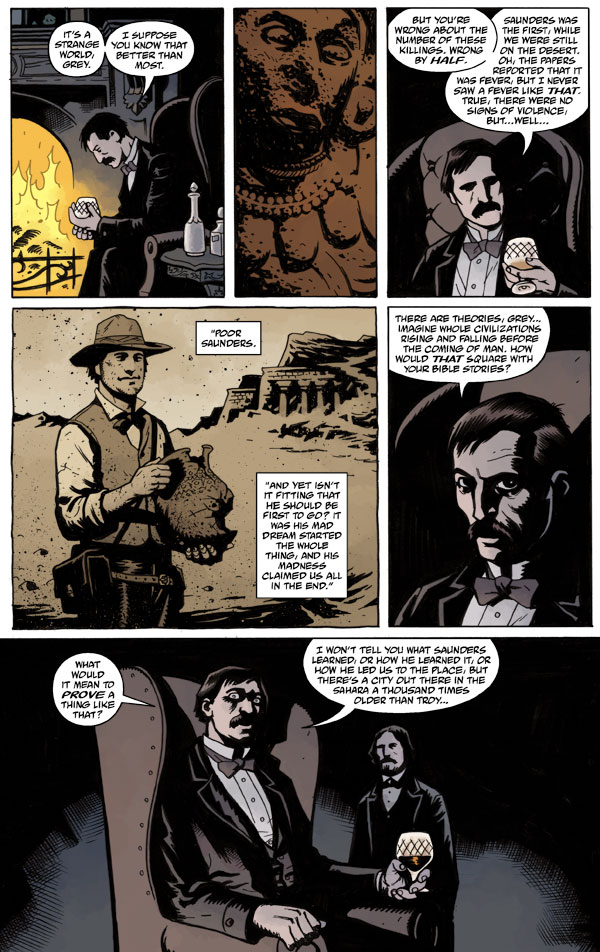
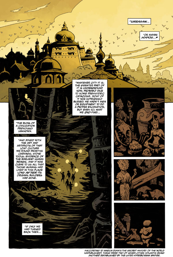
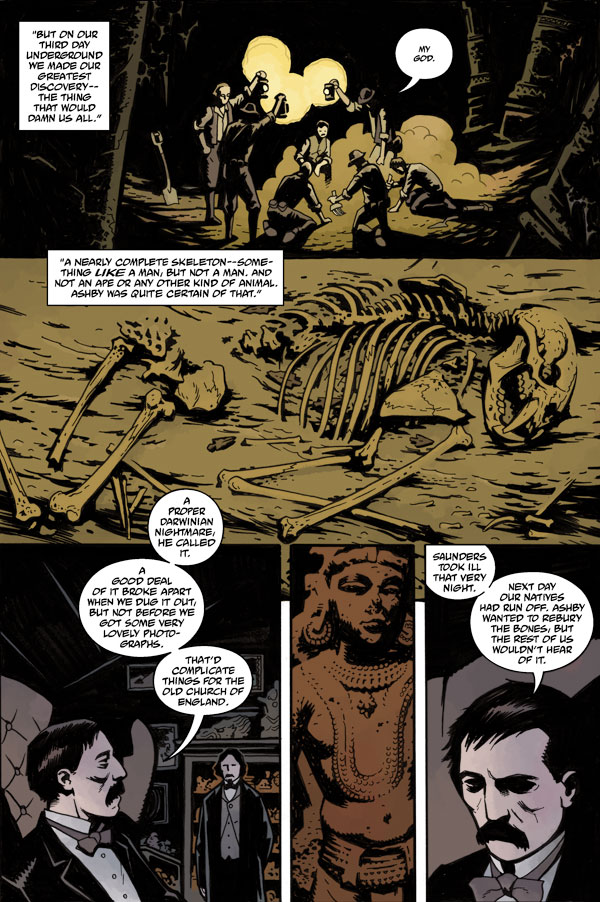
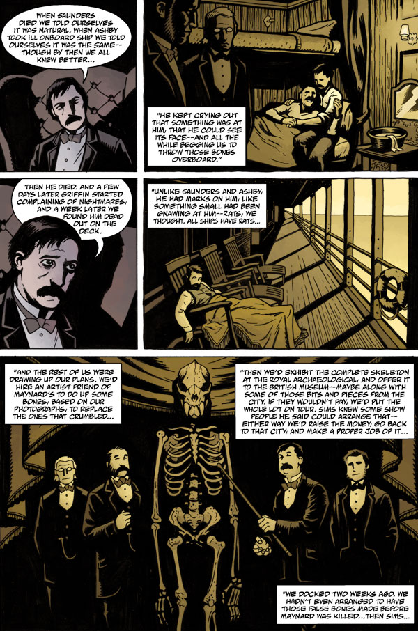
[Image: From Hellboy: The Wild Hunt, written by Mike Mignola and Scott Allie; art by Duncan Fegredo and Patric Reynolds. Courtesy of Dark Horse Comics].

BLDGBLOG: I want to go back to the idea of setting. Have you ever found yourself in a situation where a setting that you’ve devised for a certain storyline simply doesn’t work for Hellboy, say, so you have to use—or even invent—another character, or an entirely different plot, in order to use the architecture? In other words, how does setting—that is, how can architecture—affect plot and characterization, and vice versa?

Mignola: Well, part of the Baltimore series we’re doing now takes place on a World War 1 battlefield. I love that setting. It’s wonderfully rich in horror and drama—but it’s really hard for me to do a Hellboy story that takes place on a World War 1 battlefield. I could do it, and I’ve done stories like that, where it’s a time travel -slash- dream kind of thing—in fact, in an upcoming issue of Hellboy, I do have another character who I’ve tied to World War 1—but, to do it right, you need a World War 1 story.

So I came up with the Baltimore novel—and, now, the comic—to address that.

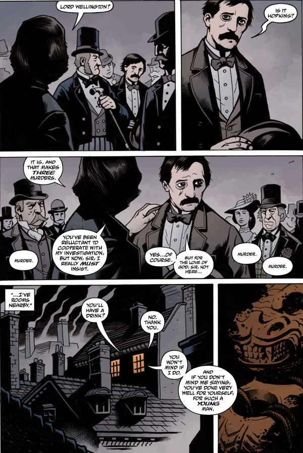
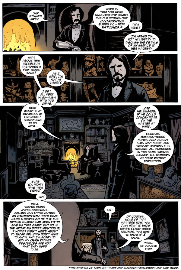
There’s also Victorian London, which I love. I came up with a Hellboy story once where he kind of time-traveled back to Victorian London—it seemed a little goofy to me—but I knew that I wanted to do Victorian London, so it was just a question of making a character who functioned in that world.

In a lot of cases, though, I am creating characters in order to see these places—these times, these settings. But, from the very beginning, I’ve known what kinds of stories I’ve wanted to do—so it’s also a question of finding the character who belongs to that world, as an excuse to draw that world.

[Images: Preview spreads from Witchfinder: In the Service of Angels. Art by Ben Stenbeck, story by Mike Mignola, courtesy of Dark Horse Comics. If this gets you hooked, purchase the book].

BLDGBLOG: I’m curious about your work method, as far as nailing the details of these settings and landscapes. Do you travel a lot, watch a lot of movies, look at lots of photographs, talk to archaeologists—or it is really just an act of imagination?

Mignola: It’s a little bit of everything. I do watch a lot of films—which is great for getting the voice and the general character and the atmosphere—but I tend to come up with stories that are not super-specific to particular locations.

If I’m doing Victorian London, I’m not trying to do that story for a scholar of Victorian London. In a way, I say that this is more like a 1940s film version of London—in other words, I want to do at least the level of research that you’d see in an old Hollywood film. So I’ve given myself a little distance from reality with that.

But, as I say, I do like history. If I’m doing something specific, I’ve got a ton of reference books here in the studio, and I’ll try to make sure I get some of the names right and some of the dates right, if I’m referring to specific things. But, for the most part, I tend to shy away from plotting stories that are going to require a lot of very specific, historical research.

In Witchfinder, where I’m doing Whitechapel—well, I’ve been to Whitechapel. But I’m writing about 1880s, or maybe 1870s, Whitechapel, and I want it to seem like the real thing. So I did a little bit of homework on the East End. But the trouble with doing research for this stuff is that you start finding so much material that’s interesting, after you’ve already plotted the story, and you think, oh, I want to use this, and I want to use this, and I want to use this—well, uh oh, too late.

In terms of specifics, a little bit of dialogue, a little bit of color, a little bit of flavor, will give any story a certain amount of authenticity, but I’m not looking to make giant plot points out of that kind of stuff. It’s just background. Most of my buildings, and most of the things I do stories around—when I’m drawing these things, I’m trying to create objects, buildings, ships, whatever, with a particular background. I want it to feel like there is more to the story than can be told.

But, yes, you know, I have traveled a bit—and people love to think that what I’m doing comes from lots of traveling, and from talking to old monks and that sort of thing—

BLDGBLOG: [laughs]

Mignola: —and I have spent more time in Prague than I ever thought possible. But, other than a story I haven’t yet done—about a haunted couch—there are no experiences I’ve had that I’ve turned into stories. And the couch wasn’t haunted, you’ll be glad to hear; I think it was just infested with some kind of Eastern European insect.

For more exotic locations—like I did a story once set in Malaysia. It was entirely because I’d read a description years ago of a particular kind of Malaysian creature—a vampire—and I just knew I was going to do that story someday. But I needed pictures of Malaysia; I needed to do Malaysia research. That went back and forth for years, until, one day, I stumbled upon a book that just had really good photos of Malaysia. And that was it. It was the same with Norway: it was just a matter of some guy at a convention coming up to me with a book once that had great photos of Norway.

You know, I’m constantly looking for visual references. Story-wise, I’ve got all that stuff in my library—but I can never have enough photo references. There are still stories that are waiting to be told until I have the right references; and there are certain stories that I decided to set in a location just as an excuse for me to draw a particular place or building.

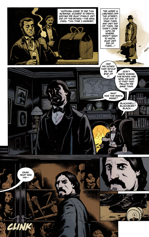
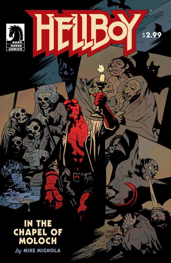
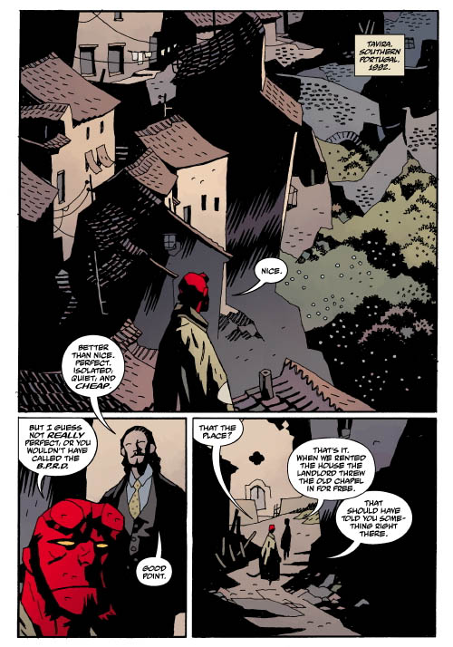
For instance, I did a story a couple of years ago called “In the Chapel of Moloch.” It was designed to take place almost entirely inside an old chapel. But the story wasn’t set in any particular location; it was just a matter of going to the books I had and looking for a building that would be fun to draw, or for a city that would be fun to draw, and I happened to have a book on Portugal. It had these great photos of decrepit hill towns, and a couple really good pictures of an old chapel. There was nothing about the story that was specific to Portugal—it was just that Portugal would be fun to draw. It was a nice, exotic location that I had never drawn before. And that’s usually how it works.

[Images: From Hellboy: In the Chapel of Moloch by Mike Mignola, courtesy of Dark Horse Comics].

BLDGBLOG: Stepping away from the idea of setting, I’m also interested in how you populate your stories with this constantly shifting catalog of sinister, yet natural, creatures: amphibians, frogs, worms, apes, gorillas. What is it about these particular species that works so well in terms of developing your mythological world?

Mignola: Well, I think monkeys are funny—that’s the easiest answer there. I don’t really love monkeys—but they’re kind of fun to draw. Something I always say is: monkeys always work. [laughter] People just like to see monkeys show up in these stories. I think it’s the absurdity of it.

In one of the first issues of Hellboy, I showed a 1940s scientist. I was drawing a bunch of scientists in a room, and one guy was actually just a severed head in a jar—but that wasn’t enough. The picture needed something else. So I drew a giant gorilla towering over them, with these Frankenstein-like bolts sticking out of his neck.

Oh—and you know what? Go back even earlier than that. Go back to one of the try-out stories—one of the teaser stories—before I even started the Hellboy series. It was a Frankenstein gorilla about to stick a needle in a girl’s neck—and, not that I stole the image from pulp magazines, but it’s such an old, clichéd, pulp magazine image. Making it a Frankenstein gorilla probably took it one step further, and made it my own, but it’s just… it’s funny. It’s so absurd it’s funny.

So, yeah, I use monkeys. And monkeys are usually the animal you associate with animal-testing. For instance, there’s another story where Hellboy’s blood is being extracted—and what are you going to inject Hellboy’s blood into? A rat? A rat just isn’t as much fun to draw turning into a giant hell-rat—actually, that’s not a bad idea—but it would be much more fun to take a monkey and turn it into a big demon-monkey, which is what I did.

As far as frogs and other amphibian stuff—that, again, is a reference to this kind of H.P. Lovecraft worldview where anything from the ocean is scary. Frogs, in a Lovecraft sense, are associated with some kind of unknowable world. They’re not from the ocean, but they’re also not from, you know, the woods. Where do they come from? And why are they always out there… chirping, or whatever the hell it is that frogs do? Lovecraft also uses birds that way—and birds are great—but I have a harder time drawing birds than frogs.

In the very first issue of Hellboy, I did a sequence with frogs in it, and it just sort of stuck. I established it early. Frogs will be my kind of icon characters; when frogs show up, you know something bad’s going to happen. They become symbolic of this kind of evil that’s always running around in the background.

And then things just tend to snowball. You know, you hear about something like a “rain of frogs,” which happens periodically for whatever reason—it’s one of those weird phenomena that gets written about—and, I thought, well, let me have a little bit of that kind of action. I mean, that’s a weird thing and it’s got a kind of authenticity to it: there’s something about it that’s unnatural, yet supposedly it does really happen. And I like that.

But I think you’ve put more thought into these questions than I have into why I do these things!

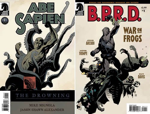
[Images: Covers by Mike Mignola, from Abe Sapien: The Drowning and B.P.R.D.: War on Frogs, courtesy of Dark Horse Comics].

BLDGBLOG: No, this is fascinating. It’s great to hear how you work. You mentioned H.P. Lovecraft: I’m curious to hear what you think it is about the Lovecraft universe—about the mythology of H.P. Lovecraft—that remains so appealing. In fact, it actually seems to be increasing in popularity today.

Mignola: For me, the monsters in Lovecraft are… you know, they’re fine. But what’s really appealing to me is his antiquarian sensibility. It’s the old houses in Rhode Island. It’s the fact that the guys are all scholars and they’re researching things, and there are references to different editions of this book or that book, and this edition is in that library, and a Latin translation of that book is in this other library. He writes about smart guys who spend a lot of time in libraries—and I love that.

His stories are set in a time when people are still wearing suits everyday. They even have upturned collars and things like that. There’s just a wonderfully old-fashioned, scholarly antiquarian feel to the stuff. It bridges the gap between modern horror and the old, classic M.R. James ghost stories—Lovecraft just added bigger monsters. Instead of some shadowy thing that skitters along the wall, it’s a giant octopus in space that makes people go crazy.

But it’s his obsession with old buildings, and shuttered windows, and climbing into church steeples—it’s his locations. I just love that.

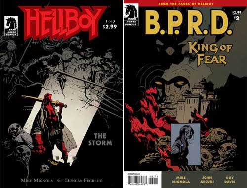
[Images: Covers by Mike Mignola, from Hellboy: The Storm and B.P.R.D.: King of Fear, courtesy of Dark Horse Comics].

BLDGBLOG: As well as things like abandoned fishing towns in New England, with collapsing wharves and moonlit salt marshes and that sort of thing.

Mignola: That’s actually one of my dream projects: to sit around and do half a dozen paintings of those towns. To do a series of drawings that’s just called Arkham, and it’s all about these buildings in creepy old coastal towns where the walls are falling over and they have these wonderful leans.

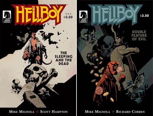
[Images: Covers by Mike Mignola, from Hellboy: The Sleeping and the Dead and Hellboy: Double Feature of Evil, courtesy of Dark Horse Comics].

BLDGBLOG: That brings us back to the idea of architecture and the role that architecture plays in your work. What brings you to draw a certain building or structure—and what do you add or exaggerate to make it more your own?

Mignola: [laughs] Well, once upon a time, when I started all this stuff, the one thing I didn’t want to draw at all was buildings. Because, growing up in California, buildings to me were an exercise in using a ruler and perspective, and shit like that. I just had no interest in drawing that kind of stuff.

It was only after having lived in New York for a while, around really old buildings—where you see that, actually, this building’s kind of sagging and that building’s kind of leaning against the other building next door and this chimney looks like, if those three wires weren’t there, it would all fall over, and that fire escape is at some odd angle—that’s when I really started to love architecture.

It’s one of those things that is still evolving in my work, as I become more and more comfortable drawing that sort of stuff: my buildings lean more.

Right now, I’m drawing an old house, and the house is leaning one way, the fence is leaning another way; I’m working from photo references, as I love to do, but I’m able to exaggerate it, and say, yeah, okay, this building’s kind of crooked in the photo, but let’s lean it way the hell over there. Let’s throw a couple of sticks out of it this way. Let’s make the building next door look like it’s about to fall over. And let’s make everything dark.

It’s really one of my favorite things to draw these days: old, crumbling architecture.

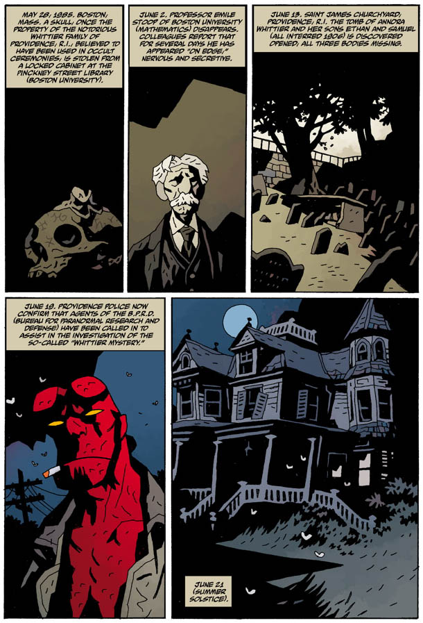
[Image: From “The Whittier Legacy” by Mike Mignola, courtesy of Dark Horse Comics; originally published in USA Today].

BLDGBLOG: Is there a particular building in your recent work that stands out this way?

Mignola: I recently did an 8-page story for USA Today called “The Whittier Legacy.” I said I was going to keep it simple for myself; I would set it almost entirely inside a house, in the dark. The way the story’s structured, we’re not going to spend a lot of time drawing furniture, little details, and things like that; it could just be an old, derelict house.

The most work that went into that story was going through my references and finding a really good house that would be fun to draw. I happened to have a book on Victorian houses that had a lot of really good texture to them and really nice angles, with things jutting out at weird angles. With the way I use shadow, it’s really important to me to have some sort of structure where things are going to be jutting out at different angles—because you can say, okay, if I light it on this side, that bit’s going to be in shadow; but if I light it on that side, then this is going to be in shadow. A square? You get light on one side and black on the other.

But if it’s a square with other things sort of jutting at you out of the shadows, and if you put a big porch on it, and, you know, it’s a derelict place so it’s all sort of sagging the way those old places start to do—then that’s a really good day for me, being able to draw stuff like that.

• • •

Thanks to Mike Mignola for taking the time to talk—and for producing so many awesome comics. Thanks, as well, to Jim Gibbons, Jeremy Atkins, and Scott Allie at Dark Horse Comics for their help with the images. If this interview piques your interest, consider picking up some of Mignola’s work for yourself.