The Third & The Seventh, a short film by Alex Roman uploaded to Vimeo just last month and already viewed more than half a million times, is an entirely computer-generated, exquisitely rendered, photorealistic tour of architectural space.
While Frank Gehry’s Disney Concert Hall unfortunately makes an appearance, the remainder of the film tours some pavilions, museums, wind farms, and other urban icons, from both inside and out, that you will no doubt recognize.
There’s no plot as such, but the imagery is of such ridiculously high quality—although I could skip the soundtrack—that this seems much more visually promising to me then, say, the much hyped, half-a-billion dollar technologies used in Avatar; I would rather watch the opening two or three minutes of Roman’s film stretched out to feature length and threaded through with some narrative cues than revisit James Cameron’s badly rendered blue giants.
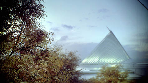 [Images: A Calatravian still from Alex Roman’s The Third and the Seventh].
This also seems to be yet more evidence that architecture students are literally just on the cusp of expertise in several different industries, and that even the briefest of collaborations with interested writers could push many student projects instantly over into fully realized narrative films. While I’m aware that many architecture students couldn’t care less about this—they didn’t, after all, apply to film school—I think it is nonetheless a strategically interesting option to consider when it comes to developing, presenting, and recontextualizing spatial ideas: a slight tweak here and there, a presentation of the most bare-bones scenario imaginable, and you’ve gone from student thesis project to La Jetée after one late night and some 5 Hour Energy drinks…
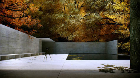
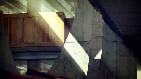 [Images: Stills from Alex Roman’s The Third and the Seventh].
In any case, Roman’s website includes galleries of some gorgeous film stills, including these details, these lighting effects, a few examples of “man-made vs. nature,” and multiple glimpses of classic furniture.
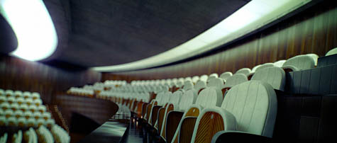 [Image: From Alex Roman’s The Third and the Seventh].
However, Vimeo seems to be loading quite slowly at the moment, so I’ve included a few stills here.
 [Image: Alex Roman, The Third and the Seventh].
Here’s hoping Roman gets the attention he deserves for this, and that we someday see his work popping up in more venues. The film was created using 3ds Max, V-Ray, After Effects and Premiere.
(Thanks to Jim Rossignol and Ilari Lehtinen for the tip!)
Correct me if I'm wrong, but I believe the soundtrack is from the film "Gattaca". A favorite of mine, especially since it seems to meditate at times more on the modernist backdrop of Wright and Predock, than the characters themselves!
Beautiful but eerie. The music lifted from Gattaca probably has a lot to do with the feeling, but chiefly it's the absence of people other than the (somewhat ghostly) filmmaker. Reminds one a little of the elegiac scenes of a world without people in apocalypse movies like Last Night just in a fancier part of town. 8)
oops. I may have jumped the gun on the 'Gattaca' comment! It seems it was an original score by Alex Roman. Fantasic work. Yes, I'd love to see an adaptation of 'The Road' where humanity's survivors re-appropriate last century's Brutalist architecture for their own means!
Alex Roman's work is amazing and lovely, but evokes little more than an overwrought advertisement, displaying his skills and services to large architectural firms in need of high quality fly-through animations. Some of the false depth-of-field effects were annoying, too.
And I rather enjoyed Avatar.
No, Andy, you were right: the melody played is indeed the theme from Gattacca; which is somewhat appropriate considering the amount of screen time and space that architecture (mostly Wright's) took up in that film.
Gorgeous, gorgeous gorgeous video.
The cinematography really reminds me of some of the finer moments within Darren Aronofsky's The Fountain – sans annoying plot! I agree about the soundtrack, the only thing that *really* irked me about this clever film was the constant manipulation of the depth of field. Regardless, it is quite stunning work.
as a typical architecture student i spend most of my free (?) time loathing architecture and models and autocad.
BUT this video reminded me, in the middle of my exam period, why i chose to study architecture in the first place.
thanks for sharing:D
I actually like the depth of field changes in this- it made it feel more cinematic or photographic
Having talked to friends with professional experience in 3d modeling and read the comment thread on this making-of video that Roman posted:
there seems to be a sense that the technical achievement here is just absolutely mind-boggling. A Pratt-alum and pro 3d modeler I watched the film with said (after staring mute, saucer eyed for a few minutes) it either took the guy 10 years or he's doing something workflow-wise that no one else is.
Anyway, this leaves me to ask: to what extent do architecture students actually study this kind of modeling? Where's the line between the CAD/floorplan work they do and all the texture, mapping, lighting effects, and whatnot we're seeing here? Are these disciplines actually coming together or is this an example of the film people running away with the ball?
And, Geoff, what bothered you about the Disney's inclusion? You didn't like the contrail or its reflection in the titanium tiles? Or did you find it inaccurate because it didn't render the sandblasting that parts of the Disney underwent to reduce the glare on its neighbors?
And, Geoff, what bothered you about the Disney's inclusion?
I just think Frank Gehry is one of the world's worst living architects! So it was sad to see a Gehry building in there.
That's funny. I always feel torn about Gehry. I'm not wild about the idea of Event or Destination Architecture or whatever their calling it these days: eye-catching architecture as urban renewal plan via tourism. The Bilbao Effect and whatnot.
But, that said, having visited Bilbao and the Disney they are two of the most effective buildings in the world for their actual purposes. Bilbao is one of the best places to see art I've ever been and Disney is one of the best places to hear acoustic music.
Take Bilbao. Unlike nearly every other museum in the world, it is centrally planned. As a visitor you always return to the central atrium on any floor and so have complete control of the order in which you visit the different exhibits. (Contrast this with the NY Guggenheim which allows only one spiral path through its galleries with no choice but to view the exact procession of art the curators have in store for you as you ascend towards Modernist heaven.) Also, it has a wide variety of spaces from intimate simple ones with amazing natural light where painting shines to huge strangely shaped ones that have acted as provocations for the creation of new work by people from Richard Serra to Jenny Holzer. It is the quietest museum I've ever been to: all those wiggly walls break up echoes and whatever stone the floor is doesn't squeak like most museum floors. Also, if you look closely at the walls, you'll see that they don't reach the floor or ceiling, there's a gap of a couple of inches at each. That's so that the walls can be temperature controlled separately from the rest of the gallery so that the art can be at the cooler temperature needed for preservation and people can be at the warmer one needed for comfort. This, again, is unique in museums as far as I know, but should absolutely be standard practice.
And then, the Disney. The Disney has the best acoustics of any space I've ever been in by an enormous amount. It's stunningly amazingly clear. I can't find the article now, but I remember reading that on prepping to launch the building, the LA Phil was having to relearn to play because suddenly you could hear flaws that were previously hidden by the muddiness of all other halls. I've sat everywhere from third row center to the back row sides and everywhere has a clear and interestingly different view.
My biggest criticism of the Disney is that the city didn't let them go ahead with part of Gehry's plan: to project video footage of in-progress concerts on the big screenlike surfaces on the outside of the building that were specifically designed with that purpose in mind.
I'm sure there are other Gehry buildings that don't achieve this level of excellence in their program (the EMP is kind of a shapeless blog building- and program-wise and there's been that battle over the MIT dorm), but I think it's hard to dismiss him without mentioning the incredible practical success of such iconic buildings, which is an incredibly rare thing in big name big project architecture.
As Gehry is turning out to be the architect associated with late 20th Century Decadence, I'm sure his reputation is going to take a huge hit in the next 50 years or so, but I'd take a long bet that by the end of the 21st C, he'll be largely redeemed as people have been happily listening to music and seeing art in this spaces for a generation.
Greg, I don't at all disagree with you about Gehry's historical importance, and even necessarily about the spatio-urban impact of the Disney Hall (I've never been to Bilbao); and I also have to admit that my previous comment deliberately overstates the case.
But Gehry, to use a bad analogy, is to architecture as Salvador Dalí is to painting—and it's hard for me to take bad surrealism very seriously.
Having said that, though, Gehry has attracted a lot of people into architecture who wouldn't otherwise have been excited by building design, and he has certainly opened up architecture to a wider public audience, and both of these, I think, are good.
But the Dalí comparison holds, in my view.
Or another bad analogy, perhaps: Frank Gehry is to architecture as Richard Simmons is to the Summer Olympics…
Ha. I'm not sure I agree with it, but I know exactly what you mean about Dali. I feel about Dali how you feel about Gehry.
And I can see how judging from the facades alone I might even be onboard with the comparison. The difference for me is in the practical details I tried to describe in my last comment. I've never found anything like them in a Dali. At least Disney and Bilbao, in addition to being splashy surfaces that look from afar how sophomores expect "architecture" to look are also great places to live, to spend large amounts of time listening to music or looking at art. The biggest surprise for me in spending time at both these places was how the architecture actual disappeared for me leaving just the program. Most of my memories of Bilbao are about the 25 foot Julian Schnabel bull fighting canvases and having my first up-close experience with Richard Serra rather than about the building.
I don't think you can say the same thing about Dali.
it's a gorgeous piece. the depth of field games got to be a bit much, but what really distracted me was the outdoor scenes at the Barcelona Pavilion. they are all flipped right to left.
What interested me about this film was the use of the nostalgically dressed and equipped figure of the photographer used to locate the viewer inside of these environments. This works really well as a narrative tool to draw you into the experience of the film as it takes you through these stunning illustrations of architectural space. One imagines oneself exploring these buildings with a really cool vintage camera. Ironically, as a professional architectural photographer myself, I fear that the sophistication of this kind of illustration may soon make my profession obsolete!
does anybody know more information about the framehouse in the forest? the only building in this flick i don´t recognize.
architect, location, link with detailed info, or anything?
thanks in advance.
According to the information here it is the Forest Refuge by Satoshi Okada.
Does anyone recognize the first library in the film – not the Exeter, the one in the last still above?
Thanks much.
yeah, the library is the Ryotaro Shiba Museum by Tadao Ando. gorgeous.
beautiful, stunning images…
Super, thanks.
"…badly rendered blue giant" maybe you should start a rendering blog too