 [Image: Photo courtesy of the Rijksmuseum Amsterdam and the Metropolitan Museum of Art].
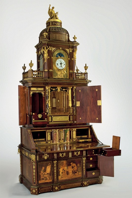
A gorgeous exhibition last year at the Metropolitan Museum of Art featured mechanical furniture designed by the father and son team, Abraham and David Roentgen: elaborate 18th-century technical devices disguised as desks and tables.
First, a quick bit of historical framing, courtesy of the Museum itself: “The meteoric rise of the workshop of Abraham Roentgen (1711–1793) and his son David (1743–1807) blazed across eighteenth-century continental Europe. From about 1742 to its closing in the early 1800s, the Roentgens’ innovative designs were combined with intriguing mechanical devices to revolutionize traditional French and English furniture types.”
Each piece, the Museum adds, was as much “an ingenious technical invention” as it was “a magnificent work of art,” an “elaborate mechanism” or series of “complicated mechanical devices” that sat waiting inside palaces and parlors for someone to come along and activate them.
If you can get past the visual styling of the furniture—after all, the dainty little details and inlays perhaps might not appeal to many BLDGBLOG readers—and concentrate instead only on the mechanical aspect of these designs, then there is something really incredible to be seen here.
 [Image: Photo courtesy of the Rijksmuseum Amsterdam and the Metropolitan Museum of Art].
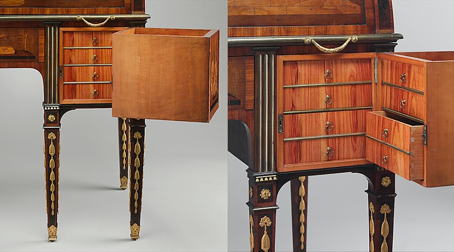
Hidden amidst drawers and sliding panels are keyholes, the proper turning of which results in other unseen drawers and deeper cabinets popping open, swinging out to reveal previously undetectable interiors.
But it doesn’t stop there. Further surfaces split in half to reveal yet more trays, files, and shelves that unlatch, swivel, and slide aside to expose entire other cantilevered parts of the furniture, materializing as if from nowhere on little rails and hinges.
Whole cubic feet of interior space are revealed in a flash of clacking wood flung forth on tracks and pulleys.
As the Museum phrases it, Abraham Roentgen’s “mechanical ingenuity” was “exemplified by the workings of the lower section” of one of the desks on display in the show: “when the key of the lower drawer is turned to the right, the side drawers spring open; if a button is pressed on the underside of these drawers, each swings aside to reveal three other drawers.”
And thus the sequence continues in bursts of self-expansion more reminiscent of a garden than a work of carpentry, a room full of wooden roses blooming in slow motion.
 [Images: Photos courtesy of the Rijksmuseum Amsterdam and the Metropolitan Museum of Art].
The furniture is a process—an event—a seemingly endless sequence of new spatial conditions and states expanding outward into the room around it.
Each piece is a controlled explosion of carpentry with no real purpose other than to test the limits of volumetric self-demonstration, offering little in the way of useful storage space and simply showing off, performing, a spatial Olympics of shelves within shelves and spaces hiding spaces.
Sufficiently voluminous furniture becomes indistinguishable from a dream.
 [Image: Photo courtesy of the Rijksmuseum Amsterdam and the Metropolitan Museum of Art].
What was so fascinating about the exhibition—and this can be seen, for example, in some of the short accompanying videos (a few of which are archived on the Metropolitan Museum of Art’s website)—is that you always seemed to have reached the final state, the fullest possible unfolding of the furniture, only for some other little keyhole to appear or some latch to be depressed in just the right way, and the thing just keeps on going, promising infinite possible expansions, as if a single piece of furniture could pop open into endless sub-spaces that are eventually larger than the room it is stored within.
The idea of furniture larger than the space that houses it is an extraordinary topological paradox, a spatial limit-case like black holes or event horizons, a state to which all furniture makers could—and should—aspire, devising a Roentgen object of infinite volumetric density.
A single desk that, when unfolded, is larger than the building around it, hiding its own internal rooms and corridors.
Suggesting that they, too, were thrilled by the other-worldly possibilities of their furniture, the Roentgens—and I love this so much!—also decorated their pieces with perspectival illusions.
 [Image: Photo courtesy of the Rijksmuseum Amsterdam and the Metropolitan Museum of Art].
The top of a table might include, for example, the accurately rendered, gridded space of a drawing room, as if you were peering cinematically into a building located elsewhere; meanwhile, pop-up panels might include a checkerboard reference to other possible spaces that thus seemed to exist somewhere within or behind the furniture, lending each piece the feel of a portal or visual gateway into vast and multidimensional mansions tucked away inside.
The giddiness of it all—at least for me—was the implication that you could decorate a house with pieces of furniture; however, when unfolded to their maximum possible extent, these same objects might volumetrically increase the internal surface area of that house several times over, doubling, tripling, quadrupling its available volume. But it’s not magic or the supernatural—it’s not quadraturin—it’s just advanced carpentry, using millimeter-precise joinery and a constellation of unseen hinges.
 [Images: Photos courtesy of the Rijksmuseum Amsterdam and the Metropolitan Museum of Art].
You could imagine, for example, a new type of house; it’s got a central service core lined with small elevators. Wooden boxes, perhaps four feet cubed, pass up and down inside the walls of the house, riding this network of dumbwaiters from floor to floor, where they occasionally stop, when a resident demands it. That resident then pops open the elevator door and begins to unfold the box inside, unlatching and expanding it outward into the room, this Roentgen object full of doors, drawers, and shelves, cantilevered panels, tabletops, and dividers.
And thus the elevators grow, simultaneously inside and outside, a liminal cabinetry both tumescent and architectural that fills up the space with spaces of its own, fractal super-furniture stretching through more than one room at a time and containing its own further rooms deep within it.
But then you reverse the process and go back through in the other direction, painstakingly shutting panels, locking drawers, pushing small boxes inside of larger boxes, and tucking it all up again, compressing it like a JPG back into the original, ultra-dense cube it all came from. You’re like some homebound god of superstrings tying up and hiding part of the universe so that others might someday rediscover it.
To have been around to drink coffee with the Roentgens and to discuss the delirious outer limits of furniture design would have been like talking to a family of cosmologists, diving deep into the quantum joinery of spatially impossible objects, something so far outside of mere cabinetry and woodwork that it almost forms a new class of industrial design. Alas, their workshop closed, their surviving objects today are limited in number, and the exhibition at the Metropolitan Museum of Art is now closed.


 [Images: A “trap street” on Google Maps, documented by
  [Image: Photo by
  While I’m announcing things, I also want to give a heads up to anyone in the Los Angeles area that I’ll be lecturing on Wednesday evening, October 13th, over at
  [Image: Based on a