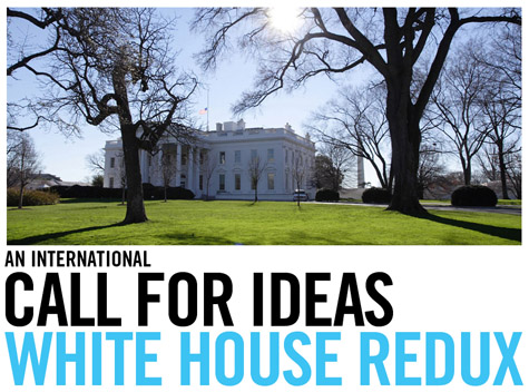
I’m excited to announce that I’m on the jury for a new design competition, called White House Redux, the purpose of which is to design a new home for the U.S. Presidency.
 It’s a speculative project, to be sure – but a fun one, and I can’t wait to see what comes up.
Here’s the brief:
What if the White House, the ultimate architectural symbol of political power, were to be designed today? On occasion of the election of the 44th President of the United States of America, Storefront for Art and Architecture, in association with Control Group, challenge you to design a new residence for the world’s most powerful individual. The best ideas, designs, descriptions, images, and videos will be selected by some of the world’s most distinguished designers and critics and featured in a month-long exhibition at Storefront for Art and Architecture in July 2008 and published in Surface magazine. All three winners will be flown to New York to collect their prizes at the opening party. Register now and send us your ideas for the Presidential Palace of the future!
 Continuing:
Few people realize the extent of the White House, since much of it is below ground or otherwise concealed by landscaping. The White House includes: Six stories and 55,000 square feet of floor space, 132 rooms and 35 bathrooms, 412 doors, 147 windows, twenty-eight fireplaces, eight staircases, three elevators, five full-time chefs, a tennis court, a bowling alley, a movie theater, a jogging track, a swimming pool, and a putting green. It receives about 5,000 visitors a day.
The original White House design, by James Hoban, was the result of a competition held in 1792. Over the centuries, presidents have added rooms, facilities and even entire new wings, turning the White House into the labyrinthine complex it is today.
What if, instead of in 1792, that competition were to be held today? What would a White House designed in 2008, year of election of the 44th President of the United States, look like?
That’s the question, then: If you were to design a residential office complex for the U.S. President, what would it look like? Perhaps London’s GLA? Or the CCTV Building? Or Selfridge’s, Birmingham? Or the Kunsthaus Graz?
Would it be stylistically European – or Latin American, or African, or Asian? Prefab? Rammed earth? Perhaps an updated Nakagin Capsule Tower? Or would it be a Walking City? Maybe a helicopter archipelago? Maybe algae-powered, or billboard-bound, or an inhabited dam?
Would it be ironic, self-deprecating, imperial, solar-powered, walled off behind anti-missile batteries, or anachronistically neoclassical and made of limestone?
All of the above?
Here are the specs. The jury consists of Beatriz Colomina, Stefano Boeri, Liz Diller, John Maeda, myself, and Laetitia Wolff.
So step up and submit. I’m genuinely excited about this. Show us your best! Think big, think small, think detailed. Think abstract. Change history.
 [White House Redux is sponsored by Control Group and Storefront for Art and Architecture].
My school is hosting an entire studio based on current competitions… I think I will forward this to the professor of that studio.
Hi Geoff,
Very exciting news! My head is already bustling with ideas. Nice to get a vitalizing break from the more pragmatic tasks of real life.
“purpose of which is to design a new home for the U.S. Presidency…”
…to be built in Dubai.
It should be all black, so as it properly absorb the unforgiving Arab sun.
trim it on with chrome just cuz.
and somehow integrate the world’s most advanced weaponry within it’s architecture.
ex. a dome roof opens up to release a telescoping laser beam.
i dunno, whatevs, just a thought.
Maxwell you’re right. I had the exact same thought the other day. Dubai might become the center of the world much sooner than we think.
This new Whitehouse should be designed in ways to enlighten our decision makers…
This competition will be a cinch. I’m going to subcontract Blackwater to make me the ultimate “Machine for Democracy”.. it will only cost a half billion to build and if any of you have any problems with it you can expect a knock on your door in the middle of the night.
I can see it now.. the front elevation will be based off meticulous diagrammatic studies of slot-machines and Diebold automated voting kiosks.
What an exciting competition!
I hope the New White House would be transparent like politics should aspire to be. And more vagina-like and less phallic.
QT
http://wip-qt.blogspot.com
all I can say is the pentagram has to remain. What pentagram…the upside down one created out of the roads directly in front of the main entrance of the White House.
check google maps, but a better source would be a map from before the 20 century.
this pentagram must be the source of all the American greatness.
Would America really be able to ditch its love affair with Classicism if this were done today? Much as I’d love to see Daniel Liebeskind design a White House, I can’t see the populace ever going for it.
I read somewhere years ago (forget where, sorry…) that the Roman Imperial style was always the first choice for nations with inflated notions of their own importance. Hence Washington DC, Paris of the First Empire, Hitler’s Berlin, Mussolini’s Rome (natch) and so on. Oddly enough, although many of the designs for the new Houses of Parliament in London in 1835 were Classical, the winner wasn’t, despite architect Charles Barry being renowned for his Classical imitations. I think that was more down to the British affection for the Gothic than for any great sense of national modesty.
It seems relevant to mention Mäntyniemi, one of the official residences of the President of Finland. The design-forward residence was completed in 1993 and sets a good example of modern architecture applied to the pillars of government (pun intended). I can’t find a good link to Mäntyniemi but several images come up on a Google image search.
Jeff Kipnis in a recent lecture at SCIArc referenced the film Independence Day as if it were a story about interstellar architecture critics that come to earth and begin destroying all the buildings that don’t make the cut. He may have been testing the response to his entry for this competition.
Considering that we are a country with a scarily President-worshiping culture, that has handed way too much power to whomever holds what should be a fairly boring administrative position, my design for a new residence would be to have the President rent or buy his or her own place to live, just like everybody else.
Why does my first idea for this center upon that ridiculous Ron Paul blimp??
This really got people talking at livejournal’s politics forum. http://community.livejournal.com/politicsforum/1433436.html
John Coulthart,
Still warring with classicism? It is an expression of many things for many people, and for some it is imperialism. For others it is serenity or steadfastness, or religiosity, or even pagan eccentricities. For some it might even express leftist tendencies, or what we might call liberal tendencies, though this view is rarely acknowledged. The modernist experiment and the majority of modern architecture, ever worshipping bold, disconnected “originality” and starchitects with inflated notions of their own self-importance, has yet to impress me. Architecture is most successful as a civic art, not a gallery art. Subjective poetic statements expressed through architecture are of no interest to me; while it is easy for an intellectual to reject the most typical initial response to modern “original” architecture or art — “what IS it? I could do that…it looks like a spaceship…” — there is much to be said for this view. As important as we architects think our profession is, and while we should not “dumb down” our designs to the level of non-architects (in this argument, through classicism, or traditional architecture), it is more important that we do not expect the public to understand ridiculous, complex concepts and read Derrida. Understanding what a building means should not require reading an essay. I am not a proponent of imitation, but I do support a closer connection in architecture with our cultural legacy that is not ashamed of itself and is accessible. A new derivation, a new inventiveness in classical architecture would be most appropriate, and not necessarily the “Roman Imperial Style.” An easily-sensed ambiance of order and permanence would be appropriate for the home of the president, rather than a building that intends to make one feel as if they just arrived in a concentration camp (Libeskind’s Holocaust Museum in Berlin, and most deconstructivist architecture).
…will it include skyboxes? If it’s going to make a profit; it is going to need skyboxes.
Tear down that old jalopy and build a Wal-Mart…
I thought that some of you might be interested in this Wiki hosted specifically regarding this competition:
http://arch1k.wikidot.com/