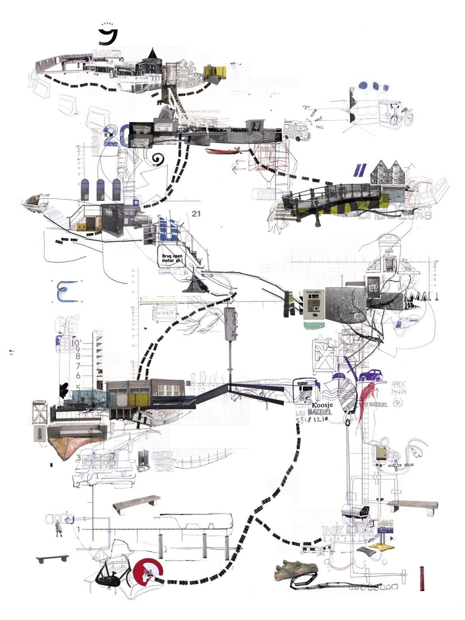
 [Image: From Project 360º by Frank Dresmé].
Here’s an old project by Dutch graphic designer Frank Dresmé. Called Project 360º, it used the idea of the “transect” as a way to map and graphically depict pedestrian movement through urban space.
 [Image: From Project 360º by Frank Dresmé].
As Dresmé explains, he found existing maps of Amsterdam both navigationally inadequate and conceptually boring, so he sought to find a new way to represent how the city really feels as a sequence of spatial opportunities and physical obstacles.
This meant, among other things, focusing on and highlighting the signs, paths, turns, landmarks, and other bits of the city that stand out to someone intent on moving through it.
 [Image: From Project 360º by Frank Dresmé].
The results was “four psychogeographical maps,” as he described them, that unpeeled and restitched Amsterdam back together again.
“These maps are the routes between personal destinations in Amsterdam,” he explained. “Every destination in a different wind direction; north /east /south /west back to the north.”
While the final images are perhaps not navigationally useful for other pedestrians, they are certainly visually striking; what is more important, in any case, would not be the use-value you can extract from Dresmé’s project, but the methods and techniques it suggests for breaking down and understanding your own use of the city.
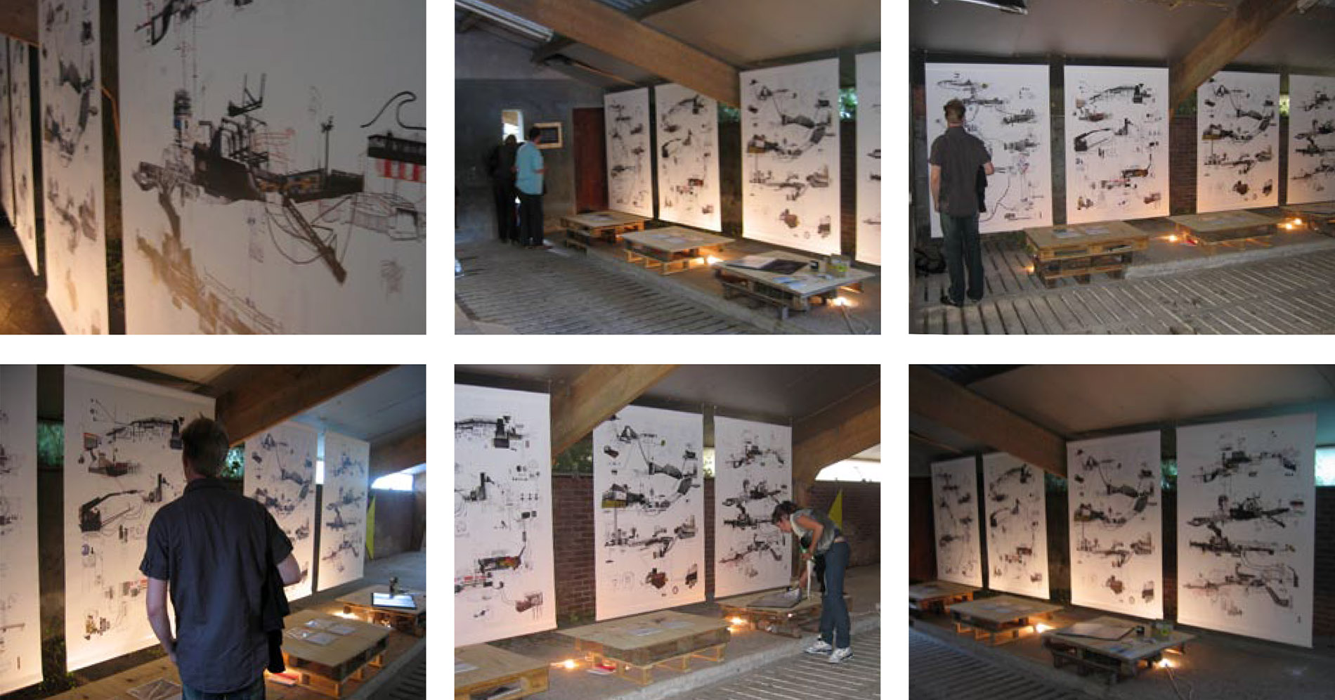
 [Image: Exhibiting Project 360º by Frank Dresmé].
Given all of the spatial data now available about ourselves, whether we want it to be or not, it seems particularly timely to imagine new ways of engaging with, mapping, and representing that geographic information.
Part trail map, part daily diary, Dresmé’s transect offers as good an option as any. Download a PDF of the project over at his site.
[Note: Brent Milligan of Free Association Design used these and other graphic representations of urban space as a launching point for a long post back in 2009].
 [Image: Typing messages with Katie Holten’s tree alphabet].
 [Image: From
  [Image: From
  [Image: From
  [Image: Exhibiting