The Weather Bank

A slideshow over at National Geographic features this image by photographer Ian Wood, showing, in the magazine’s own words, “what might be called extreme Inca landscaping.”

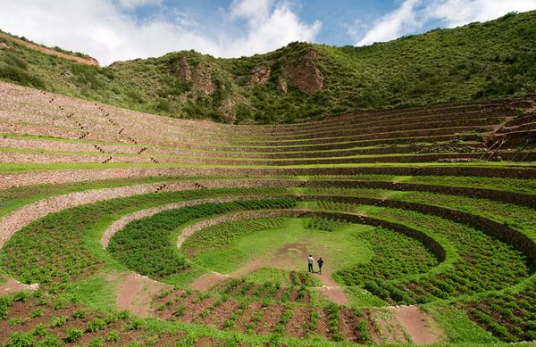
[Image: The weather bowl at Moray, Peru; photo by Ian Wood/Alamy, courtesy of National Geographic].

“Three enormous pits, each with beautifully curved sides that staircase down like the interiors of titanic flowerpots have been carved out of the earth to depths of up to 100 feet and more,” the magazine adds. They are like Indian stepwells—only they concentrate thermal gradients—and this affects the local weather: “Air temperatures between the top and bottom layers can differ by more than 20 degrees, which has led some researchers to theorize that Moray was an Inca agricultural site where experiments on crops were conducted.”

It’s a site of experimental agriculture fueled by an act of microclimatic terrain deformation.

So does this mean that the weather at Moray should be subject not only to meteorological analysis, but to archaeological interpretation? The site you’re excavating seamlessly continues into the sky above it, turning the weather itself into an historic artifact—a whole new spin on paleotempestology.

But is the weather created by an historic site also part of that historic site? If so, should ancient microclimates such as these be subject to material preservation? Put another way, if there were a Museum of Ancient Microclimates, how would you design it and what would the visitor experience be?

Imagine a whole constellation of these oversized weather pits, meanwhile, distributed throughout the Andes, all interacting with and augmenting one another, producing continent-scale storm systems—and imagine being hit by a summer downpour, or sitting calmly throughout the winter as blizzards rage just one valley over, knowing that the atmospheric events around you are really long-lasting cultural gifts of the people who lived there centuries before. Weather designed by your ancestors still rages around you today.

[Image: From Sietch Nevada by Matsys; renderings by Nenad Katic].

Superficially, I’m reminded of the hexagonal “water storage banks” of Sietch Nevada, a speculative design by the San Francisco-based firm MATSYS. While the resemblance doesn’t go much beyond form, this comparison lets us borrow MATSYS’s idea of a water bank and, thus, reinterpret the Incan site at Moray as a kind of weather bank, storing temperatures and headwinds year round. It is a space to store climates in.

Extrapolating wildly from this, if the rise of the Himalayas radically altered the earth’s climate by changing weather patterns for thousands of miles in all directions, then perhaps we can imagine a scenario in which a network of artificial pits in the Andes begins to affect the jet stream, plunging Australia into drought and pushing rain far north into Mexico—and that, in turns out, is those pits’ very purpose, having been excavated by scientifically advanced, self-styled weather warriors more than 600 years ago for reasons still unclear today. Groups of elders would get together in the dark, sitting around their pits in tight circles as the winds picked up, burning incense, singing tales, hurling storms like artillery into the central Pacific.

(Thanks to Marilyn Terrell for the heads up!)

Geopolitical Redesign, or: A Bridge Between Europe and Africa

[Image: A cable car connects Europe and Africa, by Fabio Tozzoli and Eliana Salazar, Bologna (Italy); via Domus].

Back in May, the revitalized Domus magazine asked to see “your ideas for a connection between Africa and Europe across the Strait of Gibraltar,” suggesting in the process that the best results might be a “Bridge? Tunnel? Cablecar? Dam? Metropolis? Market? Power plant? Museum? Icon? Prison? Park? Airport?”

Perhaps all (or none) of the above.

[Image: Walking alone through the precarious geopolitical space between Europa and Africa, by Gabriele Garavaglia (Italy); via Domus].

Of course, viewed simply on the level of geography, this is no ordinary crossing. As Domus points out, “a tunnel would have to overcome engineering challenges far greater than those faced by the Eurotunnel’s designers: the water is exponentially deeper (nearly 1 km at the shortest point across the strait, compared with just 70 metres in the English Channel).” A bridge wouldn’t be much better, as any such proposal “must take into account the presence of heavy east-west marine traffic, and its piers must be able to withstand ship collisions and high winds.” On the other hand, “an underwater ‘mountain’ exists at the center of the strait’s narrowest section,” and this “could be used to divide the bridge’s span in two”—but, unfortunately, “the location of the crossing coincides with an active fault of the African and the Eurasian tectonic plates.”

Even this, though, is well before the harrowing reality of a trans-Mediterranean crossing has been politically improved for so many of those who attempt to make it. Indeed, as one response suggests, there are “a lot of things to think about before building a massive bridge between two different worlds”—indeed, “dialogue is the solution” to international relations around the Mediterranean Sea, not some Herculean piece of half-baked infrastructure.

No matter how you look at it, then, it seems an architectural connection between the continents is not only difficult, it is perhaps impossible.

[Image: The Eurafrican maritime border as “geostrategic platform,” by Gabriel Esteban Duque, Juan Miguel Gómez, Maria Isabel González, Medellín (Colombia); via Domus].

However, that’s exactly the kind of challenge that design increasingly thrives on, and over the past two months an extraordinary collection of postcards has been arriving at the Domus offices in Milan, responding to this call for ideas. These potential continental connections have fallen into a few dozen categories, including:

21 Islands and archipelagos
10 Ship chains
6 Bridge-cities
6 Red Sea [Biblical partings-of-the-water]
5 Bridges suspended with air ballons
4 Tensile structures
4 Funiculars
4 Tightropes
3 Rainbows
3 Markets
3 Airships
2 Underwater bridges
2 Roller coasters
2 Tunnels
1 No bridge
1 Geoengineering
1 Shopping mall
1 Zebra crossing
1 New continent
1 Swimming Pool

And this still doesn’t tally the full run of ideas coming in from all over the world (in fact, you have till 19 July to submit your own). A suite of 300 different responses will be on display starting at 7pm, Thursday, 21 July 2011—with free drinks—at the Gopher Hole in London. See the Gopher Hole’s website for more info.

[Image: Europe and Africa perhaps sarcastically joined by a bridge of colored balloons, by Pat and Luca Architecture, Melbourne (Australia); via Domus].

One entry in particular, seen here for the first time courtesy of Domus, seems worthy of comment: a new international currency designed by architect Bjarke Ingels of BIG. 100 samples of Bjarke’s new infrastructurally-themed currency will be printed on banknote paper and given out at the event, so it’s worth stopping by if for no other reason than to collect counterfeit money designed by one of today’s most widely recognized architects.

[Images: The 1,000 Afro note by Bjarke Ingels].

These are the 1,000 EURO note and the 1,000 AFRO note.

[Images: A new 1,000 Euro note by Bjarke Ingels].

As BIG explains:

BIG has designed a 1000 EURO bill and a corresponding 1000 AFRO bill as a first proposal for a United African Currency—the AFRO.
The two bills portray the proposed connection across the Gibraltar Strait linking Europe and Africa. The bridge is conceived as an inhabited overpass uniting Euro-African typologies—such as Firenze’s Ponte Vecchio and Le Corbusier’s Obus Plan for Algiers—into an intercontinental hybrid of city and infrastructure. The investment in concrete and steel doubles as load-bearing structure for living and working spaces for the many immigrants anticipated over the next decades, and will help establish the bridge itself as a bicontinental city in its own right.
The EURO bill draws on the current design template, emphasizing architecture as the common denominator between the various European cultures.
The AFRO combines great African landmarks—in this case, the bridge—with great African people of recent history who have contributed significantly to making a free united Africa a possibility.

Briefly, I’m reminded of a student project from 2008 called Our New Capitol, by Bryan Boyer. For that project, Boyer asked what sort of congressional meetinghouse would be most appropriate for U.S. governance in the 21st century, but also what that country’s currency should look like.

[Image: From Our New Capitol by Bryan Boyer].

Or, of course, there is the famous Dutch architecture coin by Stani Michiel:

[Image: Speculative numismatics by Stani Michiel].

The idea that a nation—or an inter-nation, as it were, formed by a crossing between Europe and Africa—deserves its most representationally accurate currency is a compelling one, as is the idea that architects and designers could start issuing their own banknotes as geopolitical provocations, simply to see what happens next.

Of course, if we’re going to take this experiment seriously, then we should perhaps ask why it is worth including one of Bjarke’s own earlier buildings on the notes—as you’ll see, above, the 1,000 EURO features the VM Houses, designed by Bjarke Ingels and Julien De Smedt—although this is fairly obviously a joke. And, further, I would love to see a 500, 100, 50, etc., AFRO note, simply to rest assured that the architect doesn’t really believe this bridge is the single “great African landmark” worthy of monetary representation.

But, putting those criticisms aside, BIG’s money is a useful launching point for wondering aloud what we could do, as architects, designers, writers, artists, and more, to rethink the accoutrements of the nation-state, from passports to parking tickets, and thus how we might reconsider, down to the smallest details, how the State, writ large, is understood and presented.

That is, how can we redesign the geopolitical ephemera through which nation-states currently recognize each other, and how might these sorts of peripheral—even frivolous—interventions inspire real constitutional change elsewhere? To put this in spatial terms: what is the architecture of the post-nation-state? And what sorts of infrastructure might the future of governance require? (See, for example, Pier Vittorio Aureli’s Brussels: A Manifesto Towards the Capital of Europe for a provocative look at how urban design can help to implement a transnational system of governance such as the European Union).

Altering the order of emphasis here, perhaps it is time to prioritize the wholesale redesign of nation-states as a central problem for the 21st century, whether that means redrawing international (or intranational) borders around natural resources, such as this alternative map of the western U.S. produced by John Wesley Powell—

[Image: A hydrocentric alternative to today’s western geopolitical boundaries by John Wesley Powell; see the excellent book Cadillac Desert by Marc Reisner for more on Powell].

—in which the outer limits of U.S. states are determined not by human demographics but by watersheds. Or perhaps we should more aggressively rethink the future of governance and national validity through such things as literary works—through novels like Paul Auster’s Man in the Dark, Rupert Thomsen’s Divided Kingdom, or Anna North’s America Pacifica—or even through games, such as the underwhelming and jingoistic Homefront.

More to the point, could we use Domus‘s Project Heracles to open the door to other, equally radical possibilities for geopolitical redesign; where do these possibilities now most urgently exist (Israel/Palestine? the Bering Strait? the U.S./Mexico border?); and what is the most useful way for architects and designers to catalyze new forms of human governance?

Do we start with counterfeit money or do we build new geographies altogether?

In any case, be sure to stop by the opening party at the Gopher Hole in London on Thursday night—and keep your eye out for Bjarke Ingels’s new cash.

Ruin Index

Welsh soldiers are currently documenting abandoned neighborhoods in the divided city of Nicosia, Cyprus, photographing a region that “stretches across the entire breadth of the island, covering 134 square miles.” Their ultimate goal is “to catalog everything in the area of the city that is part of a buffer zone established by the UN to end the fighting.” Quoting the soldier in charge:

“The people had to leave their homes and shops pretty quickly, leaving everything behind. There’s children’s clothing, boxes of unused shoes. Of course, all this stuff still belongs to the people who left it.”
Some of the things lying in vacant blocks also include brand new cars made in 1974 that have been left in hollow shopping centres.
“There’s a Toyota Corolla 1974 which has 38 miles on the clock,” said [Corporal Kelvin Roberts]. “When you open the doors you get hit with a fresh smell of untouched leather and the plastic wrapping remains on the inside of the doors. It’s a bit spooky.”

Jace Clayton—aka DJ /rupture—wrote a great piece about the often surreal life of the international DJ, which kicks off with a visit to this very place:

I sat beside the pool talking to our host, trying to figure out why we were there. Down the coast, thirty miles away in the haze, a tall cluster of glass-and-steel buildings hugged the shore. “What’s that city?” I asked. It looked like Miami. “Varosha,” she said. Completely evacuated in the 1974 conflict. A ghost town on the dividing line between North and South Cyprus. The only people there were UN patrol units and kids from either side who entered the prohibited zone to live out a J.G. Ballard fantasy of decadent parties in abandoned seaside resorts.

Of course, this is also the same city where, in the recent book Divided Cities, we read about a subterranean network “where all the sewage from both sides of the city is treated.” A casually post-political waste-management engineer jokes that “the city is divided above ground but unified below.” It is a kind of infrastructural conjoined twin.

Will the Welsh soldiers also document the sewers?

(Thanks to John Maas for the tip).

Those of you in the UK on 19 July can take a “smell walk of Sheffield’s University Quarter followed by a presentation on the role of smell in urban design.” You’ll learn about “the unique qualities offered by smell to placemaking; contemporary experiences of odors in town and cities; [and] design issues and tools relating to smell.” Read more at Urban Design Group. Meanwhile, for some background on comparative urban odorology, check out the work of Sissel Tolaas.

Interpretation-Based Spatiality

[Image: A collage of various buildings by Robert Scarano, from photos by Gabrielle Plucknette for the New York Times].

After reading today that a New York appeals court has upheld a ban on architect Robert Scarano, preventing him from practicing in the city, I found this fascinating anecdote published a few months ago about one of the tactics Scarano has used to get his developments cleared by the Department of Buildings. Quoting the New York Times at length:

It’s the summer of 2008. A young couple decides to buy an 800-square-foot apartment in a new condo building on the gentrifying outer edge of a fashionable Brooklyn neighborhood. The buyers go to close on the place, and as they’re signing away half a million dollars, the building’s developer, keeping a wary eye on the hovering lawyers, leans over and whispers something. There’s a second bathroom in the apartment, he says, one that does not appear on the floor plan—its doorway is concealed behind an inconspicuous layer of drywall. At first, the buyers think the developer is kidding. This is before the crash, near the peak of the market, and no one’s giving away a square inch. But the developer says no, he’s dead serious, just look. So a few days after they buy the place, the couple takes a sledgehammer to their wall.

Like something out of House of Leaves—or a kind of architectural Advent calendar, in which various walls are knocked down at specific times of the year to reveal whole new rooms and corridors behind them—the building contained more space than its own exterior had indicated.

Later, the article’s author goes on to attend a party in another of Scarano’s buildings: “‘There’s a secret room,’ [the party’s host] told me, conspiratorially. Up on the mezzanine level, next to a pair of D.J.’s turntables, he knocked on a wall. It sounded hollow.”

I have to admit that this totally blows my mind. Imagine another room within that room whose doorway is also sealed behind drywall—and then other rooms within that room, and further corridors and stairs and entrances. Tap, tap, tap—you navigate by sound, knocking deeper and deeper into an architectural world you only reveal by means of careful deconstruction. Amidst this labyrinth of drywalled rooms, you realize the true extent of your property, which extends so far beyond what you originally thought was your building that you end up, at one point, standing in another zip code.

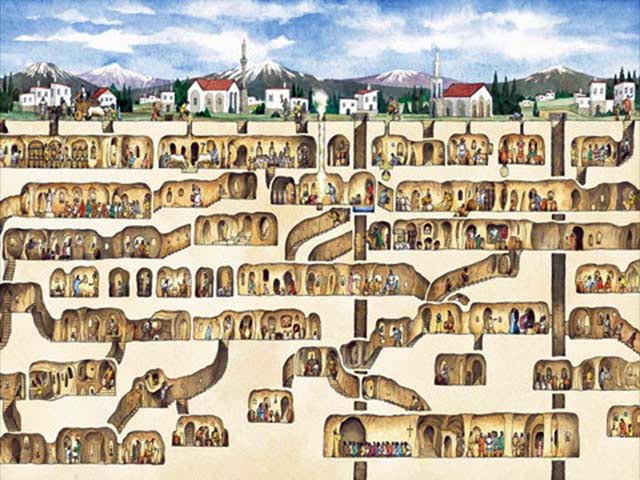
[Image: The underground city of Derinkuyu].

In a way, I’m reminded of the massive underground city of Derinkuyu, which, as Alan Weisman explains in The World Without Us, was discovered entirely by accident:

No one knows how many underground cities lie beneath Cappadocia. Eight have been discovered, and many smaller villages, but there are doubtless more. The biggest, Derinkuyu, wasn’t discovered until 1965, when a resident cleaning the back wall of his cave house broke through a wall and discovered behind it a room that he’d never seen, which led to still another, and another. Eventually, spelunking archeologists found a maze of connecting chambers that descended at least 18 stories and 280 feet beneath the surface, ample enough to hold 30,000 people—and much remains to be excavated. One tunnel, wide enough for three people walking abreast, connects to another underground town six miles away. Other passages suggest that at one time all of Cappadocia, above and below the ground, was linked by a hidden network. Many still use the tunnels of this ancient subway as cellar storerooms.

In any case, for Scarano it was not always about literally hiding extra rooms inside a building; it was often just a matter of using certain words—like basement—instead of others—like cellar—to hide his intentions. For instance, “Scarano tried to build a two-story addition to the roof of [an] old warehouse by transferring floor area from the building’s lowest level, which he planned to convert to parking, to the top of the roof. But the zoning code distinguished between a basement (which is partly above ground, defined as habitable, and therefore counted toward the floor-area ratio) and a cellar (which is underground and uninhabitable). Opponents accused Scarano of trying to finesse the difference, and eventually the Department of Buildings declared the space a cellar. New height limits have been established in the neighborhood, and the partly built addition is coming down.”

Or this: Scarano “adapted the zoning rules that applied to warehouse conversions. Under certain circumstances, the code classified loft mezzanines as storage space, not floor area, and Scarano assured developers their new building plans could slip through this loophole.”

It’s hermeneutics—as if the spatial expansion of whole neighborhoods is really just a graph of certain words used in different contexts. As if vocabulary itself materializes, precipitating out as alternative spatial futures for the city. Indeed, the New York Times writes, “in Scarano’s view, the city’s code was a Talmudic document, open to endless avenues of interpretation. Through a variety of arcane strategies, he could literally pull additional real estate out of the air.”

I’ve long been a fan of David Knight and Finn Williams, two London architects with an encyclopedic knowledge of that city’s building permissions and zoning codes (I highly recommend their book SUB-PLAN: A Guide to Permitted Development, as well as Knight’s recent guest post on Strange Harvest). The following image, taken from that book, is just one example of the type of interpretation-based spatiality so often abused by Scarano.

[Image: From SUB-PLAN: A Guide to Permitted Development by David Knight and Finn Williams].

Whether or not hiding entire rooms behind drywall is part of London’s “permitted development” is something we’ll have to ask Knight and Williams.

(Thanks to a tip from Nicola Twilley).

Gotham Sans

[Image: The Dark Knight Rises, courtesy of Warner Brothers].

Paul Owen of the Guardian today attempts a thorough critique of director Christopher Nolan’s most recent films, by way of nothing more than the new poster for The Dark Knight Rises, due out in summer 2012.

The poster presents us with “an empty city totally devoid of people,” Owen writes, which suggests to him a film that will be at once “claustrophobic, joyless, and derivative”—and he adds the third term as if in delayed realization that the first two, despite themselves, can often frame a compelling drama (many morality tales are precisely claustrophobic and joyless, which is where their effective power lies). But, in this way of thinking, the poster’s highly architectural glimpse of a “city literally falling to pieces,” as Owen describes it, is indication that the film itself will also shudder and fail under Nolan’s unfounded narrative ambitions, as if depopulated streets accidentally reveal the director’s inability to portray human complexity.

Is Owen right to deduce from a single piece of visual art the internal collapse of a film whose release is still more than one year away? And does this foreshortened view of a ruined metropolis—”an empty city totally devoid of people” with “rubble crumbling from the roofs”—rightly imply a story equally vacated of human interest?

Either way, it’s nice to see a short piece of virtuoso art interpretation, inspired by an image of buildings.

(Earlier on BLDGBLOG: Dream-Sector Physics and Inception Space and Shining Path).

Situationist Drawing Device

[Image: The “Situationist Drawing Device” by Ji Soo Han and Paul Ornsby].

The “Situationist Drawing Device” is a backpack-sized mechanism for recording the experience of landscape. Designed by Ji Soo Han and Paul Ornsby, and operating by way of mirrors, the Device “records a journey taken in an altered state of perception through drawing.” It is an “intermediary and interpretative tool,” the designers add, one that stands between the human body and the landscape it exists within and explores.

It is spatial equipment—an optical exoskeleton. Navigational clothing.

[Images: The “Situationist Drawing Device” by Ji Soo Han and Paul Ornsby].

This video shows it at work:

“As each eye retina receives different images, both conditions blur into one and simultaneously alternate—phasing in and out over the other,” the designers write. “This blurring effect, as known as retinal rivalry, creates a new perception of the site. The device was initially adapted from the pseudoscope (Greek, false view) which is a binocular instrument that reverses depth perception. The idea of reversing left and right eye vision was adapted to reverse forward and backward vision.”

You advance by looking backward, walking into layered optical phantoms of the place you’ve left behind. It is both mnemonic and projective.

[Images: The “Situationist Drawing Device” by Ji Soo Han and Paul Ornsby].

The key detail, though, is that the backpack also registers, through drawing, your experience of wearing it; a small, Iron Man-like disc (see opening image) on the user’s back serves both to house and to produce those vaguely seismological sketches. It is a mystical drawing pad for upstart Situationists.

[Images: The “Situationist Drawing Device” by Ji Soo Han and Paul Ornsby].

The device later inspired Han to design a project called the “Scrap Metal Refinery,” a few images of which appear here.

[Images: The “Scrap Metal Refinery” by Ji Soo Han].

That proposes a bridge that would stride across its own curved shadows and reflections, which are meant to be seen as a form of spatial notation, the structure registering itself in the landscape.

[Images: The “Scrap Metal Refinery” by Ji Soo Han].

For my money, the device is the stronger of the two projects, recalling the introductory essay written by CJ Lim for an edited collection of student work produced at the Bartlett School of Architecture, Devices: A Manual of Architectural + Spatial Machines. Quoting at length:

Devices have shared a long and complex history with architecture. The machines of Vitruvius and Leonardo da Vinci were devised in times of peace and war for both the construction and destruction of the built form. Today, kinetic intelligent systems are incorporated into building facades for environmental and aesthetic control. The device, however, has simultaneously followed a parallel trajectory—the Victorians invented a proliferation of devices, often ingenious, rarely of much practical use; Heath Robinson’s contraptions displayed the absurd length to which devices were invented to satisfy our convenience and curiosity; his illustrations, sometimes carrying satirical and political overtones, are best remembered for their humor. Similarly, many of today’s devices no longer perform quotidian practical tasks but are the results of artistic endeavor and are housed in galleries and museums.

The “Situationist Drawing Device” is what happens when an unironic Vitruvian sensibility is crossed with the willful absurdity of Situationist urban exploration, by way of mirrors and pens: an unfeasibly complicated piece of clothing through which the experience of built space is memorably upended.

Read a bit more at Ji Soo Han’s website.

Henry Waltz

This preview for an independent film called Henry Waltz, by Emil Goodman, is hard to decipher on a narrative level, but it unfolds in a Jasper Morello-like world of steampunk shadow puppets and wireframe cities on circular space frames, with underwater crystal submarines and fluttering machine-butterflies crossing monstrous landscapes. Humans in motorized glass domes chase one another through a maze of iron columns—which is where something like a plot must lie, though it’s hard to tell exactly what it might be. Read more on the Henry Waltz website, including a link to this short making-of video.

Weather Warriors

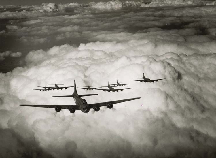
[Image: Allied bombers in World War 2; via KUED].

Allied bombing raids during World War II “inadvertently experimented on the weather” in England by creating massive concentrations of artificial clouds as the planes roared off toward continental Europe. Researchers quoted by New Scientist claim that “where the aircraft circled and assembled into formation,” on one particular day back in 1944 for which military, meteorological, and even anecdotal eyewitness records are available, “it was significantly cloudier and 0.8°C cooler than the area upwind of the bases.”

In many ways, this is both obvious and uninteresting, as, of course, any uniquely large-scale act of artificial cloud-production—such as aircraft contrails—would have at least some effect on local weather.

But what, to me, seems most remarkable about this story is the darkly poetic idea that war brings with it its own meteorology, its own skies, storms, and atmospheres, literally altering the very firmament beneath which human affairs take place. World War II becomes an even more frightening event, as sun-obliterating cloudfronts of mechanized combat roll eastward over the ruined cities of Europe.

(Spotted via @subtopes; you can read more about weather warfare in The BLDGBLOG Book).

Split Infinitives

[Image: The infrastructure of bullet time].

A digital image-processing system under development since 2007 will allow photographers “to artificially create photos taken from a perspective where there was no photographer.” It uses “a computer-vision technique called view synthesis to combine two or more photographs to create another very realistic-looking one that looks like it was taken from an arbitrary viewpoint,” as New Scientist explains.

One expert quoted refers to this as “anonymizing the photographer.”

The images can come from more than one source: what’s important is that they are taken at around the same time of a reasonably static scene from different viewing angles. Software then examines the pictures and generates a 3D “depth map” of the scene. Next, the user chooses an arbitrary viewing angle for a photo they want to post online.

The photo then goes through a “dewarping” stage, in which straight lines like walls and kerb angles are corrected for the new point of view, and “hole filling,” in which nearby pixels are copied to fill in gaps in the image created because some original elements were obscured.

While the article rightly emphasizes the political implications of this—writing that the technology “could help protestors in repressive regimes escape arrest—and give journalists ‘plausible deniability’ over the provenance of leaked photos”—there are, of course, other possibilities inherent in the technique that seem worth exploring. These include virtualizing photographs taken of a landscape, building, person, or city, producing views, angles, and perspectives never actually seen by human beings. This would be like something out of the work of Piranesi—specifically as interpreted by Manfredo Tafuri in The Sphere and the Labyrinth—in which impossible scenes overlap to produce a single, far from comprehensive spatial reality.

Perhaps some editor somewhere could send Iwan Baan and Fernando Guerra out to shoot a new building together, then “hole fill” their images to create a virtual, third photographer. Every image thus published in the resulting article documents a viewpoint neither photographer either experienced or saw. It is the building as seen by no one, virtually extruded from otherwise real-world photographs.

To throw another gratuitous theory reference out there, it’s like Foucault’s analysis of “Las Meninas” in The Order of Things, where we read that the painter may or may not have included an obscured vantage point from which his painting was supposedly painted. To translate Foucault’s hypothesis into New Scientist‘s terms, this would be “location privacy,” that is, “a way of disguising the photographer’s viewpoint.”

[Image: “Las Meninas” by Diego Velázquez].

Or, imagine, for instance, an entire film assembled from “dewarped” images—intermediary, falsified frames precipitated out from between the cameras—creating an uncanny motion picture of interstitial imagery. Virtual films between films; films recombined to create a third cinema of gaps; virtual still images taken from virtual films, overlaid and dewarped to form fourth and fifth and sixth films generationally removed from the original, in an infinite splintering of derivative film stills. We won’t document the world as everyone sees it; we’ll document it from places where no one’s ever been.

(Thanks to Luke Fidler for the tip).