Vertical Transport Through Architectural Space

[Image: A cargo elevator beautifully shot by po1yester].

Further proof that elevators have been ignored for too long in contemporary building design – after all, they are moving rooms and could be put to use as something other than mere vertical transport through architectural space – even Harrods, the London department store, is (temporarily) updating its lifts.
According to the Guardian, Harrods is about to open Lifted, “the world’s first exhibition to be displayed in elevators” (a wild over-statement that is, in fact, wrong). The elevator-based exhibition will include work by “Oscar-winning composer Michael Nyman and visual artist Chris Levine.”

Levine’s “Sight” lift will feature a light sculpture using Swarovski crystals and lasers to immerse passengers in mesmerising patterns once the doors close. Nyman’s “Sound” composition aims to trigger feelings of confinement. The “Smell” lift, designed by Aroma Co, emits smells such as pomegranate and fresh laundry via wall-mounted buttons, while the tactile “Touch” lift was devised by the Royal National Institute for the Blind.
The “Sixth Sense” lift, however, created by author and “cosmic ordering” expert Bärbel Mohr, encourages customers to send wishes to the universe and “reconnect with their inner self”.

On an only vaguely related note, meanwhile, I’d be curious to see if you could invert the expected volumetric relationship between stationary floors and moving elevators in a high-rise.
In other words, if elevators usually take up, say, one-twentieth of a building’s internal space, could you flip that ratio – and end up with just one stationary floor somewhere hanging out up there inside a labyrinth of elevators?
You have a job interview on that one, lone floor in a half an hour’s time – but you can’t find the place. You’re moving from elevator to elevator, going down again and stopping, then stepping across into another lift that takes you up four floors higher than you’d expected to be – before you’re going down again, confused. You hear other elevators when you’re not moving, and it’s impossible to locate yourself amidst that system of moving rooms. The only floors you ever exit onto are simply other elevators.
Then, through a coincidence of open lift doors, forming a temporary corridor through space, front and back doors open, stretching off through eight cars at a time, you glimpse the meeting room that you’re even right then supposed to be sitting down in for an interview… and you see people there waiting… but the doors all close and you’re back on the ground floor in no time.
You hear machines, cables, whirring gears.

[Image: Elevator Buttons by Vancouver-based photographer Jason Pfeifer].

Stunned, perhaps mesmerized, and already addicted to that well-machined state of vertically nomadic groundlessness, you smile, hit the UP button, and start again.

(Thanks, Nicky!)

Amsterdam Subcity

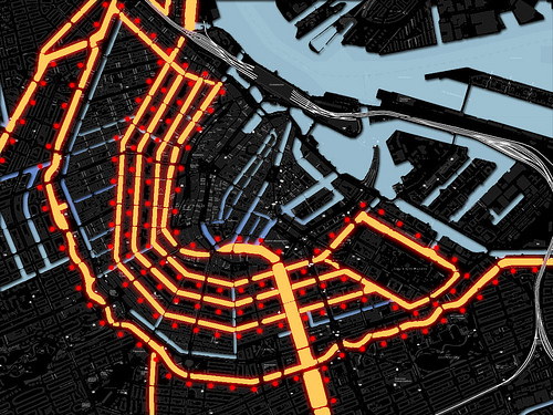
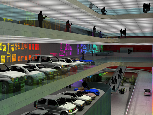
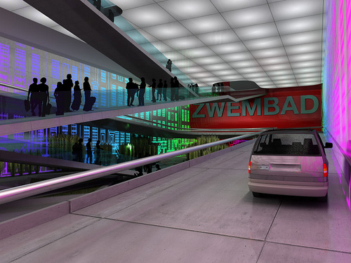
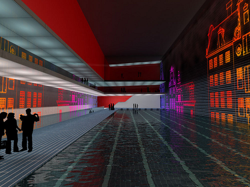
Will the city of Amsterdam soon build “a labyrinth city” beneath its canals?

[Image: A new underground city for Amsterdam, by Zwarts & Jansma].
Maybe so.
According to World Architecture News, “Newspapers around Europe have been reporting on the scheme, which requires the city’s canals to be drained to allow the construction of a vast underground mixed-use complex beneath.”

[Image: Underground Amsterdam by Zwarts & Jansma].

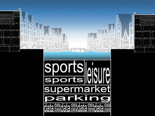
It’s an idea by Zwarts & Jansma architects, whose plans includes excavating “a range of underground facilities… at various levels below the city.”

[Images: Zwarts & Jansma].

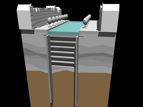
Apparently, the project is even technically feasible:

The Dutch capital may be unique as its geology lends itself to the technical feasibility of this scheme. Moshé Zwarts explained, “Amsterdam sites on a 30-metre layer of waterproof clay which will be used together with concrete and sand to make new walls. Once we have resealed the canal floor, we will be able to carry on working underneath while pouring water back into the canals. It’s an easy technique and it doesn’t create issues with drilling noises on the streets.”

But does that mean Amsterdam should really build it? For instance, World Architecture News is quite opposed to the project – yet the Telegraph reports that “the project has been approved by Amsterdam’s city council. Construction work, lasting up to 20 years, is expected to begin in 2018.”

[Image: Zwarts & Jansma].

Maybe they should build it and use it as a penal colony. Imagine the escape attempts – trying to get out of the earth.

(Thanks to Alex Haw for the tip!)

Trash Mandala

[Image: By Jeffrey Inaba/C-LAB].

Jeffrey Inaba and C-LAB have created this mandala of consumption, refuse, and plastic waste, with one side dedicated to the “hydration compulsion” that helps puts millions of one-use bottles in places bottles aren’t meant to be.

[Image: By Jeffrey Inaba/C-LAB].

There is even a deity of hydration, tempting us with its multi-limbed assortment of tasty beverages.

[Image: By Jeffrey Inaba/C-LAB].

But it’s all part of a new project meant to rethink waste management infrastructure, complete with ironic and colorfully alluring designs for private trash cans.

In this project, the trashcan has been redesigned, and mostly over-designed, to celebrate the taste of suburban culture and to give a form to the can that describes the processes of use, disposal, and management of the things we trash.

The project is thus a look at “our eco-era obsessions that generate trash: the simultaneous rise in environmental awareness and in disposable cleaning goods… the simultaneous rise in global water awareness and the generation of water bottle waste… We made a series of suburban style trash cans to describe these contradictory tendencies.”

The project goes on display today at the Walker Art Center in Minneapolis.

[Images: By Jeffrey Inaba/C-LAB].

Read BLDGBLOG’s interview with Inaba here.

Air Disaster Simulations

[Image: From the series Air Disaster by Richard Mosse].

Photographer Richard Mosse got in touch over the weekend with these photographs of air disaster simulations: fire crews racing to put out temporary fires, amidst fake airplane bodies on the runways of airports all over Europe and the United States.
“I spotted my first air disaster simulator on the tarmac at JFK,” Mosse wrote. “You can see it yourself next time you fly into that airport. It’s an intimidating black oblong structure situated dangerously close to one of the runways. Ever since, I have hunted for air trainers while taxi-ing across each new airport that I’ve had the chance to fly into.”

[Images: From the series Air Disaster by Richard Mosse].

When I asked him about the actual photographic process – setting himself up near burning, abstract airplanes in order to get the right shot – Mosse replied: “They are extremely difficult to photograph. First the water jets are turned on to douse the fuselage in water. This is in order to stop the metal warping under the intense heat of the flames. Then a pilot light comes on – and the spectacle begins.”

[Image: From the series Air Disaster by Richard Mosse].

“But before you’ve had a chance to cock your shutter and take the photo,” Mosse continued, “it is all finished.”

The firemen have put out the fire in seconds. That’s their job, after all. They do this with decisive brevity and great courage, sometimes walking right into flames – but it doesn’t make for an easy photograph. It’s all a bit like the sexual act: the flames come up and men run in and spray everything with a high power water hose and then it’s all over.

But that act entails artistry and technique…

[Image: From the series Air Disaster by Richard Mosse].

And each airport is different: “The fire crew at each airport is always fiercely proud of their rig,” Mosse writes.

One crew invited their family along and held a barbeque to watch the training unfold over the course of an evening. Another crew actually let me use their cherry picker bucket to get my camera into position. At one airport, I was even fully equipped to let me work as close as possible to the flames. During one shoot, a Royal Brunei jumbo hit a piece of debris upon take off and the entire crew were mobilized to battle stations. For security reasons, I hid in a small shed while they dealt with the emergency, which they resolved without incident. But that’s why these structures are built: to keep the crew fire fit at all times, always willing to jump into the flames.

It’s a kind of anthropological micro-culture of the air disaster simulation crew, eating barbecued chicken and running through flames.

[Images: From the series Air Disaster by Richard Mosse].

Sometimes mannequins get involved, artificial humans needing to be rescued from situations of extreme peril. Like Ballardian stand-ins, they are scuffed, scraped, and partially blackened by oil and smoke, then surgically repaired with strips of duct tape.

[Image: From the series Air Disaster by Richard Mosse].

Of course, this reminds me of the Center for Land Use Interpretation’s work on law enforcement training architecture, where simulated townscapes play host to staged police raids, fake shoot-outs, and simulated hostage situations. There is even a Laser Village.
As the Center writes: “Whether they are made for police or fire departments, these training sites are stylized versions of ordinary places, with the extraordinary horrors of the anticipated future applied to them on a routine basis.”
One location in particular, the Del Valle Training Center, comes complete with “industrial props (including a portion of an oil refinery), vehicle accident props (including propane-powered bus collisions and a collapsed building prop), concrete slab cutting props, shoring training props, confined space rescue props, and other urban search and rescue facilities.”
Something tells me Richard Mosse would have a field day there.

[Images: From the series Air Disaster by Richard Mosse].

In any case, I asked Mosse what the general idea behind this project was, and he explained that, in all his work, he’s been trying to show “the ways in which we perceive and consume catastrophe.”

The actual disaster is a moment of contingency and confusion. It’s all over in milliseconds. It’s hidden in a thick cloud of black smoke and you cannot even see it. Battles, ambushes, hijackings, air strikes, terrorism: it’s the same with all of these, too. But the catastrophe lives on before the fact and after the fact, as this spectacle. That’s why I wanted to photograph the air disaster simulators; they are the air disaster more than the thing itself. We have built in our airports these enormous, absurd, phallic structures with kerosene jets and water sprinklers. They are monuments to our own fear, made within the pared down, hyper-functional, green and black and grey symbolic order of militarized space.

Mosse has also photographed real plane crash sites:

As for the actual plane crashes, these are also difficult to photograph. You must be prepared to travel immediately in order to photograph one, and you don’t know if you will even be able to get a photograph of it when you get there. For very good reasons, press photographers are always corralled into a pen at a great distance from the disaster. Most photographers take out their longest lens and zoom right in – but I don’t have a zoom lens. I shoot with a wooden field camera, and so I am forced to shoot the disaster in its context, as a landscape photograph. The results end up looking like something approaching early war photography from the 19th century (Roger Fenton, Matthew Brady, Timothy O’Sullivan, etc.).

[Image: From the series Air Disaster by Richard Mosse].

“I think it’s important,” Mosse concludes, “that we understand where catastrophe exists in our cultural imagination – where it actually is in reality – which is why I do what I do.”
Be sure to check out the rest of Mosse’s work on his website, including his photographs of Dubai.

We will migrate into the sky

[Image: Courtesy of Studio Lindfors].

For a recent design competition called What if New York City…, architects and city planners were asked:

What if New York City were hit by a Category 3 hurricane? What if the most densely residential city in the country loses hundreds of thousands of homes in a few hours? What if millions are left with nowhere to live, to work, or to go to school? What if subways flood, streets close, and whole neighborhoods are submerged by up to 23 feet of ocean water and battered by 130 mile-per-hour winds? What if New Yorkers need a place to live during years of reconstruction?

Local architects Studio Lindfors offered a weirdly hilarious answer to these questions in the form of habitable blimps.
Welcome to Cloud City.

[Images: Courtesy of Studio Lindfors; maybe Will Smith, in I Am Legend should have lived in one of these things… If so, he might have survived].

“Though perhaps an unusual proposal,” we read, “Cloud City is literally an uplifting experience that will allow communities to remain intact as they pull themselves out of the rubble.”
It’s an Archigram-like instant city in the sky:

The homes can be rapidly deployed with minimal site preparation. They are intended to ‘plug in’ to existing utility services, and can be deployed by a team of four workers in roughly an hour. Once airborne, the floating homes allow construction crews below to work unimpeded, speeding up the recovery effort. This in turn reduces cost overruns and unnecessary delays.

The hovering metropolis seems easy enough to construct.

[Images: Courtesy of Studio Lindfors].

As the architects themselves explain, the blimps are a kind of emergency city, held in reserve:

Inflatable homes would be pre-fabricated and stored in warehouses for deployment as required. Each home consists of three basic components: an inflatable bladder, a rigid core, and a metal and wood platform. The bladder would consist of two compartments, filled with pressurized helium (which is non-combustible). The pressurized gas would give shape to the tailored and stitched fabric shell, creating an open living space within. Made from recycled polyester fabric, the balloon has a large surface area suitable for mounting of flexible solar panels for generating electricity. Within this living space is a rigid core which contains an efficient kitchenette and bathroom, along with plumbing and electrical services. The 300sf living space is open, and can be configured in many ways, with up to three bedroom spaces suitable for a family of four.

However, a part of me thinks there’s no real reason to wait until disaster strikes; we could simply migrate into the sky. Renewing ourselves – becoming literally airborne – in a vertical migration that evacuates the earth.
Let’s say you’re from Kansas City. You haven’t been home in two decades. You don’t get along with your family anymore and, well: you just don’t want to go back. But then a special occasion comes up and you book a flight home.
The whole city has been replaced with blimps.

[Image: Courtesy of Studio Lindfors].

You hadn’t heard about this. Somehow your newspaper just didn’t pick it up – the transition was so slow that no one noticed – or you simply missed that article, but, either way, you’re stunned. Everyone is up in the sky.
There are no streets. You see your dad – in fact, he sees you – waving down from a well-tethered terrace. He’s barbecuing something and drinking Diet Coke. No one pays property tax, just a small tethering fee. They grow their gardens on secondary platforms that drift around like balloons in a parade. Only one falling death has been reported in the last two years.
The blimps themselves are bulletproof.
They are suburbs in the sky.

[Image: Courtesy of Studio Lindfors].

In any case, read more about the project at Studio Lindfors’s site – and don’t miss the other competition entries, some of which are also worth posting.

Aerial Terrains

It what sounds like the coolest job description going, the BBC reports that “scientists have been sailing across the Atlantic in a bid to track down sand from the Sahara Desert.” They are chasing an aerial landform while plying currents through the sea.

Terrestrial stability is nowhere in sight.

[Image: Photo by Thomas J. Abercrombie].

Tracking that desert in the sky, the scientists have already “encountered two large sand storms during their cruise and recorded footage of their dust-drenched experience for the BBC News website.”

It’s airborne geology, of a different kind.

Of course, the Sahara is always popping up in unexpected places. A few quick links away from the BBC and we find that Saharan sand even peppered the ground in Wales last month; and that desert often blooms northward to cover parts of France, Italy, and Mediterranean Europe more generally, going as far north as England. It’s like some shapeless, living landmass from Greek myth – or from the tales of Scheherazade. (Leading me to wonder aloud: are the world’s religious texts an untapped resource of ideas for avant-garde landscape design?)

[Image: The Libyan Sahara; photo ©Jacques Herman].

So here’s a landscape design project for your next summer school studio: go around Europe tracking down the Sahara. Map these sites of territorial spread. Find where airborne terrains stratigraphically settle onto fields and cities elsewhere. Photograph zones of undisturbed deposition – small pockets of sand in a gully in eastern Spain – where it’s already compressing to form stone.

Then you hear rumors of a particularly violent storm that blew grains as far as Japan… and so off you go in your personal jetliner, sponsored by SCI-Arc.

In any case, the future geology of Europe will come down to it from the air, a distant lamination of the Sahara. Landscape at a distance.

If we stop sweeping the streets, what new sedimentary rocks would be forming here?

Perhaps that famous graffiti from Paris in May 1968 got it all wrong. Instead of: “Beneath the paving stones – the beach!” It should have read: “Above these roofs – the desert!”

Sailing across the Atlantic, scanning for nomadic side-storms of the Sahara, seems like a good place to start.

The Big Issue

The March 2008 issue of Dwell is now out and, as some of you may or may not know, I recently became one of Dwell‘s Senior Editors – where the other Senior Editor is Amber Bravo, the woman who puts the cool in school.
March is the first issue in which I’ve had a real impact on content, so I thought I’d urge everyone to go check it out! It’s good for you.

[Image: A page from Dwell featuring scenes from the short film After the Rain by Ben Olszyna-Marzys, produced for an architecture studio taught by Nic Clear].

The cover itself is gorgeous, featuring a project called the Boxhome by Finnish artist and architect Sami Rintala. I was very happy to send British novelist – and occasional BLDGBLOG commenter – Clare Dudman over to Oslo in October ’07 to see the Boxhome firsthand. Clare compares the Boxhome to a TARDIS from Dr. Who, “a tiny telephone box that opens into a series of rooms.”
Clare’s recent novel One Day the Ice Will Reveal All Its Dead is well worth the read; it’s an historical retelling of the life of German naturalist Alfred Wegener, who first pioneered the theory of “continental drift.” Dudman is an extraordinary writer, and it was a genuine pleasure to work with her – and Sami is an enthusiast, plain and simple, so corresponding with him was a delight. Clare’s article starts on page 114.
I’ve basically got three articles of my own in there, as well.
First, I interviewed architect David Adjaye when he came through town last Fall. You’ll see a “Conversation” with Adjaye on page 92.
Adjaye was surprisingly fun to talk to, I have to say, and I’m quite proud of the resulting transcript. We talk about LEED certification, the state of the U.S. construction industry, David’s ongoing urban interest in Africa, and the idea that, to quote Adjaye himself:

As cities grow, and as the experience of urbanism becomes overwhelming or intoxicating, I think the notion of the domestic retreat becomes more and more important.

It’s a short article, but give it a read if you can.

[Image: Three projects by David Adjaye].

I also visited a house in Chicago while I was there in September ’07, and an article about that residence appears on page 80. The house is a converted tavern in Bucktown. It’s been fitted out with geothermal wells, solar panels, and some really cool wind turbines by Bil Becker of Aerotecture International; 80% of the construction waste was recycled. The coolest detail, for me, was the bathroom floors, which are made from a glass aggregate in which the pulverized remains of old musical records can still be seen. I actually got to tour the house with the lead and project architects, and they pointed out small, recognizable fragments of old LPs in the floor beside the toilet.
It’s a beautiful house; it’s received an awful lot of media attention, including an entire show by National Geographic, but hopefully my little three-page article adds something to the conversation.

[Images: Photos taken by Michael Tercha for the Chicago Tribune; I have actually sat on one of those loungers, surreally enough].

While I was in Chicago, then, I was also given a long tour of one of the houses that appears on page 64. Designed by Chris Talsma, of Filoramo|Talsma, it’s his own house; Chris, his wife, and I walked around for nearly an hour exploring the place, looking out over the city from the enormous – genuinely just enormous – roof deck, talking about architecture and the Pompidou Centre and the changing neighborhoods of Chicago, where I once lived, and I wish that we could have covered the house in more detail, but at least we managed to include it. If you’re looking for a residential architect in Chicago, consider giving Chris a call.
Finally, I’ve got a short, uncredited article about professor Nic Clear, from the Bartlett School of Architecture, who, for nearly a decade, has been using a heady mix of film production, sci-fi, and J.G. Ballard to teach his students the narrative rudiments of built space. I showed some of Clear’s students’ work at a film festival I helped curate in Pasadena last year, so I was excited to include Clear in the issue.
So go check it out! It’s got small houses in London and New York, and an “Archive” piece, by Aaron Britt, about Bertrand Goldberg, architect of the corncob towers in Chicago, of Wilco fame. It mentions Piranesi and the book Hyperborder. It’s got fish made from bone china and a tour of Lima, Peru. It’s got iPod docks.
Sam Grawe, the Editor in Chief, has put together a really cool issue.
If you do pick up a copy, I’d love to hear what you think – of the Adjaye conversation and the Nic Clear article, in particular.
At the very least, just look at the cover! It’s gorgeous.

Psychology at Depth

As published by Science and Mechanics in November 1931, the depthscraper was proposed as a residential engineering solution for surviving earthquakes in Japan.
The subterranean building, “whose frame resembles that of a 35-story skyscraper of the type familiar in American large cities,” would actually be constructed “in a mammoth excavation beneath the ground.”

Only a single story protrudes above the surface; furnishing access to the numerous elevators; housing the ventilating shafts, etc.; and carrying the lighting arrangements… The Depthscraper is cylindrical; its massive wall of armored concrete being strongest in this shape, as well as most economical of material. The whole structure, therefore, in case of an earthquake, will vibrate together, resisting any crushing strain. As in standard skyscraper practice, the frame is of steel, supporting the floors and inner walls.

My first observation here is actually how weird the punctuational style of that paragraph is. Why all the commas and semicolons?
My second thought is that this thing combines about a million different themes that interest me: underground engineering, seismic activity, redistributed sunlight through complicated systems of mirrors, architectural speculation, disastrous social planning, etc. etc.
In J.G. Ballard’s hilariously excessive 1975 novel High-Rise – one of the most exciting books of architectural theory, I’d suggest, published in the last fifty years – we read about the rapid descent into chaos that befalls a brand new high-rise in London. Ballard writes that “people in high-rises tend not to care about tenants more than two floors below them.” Indeed, the very design of the building “played into the hands of the most petty impulses” – till “deep-rooted antagonisms,” assisted by chronic middle-class sexual boredom and insomnia, “were breaking through the surface of life within the high-life at more and more points.”
The residents are doomed: “Like a huge and aggressive malefactor, the high-rise was determined to inflict every conceivable hostility upon them.” One of the characters even “referred to the high-rise as if it were some kind of huge animate presence , brooding over them and keeping a magisterial eye on the events taking place.”
My point is simply that it doesn’t take very much to re-imagine Ballard’s novel set in a depthscraper: what strange antagonisms might break out in a buried high-rise?
Living underground, then, could perhaps be interpreted as a kind of avant-garde psychological experiment – experiential gonzo psychiatry.
I’m reminded here of the bunker psychology explored by Tom Vanderbilt in his excellent book Survival City: Adventures Among the Ruins of Atomic America.
In the midst of a long, and fascinating, tour through the 20th century’s wartime underworlds, Vanderbilt writes of how “the confined underground space becomes a concentrated breeding ground for social dysfunction as the once-submerged id rages unchecked.” Living inside “massive underground fortifications” – whether fortified against enemy attack or against spontaneous movements of the earth’s surface – might even produce new psychiatric conditions, Vanderbilt writes. There were rumors of “‘concretitis’ and other strange new ‘bunker’ maladies” breaking out amidst certain military units garrisoned underground.
What future psychologies might exist, then, in these depthscrapers built along active faultlines?

Mod Living

[Image: A “cellular house” by Lúcio Santos. View larger].

Clicking around this morning, I found the work of Lúcio Santos – lots of modularity exploring slightly offset asymmetric repetitiveness. The house pictured here, for instance, “a detached single-family home, pre-manufactured and assembled on site,” can also be stacked further upon itself in a kind of vertical stutter to form towers.
On its own, it also vaguely resembles a prosthetic knuckle, or some other sort of avant-garde medical device manufactured from high grade plastic.
House for David Cronenberg.

[Image: A “cellular house” by Lúcio Santos. View larger].

Santos’s modular dining experience is also worth zooming in on – a prototype table/seating unit perhaps soon to grace a kitchen (or campground) near you. Or perhaps it’s a new kind of shelter for street chess players.