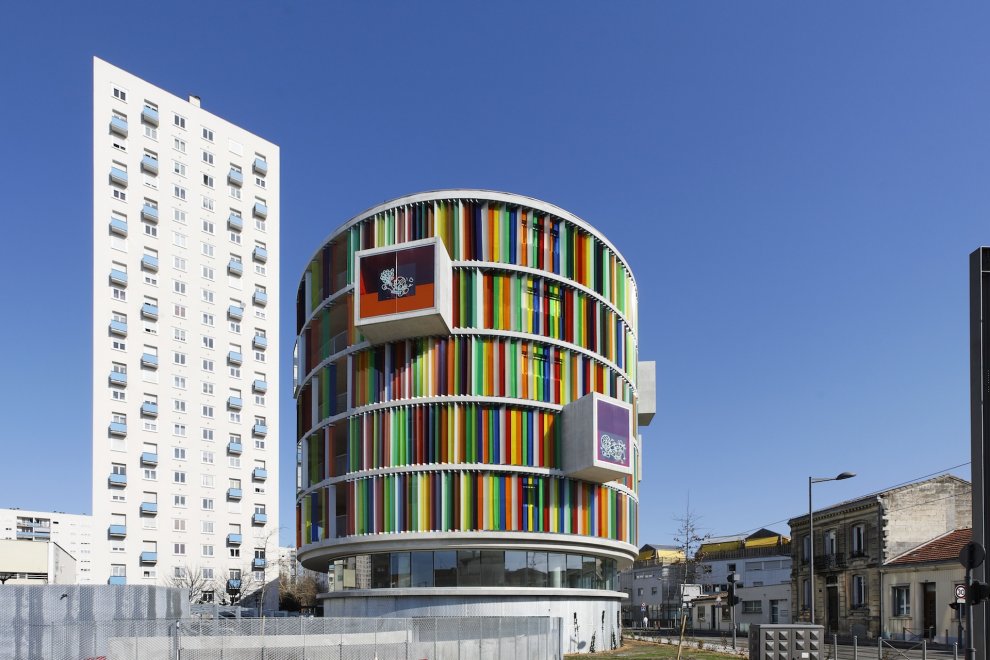
 [Image: Arc en Ciel by Bernard Buhler Architects].
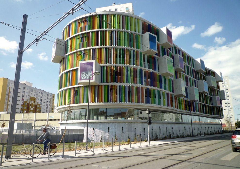
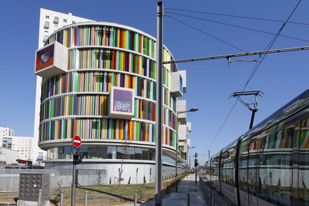
Here’s some eye-candy for a Tuesday evening: Arc en Ciel, a new building in Bordeaux, France—part residential, part office—by Bernard Buhler Architects, spotted via Architizer.
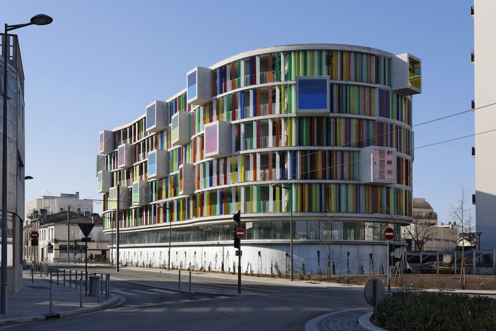
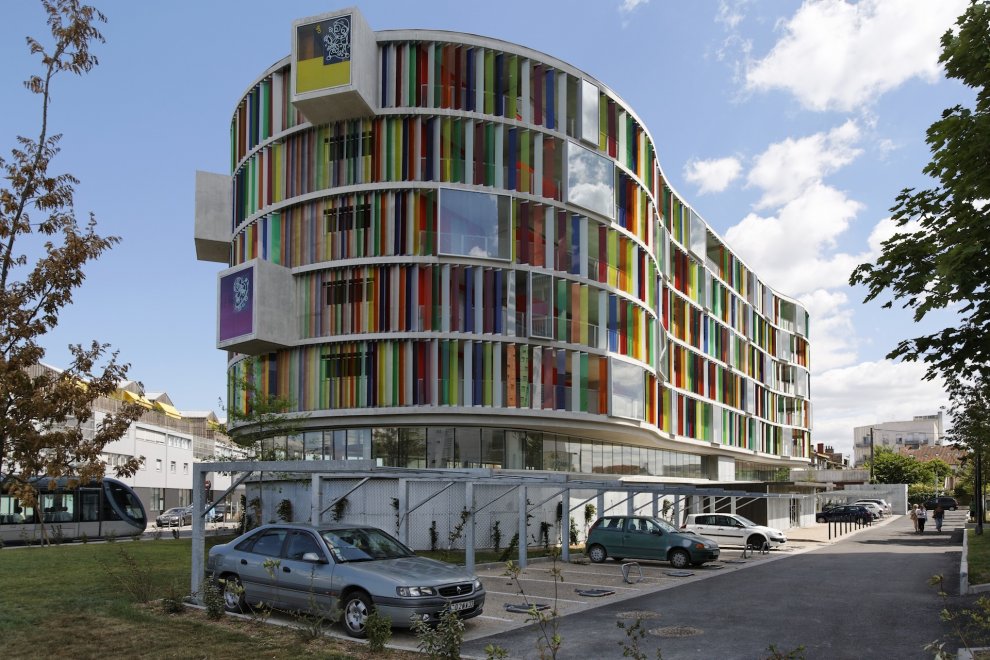
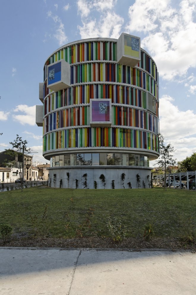 [Images: Arc en Ciel by Bernard Buhler Architects].
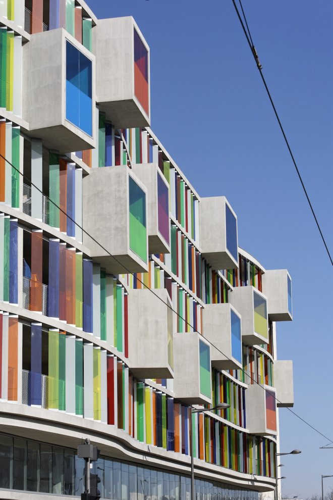
With a building as eye-catching as this one, it’s quite difficult to imagine a rationale behind adding graphics to the exterior glass windows—like children’s drawings, or some vague gesture toward “street art”—which looks both kitschy and unnecessary.
 [Images: Arc en Ciel by Bernard Buhler Architects].
After all, the graphics-free windows look fantastic—but c’est la vie.
 [Image: Arc en Ciel by Bernard Buhler Architects].
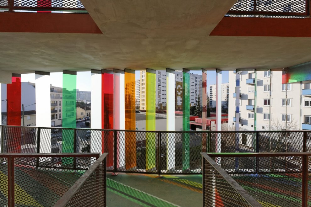
Successfully, to my mind—based entirely on a scan of some photographs on the internet—the colored exterior glass works not only to vivify the building’s urban site but to bring a constantly changing series of hues, like a colored bar code, onto the interior walkways. I would love to see this place lit from within at night, a sight the available photographs don’t offer.

 [Images: Arc en Ciel by Bernard Buhler Architects].
Anyway, the building looks cool; that’s about all I have to say. I will add, however, that I’m struck by how extraordinarily better the actual, constructed building is, compared to its rendering, seen below.
 [Image: Arc en Ciel by Bernard Buhler Architects].
All the more evidence that rejecting (or embracing) a building’s outward formal characteristics on the basis of renderings is not necessarily a good idea.
See many more images over at Architizer.

I'm not sure I understand the extra graphics either—the building does just fine as a colorful, living billboard. Detailed views of the interiors would've been welcome, though nothing beats seeing the building and what's inside live and in full color. Someday soon.
the graphics does look quite cluttered, but all in all, great architecture. love the concept. 🙂
I not sure how I could figure out what's "extra" in this place. I'd like to try a walk-through but the halls looks like my personal migraine trigger; though I wish it wasn't so.
The end-on shots remind me vaguely of the Calman building in Durham.
That first shot almost looks pasted together from two different skylines, with that enormous area of empty blue in the upper right…
I agree with Terry, as vibrant as this building is I don't think I would enjoy being subjected to so many different and contrasting colors of light at once, where this a place I inhabited. Also the colors are fun at first, but if I saw them every day they would get old quickly.
without the colours, the building is wholly unremarkable, and reminiscent of much recent, cheaply built, 'shed' housing covering Europe in the last 5 years.
http://www.skane.se/Public/Regionservice/bilder_externt/startsida/aktuellt/malmo_stadsbyggnadspris_2010/_DSC1421–%C2%AERuona-10.jpg
An emergency hospital in Malmö, Sweden
The exterior of the building looks like the paintings from the Israeli artist AGAM.
Sergio
http://www.sergiostudiony.com