Nobson Newtown

I just found an old article from frieze about graphic artist Paul Noble‘s “monumental eight-year project… [to create] a fictional city called Nobson Newtown.”
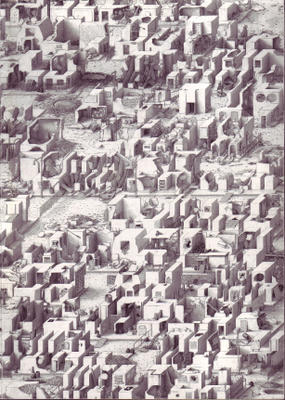

Nobson Newtown was an “exercise in self-portraiture via town planning,” involving “the painstaking design of a special font based on the forms of classic modernist architecture.”
The “city,” in other words, was made of words.
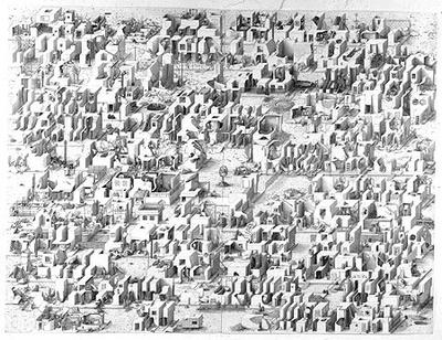

“Variously described as ‘3-D Scrabble tiles’ or ‘Lego blocks’, Noble’s pictograms name the buildings that they depict. From the hospital (Nobspital) to the cemetery (Nobsend) via the town centre (Nobson Central) or the Mall, citations from Omar Khayyam’s Rubaiyat, Gerard Winstanley’s letters to Oliver Cromwell or T.S. Eliot’s The Wasteland are camouflaged within the fields, the trees or the brickwork. Noble’s project embodies a complex infrastructure of civil planning, social policies and historical perspectives” – and it was all done with pencil. (Book available here).


“At first,” says the BBC, “the drawings appear to be depictions of a crazy Babylonian society, with a touch of Brueghel’s Tower Of Babel and Robert Crumb’s rounded comic strips. Then you realise each building is also a 3-D letter of the alphabet spelling out hard to decipher sentences in Noble’s self-created Nobfont.”


But he wasn’t the first.
Nearly two decades earlier, in 1980, Steven Holl published his own “Alphabetical City” through Pamphlet Architecture, and it, too, consisted entirely of buildings that were actually letters, that were actually a city, that… – but the funny thing is, Holl’s drawings look absolutely, unpublishably stupid compared to Noble’s:
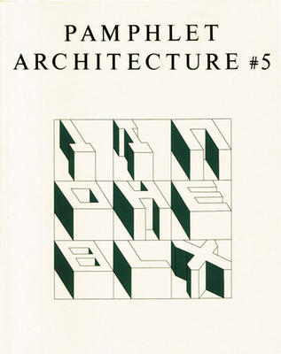

Hello? One wonders which two-minute lunch break Holl took to draw those… Or was it thirty seconds?
In any case, the creation of architectural space through a tweaking of the alphabet is not an inherently interesting proposition, but Noble’s eye-failure-inducing drawings reward repeated viewings. Just blink occasionally.
The buildings, frieze‘s Tom Morton claims, look like, “odd, wind-carved rock formations. Standing on higher ground, squinting against the sun, we’d see that they formed an eroded text.”
Here I’m reminded of the idea of “slow sculpture” from China Miéville’s novel, Iron Council:
“Huge sedimentary stones… each carefully prepared: shafts drilled precisely, caustic agents dripped in, for a slight and so-slow dissolution of rock in exact planes, so that over years of weathering, slabs would fall in layers, coming off with the rain, and at very last disclosing their long-planned shapes. Slow-sculptors never disclosed what they had prepared, and their art revealed itself only long after their deaths.”
Perhaps, in those dissolving rocks, you could plan a slow and secret alphabet…

The light/surface fold: advertisements, Steven Holl, et cetera

I noticed several years ago that the pine forests outside Chapel Hill, NC, fill with a strange white light in winter, and not for the obvious reasons that, yes, it’s winter, so the leaves are all gone: ergo more light.
Nope: it’s because the angle that the earth takes in relation to the sun has changed, as it does every winter, and so the forests have literally begun to glow: the sun has begun hitting them at a different angle.
Winter, in this regard, is really a question of spherical geometry, angles, and trigonometric effects at long distances: sun–>earth/angle of incidence (or whatever). One of winter’s more interesting side effects, then, is the way that it transforms shadows – making them longer and thinner – while simultaneously illuminating objects from the side. This brings out details that go unremarked – and unlit – in other seasons.
All of these written reflections having been inspired by this photograph:


What’s interesting here is how the billboard enlists sun/earth trigonometry in the selling of suntan lotion. Who’da guessed?
But so I got to thinking about what would happen if you did more of that with architecture, if you learned a spatio-architectural lesson from however brief a glance at that billboard.
The deliberate shadow-machining effects of different times of day, say, in the vein of Steven Holl: entire hallways and galleries and courtyards and milled surface details could become visible only at specific hours, perhaps in pre-patterned ways.
Like an inhabitable sundial, you would always know it was 3 o’clock in the afternoon because the little grilled incisions in the plaster of the upstairs walls just appeared. They were invisible before that, and will be invisible again: but now is their moment in the light…
Or you know it’s noon because there are suddenly no shadows of any kind in your courtyard: you’ve angled everything perfectly for that moment. The space folds in on itself, reboots back to undisturbed white, and at 12:01pm the shadows reappear.
I just mean to point out the connection, here, between architecture and astronomy – via spherical, planetary trigonometrics – not because I’m the first to do so or even because it’s ultimately all that interesting, but because every little mundane trace – mere shadows – can be seen as an indication of literally superior, astro-stellar relationships.
Every shadow, if you do the math right, if you know the angles and the trig and the spherical velocity of objects in space, is actually an indication of the time of day – in a calendar that precedes Swatch and Swiss Army and electricity and even biological organisms as such.
And every kid with a flashlight – every person with a match or candle – every architect, even – can participate. Everything you build can be – and is automatically – an astronomical event.