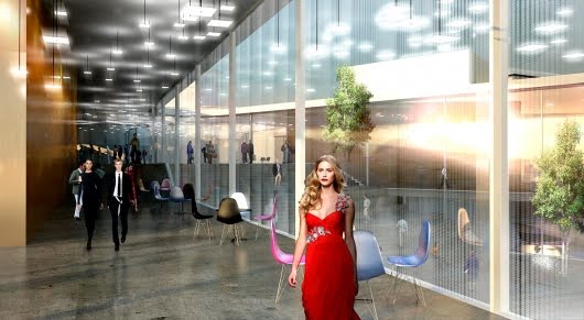
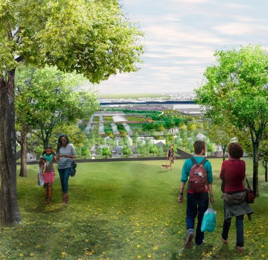
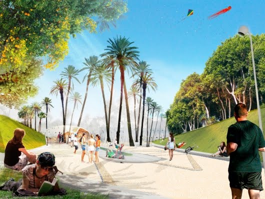
Yesterday’s New York Times Magazine included a new installment of Rob Walker’s excellent “Consumed” column in which he explores “the little human figures who inhabit the rendered world” of today’s architectural images.
 [Image: From a proposal by WE Architecture, via Bustler].
“The apparent purpose of these figures is to provide [a] sense of scale,” he writes. They give the image what is known as “people texture.”
“But where did these uncanny little citizens come from, and what are they really up to?”
 [Image: From a proposal for the Minneapolis waterfront by TLS/KVA, via Bustler].
I had the pleasure of speaking to Rob about his piece, and our conversation rapidly turned into a sprawling look at the various meanings and purposes of inserting nameless, miniature, and often semi-transparent human beings into images of the built environment. The resulting article is worth reading in full—but there are two particular sub-topics we discussed that didn’t make it into the final article, and I’d briefly like to mention those here.
1) Rob points out that “there is a small people-texture industry.” He writes, for instance, that a company called Realworld Imagery sells a CD featuring 104 “Business People” for $150 per disc. “A site in Britain,” he adds, “Falling Pixel, offers, among others, ‘120 Casual People’ (which sounds like a passable indie movie) for about $70.” Further, he explains, “While a certain amount of variety matters—scalies can be young or old and come from diverse ethnic backgrounds—the most important factor is making sure any individual isn’t so remarkable as to distract from the scene as a whole (or dressed in outfits that will quickly look dated).”
I had to wonder, nonetheless, if there might not be some fantastic, Don DeLillo-like storyline hidden in the material here—a novel, or short story, or film, that would follow a group of individuals who pay their bills and make a living working as nothing more than anonymous “people texture” in the backgrounds of architectural renderings. SOM, KPF, OMA, HOK—their press teams all seek out this elite group, who, like the legendary hand-model from Zoolander, are seen as uniquely able to add authentic culture to the increasingly elaborate press releases of the architectural world. Listening to their iPods in apartments that don’t exist yet, walking their dogs down prospective city streets, playing chess together in a forthcoming park near Potrero Hill.
Anonymous, translucent, and ubiquitous, they are the ghosts of modern real estate, minor celebrities of unbuilt space.
 [Image: From a proposal by West 8, via Bustler].
2) If we treat this whole discussion simply as a look at how the human body is depicted in architectural images—in renderings, animations, and films—then it is interesting to look back at a video released roughly three years ago in which “urban free runners” are seen jumping, leaping, bounding, and rolling through the Mountain Dwellings in Copenhagen, designed by Bjarke Ingels Group with Julien De Smedt.
I feel compelled to admit that I am not actually a fan of parkour; my interest here is simply in pointing out that fringe athletic videos—BMX tricks, free-running, skateboarding, etc.—can be tentatively placed into the same genealogy as the “people textures” discussed by Rob Walker.
These peripheral athletics of the city, in other words, are another way to show how the human body populates, textures, and otherwise interacts with architectural space. They don’t suggest actual future uses, however, but rather indicate the range of behaviors and movements that a specific location can tolerate. In this context, we could perhaps even suggest that someone like Danny MacAskill is actually advancing the “people texture” industry, without intending to, insofar as his actions reveal new ways for the human body to interact with a given landscape, or that something as apparently irrelevant as trick basketball-shot videos suggest a humanization of architectural space that even well-populated renderings still struggle to achieve.
Fringe athletics videos, then—even if we limit ourselves solely to the Bjarke Ingels/parkour example cited above—can be seen as a kind of unexpected continuation of the people texture industry: highly novel ways of revealing how a site can be woven into the cultural fabric of the city.
Read Rob Walker’s article for more.

http://www.peopleforthearchitecture.com
I don't recall when I noticed the switch over to photo-based people in architectural drawings, but I came to intimately observe this phenomenon once I entered architecture school. Students would trade (or steal) people–packets 40 or 50 image files were passed around the studio. In the grueling, sleepless crush of production in the 100 or so hours before final pin-up, when no one left their desks and everyone was desperately trying to stop drawing and hit render in time to make use of their reserved plotting time, only a few hours at the very most were left to consider the finishing touches of the presentation drawings, and it was just accepted practice that anonymous actors like these were plopped in at the last minute for flavoring.
Although this was hardly the most curious phenomenon I encountered in my architectural education, I did wonder about it. I still can't help but think that it doesn't exactly augment students' perception and understanding of how architecture works with the human body when they never have to actually draw people in relation to their designs–that one of the dexterities that is no longer required is the surprisingly-challenging ability to draw a human being at all. In the whole paradigm shift to computer-driven design, it certainly seems only in keeping that suites of magazine cut-out models are how drawings are populated. Modular and Vitruvian man are logos to reblogged on tumblr.
I like your idea about the novel, because there is something eerie about the fact that these images originate with real people (which is an irony, in light of what I just said above) who have never met in person but share the shadows of these nonexistent constructions.
It would be interesting to compare these scalies to the staffage figures in old landscape paintings. Or see an architect photoshop some of those anonymous shepherds and soldiers into their designs. These words could have been given as advice to the classical landscape painter: 'the most important factor is making sure any individual isn’t so remarkable as to distract from the scene as a whole (or dressed in outfits that will quickly look dated).' Some theories of Giorgione's 'La Tempesta' interpret its figures as unusually prominent staffage rather than representing specific Biblical or mythical characters – scaling up such figures gives them a troubling enigmatic quality.
At least people are volunteering to be photographed for these companies – how sad it would be to find an image of oneself looking neutral and unthreatening in one of these architectural renderings.
The logical evolution of people texturing is for people sculptures to be places permanently in the environment.
Static perfect families that would make architects and planners ecstatic. Resnais' L'anne derniere en Marienbad personified. Walking more than 2 steps in quick succession would be prohibited.
Much like the ban on street photography in areas on London, any individuals not conforming to the stock dress code, walk, smile and gestures would be fined, or eliminated quietly into the back of a van.
I've always been interested in the use of people as texture in the large-scale line drawings of Rogers, Foster, Piano, etc… I have always found it as a much more abstract and interesting representation of the human than the ubiquitous sexy woman in a business suit serenely gazing through the window of an affordable housing unit.
http://www.flickr.com/photos/werdsnave/242140063/sizes/o/in/set-72157594182491482/
http://www.flickr.com/photos/werdsnave/242142758/sizes/o/in/set-72157594182491482/
Take for instance the Dolphinarium and Wellness center (picture 10) on http://archidose.blogspot.com/2011/02/bigs-peaks.html today. Is it helpful when the people imitate the built environment? Also, my personal site for archi scalies (because you can never have enough) are either taken by myself or borrowed from the creative commons content on flickr: http://www.immediate-entourage.com
What I want to know is whether these people exist in a range of different types of weather. It's always the height of summer in these renderings! Do they come out at all when it rains?
They have other more recent ancestors than the staffage figures of post renaissance painting which were incidentally often painted by subcontracted specialists.
Who remembers the Letraset figures of men in snappy business suits and shapely women looking as if they'd steppped out of Mad Men? Also Letraset trees and all manner of other accessories created an elegantly minimal modernist world, I remember using them to make cartoony assemblages.
Incidentally JMW Turner would have welcomed archi scalies – he could not paint figures and the few in his paintings are exceptionally clumsy so perhaps his innovative move to drop these figures was more born out of embarrassment.
The Awl todays posted about a "gay retirement center" project that was likely never going to be built, but interestingly, the same people-textures show up only this time, well: http://www.theawl.com/2011/02/the-future-of-gaychitecture
Architectural visualisations are a fascinating cultural artefact that embodies the values of the society in which they are produced. If you begin to look at them a little more closely you begin to see recurrent themes.
As Adam says above, why is it always sunny?
People might be interested in seeing an animation I produced that exposes the standard arch vis to a healthy dose of reality…
Real Estate
I must say that I find this a truly compelling article. I am left to wonder how a designer could rebrand a project based on who is inhabiting its space. I imagine a Mike Brady type showing of a replica of his house to stand in for any architecture of any scale. I would be interested in seeing a thesis developed of how we perceive a piece of architecture based solely on the people texture used to inhabit the space.
This theory of branding holds true for a recently won competition for a prison design by C. F. Møller Architects. The project was criticized on all the design blogs for its resort like atmosphere, complete with designer lamps, with the only slightly prison looking element being its entourage.
Where do these stylish young street walkers go to live out their private lives? To Hotel Archiphilia, where the attraction of the street is consummated.
http://dspace.mit.edu.libproxy.mit.edu/handle/1721.1/47839
As imagined by MIT alum Thaddeus Jusczyk for his 2009 MArch thesis!